Typography does far more than display words—it shapes first impressions, influences emotions, and strengthens a brand’s identity. Before someone reads your message, they notice how it looks. That’s why choosing the right font is one of the most important decisions in any design project.
Whether you’re building a website, creating a logo, designing a mobile app, or preparing marketing materials, a modern font can instantly make your work feel cleaner, more professional, and more memorable.
Today’s audiences expect digital experiences that are simple, readable, and visually polished. Modern fonts help achieve exactly that. With balanced proportions, excellent readability, and minimalist styling, they work across everything from startup branding to enterprise dashboards.
In this guide, you’ll discover some of the best modern fonts available today, learn when to use them, compare free and premium options, and explore practical tips that will help you make better typography decisions. You’ll also find official download sources and recommendations for different types of design projects.
If you’re serious about improving your typography skills, this guide is a great place to start.
What Are Modern Fonts?
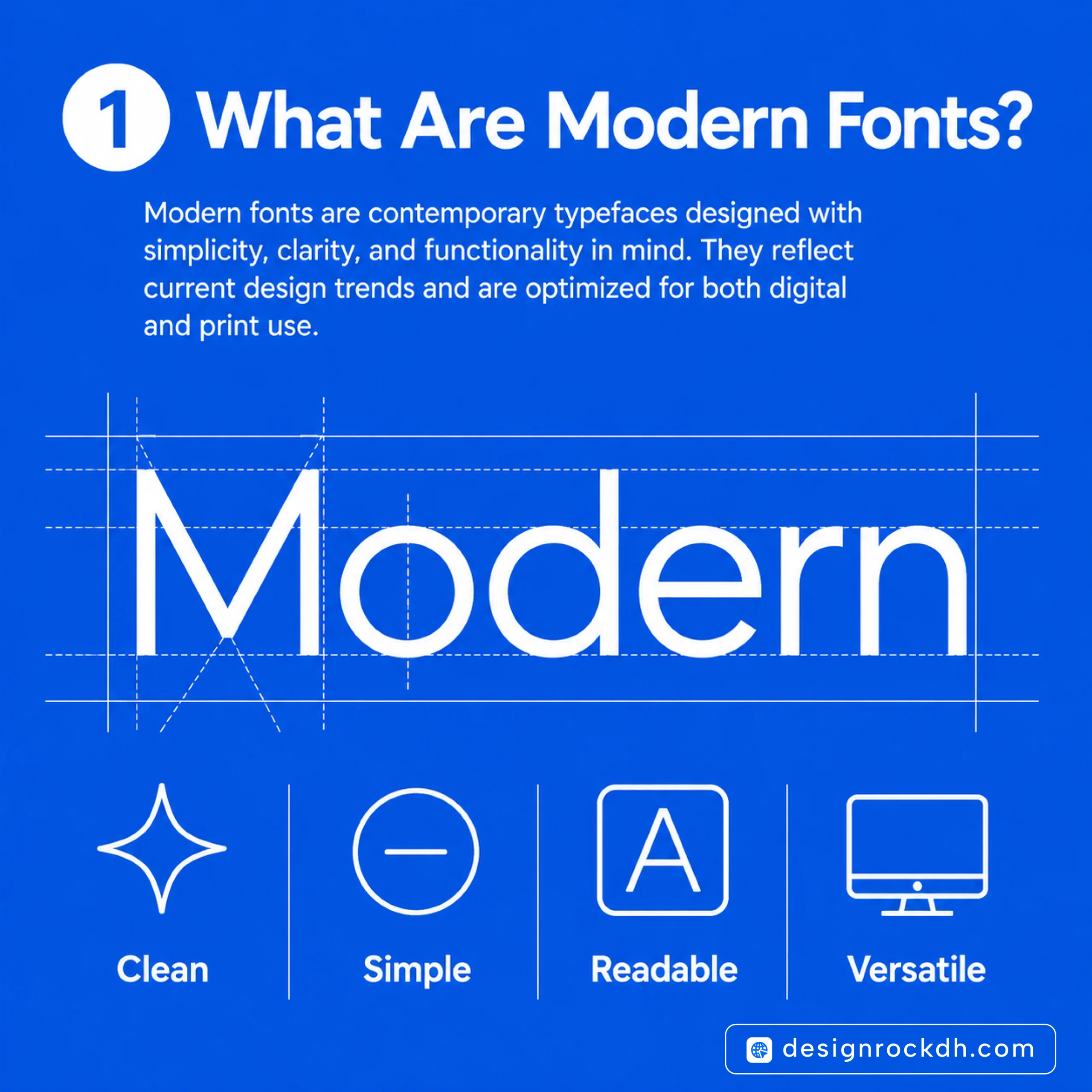
Modern fonts are typefaces designed for today’s digital-first world. Unlike highly decorative or traditional fonts, they focus on clarity, balance, and usability while maintaining a distinctive visual personality.
Most modern fonts feature clean lines, consistent spacing, and simple geometric forms. These characteristics make them highly versatile across websites, user interfaces, branding systems, presentations, social media graphics, and printed materials.
A well-designed modern font doesn’t compete with your content—it supports it. Instead of distracting readers, it improves readability and helps communicate information more effectively.
Some of the world’s most recognizable technology companies and startups rely on modern sans-serif typefaces because they perform exceptionally well on screens of every size. They’re optimized for desktops, tablets, and smartphones, making them a practical choice for today’s responsive web.
Why Modern Fonts Matter
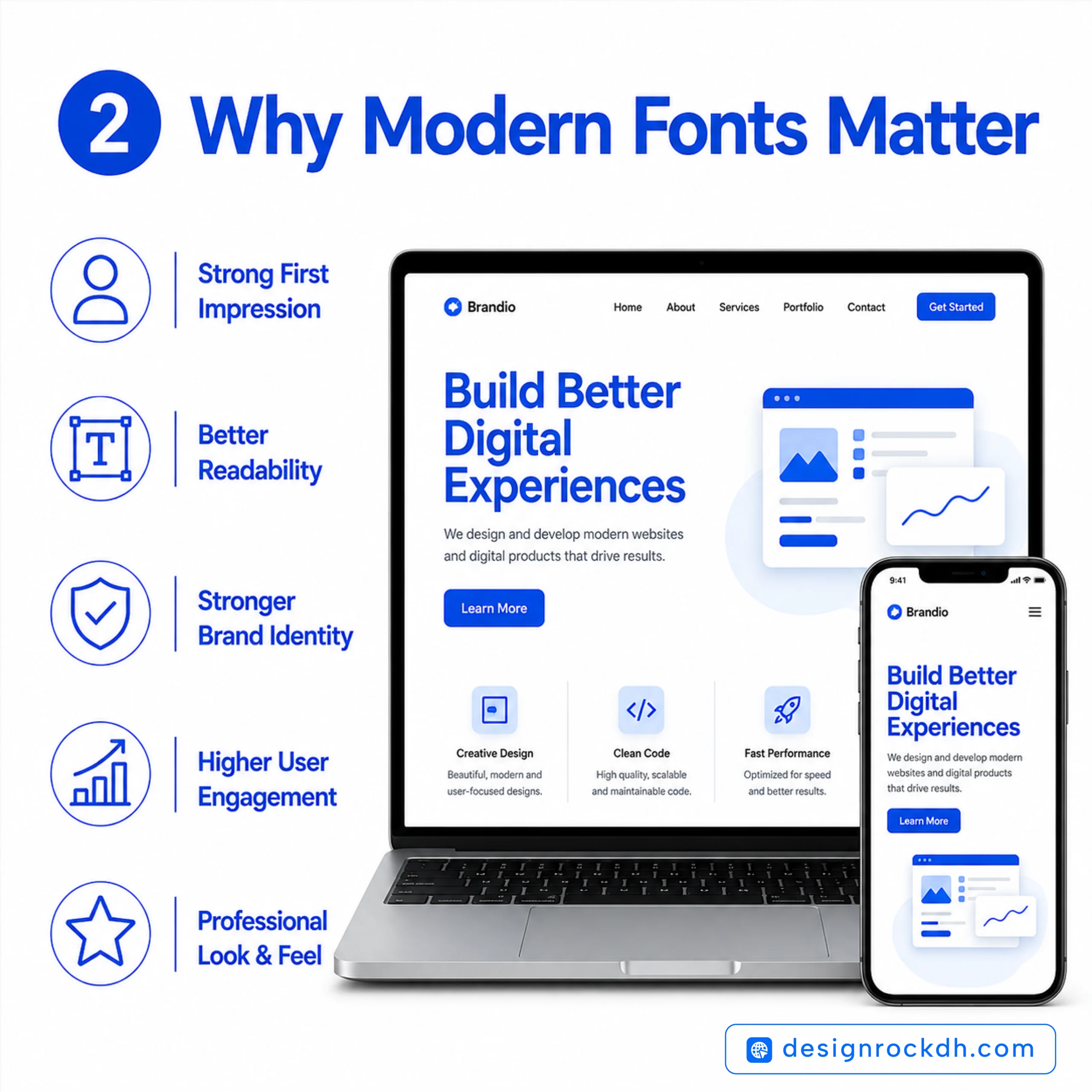
Many designers spend hours perfecting colors, layouts, and images but overlook typography. In reality, typography is often what determines whether a design feels premium or amateur.
A carefully selected modern font can:
- Create a stronger first impression
- Improve reading comfort on digital devices
- Strengthen brand recognition
- Increase user engagement
- Make interfaces easier to navigate
- Build trust through professional presentation
Imagine visiting two websites that offer the same service. One uses outdated fonts with inconsistent spacing, while the other uses a clean, contemporary typeface with excellent readability. Even if the content is identical, most people will naturally trust the second website more.
That’s the quiet power of typography—it influences perception before users consciously notice it.
The Key Characteristics of Modern Fonts
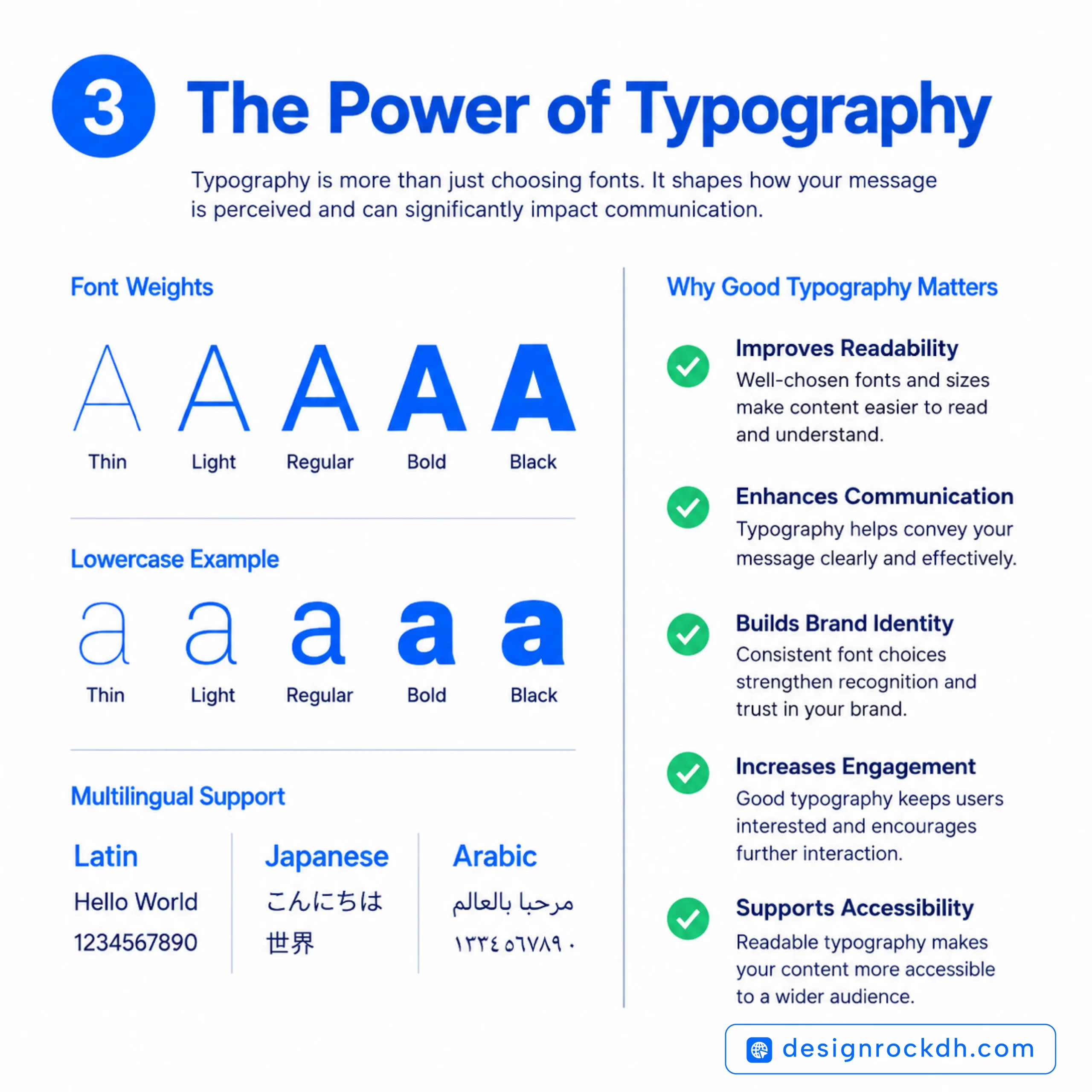
Not every clean-looking font qualifies as a great modern font. The best typefaces share several qualities that make them suitable for today’s design standards.
Clean and Minimal Letterforms
Modern fonts avoid unnecessary decoration. Their simple construction helps readers focus on the message instead of the typography itself.
Excellent Readability
Whether displayed on a large desktop monitor or a small smartphone screen, modern fonts remain easy to read. Clear letterforms reduce visual fatigue, especially in long-form content.
Balanced Spacing
Professional fonts are carefully designed with consistent spacing between letters and words. Proper kerning and tracking create smoother reading experiences and make layouts appear more refined.
Multiple Font Weights
Most modern font families include a wide range of weights—from Thin and Light to Bold and Black. This flexibility allows designers to create strong visual hierarchy while maintaining consistency throughout a project.
Variable Font Technology
Many contemporary fonts now support variable font technology, allowing multiple weights and styles to be stored within a single file. This reduces loading times and improves website performance without sacrificing design flexibility.
Broad Language Support
For businesses serving global audiences, multilingual support is essential. Many modern fonts include extensive character sets that cover dozens of languages, making them suitable for international brands.
Where Modern Fonts Work Best
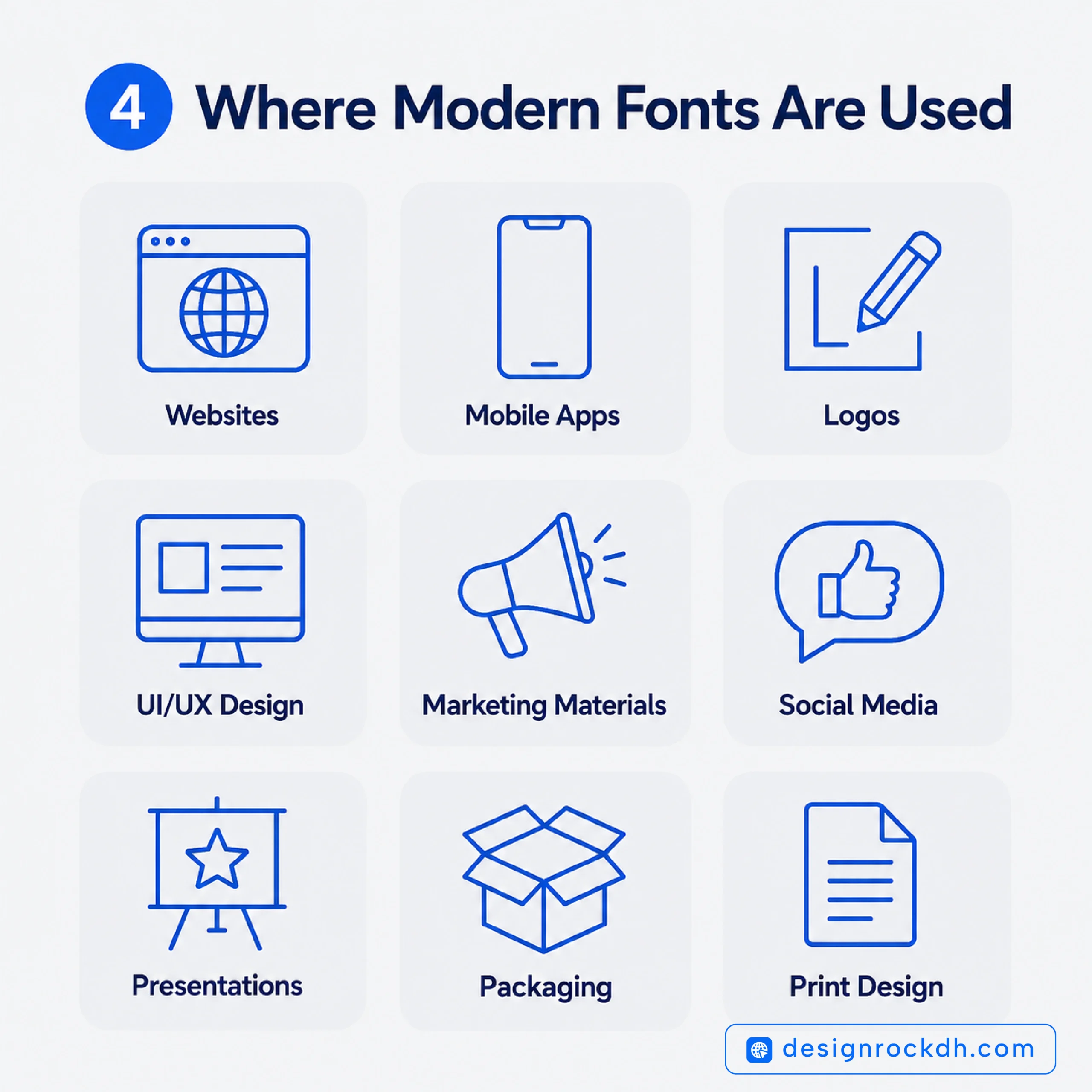
One of the biggest advantages of modern typography is its versatility. A single font family can often be used across an entire brand ecosystem.
Modern fonts are commonly used for:
- Brand identity and logo design
- Websites and landing pages
- UI and UX design
- Mobile applications
- SaaS dashboards
- Social media graphics
- Business presentations
- Marketing campaigns
- Editorial layouts
- Product packaging
Using the same font family consistently across multiple platforms creates a unified visual identity, making your brand easier to recognize and remember.
Why Designers Prefer Modern Sans-Serif Fonts
Over the past decade, modern sans-serif fonts have become the standard choice for digital design—and for good reason.
Without decorative strokes or excessive detail, sans-serif fonts remain highly legible at both large and small sizes. They also scale beautifully across responsive interfaces, making them ideal for websites and mobile apps.
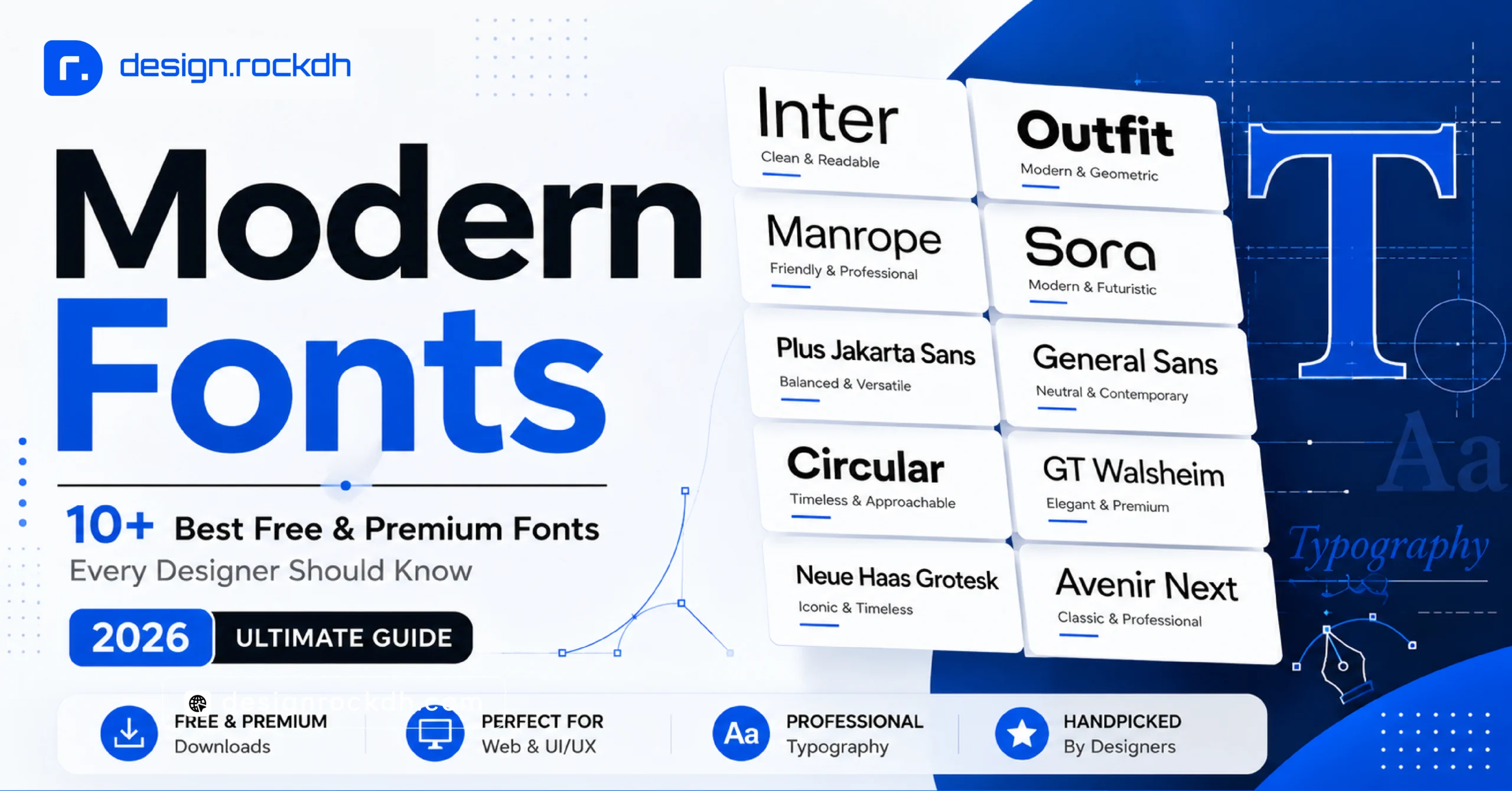
Fonts like Inter, Manrope, Outfit, and Plus Jakarta Sans have become favorites among designers because they combine clean aesthetics with excellent usability. Their versatility allows them to work equally well for startup landing pages, corporate websites, and creative portfolios.
Best Modern Fonts Every Designer Should Know
The internet is filled with thousands of fonts, but only a handful have earned the trust of professional designers. The best modern fonts aren’t just visually appealing—they’re built for performance, readability, and flexibility across digital and print media.
Whether you’re designing a SaaS landing page, creating a luxury brand identity, or building a mobile app, the right typeface can elevate your entire project.
Below are some of the best modern fonts available today, along with their strengths, ideal use cases, and official download sources.
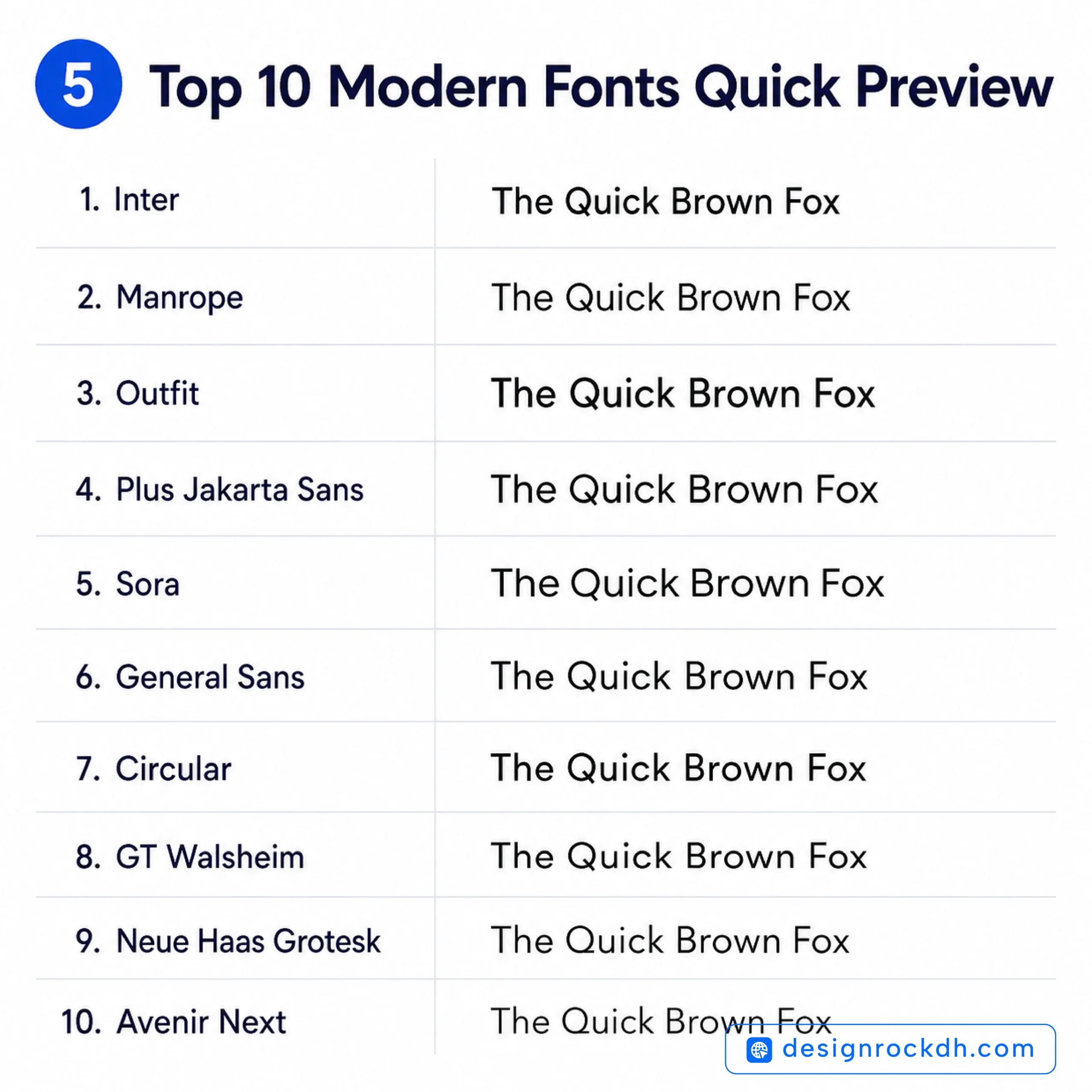
1. Inter (Free)
Inter has become one of the most trusted fonts for UI and web design—and for good reason. Designed specifically for digital interfaces, it delivers exceptional readability across screens of every size.
Unlike many older sans-serif fonts, Inter was created with modern displays in mind. Its generous spacing, clean letterforms, and extensive weight options make it an excellent choice for everything from dashboards to landing pages.
Best For
- UI/UX Design
- SaaS Products
- Dashboards
- Websites
- Mobile Apps
- Documentation
Why Designers Love It
- Free for commercial use
- 18+ font styles
- Variable font support
- Excellent readability
- Large language support
Official Download:
https://rsms.me/inter/
2. Manrope (Free)
If you’re looking for a font that feels modern without looking cold or mechanical, Manrope is an excellent choice.
Its rounded geometry gives interfaces a friendly personality while maintaining a professional appearance. Many startups choose Manrope because it works beautifully in both headlines and body text.
Best For
- Startup Websites
- Branding
- Landing Pages
- Product Design
- Marketing Materials
Why It Stands Out
Unlike many geometric fonts, Manrope has subtle humanist details that make long-form reading more comfortable.
Official Download
https://manropefont.com/
3. Outfit (Free)
Outfit is one of the fastest-growing Google Fonts among designers. It has a clean geometric structure that immediately gives websites and branding projects a fresh, contemporary feel.
Because of its bold personality, Outfit performs particularly well in hero sections, large headlines, and modern logos.
Best For
- Branding
- Logo Design
- Hero Headlines
- Social Media Graphics
- Creative Portfolios
Why Designers Recommend It
Outfit strikes a great balance between personality and simplicity. It’s distinctive enough to stand out without sacrificing readability.
Official Download
https://fonts.google.com/specimen/Outfit
4. Plus Jakarta Sans (Free)
Originally created for digital products, Plus Jakarta Sans has quickly become a favorite among UI and UX designers.
Its balanced proportions and clean appearance make interfaces feel polished without drawing unnecessary attention to the typography itself.
Best For
- Product Design
- Mobile Apps
- UI Kits
- Dashboards
- Corporate Websites
Key Advantages
- Modern appearance
- Excellent readability
- Wide language support
- Free through Google Fonts
Official Download
https://fonts.google.com/specimen/Plus+Jakarta+Sans
5. Sora (Free)
Sora offers a slightly futuristic look without becoming overly experimental. It feels innovative, making it an excellent fit for AI startups, technology companies, and fintech products.
If your brand wants to communicate innovation and forward thinking, Sora deserves a place on your shortlist.
Best For
- AI Startups
- Technology Companies
- Fintech
- SaaS Products
- Landing Pages
Why Choose Sora?
Its rounded shapes make interfaces feel approachable while still looking cutting-edge.
Official Download
https://fonts.google.com/specimen/Sora
6. General Sans (Free Personal / Commercial License Available)
General Sans has quickly become one of the most respected fonts among branding agencies. It delivers a premium appearance while remaining highly versatile across print and digital projects.
Many designers compare its quality with expensive commercial fonts.
Best For
- Brand Identity
- Corporate Design
- Editorial Layouts
- Luxury Brands
- High-End Websites
Why It’s Popular
- Elegant proportions
- Excellent kerning
- Strong font family
- Premium visual quality
Official Download
https://www.fontshare.com/fonts/general-sans
7. Circular (Premium)
Few fonts have influenced modern branding as much as Circular. You’ll find its clean, friendly appearance across countless technology companies and global brands.
Although it’s a premium typeface, many designers consider it a worthwhile investment because of its timeless versatility.
Best For
- Brand Identity
- Corporate Websites
- Mobile Apps
- Advertising
- Marketing Campaigns
Why Designers Buy It
Circular combines warmth with precision, making brands feel approachable without losing professionalism.
Official Download
https://www.lineto.com/
8. GT Walsheim (Premium)
GT Walsheim is known for its geometric precision and premium aesthetic. Fashion labels, luxury brands, and editorial designers frequently choose it because of its distinctive yet understated style.
Best For
- Luxury Branding
- Fashion
- Editorial Design
- Packaging
- Creative Agencies
Why It Works
It brings personality to a design without overpowering the content, making it ideal for premium visual identities.
Official Download
https://www.grillitype.com/
9. Neue Haas Grotesk (Premium)
If you’ve ever admired classic Swiss typography, you’ve already experienced the influence of Neue Haas Grotesk. This iconic typeface inspired Helvetica and continues to be a favorite among professional designers.
Its timeless design makes it suitable for projects that need to remain relevant for years.
Best For
- Editorial Design
- Corporate Branding
- Print Publications
- Museums
- Luxury Products
Why It’s Timeless
Rather than following trends, Neue Haas Grotesk focuses on clarity, balance, and precision—qualities that never go out of style.
Official Download
https://www.myfonts.com/
10. Avenir Next (Premium)
Designed by renowned typographer Adrian Frutiger, Avenir Next combines geometric structure with subtle humanist influences. The result is a font that’s both elegant and highly readable.
It’s widely used by businesses, educational institutions, and international organizations.
Best For
- Business Presentations
- Corporate Identity
- Professional Websites
- Annual Reports
- Enterprise Software
Why Professionals Choose It
Avenir Next feels modern without chasing design trends, making it a reliable choice for long-term branding.
Official Download
https://www.myfonts.com/
Quick Comparison Table
| Font | License | Best Use |
|---|---|---|
| Inter | Free | UI, UX, SaaS |
| Manrope | Free | Websites & Branding |
| Outfit | Free | Logos & Headlines |
| Plus Jakarta Sans | Free | Apps & Dashboards |
| Sora | Free | AI & Tech Startups |
| General Sans | Free Personal / Commercial License | Branding |
| Circular | Premium | Corporate Branding |
| GT Walsheim | Premium | Luxury & Editorial |
| Neue Haas Grotesk | Premium | Print & Branding |
| Avenir Next | Premium | Business & Enterprise |
Designer’s Tip
Instead of collecting hundreds of fonts, build a reliable typography toolkit with 8–12 high-quality families that cover different use cases. A combination like Inter for UI, Outfit for branding, General Sans for premium projects, and Avenir Next for corporate work will handle most design challenges while keeping your workflow consistent.
How to Choose the Right Modern Font
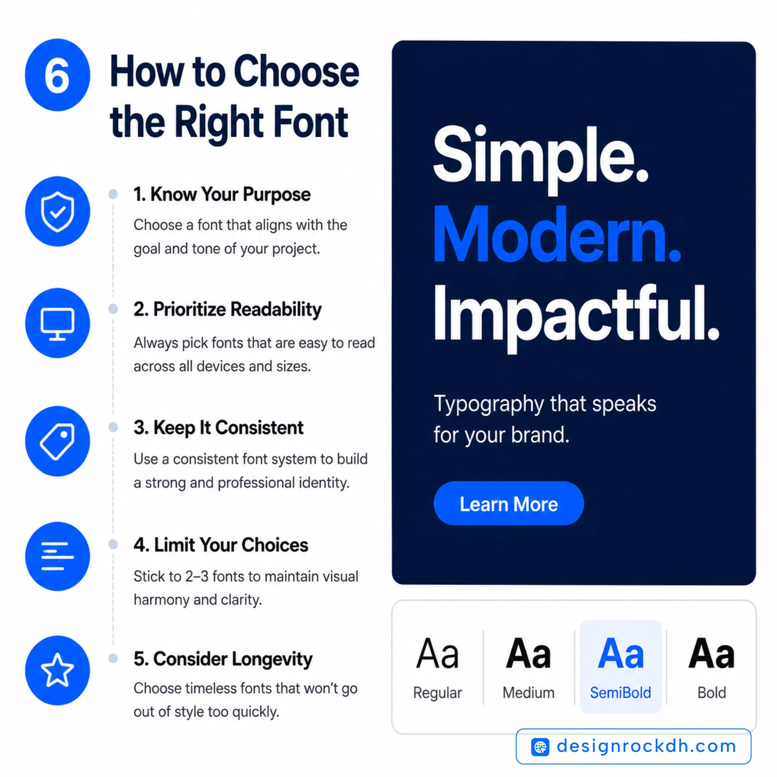
Finding a beautiful font is easy. Choosing the right one for your project is where experience matters.
The best typography doesn’t attract attention because it’s flashy—it works because it communicates clearly. A font should complement your message, reflect your brand’s personality, and remain readable in every context.
Before committing to a typeface, ask yourself these questions.
1. What Is the Purpose of Your Design?
Every project has a different goal, and your typography should support it.
For example:
- A SaaS dashboard needs clarity and usability.
- A luxury fashion brand needs elegance.
- A tech startup benefits from clean geometric fonts.
- A personal portfolio can use a font with more personality.
Choosing typography based on purpose rather than trends leads to better design decisions.
2. Is the Font Easy to Read?
Readability should always come before style.
A font might look stunning in a logo, but that doesn’t mean it will work well for paragraphs, buttons, or mobile interfaces.
Test your font in different situations:
- Desktop screens
- Mobile devices
- Large headings
- Small captions
- Dark mode
- Light backgrounds
If users have to work harder to read your content, the font isn’t doing its job.
3. Does It Match Your Brand Personality?
Fonts communicate emotion.
Before someone reads your message, they’ve already formed an impression based on your typography.
Here’s a simple guide:
| Brand Personality | Recommended Font Style |
|---|---|
| Modern Tech | Inter, Sora |
| Friendly Startup | Manrope |
| Luxury Brand | GT Walsheim |
| Corporate Business | Avenir Next |
| Creative Agency | Outfit |
| Editorial Magazine | Neue Haas Grotesk |
Typography is part of your brand voice. Make sure the two work together.
4. Does It Include Multiple Weights?
Professional font families usually include a range of weights, such as:
- Thin
- Light
- Regular
- Medium
- Semi Bold
- Bold
- Extra Bold
- Black
Having multiple weights makes it much easier to establish hierarchy without introducing additional font families.
A consistent type system almost always looks cleaner than mixing unrelated fonts.
5. Is the License Right for Your Project?
This step is often overlooked.
Some fonts are free only for personal use, while others allow commercial use without restrictions.
Before using a font for client work or a commercial product, always review its licensing terms.
Using a font without the proper license can lead to legal and financial issues.
Best Font Pairing Ideas
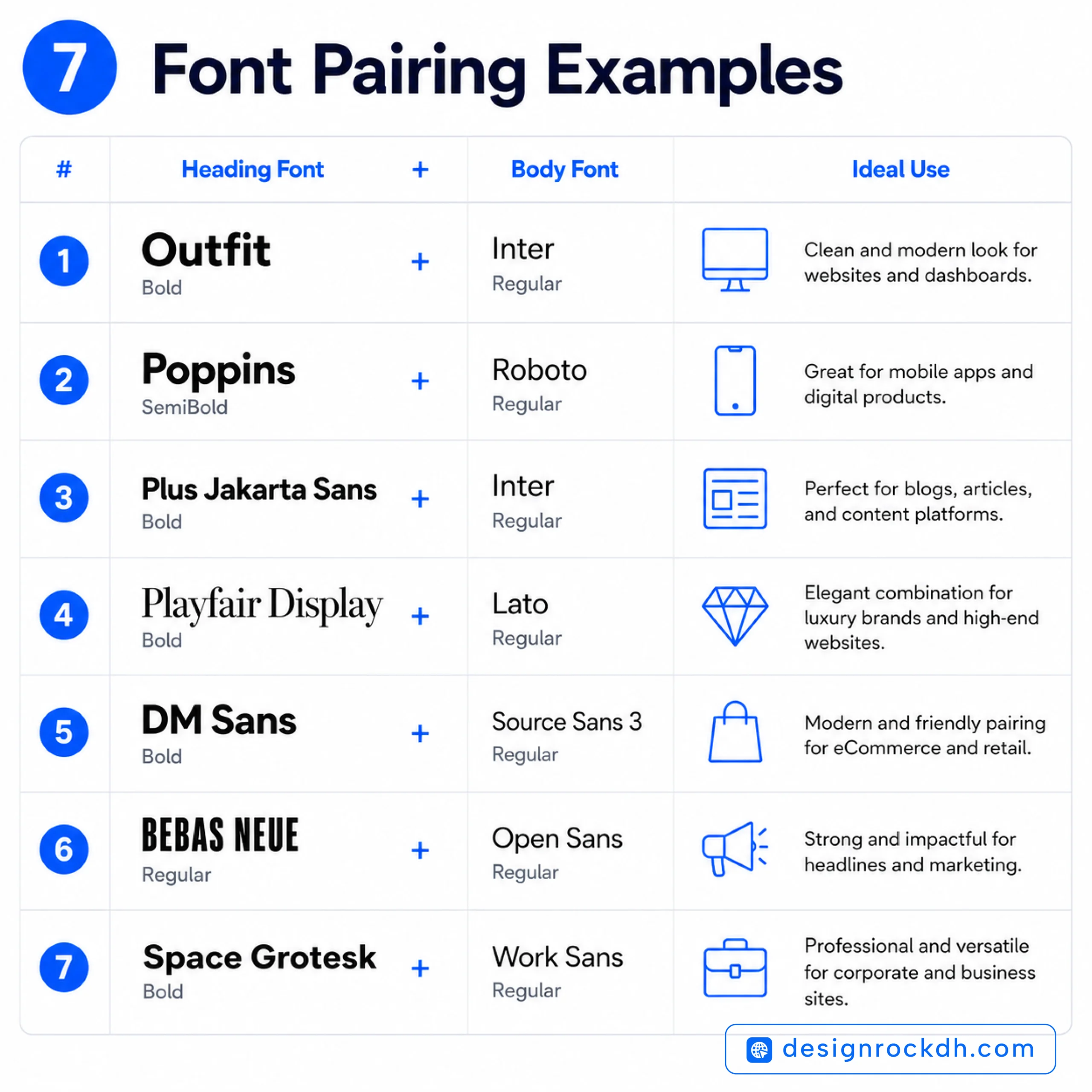
One of the easiest ways to improve a design is by pairing fonts that complement each other.
A common rule is to combine a strong display font for headings with a highly readable font for body text.
Here are some combinations that work consistently well.
Outfit + Inter
This pairing is ideal for modern websites.
Outfit gives headings confidence and personality, while Inter keeps paragraphs clean and easy to read.
Best for:
- Startup websites
- SaaS landing pages
- Creative agencies
General Sans + Merriweather
General Sans delivers a premium, contemporary feel, while Merriweather adds warmth to longer content.
Perfect for:
- Editorial websites
- Brand storytelling
- Premium blogs
Sora + Manrope
If you’re designing for an AI startup or technology company, this combination feels fresh and innovative without sacrificing usability.
Great for:
- Fintech
- AI products
- Software companies
Avenir Next + Source Serif Pro
Corporate yet approachable.
Ideal for:
- Business reports
- Consulting firms
- Enterprise branding
Plus Jakarta Sans + Playfair Display
A balanced combination of modern simplicity and timeless elegance.
Excellent for:
- Creative portfolios
- Personal brands
- Luxury products
Common Typography Mistakes Designers Make
Even experienced designers occasionally make typography mistakes that reduce readability and weaken visual hierarchy.
Avoid these common issues.
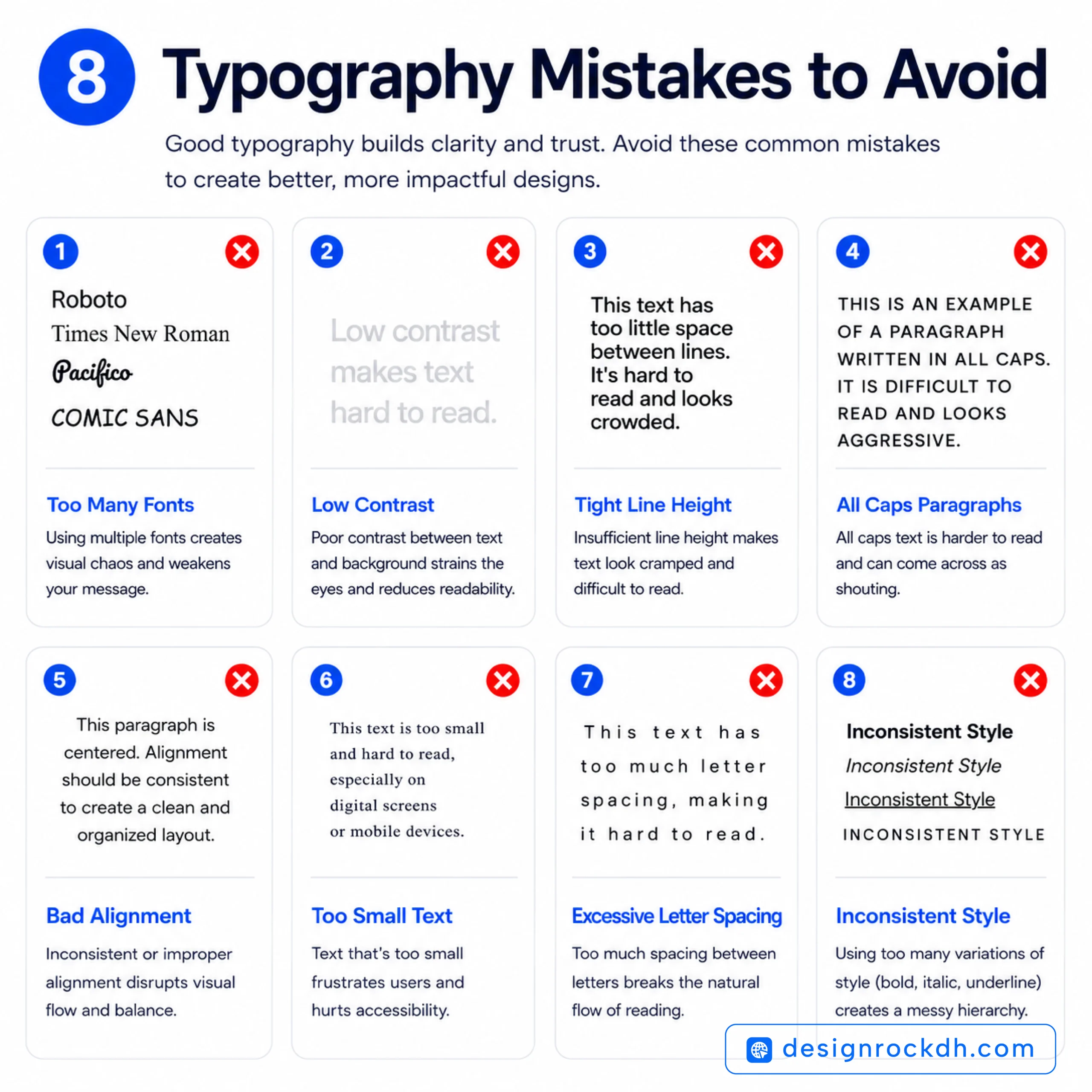
Using Too Many Fonts
More fonts don’t make a design more creative.
In most projects, two font families are enough.
Three is usually the maximum.
Ignoring Line Height
Crowded paragraphs feel overwhelming.
Increasing line spacing makes long-form content significantly easier to read.
For websites, a line height between 1.5 and 1.8 generally works well for body text.
Poor Contrast
Light gray text on a white background might look elegant, but it often creates accessibility problems.
Always prioritize readability over aesthetics.
Using Decorative Fonts Everywhere
Display fonts are designed for attention—not for long paragraphs.
Save them for:
- Headlines
- Logos
- Posters
Use clean sans-serif fonts for body content.
Inconsistent Typography
Switching fonts randomly across pages weakens brand identity.
Create a typography system and stick to it.
Consistency makes brands look professional.
Modern Typography Trends in 2026
Typography continues to evolve alongside digital design.
These are some of the biggest trends shaping modern interfaces this year.
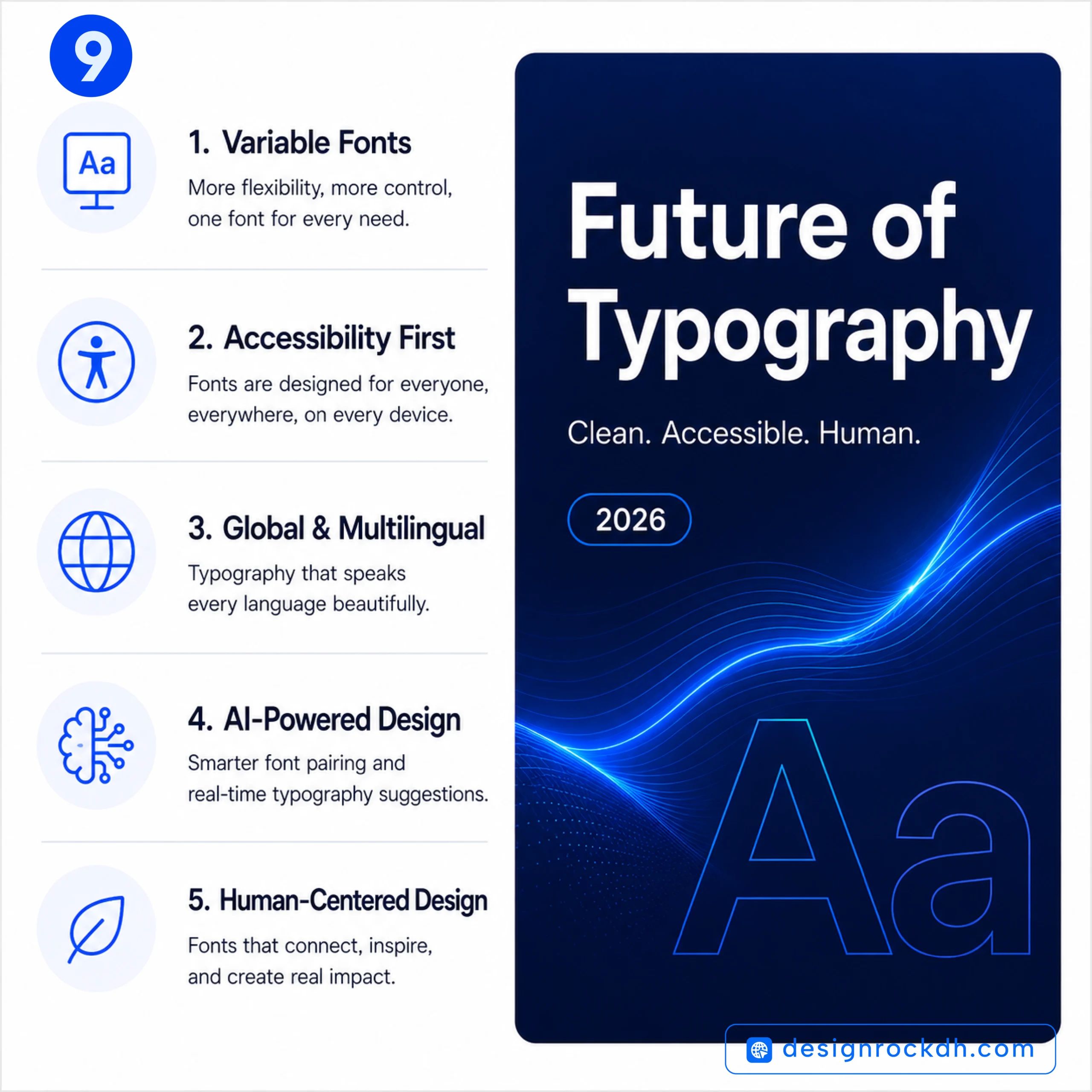
Variable Fonts Are Becoming Standard
Variable fonts improve website performance by replacing multiple font files with a single flexible file.
Benefits include:
- Faster loading
- Better performance
- Greater design flexibility
- Improved responsiveness
Bigger Headlines
Large typography is dominating modern web design.
Oversized headings immediately establish hierarchy and create a stronger visual impact.
Minimalism Continues to Win
Clean layouts paired with generous white space remain one of the strongest design trends.
Rather than adding more elements, designers are simplifying interfaces.
Accessibility Is No Longer Optional
Modern typography isn’t just about aesthetics.
It’s also about ensuring content remains readable for everyone.
Designers now prioritize:
- Larger body text
- Better contrast
- Responsive scaling
- Screen-reader compatibility
Accessibility improves both user experience and SEO.
Human-Centered Typography
Instead of choosing fonts simply because they’re trendy, designers are selecting typefaces based on usability and emotion.
The goal is to create interfaces that feel intuitive, trustworthy, and enjoyable to read.
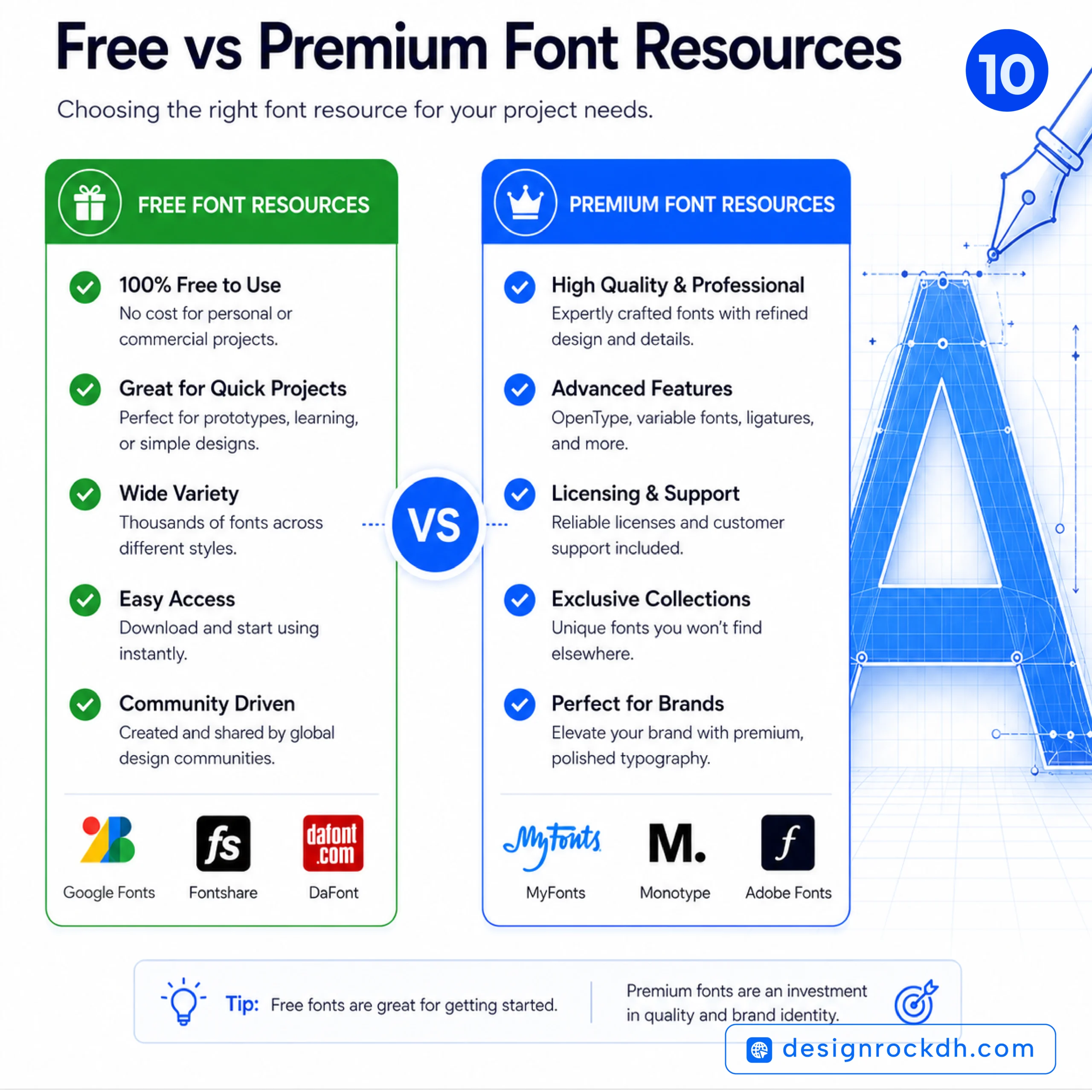
Free vs. Premium Fonts
Both free and premium fonts have their place.
The right choice depends on your project’s goals and budget.
Free Fonts
Advantages:
- No cost
- Easy to use
- Excellent for startups and personal projects
- Large selection through Google Fonts
Disadvantages:
- More commonly used
- Less distinctive for branding
Premium Fonts
Advantages:
- More refined details
- Better kerning
- Larger font families
- Exclusive appearance
- Stronger brand differentiation
Disadvantages:
- Licensing costs
- Higher initial investment
For businesses investing in long-term branding, premium fonts often provide excellent value.
Professional Typography Tips
Want your designs to look more polished? Keep these principles in mind.
- Professional typography becomes much easier when you follow a few simple principles.
- First, limit yourself to two font families to keep your designs consistent.
- Next, use different font weights instead of adding extra typefaces to create hierarchy.
- Additionally, test your typography on mobile devices before publishing.
- For better readability, maintain consistent spacing throughout your design.
- Moreover, optimize web fonts to improve loading speed.
- Finally, avoid stretching or distorting fonts, and always review the license before using them in commercial projects.
- Overall, readability should always take priority over decoration.
Great typography is often invisible. When readers can focus on your content without noticing the font, you’ve chosen well.
Frequently Asked Questions About Modern Fonts
Choosing the right font often raises more questions than answers, especially if you’re new to branding or digital design. Below are some of the most common questions designers, marketers, and business owners ask about modern fonts.
What Is the Best Modern Font for Websites?
There isn’t a single “best” font for every website, but several consistently perform well across different industries.
Some of the top choices include:
- Inter
- Manrope
- Outfit
- Plus Jakarta Sans
- General Sans
These fonts are optimized for digital screens, offer excellent readability, and work well on both desktop and mobile devices.
Which Modern Font Is Best for Logo Design?
Logo design requires typography with personality and long-term appeal.
Excellent choices include:
- Outfit
- General Sans
- Circular
- GT Walsheim
- Avenir Next
Before finalizing a logo, test the font in different sizes and on both light and dark backgrounds to ensure it remains recognizable.
Are Google Fonts Good Enough for Professional Projects?
Absolutely.
Many successful startups, agencies, and global companies use Google Fonts because they’re reliable, fast-loading, and easy to integrate.
Popular options include:
- Inter
- Outfit
- Sora
- Manrope
- Plus Jakarta Sans
The key isn’t whether a font is free—it’s how effectively you use it within your design system.
Should I Use One Font or Multiple Fonts?
For most projects, two font families are more than enough.
A common combination is:
- One font for headings
- One font for body text
Using too many fonts creates visual inconsistency and can make your design feel cluttered.
What’s the Difference Between Sans-Serif and Serif Fonts?
Sans-serif fonts have clean letterforms without decorative strokes, giving them a modern and minimalist appearance. They’re widely used for websites, apps, and user interfaces because they’re highly readable on screens.
Serif fonts include small decorative strokes at the ends of letters. They often communicate tradition, elegance, and authority, making them a popular choice for books, editorial design, and luxury branding.
Neither style is inherently better—it depends on your project’s goals and audience.
Can I Use Free Fonts for Commercial Projects?
Many free fonts are licensed for commercial use, but not all of them.
Before using a font in client work, products, or branding, always review its license on the official download page.
Taking a few minutes to verify licensing can help you avoid legal issues later.
How Many Font Weights Should I Use?
A good typography system doesn’t rely on every available weight.
In most cases, these are enough:
- Regular
- Medium
- Semi Bold
- Bold
Using a limited selection creates a cleaner and more consistent visual hierarchy.
What Makes a Font Look Modern?
Modern fonts typically share several characteristics:
- Simple geometric shapes
- Clean lines
- Balanced spacing
- Excellent readability
- Minimal decoration
- Responsive performance across digital devices
Rather than following short-term trends, modern fonts prioritize clarity and usability.
Continue Learning on designrockdh
If you found this guide helpful, explore these related articles on designrockdh to deepen your knowledge of typography, branding, UI design, and graphic design.
Typography & Fonts
- Modern Font Pairing: The Complete Guide to Creating Beautiful and Readable Designs
https://designrockdh.com/font-pairing-guide/ - Best Sans Serif Fonts for Modern Design
https://designrockdh.com/best-sans-serif-fonts/ - Serif Fonts: The Complete Guide for Designers
https://designrockdh.com/serif-fonts/ - Easy-to-Read Fonts for Design: Clear, Modern, and Highly Legible Typeface
https://designrockdh.com/easy-to-read-fonts-for-design-clear-modern-and-highly-legible-typeface/ - Script Fonts for Designers
https://designrockdh.com/script-fonts-for-design/ - 6 Futuristic Fonts for Modern Logos & Branding in 2026
https://designrockdh.com/6-futuristic-fonts-for-modern-logo-branding/ - 8 Free Luxury Fonts for Premium Branding
https://designrockdh.com/8-free-luxury-fonts/ - Free Fonts for Designers: Stylish Fonts for Logos, Branding & Social Media
https://designrockdh.com/free-fonts-for-designers/ - 5 Fonts That Look Like Professional Logos (Agale, Zaslia & More)
https://designrockdh.com/fonts-that-look-like-logos/ - Fonts for T-Shirt Design: How to Choose the Right Typeface
https://designrockdh.com/fonts-for-t-shirt-design-how-to-choose-the-right-typeface-2026-guide/
Color & Branding
- Gradient Color Combos That Instantly Elevate Your Designs
https://designrockdh.com/gradient-color-combos-that-elevate-designs/ - 6 Soft Gradient Color Combinations That Instantly Elevate Your Designs
https://designrockdh.com/6-soft-gradient-color-combinations-that-instantly-elevate-your-designs/ - 6 Modern Gradient Color Palettes Designers Should Use in 2026
https://designrockdh.com/6-modern-gradient-color-palettes-designers-should-use-in-2026/ - 5 Modern Color Palettes with HEX Codes for Designers
https://designrockdh.com/5-modern-color-palettes-with-hex-codes-for-designers/ - 6 Elegant Color Combination Ideas for Designers with HEX Codes
https://designrockdh.com/color-combination-ideas-for-designers/ - 5 Bold Modern Color Palette Combinations Designers Should Use in 2026
https://designrockdh.com/5-bold-modern-color-palette-combinations-designers-should-use-in-2026/
Branding & Creative Resources
- 5 Modern Brand Identity Mockup Prompts for Stunning Presentation Designs
https://designrockdh.com/modern-brand-identity-mockup-prompts/ - Free PNG Resources for Designers: 4 Useful Websites for Transparent PNGs
https://designrockdh.com/free-png-resources-for-designers/ - Social Media Image Sizes Guide (Updated for Designers & Marketers)
https://designrockdh.com/social-media-image-sizes/
Summary
Typography is one of the few design elements that influences both aesthetics and usability at the same time. The right font can strengthen your brand, improve readability, and make every design feel more polished and professional.
Whether you’re creating a logo, launching a website, designing a mobile app, or building marketing materials, investing time in choosing the right typography is always worthwhile.
If you’re just starting out, you don’t need hundreds of fonts. Build a small collection of dependable typefaces like Inter, Manrope, Outfit, and Plus Jakarta Sans for everyday projects. As your experience grows, you can expand your toolkit with premium options such as Circular, GT Walsheim, or Avenir Next for high-end branding work.
Remember, great typography isn’t about using the trendiest font—it’s about selecting the typeface that best communicates your message. When typography feels effortless to the reader, you’ve made the right choice.