Gradients are one of the easiest ways to make a design feel modern, energetic, and visually premium. A flat color can work well, but a carefully built gradient adds depth, movement, emotion, and stronger visual attraction.
Whether you are designing a website hero section, app interface, social media post, poster, logo background, presentation slide, or product banner, the right gradient color combo can instantly improve the overall look of your design.
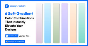
In this article, I’m sharing 5 gradient color combos that designers can use to create bold, clean, and eye-catching visuals.
1. Warm Sunset Gradient
HEX Codes:#C33300 · #CB3E00 · #DF5A00 · #FF8700 · #FFAB00 · #FFC700 · #FFD100
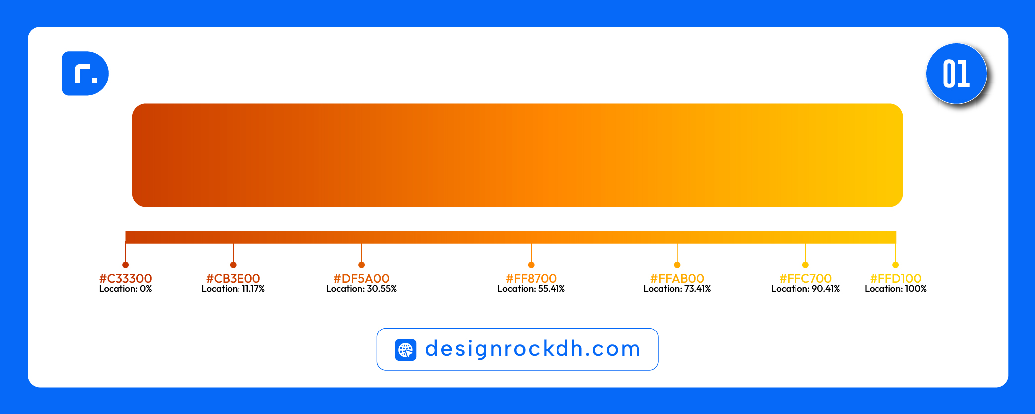
This gradient starts with a deep burnt orange and slowly moves into bright golden yellow. It feels warm, energetic, and highly attention-grabbing.
It works best for designs that need excitement, positivity, and strong visual impact. The orange-to-yellow transition is especially useful for promotional banners, event graphics, summer campaigns, food branding, and creative social media designs.
Best uses:
- Website hero backgrounds
- Sale banners
- Food and beverage branding
- Event posters
- Social media ads
- CTA sections
Design tip:
Use white or dark navy text over this gradient for strong contrast. Avoid placing light yellow text on the bright end of the gradient because readability may become weak.
2. Dark Purple to Hot Pink Gradient
HEX Codes:#0D0A4C · #FF43BD
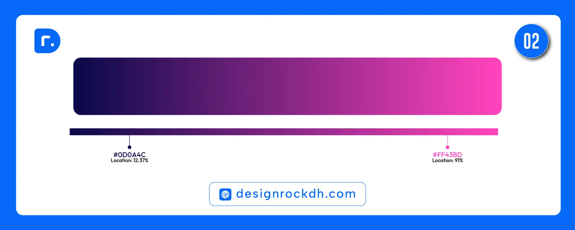
This combo creates a strong contrast between deep midnight purple and bright neon pink. It feels futuristic, stylish, bold, and digital.
This gradient is perfect for modern tech visuals, music posters, nightlife graphics, app interfaces, creative portfolio banners, and social media thumbnails. The dark purple gives depth, while the pink adds energy and personality.
Best uses:
- Tech startup visuals
- Creative portfolio headers
- Music/event posters
- App UI cards
- Gaming graphics
- Instagram carousel covers
Design tip:
Place important text closer to the dark purple side for better readability. Use pink as an accent for buttons, highlights, or icons.
3. Violet to Coral Gradient
HEX Codes:#1319B4 · #EB485C
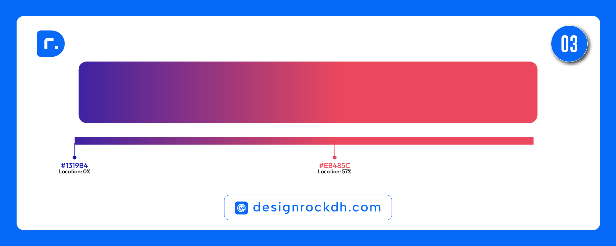
This gradient blends strong violet-blue with a soft coral-red tone. It has a modern, creative, and slightly premium feeling.
The combination is powerful but not too aggressive. It can work well for branding, digital products, presentation covers, landing pages, and fashion or lifestyle graphics.
Best uses:
- Brand identity mockups
- Landing page sections
- Presentation covers
- Portfolio banners
- Lifestyle graphics
- Creative agency visuals
Design tip:
This gradient pairs well with clean sans-serif typography. Use neutral backgrounds like white, off-white, or very dark navy to make the gradient stand out.
4. Electric Blue to Deep Purple Gradient
HEX Codes:#084ABF · #2731AD · #401D9E · #491699
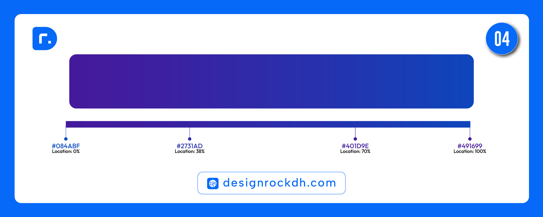
This gradient moves from rich electric blue into deep purple. It feels professional, digital, trustworthy, and modern.
It is a strong choice for SaaS websites, finance dashboards, technology branding, digital product interfaces, and corporate presentation designs. Blue communicates trust and clarity, while purple adds creativity and innovation.
Best uses:
- SaaS website sections
- Fintech branding
- Dashboard UI
- Tech presentations
- Business landing pages
- Professional social media posts
Design tip:
Use this gradient with white text, glassmorphism cards, or subtle shadows. It also works well behind product screenshots or UI mockups.
5. Deep Blue to Cyan Gradient
HEX Codes:#00389B · #00A4FF
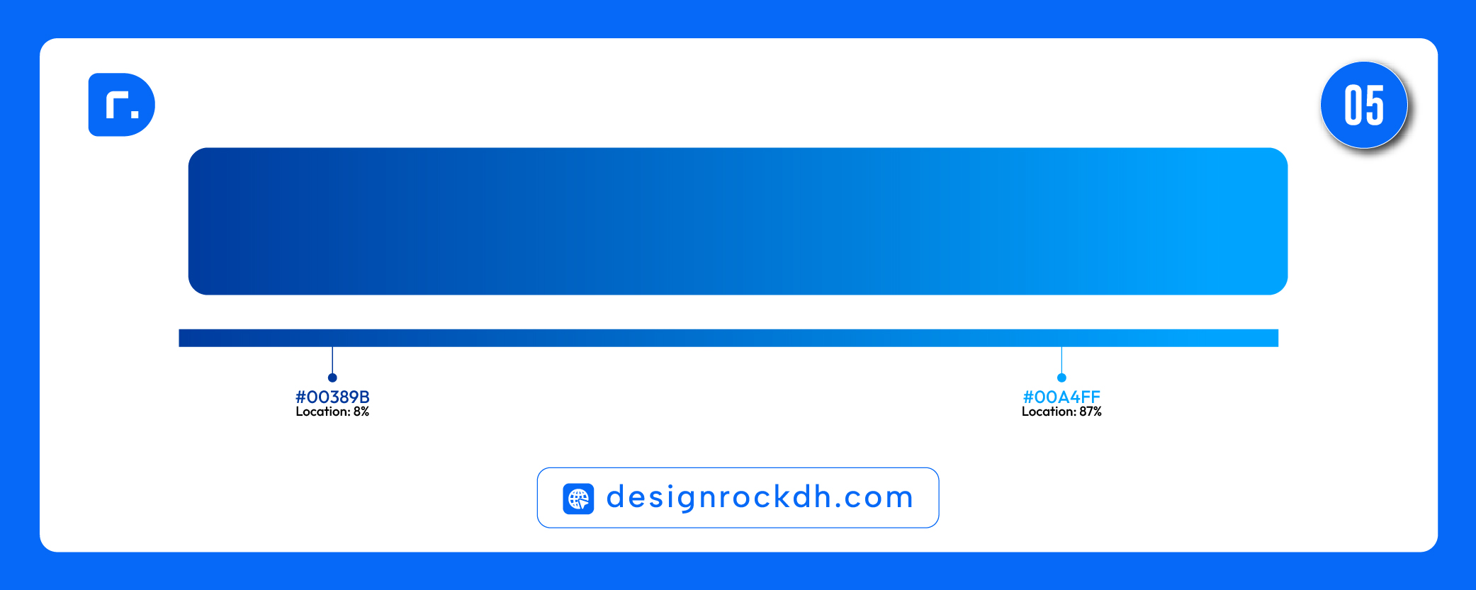
This is a clean and fresh blue gradient that moves from deep royal blue to bright cyan. It feels professional, modern, calm, and trustworthy.
This combo is very flexible because blue gradients work across many industries, including technology, healthcare, education, finance, SaaS, digital marketing, and mobile apps.
Best uses:
- Website hero sections
- Mobile app screens
- Corporate branding
- Healthcare visuals
- Software dashboards
- Email campaign headers
Design tip:
This gradient is excellent for clean UI design. Combine it with white space, rounded cards, subtle icons, and modern typography for a polished look.

Why Gradients Work So Well in Modern Design
Gradients create visual movement. Instead of using one static color, a gradient gives the design a sense of direction and energy. This helps guide the viewer’s eye across the layout.
A good gradient can also make a design feel more premium. Many modern brands use gradients in app icons, landing pages, buttons, backgrounds, and social media campaigns because they add depth without making the design too complex.
Gradients are especially useful when you want to:
- Create a strong first impression
- Add depth to a flat layout
- Make buttons and banners more clickable
- Build a modern visual identity
- Improve social media engagement
- Make a design feel more dynamic
How to Use Gradient Color Combos Correctly
The most important rule is contrast. A beautiful gradient can still fail if the text is hard to read.
Before using a gradient, check whether your text, icons, and buttons are clearly visible. For busy or bright gradients, use a dark overlay or place text inside a solid card. For dark gradients, white text usually works best.
Also, keep the direction simple. A left-to-right or top-to-bottom gradient is usually cleaner than complicated angles. If the design already has many elements, use the gradient as a background accent instead of the main focus.
Best Font Pairing Ideas for Gradient Designs
For modern gradient designs, clean sans-serif fonts usually work best. Some good font styles include:
Bold geometric fonts for headlines
Simple sans-serif fonts for body text
Rounded fonts for friendly UI designs
Condensed fonts for posters and thumbnails
Minimal fonts for premium brand visuals
Avoid using too many decorative fonts with strong gradients. Both the font and the background may compete for attention.
Gradient color combos are powerful tools for designers. They can make a simple layout look more modern, polished, and visually engaging. The key is choosing the right color mood for the project.
Use warm gradients for energy and promotion. Use purple and pink gradients for creative or futuristic visuals. Use blue gradients for professional, tech, and trustworthy designs.
These 5 gradient color combos are ready to use in your next website, branding project, poster, UI design, social media graphic, or presentation.