Choosing the right color combination can instantly improve the look and feel of any design. Whether you are creating a brand identity, website layout, poster, social media design, packaging, or presentation, colors help communicate emotion before the audience reads a single word.
A strong palette makes a design feel professional, balanced, and memorable. In this article, we are sharing six elegant color combinations with HEX codes that designers can use for modern creative projects.
1. Night Sky + Blue Sky
Night Sky: #40415D
Blue Sky: #DDDFEE
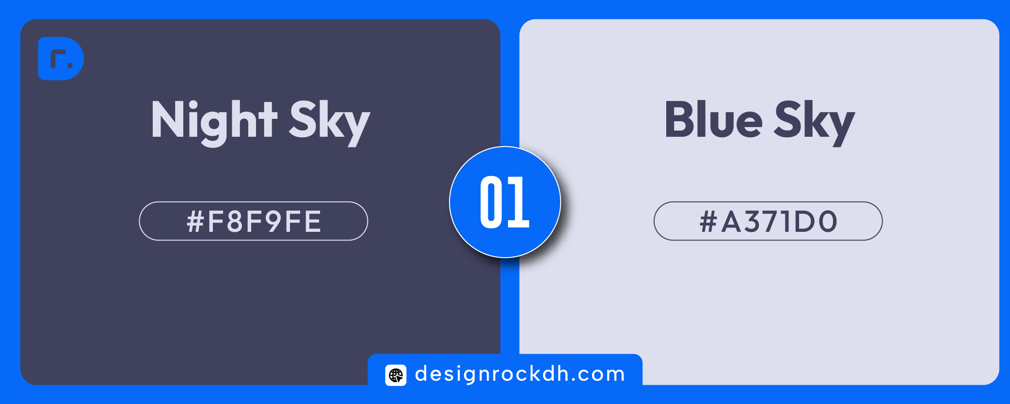
This palette creates a modern, professional, and slightly futuristic feeling. Night Sky brings depth and confidence, while Blue Sky softens the design with a cool, calm tone.
Best for:
Technology brands, dashboards, business presentations, SaaS products, corporate websites.
Design tip:
Use Night Sky for hero sections or navigation areas, and Blue Sky for cards, backgrounds, or secondary content blocks.
2. Ghost White + Amethyst
Ghost White: #F8F9FE
Amethyst: #A371D0
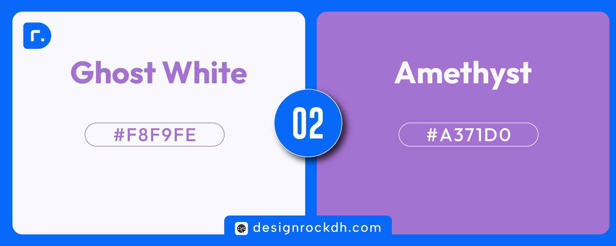
This combination feels soft, clean, and creative. Ghost White gives the layout a light and airy background, while Amethyst adds a calm purple accent. It is a great choice for beauty brands, creative portfolios, SaaS websites, wellness visuals, and feminine branding.
Best for:
Branding, landing pages, portfolio websites, Instagram posts, beauty products.
Design tip:
Use Ghost White as the main background and Amethyst for buttons, headings, icons, or highlight sections.
3. Lavender Blush + Claret
Lavender Blush: #FFF0F5
Claret: #7F1635
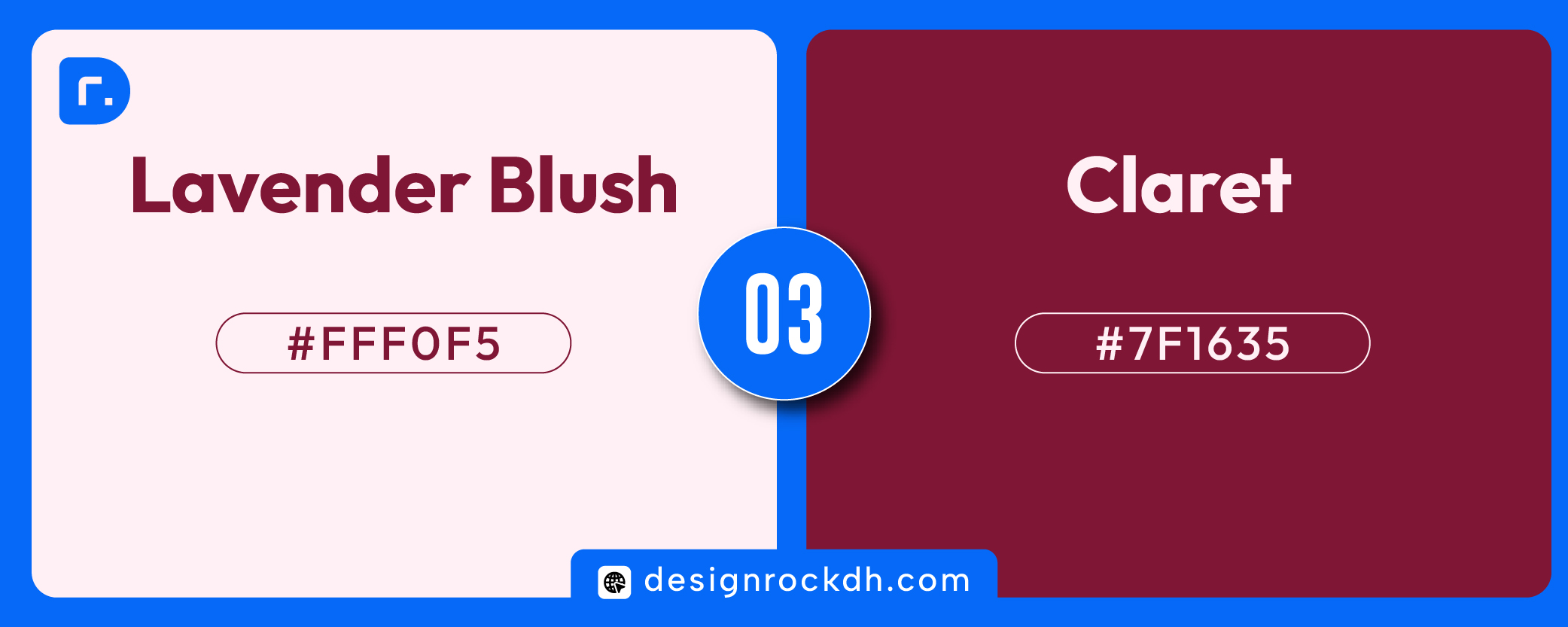
This is a romantic and premium color combination. Lavender Blush creates a gentle, elegant base, while Claret adds richness and visual strength. It works especially well when you want a design to feel luxurious but not too dark.
Best for:
Fashion branding, beauty packaging, wedding graphics, editorial layouts, luxury social media posts.
Design tip:
Use Claret for typography, borders, and call-to-action elements. Lavender Blush works beautifully as a soft background.
4. Midnight Green + Tea Green
Midnight Green: #194342
Tea Green: #DAE8B3
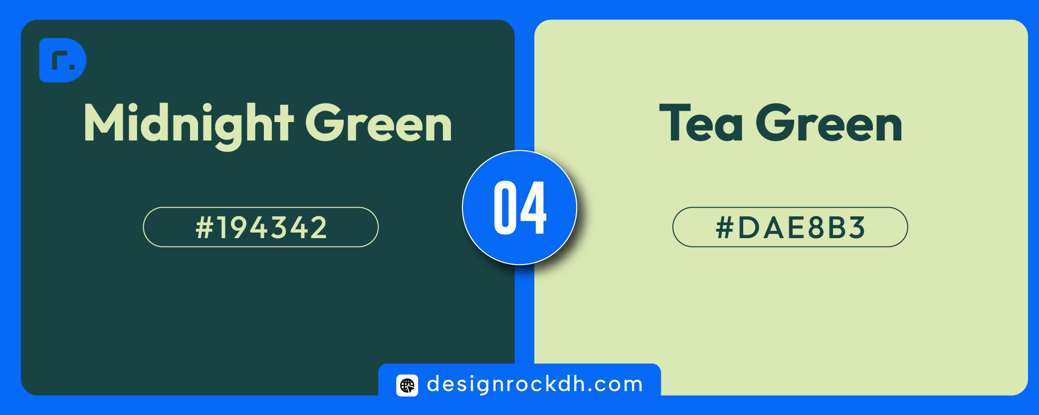
This palette feels natural, premium, and trustworthy. Midnight Green adds depth and sophistication, while Tea Green creates a fresh organic contrast. It is a strong choice for eco-friendly brands and wellness-related designs.
Best for:
Sustainable branding, organic products, skincare, wellness websites, nature-inspired packaging.
Design tip:
Use Midnight Green as the main brand color and Tea Green as the supporting background or accent shade.
5. Cornsilk + Rose Ebony
Cornsilk: #FFF8DC
Rose Ebony: #674846
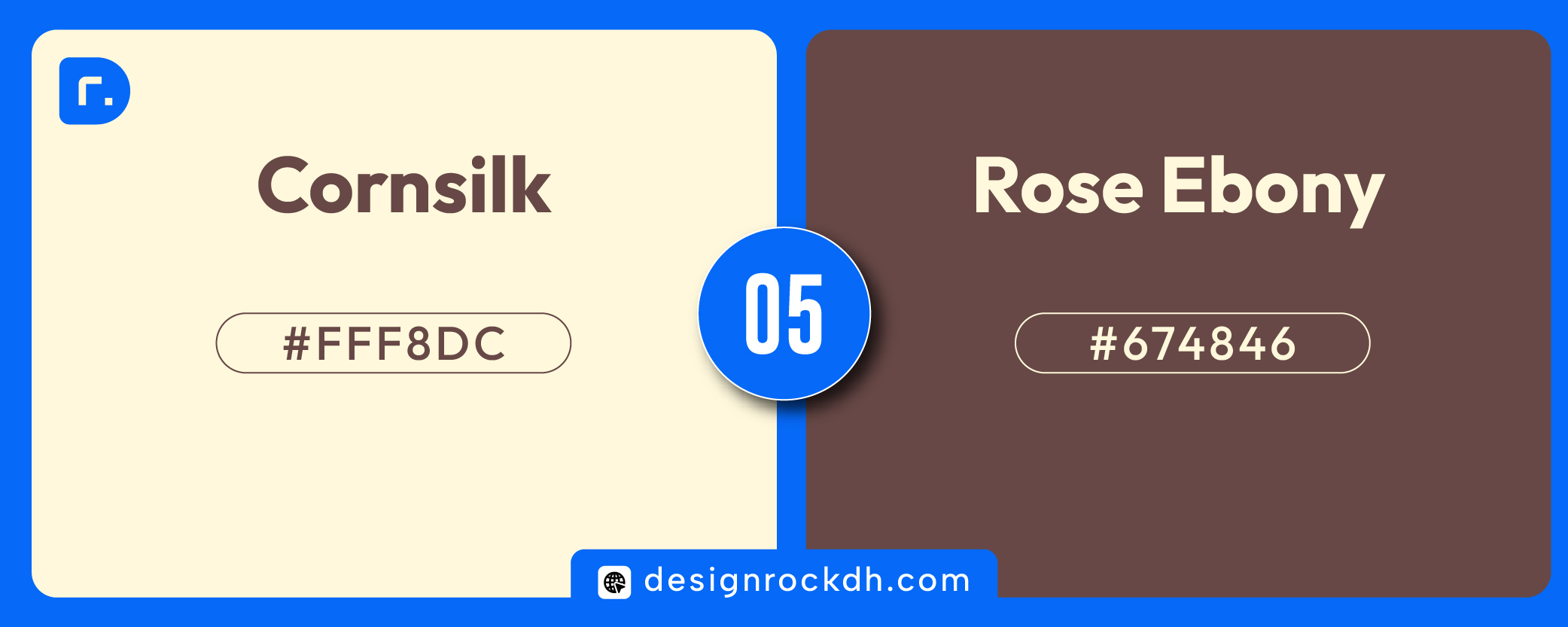
This color combination has a warm, vintage, and handcrafted feeling. Cornsilk gives a soft creamy base, while Rose Ebony adds a grounded, earthy tone. It is ideal for designs that need to feel elegant, natural, and personal.
Best for:
Coffee brands, handmade products, interior design, lifestyle branding, boutique packaging.
Design tip:
Use Cornsilk for backgrounds and Rose Ebony for headings, logo marks, packaging labels, and CTA buttons.
6. Ochre + Floral White
Ochre: #D08327
Floral White: #FEFBF2
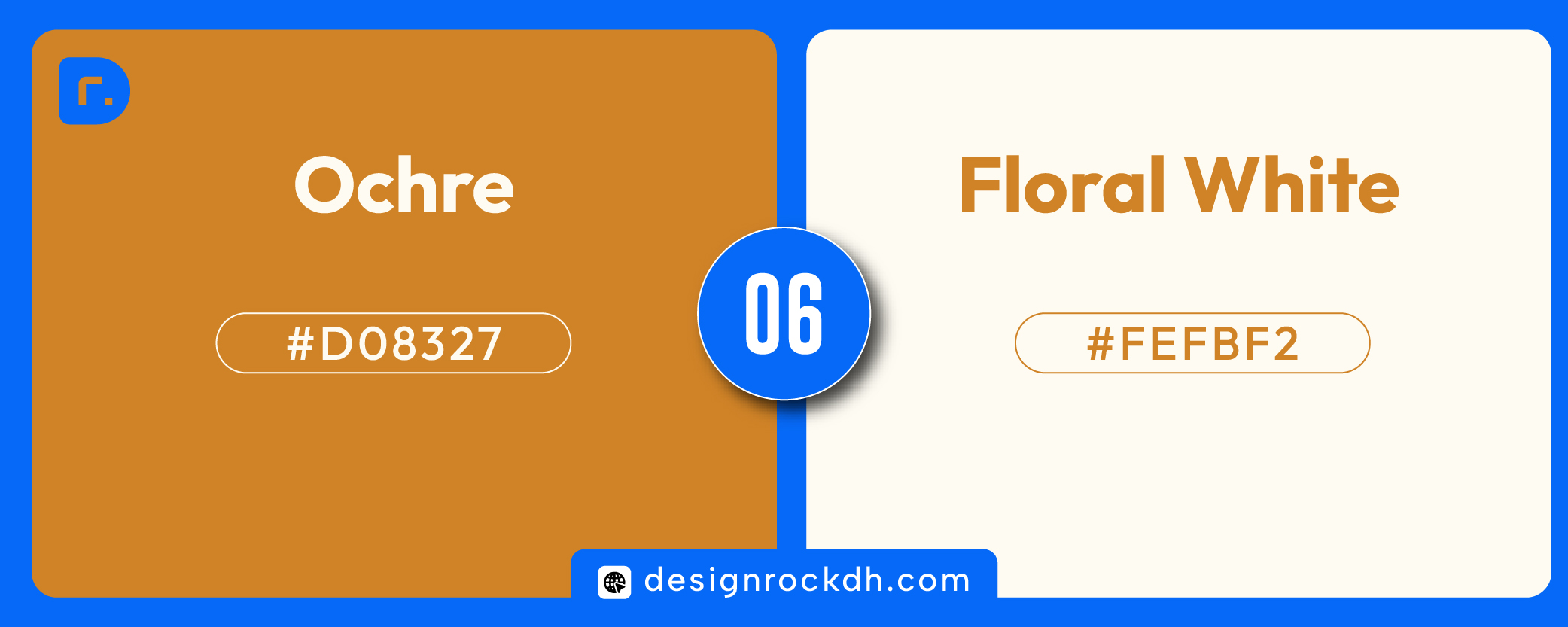
Ochre and Floral White create a warm, artistic, and editorial-style palette. Ochre feels bold and energetic, while Floral White keeps the overall design clean and balanced. This combination works well for creative brands that want a confident but refined visual style.
Best for:
Creative agencies, art posters, editorial graphics, food branding, portfolio websites.
Design tip:
Use Ochre as a strong accent color and Floral White as the main background. For better readability, use dark text instead of white text on Ochre.
Quick Color Palette Summary
| Palette | HEX Codes | Mood | Best Use |
|---|---|---|---|
| Ghost White + Amethyst | #F8F9FE + #A371D0 | Soft, creative, calm | Beauty, portfolio, social media |
| Night Sky + Blue Sky | #40415D + #DDDFEE | Modern, professional | Tech, SaaS, business design |
| Lavender Blush + Claret | #FFF0F5 + #7F1635 | Elegant, romantic | Fashion, beauty, luxury |
| Midnight Green + Tea Green | #194342 + #DAE8B3 | Natural, premium | Eco, wellness, organic brands |
| Cornsilk + Rose Ebony | #FFF8DC + #674846 | Warm, vintage | Coffee, lifestyle, handmade brands |
| Ochre + Floral White | #D08327 + #FEFBF2 | Artistic, warm | Editorial, creative, food branding |
How to Use These Color Combinations in Design
A good color palette is not only about choosing beautiful colors. It is also about using them in the right proportion. A simple rule is to use one color as the main background, one as the primary accent, and another neutral color for text or spacing.
For example, if you are using Midnight Green and Tea Green, Midnight Green can be the main brand color, Tea Green can be used for background sections, and white or off-white can be used for clean spacing. This creates balance and keeps the design readable.
For UI and website design, always check color contrast before using text over a background. Some colors look beautiful together but may not be readable for small text. For example, Ochre and Floral White are visually attractive, but Ochre needs dark text for better readability.
Color is one of the fastest ways to make a design feel more polished. The right color combination can create emotion, improve brand recognition, and make your design look more professional.
These six palettes are simple, elegant, and practical for real design projects. Try them in your next website, brand identity, poster, social media carousel, or packaging design.