Modern color palettes are no longer just about aesthetics — they influence branding, user experience, emotion, and conversion. In 2026, bold contrast combinations are dominating UI design, branding, posters, social media creatives, and web interfaces.
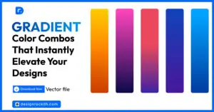
In this article, we’ll explore 5 modern color combinations with HEX codes that designers can use for branding, websites, social media, packaging, and digital products.
Whether you’re a UI/UX designer, graphic designer, or content creator, these palettes will help you create visuals that feel modern, premium, and memorable.
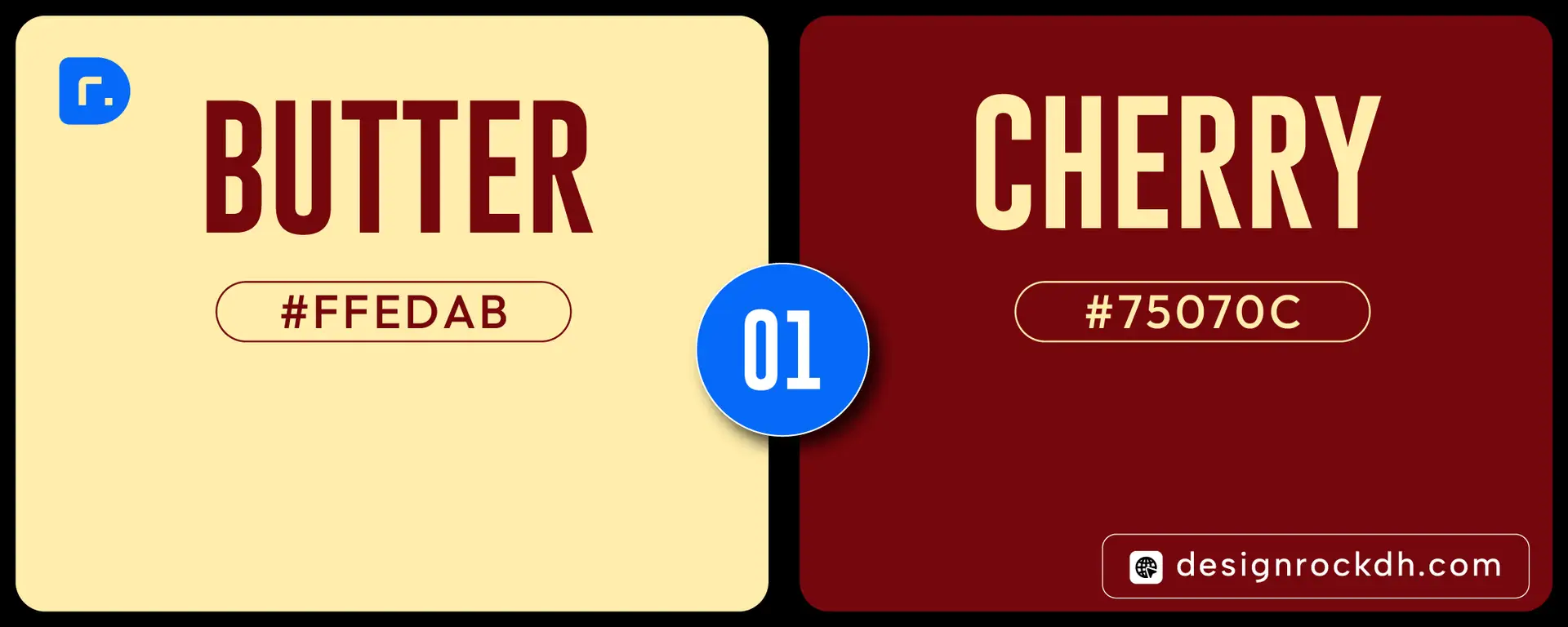
1. Butter & Cherry
HEX Codes
- Butter Cream —
#FFEDAB - Cherry Red —
#75070C
Why This Palette Works
The warm cream softens the intensity of deep cherry red, creating a luxurious and retro-modern aesthetic.
Best Uses
- Restaurant branding
- Vintage-inspired designs
- Luxury packaging
- Café menus
- Editorial layouts
Design Tip
Use Cherry Red for headlines and buttons while keeping backgrounds light and spacious.
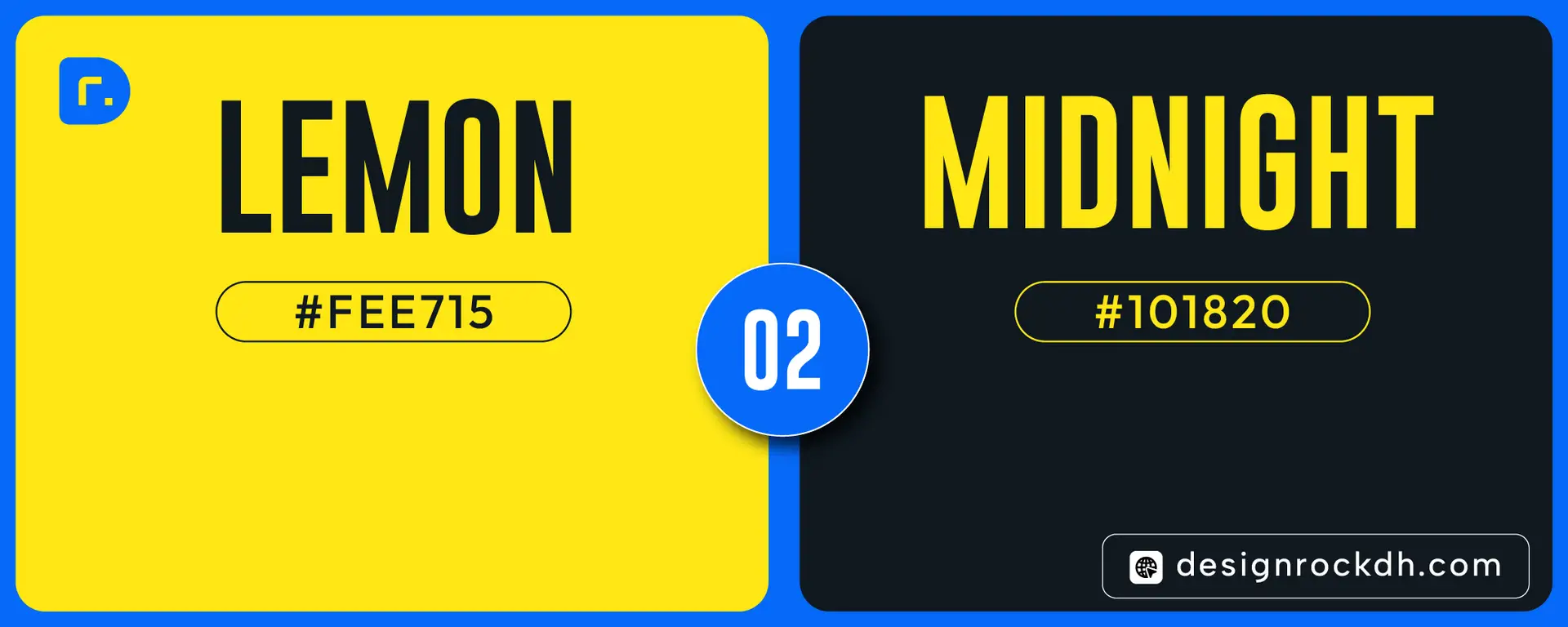
2. Lemon & Midnight
HEX Codes
- Lemon Yellow —
#FEE715 - Midnight Navy —
#101820
Why This Palette Works
This combination creates strong visual contrast while remaining elegant and modern. The bright yellow instantly grabs attention, while the deep navy adds sophistication and balance.
Best Uses
- SaaS websites
- Sports branding
- Fashion campaigns
- Modern UI design
- Social media graphics
Design Tip
Use Midnight as the primary background and Lemon as the accent CTA color for maximum readability and conversion.
3. Amber & Cobalt
- Amber —
#FFC300 - Cobalt Blue —
#003566
Why This Palette Works
This energetic combination feels youthful, vibrant, and highly engaging. It creates strong visual hierarchy and excellent accessibility.
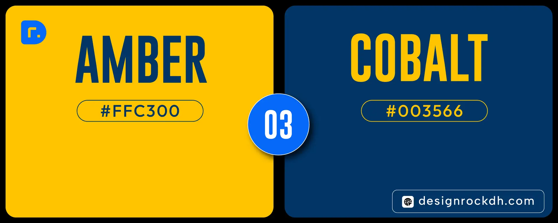
Best Uses
- Creative agencies
- Technology brands
- Mobile app UI
- Advertising creatives
- Digital campaigns
Design Tip
This palette performs especially well in dark-mode interfaces and animated social content.
4. Oat & Olive
HEX Codes
- Oat Beige —
#F0E6DA - Olive Green —
#415B06
Why This Palette Works
Minimal, organic, and calming — this palette is perfect for brands focusing on sustainability, wellness, or natural products.
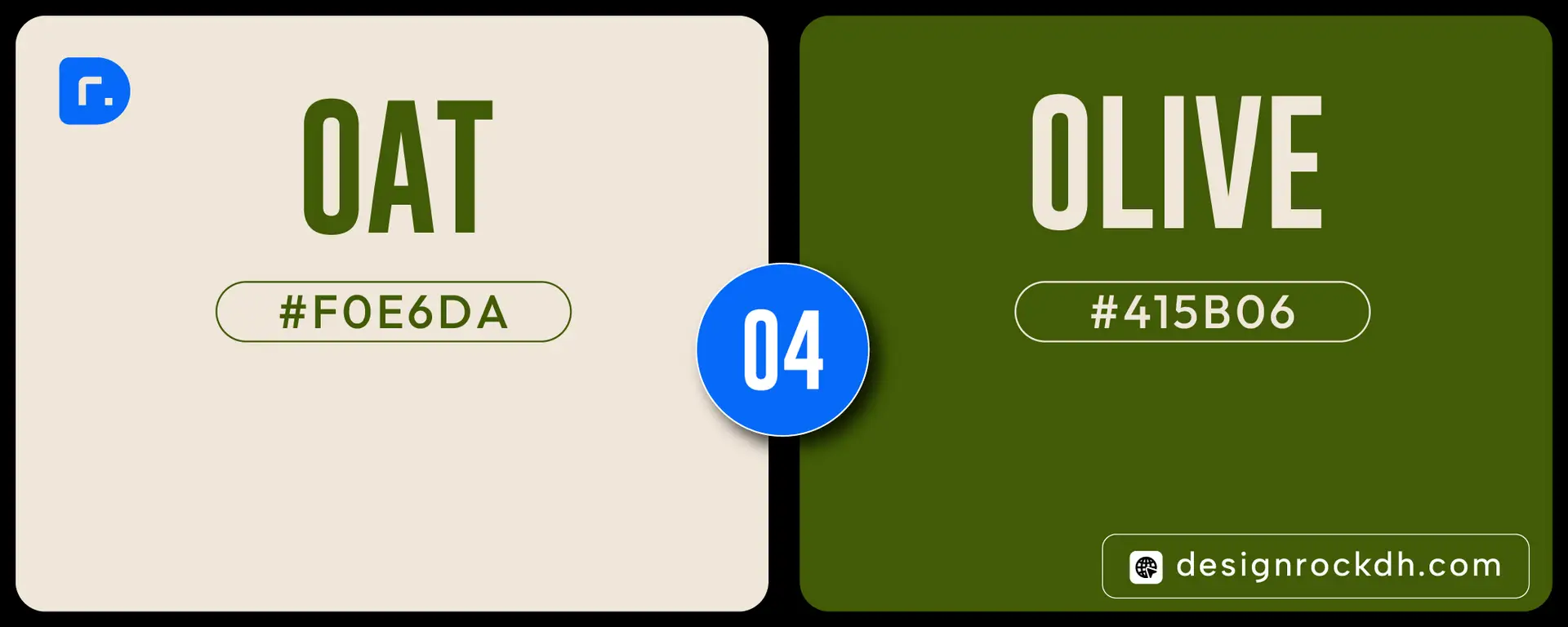
Best Uses
- Eco brands
- Organic packaging
- Interior design
- Wellness apps
- Lifestyle branding
Design Tip
Pair this palette with serif typography and soft shadows for a premium editorial look.
5. Tangerine & Charcoal
HEX Codes
- Tangerine —
#FF6C2F - Charcoal —
#252422
Why This Palette Works
Bold orange paired with deep charcoal creates a powerful modern identity that feels both energetic and professional.
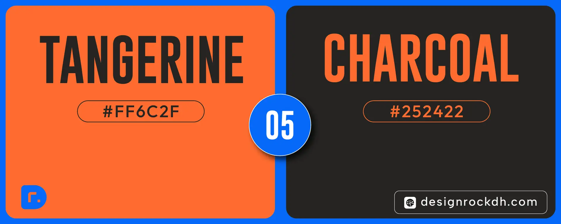
Best Uses
- Startup branding
- Portfolio websites
- Creative studios
- Poster design
- Tech product marketing
Design Tip
Use Charcoal backgrounds with Tangerine highlights for strong visual depth and modern contrast.
How to Choose the Right Color Palette
Choosing the right palette depends on:
| Goal | Recommended Style |
|---|---|
| Premium Brand | Dark + Neutral |
| High Engagement | Bright Contrast |
| Eco / Natural Feel | Earth Tones |
| Luxury Feel | Deep Reds + Cream |
| Modern Tech | Bold Blue + Yellow |
Why Color Psychology Matters in Design
Colors directly affect:
- Brand perception
- User trust
- Conversion rates
- Emotional response
- Content readability
A strong palette can improve:
- Website engagement
- Social media performance
- Brand recognition
- UI usability
That’s why successful brands spend significant time selecting their core visual identity.
Modern design trends in 2026 are moving toward:
- Bold contrast
- Minimal layouts
- Strong typography
- High-accessibility colors
- Emotion-driven branding
These 5 color combinations are practical, modern, and versatile across digital and print design.
If you’re building a new brand, redesigning a website, or creating social content, these palettes provide a strong creative foundation.