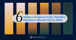
Gradient colors are one of the easiest ways to make a design look modern, smooth, and visually premium. A simple two-color gradient can add depth, emotion, softness, and a professional feel to websites, social media posts, branding, app interfaces, posters, and digital products.
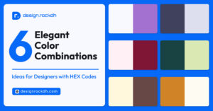
In this article, we are sharing 6 beautiful gradient color combinations that designers can use for clean, elegant, and modern creative projects. Each gradient includes HEX codes, design mood, and practical use cases.
1. Pearl Mauve
Gradient: #D8BFD8 → #FDFCFB
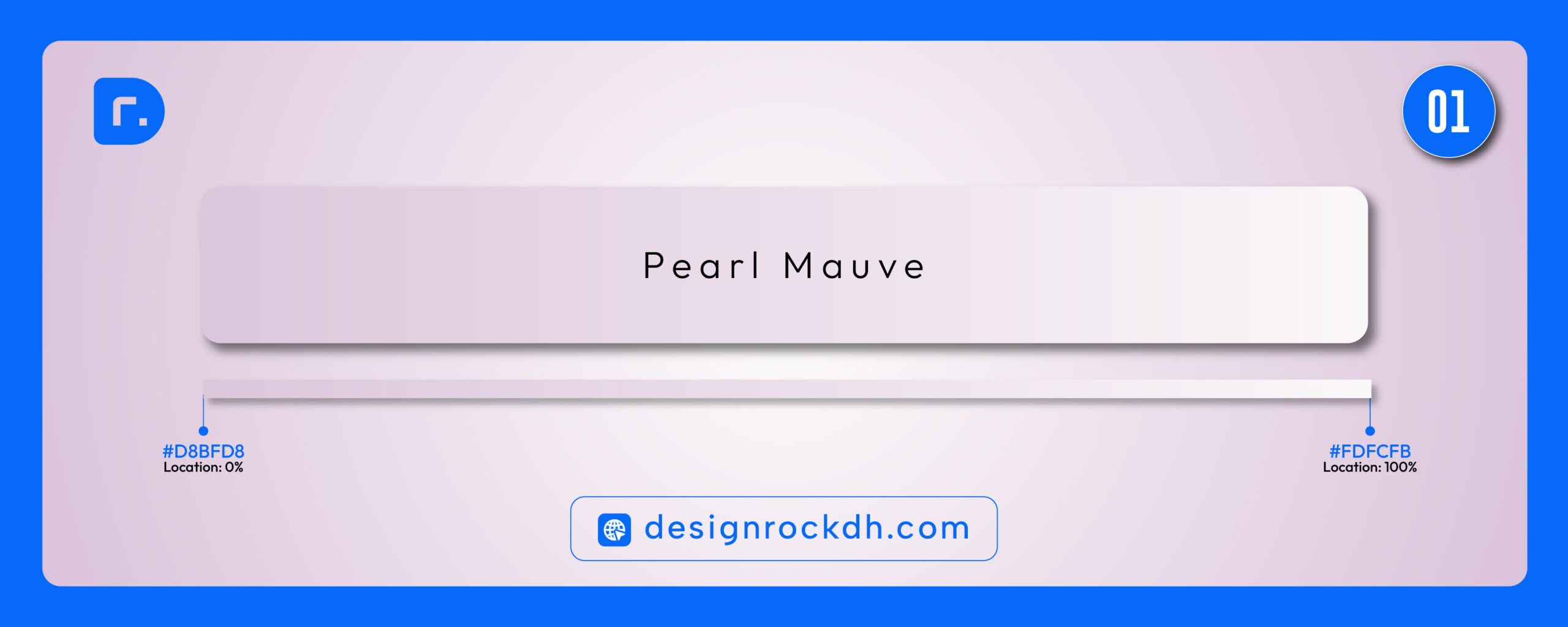
Pearl Mauve is a soft, elegant gradient with a calm and luxurious feel. The mauve tone gives a gentle feminine touch, while the near-white shade keeps the design clean and minimal.
Best for:
Beauty branding, skincare websites, wedding designs, portfolio sections, luxury social media posts, soft product packaging.
Design mood:
Elegant, soft, premium, minimal, calm.
2. Ocean Breeze
Gradient: #7FCDFF → #DFF7FF
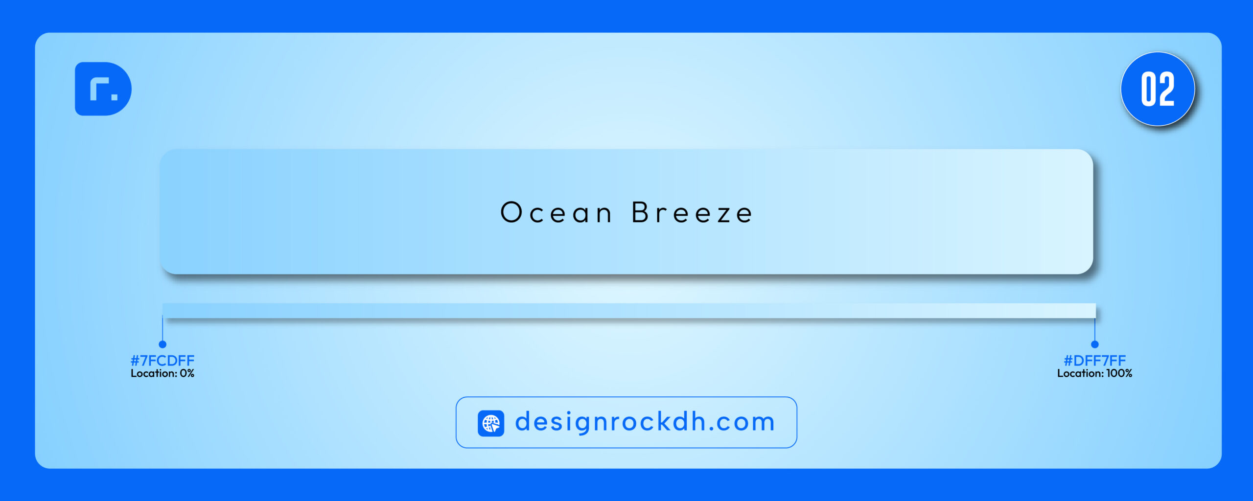
Ocean Breeze is fresh, clean, and energetic. The blue tones create a feeling of trust and clarity, making this gradient suitable for digital products, technology brands, SaaS websites, and clean UI designs.
Best for:
Tech websites, SaaS landing pages, mobile app UI, healthcare visuals, travel content, summer campaigns.
Design mood:
Fresh, clean, modern, trustworthy, airy.Suggested image alt text:
Ocean Breeze blue gradient color palette for UI and website design.
3. Eucalyptus Glow
Gradient: #A7C4A0 → #F4EFE6
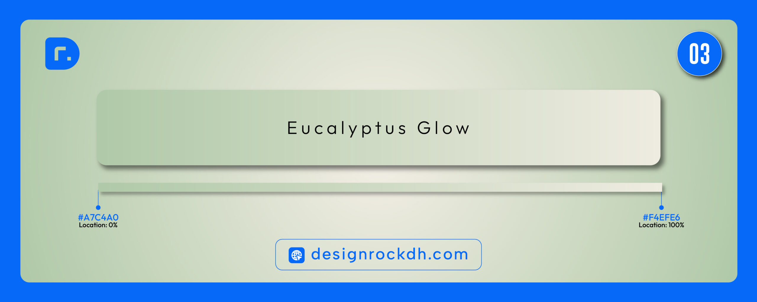
Eucalyptus Glow brings a natural and organic feeling to design. The soft green creates a peaceful visual tone, while the warm neutral shade keeps everything balanced and refined.
Best for:
Wellness brands, eco-friendly packaging, organic product websites, lifestyle blogs, spa branding, nature-inspired visuals.
Design mood:
Natural, organic, peaceful, warm, balanced.
4. Dreamy Periwinkle
Gradient: #B8C0FF → #E7D8FF
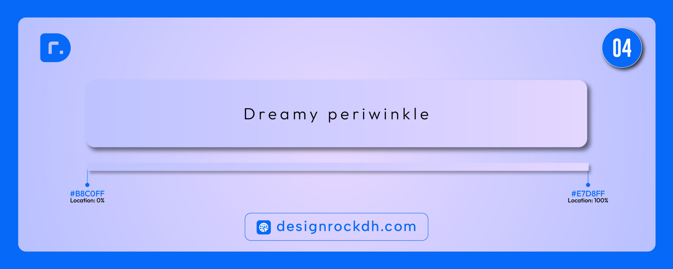
Dreamy Periwinkle is a soft purple-blue gradient that feels creative, dreamy, and futuristic. It is perfect for designs that need a gentle but modern visual style.
Best for:
Creative portfolios, AI tools, design agencies, app screens, presentation covers, social media graphics.
Design mood:
Creative, dreamy, futuristic, soft, stylish.
5. Peach Champagne
Gradient: #FFD3B6 → #FFF2E2
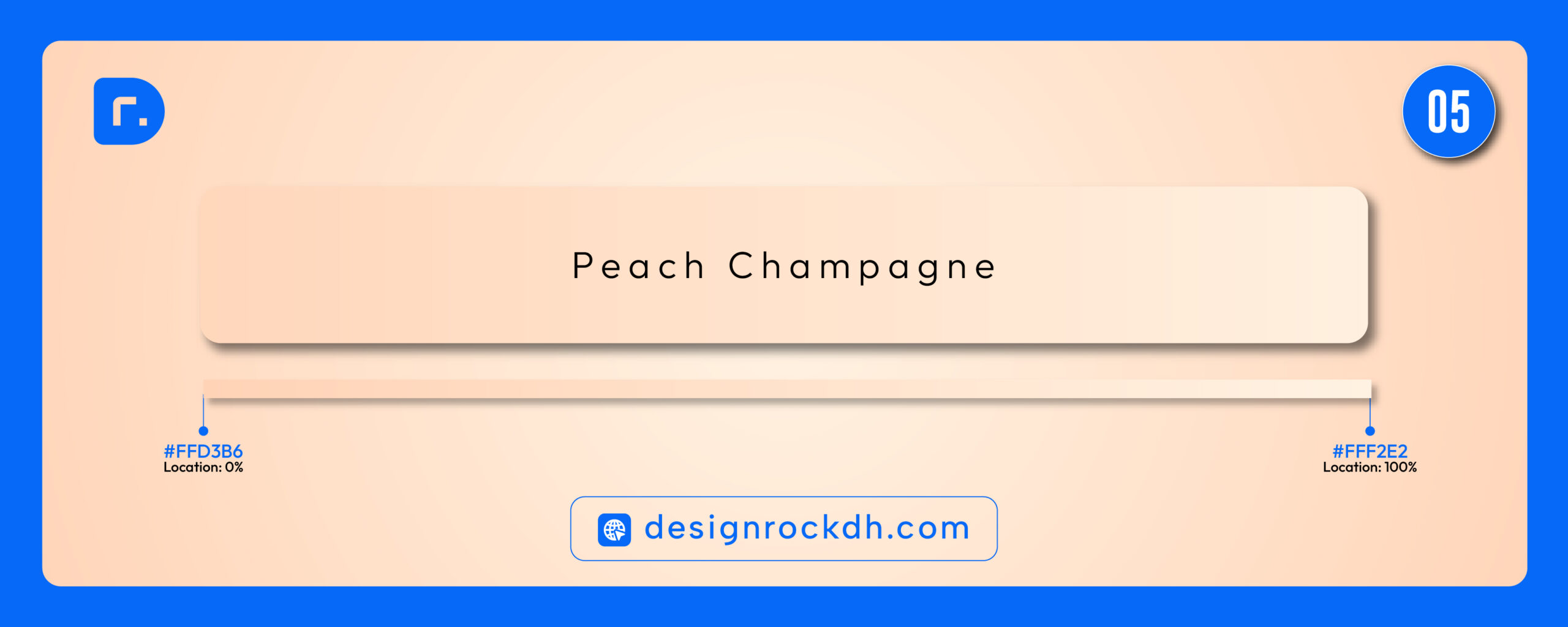
Peach Champagne is warm, soft, and welcoming. It gives a friendly and elegant feeling without being too bright. This gradient works beautifully for lifestyle, food, fashion, and personal branding designs.
Best for:
Lifestyle brands, food blogs, fashion visuals, personal websites, product cards, Instagram posts.
Design mood:
Warm, friendly, elegant, soft, fresh.
6. Mint Lagoon
Gradient: #6DD5C4 → #DFF6F0
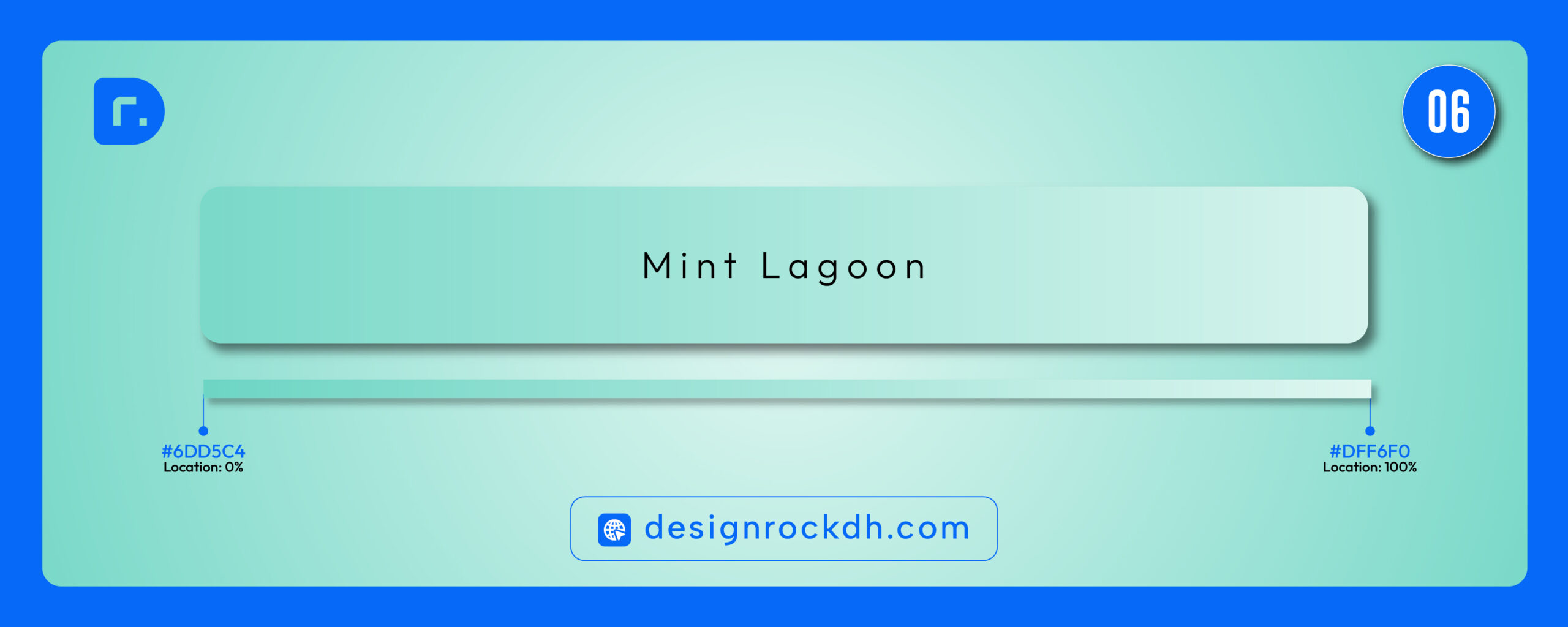
Mint Lagoon is clean, refreshing, and modern. The mint tone gives the design a bright and fresh look, while the pale aqua finish makes it softer and more usable.
Best for:
Health apps, wellness websites, clean product branding, UI cards, banners, digital downloads, summer designs.
Design mood:
Fresh, modern, clean, calm, energetic.

Download “Soft-Gradient-Color.zip” Soft-Gradient-Color.zip – Downloaded 0 times – 810.12 KB
How to Use Gradient Colors Effectively
Gradient colors look best when they are used with purpose. Avoid using too many gradients in one design because it can make the layout feel busy. Instead, use gradients as background sections, hero banners, cards, buttons, overlays, or decorative elements.
For better readability, always check text contrast. If the gradient is light, use dark text. If the gradient is dark or colorful, use white text or add a subtle overlay behind the text.
A good gradient should support the message of the design, not overpower it.
Best Design Uses for These Gradient Palettes
These soft gradient combinations are ideal for:
- Website hero sections
- Social media post backgrounds
- Branding mood boards
- App UI cards
- Blog cover images
- Poster and flyer design
- Product presentation slides
- Digital download previews
- Portfolio thumbnails
Gradient colors can instantly improve the visual quality of a design when used carefully. The six gradient combinations above are soft, modern, and flexible enough for many creative projects. Whether you are designing a website, brand identity, app interface, or social media post, these gradients can help your work feel more polished and professional.
Start with one palette, test it in your layout, and adjust the direction, opacity, and contrast based on your design goal.