Modern gradients are no longer just visual decoration — they are now a core part of branding, UI systems, hero sections, app interfaces, and digital product design.
A well-crafted gradient can instantly make a design feel:
- modern
- premium
- immersive
- visually dynamic
Here are six professionally balanced gradient combinations using updated color codes.
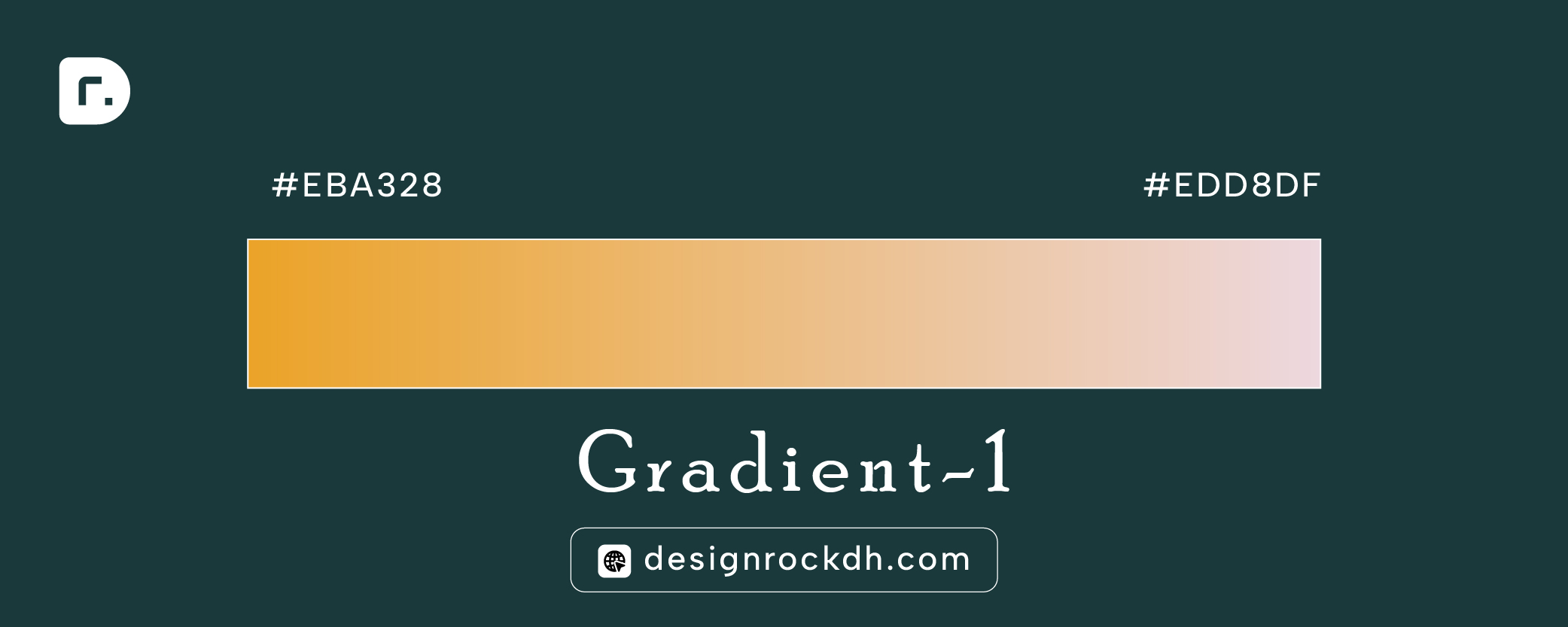
Gradient 1 — Gold to Soft Rose
Hex Codes:#EBA328 → #EDD8DF
This gradient creates a warm luxury feel by blending rich gold into soft pastel pink.
Best For
- luxury branding
- portfolio websites
- beauty brands
- premium packaging
- elegant landing pages
Design Insight
The high brightness contrast keeps the design clean while still feeling premium.
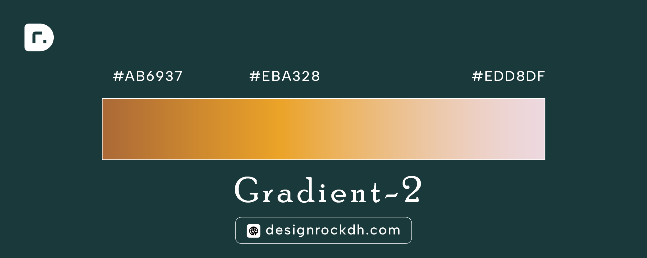
Gradient 2 — Bronze Gold Blend
Hex Codes:#AB6937 → #EBA328 → #EDD8DF
This three-tone gradient creates a smooth transition from earthy bronze to warm gold and soft blush.
Best For
- fashion brands
- editorial websites
- lifestyle UI
- social media graphics
Why It Works
The middle gold tone acts as a visual bridge, preventing harsh transitions.
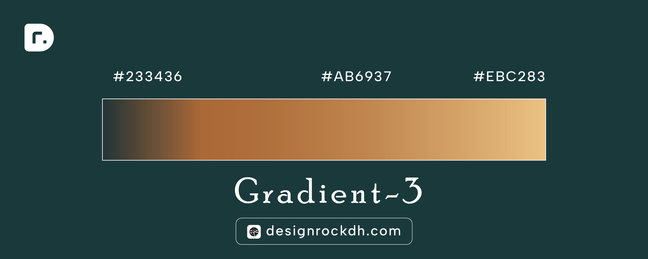
Gradient 3 — Deep Slate to Warm Beige
Hex Codes:#233436 → #AB6937 → #EBC2B3
This is a strong modern contrast palette combining deep slate with warm neutral tones.
Best For
- SaaS websites
- dashboards
- fintech interfaces
- dark UI systems
Design Tip
Pair with off-white typography for a clean premium interface.
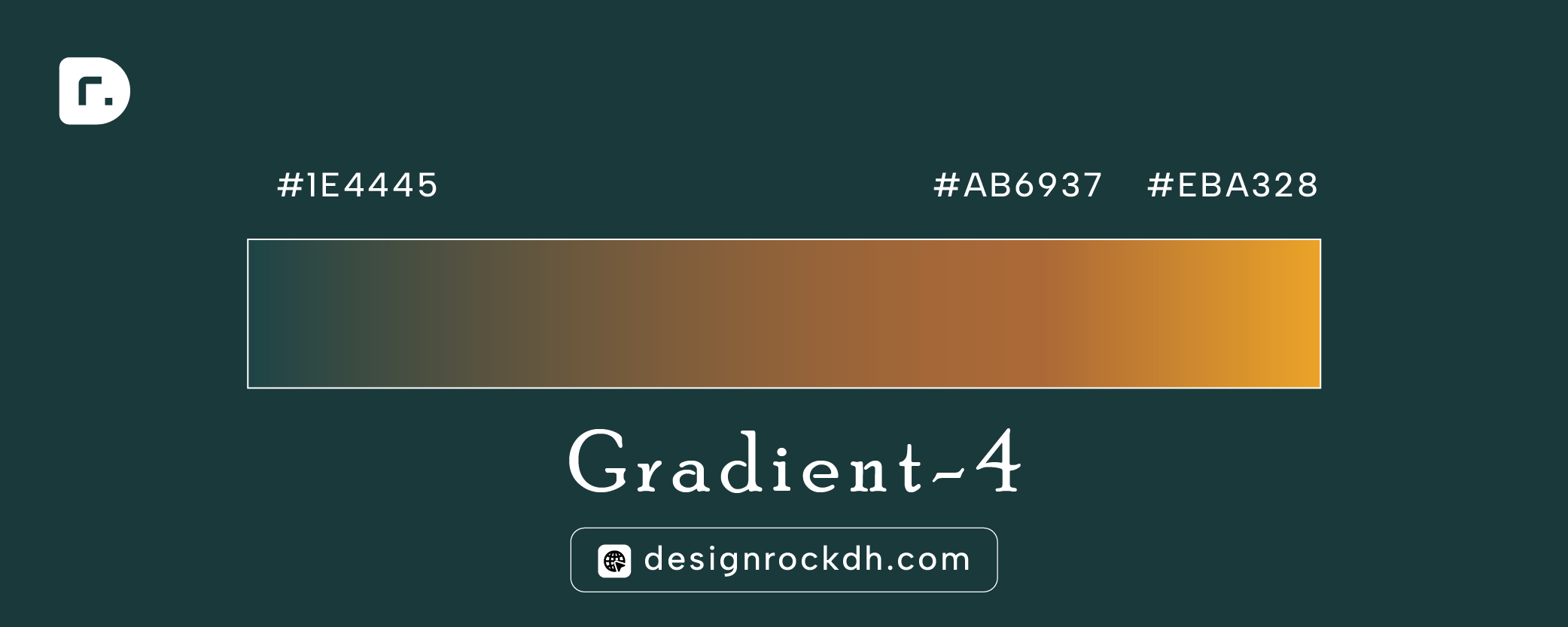
Gradient 4 — Deep Green to Rich Gold
Hex Codes:#1E4445 → #AB6937 → #EBA328
A cinematic gradient that moves from dark teal into warm metallic gold.
Best For
- hero sections
- digital branding
- startup websites
- modern product pages
Visual Effect
Creates depth and sophistication without overusing bright colors.
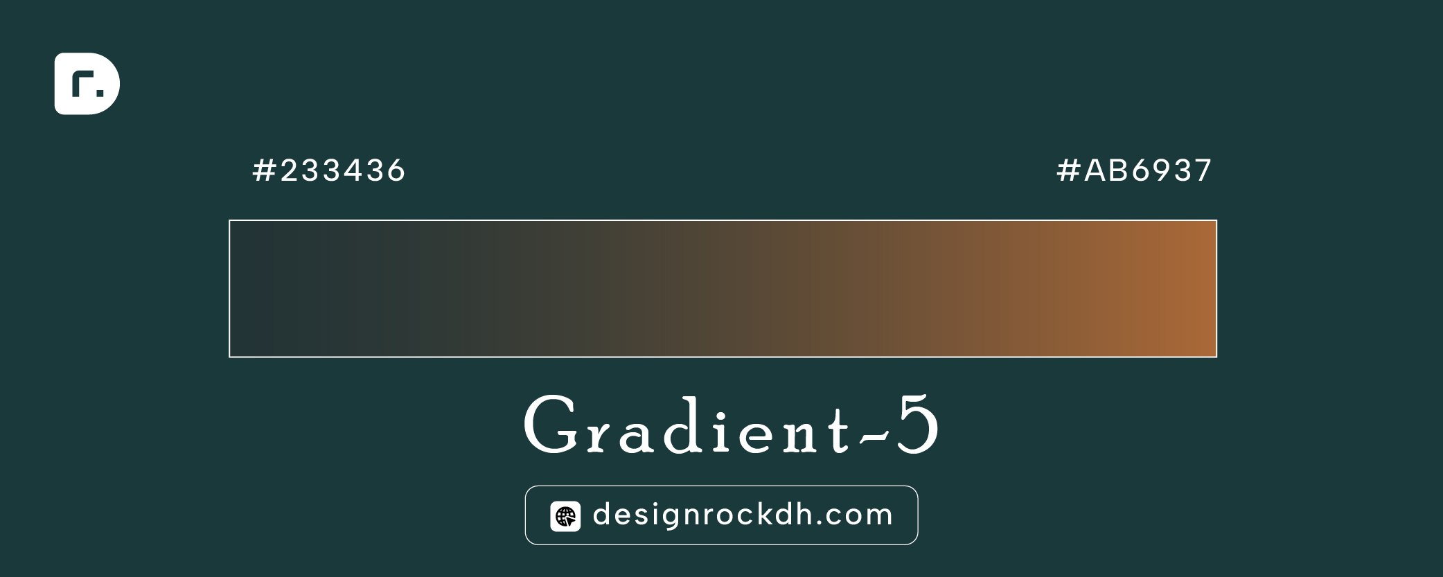
Gradient 5 — Slate Green to Earth Brown
Hex Codes:#233436 → #AB6937
This gradient feels grounded, natural, and minimal.
Best For
- architecture portfolios
- interior design
- eco brands
- premium packaging
Why Designers Like It
The muted contrast feels modern without becoming visually aggressive.
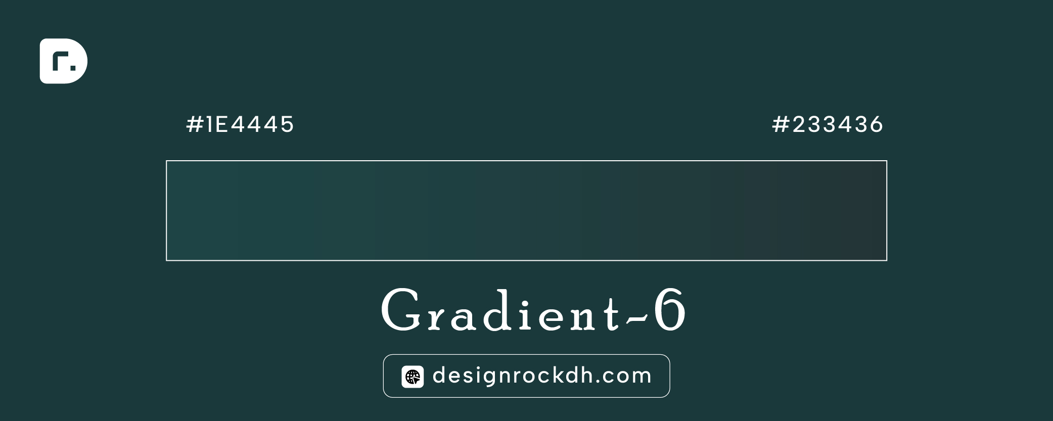
Gradient 6 — Dark Teal Blend
Hex Codes:#1E4445 → #233436
A subtle dark-mode gradient designed for modern UI systems.
Best For
- app backgrounds
- dark mode UI
- gaming interfaces
- futuristic websites
Design Insight
Low-contrast gradients create smoother visual experiences in dark interfaces.
Why These Gradient Palettes Work
1. Balanced Contrast: Each palette combines warm and cool tones for better visual harmony.
2. Modern Color Psychology: The gradients avoid oversaturated colors, which helps maintain a professional aesthetic.
3. UI Friendly: All six palettes work well with:
- glassmorphism
- minimal layouts
- dark interfaces
- modern typography
4. Branding Ready: These gradients can easily be adapted into:
- logos
- website backgrounds
- app onboarding screens
- social banners
Best Practices for Using Gradients
Use Large Spacing
Gradients perform best in layouts with strong whitespace.
Avoid Too Many Colors
2–3 color stops are ideal for professional interfaces.
Pair with Minimal Typography
Simple fonts enhance gradient clarity and modern aesthetics.
Test Accessibility
Always verify text readability over gradient backgrounds.
Modern gradient palettes continue to dominate:
- UI design
- branding
- landing pages
- social media visuals
- digital product design
The updated palettes above provide a strong balance between:
- elegance
- depth
- contrast
- usability
If you’re building modern digital experiences in 2026, these gradients offer a versatile foundation for both light and dark interfaces.