Color is often the first thing people notice about a luxury brand.
Whether you are designing for high-end fashion, luxury real estate, premium cosmetics, or an exclusive digital platform, the right colors can instantly create a sense of prestige, sophistication, and quality. Before someone reads a tagline or explores a product, the color palette has already started shaping their perception of the brand.
But creating a luxury color palette is not simply about choosing expensive-looking colors. The real secret is restraint.
Mass-market brands often use bright, highly saturated colors to grab attention quickly. Luxury brands usually take a different approach. They tend to rely on deep tones, muted neutrals, subtle contrast, generous whitespace, and carefully placed metallic accents.
The result is a visual identity that feels confident rather than loud.
In this guide, we will explore the psychology behind luxury branding colors, look at five ready-to-use luxury color palettes with their exact hex codes, and discuss how to apply these colors effectively across websites and mobile interfaces. We will also cover typography, WCAG accessibility, useful design tools, and common mistakes to avoid.
The Color Psychology of Luxury & Exclusivity
Luxury design is largely built around the idea of visual restraint.
Premium brands do not necessarily need to fight for attention. Instead, they create a visual environment where every element feels intentional. Balanced colors, generous whitespace, and carefully selected accents work together to create a sense of refinement.
Different luxury color families can communicate very different emotions:
| Luxury Color Hue | Psychological Impression | Typical Industry Application |
|---|---|---|
| Onyx / Pure Black | Authority, mystery, timelessness | Haute couture fashion, luxury automotive |
| Champagne & Gold | Wealth, prestige, heritage, warmth | Premium jewelry, boutique hotels, high-end spirits |
| Midnight Navy | Trust, intellectual depth, elegance | Executive wealth management, luxury timepieces |
| Deep Emerald | Opulence, nature, rare refinement | Luxury real estate, high-end skincare, heritage brands |
| Warm Taupe & Cream | Soft minimalism, organic comfort | Modern architecture, minimalist fashion |
Key Principles of Luxury Color Systems
1. Choose Low Saturation with Plenty of Depth
Bright neon shades and highly saturated colors are commonly associated with discounts, fast-moving products, and attention-driven advertising.
Luxury palettes usually take a quieter route. Muted colors, desaturated tones, and deep shades create a more sophisticated visual atmosphere.
The goal is not to make the design invisible. It is to make it feel deliberate.
2. Let Premium Neutrals Do Most of the Work
In many luxury interfaces, a large portion of the canvas can be dedicated to rich neutrals such as deep charcoal, alabaster, warm cream, or slate.
The source guide suggests that neutrals can occupy up to around 80% of the design canvas, leaving plenty of visual breathing room for the important elements.
This approach also makes accents more effective because they are not competing with too many other colors.
3. Keep Metallic Accents Under Control
Gold, copper, and platinum-inspired colors can immediately suggest luxury, but using them everywhere has the opposite effect.
Treat metallic shades as secondary or tertiary accents. A good rule is to keep them at 10% or less of the overall layout.
A small amount of gold used strategically can feel much more premium than an interface covered in gold.
Top 5 Classic Luxury Color Palettes With Hex Codes
The following five palettes are designed for practical use in tools such as Figma and Canva. Each combination can be adapted for websites, branding systems, social graphics, and digital products.
Palette 1: Royal Onyx & Muted Gold
Classic Opulence
This combination is a strong choice when you want a timeless, dramatic luxury aesthetic. It works particularly well for jewelry brands, watchmakers, premium agencies, and other high-end businesses.
Onyx Black:
#0B0C10— Dominant canvas / backgroundDeep Graphite:
#1F2833— Card containers and secondary surfacesBrushed Gold:
#C5A059— Primary accent and CTA buttonsSoft Champagne:
#E5C583— Hover states and highlightsIvory White:
#F4F4F6— Primary typography
The deep black creates the foundation, while muted gold adds just enough warmth and visual emphasis without overwhelming the interface.
Palette 2: Midnight Navy & Platinum Silver
Corporate Prestige
For brands that want luxury without appearing overly traditional, midnight navy can be an excellent alternative to black.
This palette is particularly suited to wealth management firms, private aviation companies, premium SaaS products, and executive-focused services.
Midnight Navy:
#0A192F— Dominant backgroundSlate Navy:
#112240— Elevated surfaces and cardsPlatinum Silver:
#E6F1FF— Headline typographyMuted Steel:
#8892B0— Body copy and secondary detailsChampagne Accent:
#D4AF37— Interactive focal points
The combination feels professional and trustworthy while still maintaining a premium visual character.
Palette 3: Deep Emerald & Warm Alabaster
Botanical Luxury
Deep emerald introduces a more organic interpretation of luxury. It works especially well for premium skincare, high-end hospitality, sustainable luxury products, and heritage-inspired brands.
Imperial Emerald:
#062C22— Rich deep canvasForest Shadow:
#0D3B2E— Secondary card backgroundsWarm Alabaster:
#F2EFE9— Primary typography and light canvasSoft Gold:
#C9A86A— Accent borders and decorative linesMuted Sage:
#A3B18A— Secondary text details
The deep greens create a sense of rarity and natural richness, while alabaster and soft gold keep the overall palette refined.
Palette 4: Warm Taupe & French Cream
Soft Minimalist Luxury
Not every luxury design needs to be dark.
Warm neutrals can create an equally premium look, particularly for contemporary interior design studios, architectural firms, minimalist fashion labels, and lifestyle brands.
French Cream:
#F7F5F0— Light canvas backgroundWarm Taupe:
#B8A390— Card containers and bordersDeep Espresso:
#2B231D— Primary dark typographyMuted Sand:
#D0C5B6— Secondary background surfacesRich Mocha:
#5C4B3E— Interactive buttons and accents
This palette feels calm and sophisticated. It is especially useful when you want a luxury aesthetic without the dramatic appearance of black-and-gold branding.
Palette 5: Plum Rose & Brushed Copper
Boutique Elegance
For a more distinctive and artistic interpretation of luxury, plum and copper create a rich combination with plenty of personality.
This palette can work beautifully for artisanal perfume houses, boutique hotels, luxury lifestyle publications, and other creative premium brands.
Deep Plum:
#2A1B28— Primary dark surfaceBrushed Copper:
#B87333— Metallic focal accentRose Ash:
#D8B4A6— Secondary soft accentWarm Vanilla:
#FAF3E0— Primary light typographyCharcoal Slate:
#3D313C— Dividers and sub-elements
The warmer accents soften the deep plum base and give the design a boutique, editorial feel.
Applying Luxury Color Systems in Web & Mobile UI/UX
Choosing a sophisticated palette is only half the job. The way those colors are applied can determine whether a digital interface actually feels luxurious.
A premium website should feel spacious, controlled, and easy to navigate. A beautiful palette can quickly lose its impact if the layout is crowded or the interface relies too heavily on visual effects.
Here is how a conventional web design approach differs from a luxury UI approach:
| Design Element | Standard Web Design Approach | Luxury UI Design Approach |
|---|---|---|
| Layout Density & Spacing | Compact, grid-packed content | Generous whitespace, open grids |
| Typography Pairing | Standard sans-serif body copy | High-contrast serif headlines |
| Button Styling | Bright, high-saturation fills | Delicate borders, ghost buttons, gold fills |
| Image Frame Borders | Rounded corners and drop shadows | Crisp 1px gold or slate borders |
Essential Luxury UI/UX Rules
1. Make Plenty of Room for Whitespace
Luxury interfaces should never feel rushed.
Instead of trying to fill every available space, give sections more breathing room. The guide recommends increasing section padding by roughly 30%–50% compared with standard e-commerce layouts.
Whitespace gives important elements room to stand out and can make a relatively simple interface feel much more premium.
2. Use Fine Border Strokes
Heavy shadows can sometimes make a design feel overly decorative.
For a more refined look, consider replacing large drop shadows with subtle 1px borders. Brushed gold such as #C5A059 or deep slate such as #1F2833 can work particularly well for this purpose.
The effect should be subtle enough that users notice the structure without consciously noticing the border itself.
3. Give Typography an Elegant Contrast
Typography plays a major role in communicating luxury.
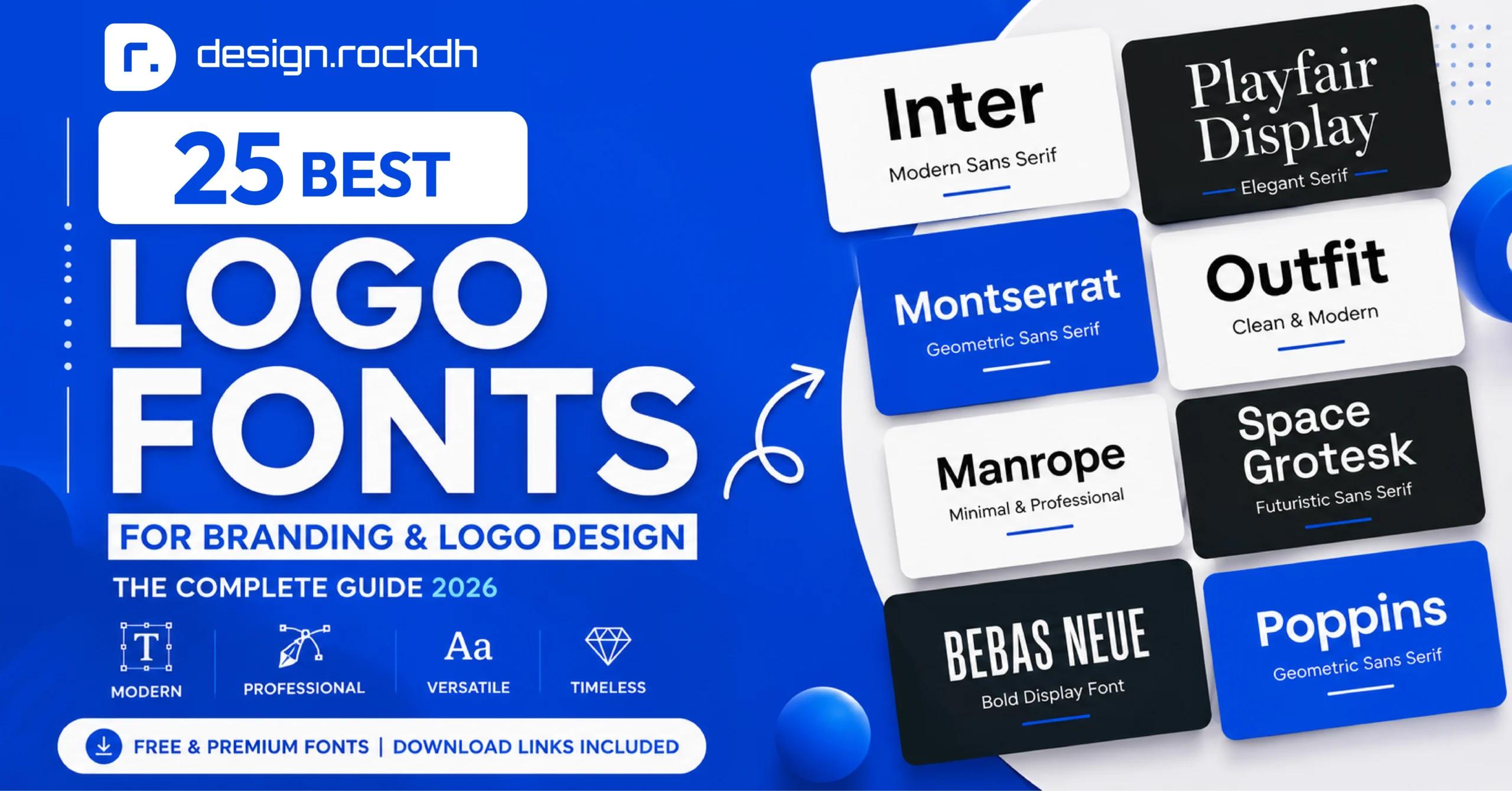
A classic approach is to combine a sophisticated serif display typeface with a clean sans-serif font for supporting content.
For example:
Display: Cormorant Garamond
Body: Inter or Montserrat
Another option mentioned in the guide is Playfair Display for high-contrast headlines.
This combination gives headings personality while keeping paragraphs easy to read.
Ensuring WCAG 2.1 Accessibility in Luxury Color Schemes
One of the easiest mistakes in luxury web design is prioritizing aesthetics at the expense of readability.
A color can look beautiful in a brand board but become difficult to read once it is placed on a real interface.
For example, using muted gold such as #C5A059 as text on a light cream background such as #F7F5F0 can create insufficient contrast.
The solution is not to abandon luxury colors. Instead, use them more strategically.
How to Balance Luxury Aesthetics with Contrast
Dark Backgrounds
Gold text such as #C5A059 can achieve strong contrast when used against very dark colors such as:
Onyx Black:
#0B0C10Midnight Navy:
#0A192F
The source guide notes that these combinations can reach a contrast ratio above 7:1, depending on the exact implementation.
Light Backgrounds
On light cream or white surfaces, avoid relying on light gold for essential text.
Instead, use deeper shades such as:
Deep Espresso:
#2B231DImperial Emerald:
#062C22
Gold can then be reserved for decorative elements, borders, icons, or other non-essential visual details.
Always Test Your Contrast
Do not rely only on visual judgment.
Check your actual color combinations using a contrast-testing tool such as the WebAIM Contrast Checker and make sure the interface remains readable across different screens and conditions.
Essential Tools for Creating Luxury Color Systems
The right tools can make it much easier to develop, test, and implement a luxury color system.
Palette Generators & Color Exploration
Coolors Palette Generator
Useful for generating, adjusting, and exporting custom color combinations. It can also help prepare palettes for practical formats such as CSS and SVG.
Adobe Color Wheel
Helpful for exploring color harmony and experimenting with different color relationships. It also provides colorblind accessibility options.
Tailwind CSS Palette Customizer
A practical option for developers who want to translate luxury hex colors into utility-based color scales for faster web implementation.
Prototyping & Layout Tools
Figma
A strong choice for creating high-fidelity UI prototypes, reusable luxury design systems, and tokenized color variables.
Canva
Useful for creating premium social media designs, brand boards, presentations, and marketing materials.
Google Fonts
A convenient source for free typefaces that can support an editorial or luxury visual direction. Examples include:
Cormorant Garamond
Playfair Display
Cinzel
Common Mistakes in Luxury Color Design
Even a carefully selected luxury palette can fail if it is applied without restraint.
Here are three common mistakes to watch for.
1. Using Too Much Metallic Gold
Gold is one of the most recognizable luxury branding colors, but more gold does not automatically mean more luxury.
If every heading, button, icon, and border is gold, the design can quickly start feeling excessive.
A better approach is to keep gold to roughly 10% or less of the overall canvas and use it only where you genuinely want to attract attention.
2. Forgetting About Mobile Screen Brightness
Dark interfaces can look impressive indoors but behave differently outdoors.
For example, a dark background such as #0B0C10 may interact with glare and bright daylight when viewed on a mobile device.
Make sure your body text maintains sufficient contrast and aim for a minimum 4.5:1 ratio for standard text.
3. Mixing Incompatible Neutral Families
Neutral colors may seem interchangeable, but they can have noticeably different undertones.
Combining cool grays with warm taupes in the same interface can make the design feel inconsistent.
For a more cohesive result, choose either a predominantly cool neutral family or a warm neutral family and stay consistent throughout the system.
Frequently Asked Questions
What is the most popular color combination for luxury brands?
Onyx Black, Gold, and White or Ivory remain among the most recognizable luxury color combinations worldwide.
The appeal comes from the combination of prestige, timelessness, and strong visual contrast.
That said, modern luxury branding has expanded beyond traditional black and gold. Deep navy, emerald, taupe, cream, plum, and other muted tones can create equally sophisticated identities.
How do I use gold hex codes on digital web screens?
Digital screens cannot reproduce the physical reflective qualities of metallic materials.
Instead, designers use warm ochre and champagne-inspired shades to create the impression of gold.
Some useful examples include:
#C5A059#D4AF37#E5C583
Subtle linear gradients can also be used to create a gentle sense of light reflection.
However, flat gold accents are often more versatile and easier to maintain across a consistent design system.
Are serif fonts required for luxury brand designs?
No.
Serif fonts such as Playfair Display and Bodoni are strongly associated with traditional luxury, but they are not a requirement.
Many modern luxury brands prefer clean geometric sans-serif typefaces such as Futura or Montserrat. When combined with generous whitespace, deep neutrals, and restrained accents, sans-serif typography can feel just as premium.
The important thing is consistency between the typography, color system, layout, and overall brand personality.
Summary
A successful luxury color palette is not simply a collection of expensive-looking colors.
It is a carefully controlled visual system.
The strongest luxury designs usually combine deep neutrals, muted accents, generous whitespace, thoughtful typography, and a clear hierarchy. Metallic colors such as gold or copper work best when they are treated as accents rather than dominant colors.
Accessibility should also remain part of the design process from the beginning. A premium interface should not force users to choose between visual beauty and readability.
Whether you are designing a luxury fashion website, a premium SaaS platform, a boutique hotel brand, or a high-end mobile experience, the right color system can make the entire product feel more intentional and refined.
Start with a strong neutral foundation, introduce one or two carefully selected accent colors, give your layout plenty of breathing room, and test every important color combination for accessibility.
When those details work together, luxury becomes less about decoration and more about the overall experience.
For premium luxury UI kits, Figma templates, and brand style systems, explore the resource library at designrockdh.com.