1. Introduction
Typography plays a huge role in how people experience a design. The right font can make a website feel modern, a brand look more trustworthy, or a marketing campaign feel more polished.
Whether you’re designing a client website, creating social media graphics, building a SaaS dashboard, or preparing printed marketing materials, your font choices can have a direct impact on the overall look and feel of the project.
The problem is that premium fonts can get expensive, especially for freelancers, startups, and small agencies. Some professional typefaces cost hundreds of dollars per style, while web licenses can become even more expensive depending on the number of websites or page views involved.
Fortunately, you don’t always need to spend a fortune on typography.
There are now hundreds of high-quality open-source and royalty-free fonts that can be used for commercial projects. Many of them are designed by professional type designers and are available under licenses that allow use in websites, apps, branding, and print materials.
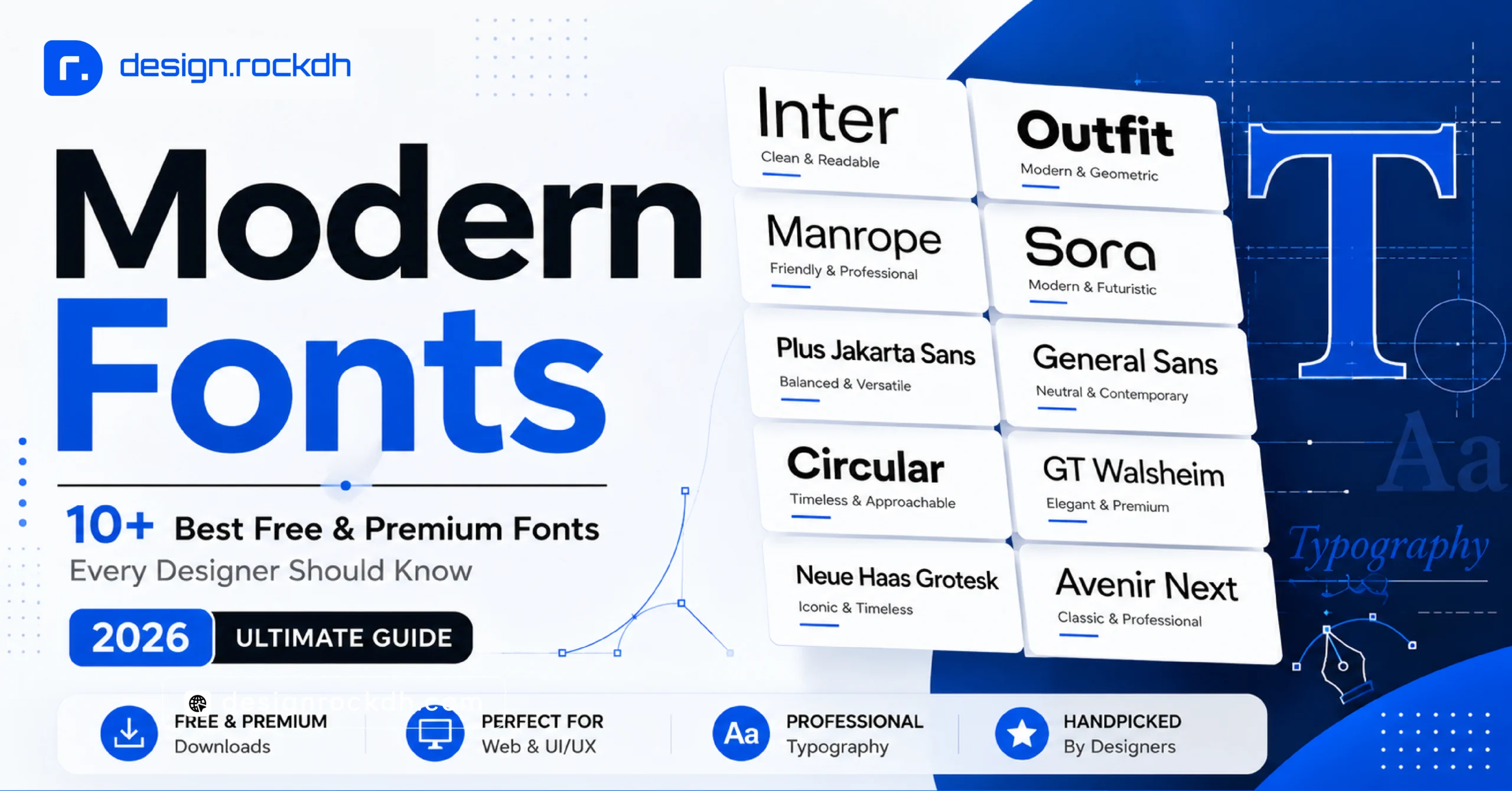
In this guide, we’ll look at some of the top free fonts for commercial use in 2026. We’ll also explain the most common font licenses, show you where to find reliable downloads, and share practical tips for using free fonts without hurting website performance.
2. Understanding Commercial Font Licensing
Before downloading a font and using it in a client project, website, app, or branding package, it’s important to understand its license.
A font being labeled “free” doesn’t automatically mean that you can use it commercially. Some fonts are free only for personal projects. Using those fonts for business purposes without permission can potentially create copyright and licensing problems.
Here are some of the most common licenses you’ll come across:
| License Type | Commercial Usage | Key Restrictions |
|---|---|---|
| SIL Open Font License (OFL) | Web, print, apps, branding | The font file itself cannot be sold separately; license and author information must be preserved |
| Apache License 2.0 | Commercial use and web embedding | Copyright notice may be required when redistributing |
| CC0 / Public Domain | Unrestricted commercial use | No attribution required |
| Personal Use Only | Personal projects | Not intended for business or client work |
Key Rules for Safe Commercial Font Usage
Always check the license file.
Before using a font commercially, download it from the official source and look for files such as LICENSE.txt, OFL.txt, or other licensing documentation.
Check web embedding rights.
If you’re using the font on a website, make sure the license allows web embedding through @font-face. The same applies when bundling fonts inside mobile applications.
Understand desktop and web licensing.
A font may be free for desktop design but have different rules for web use. That’s why it’s safer to rely on reputable font libraries and always verify the specific license attached to the font.
When in doubt, don’t assume. Read the license before using the typeface in a commercial project.
3. Top Free Sans-Serif Fonts for Commercial Projects
Sans-serif fonts are among the most useful choices for modern digital design. They’re generally clean, easy to read, and work particularly well across websites, apps, dashboards, and mobile interfaces.
Here are some excellent free commercial fonts worth considering.
1. Inter
Designed by: Rasmus Andersson
License: SIL Open Font License
Best Uses: Product UIs, SaaS dashboards, web portals, and mobile apps
Inter has become a popular choice for digital products because it was designed with screen readability in mind.
Its tall x-height, generous ascenders, and careful screen-rendering adjustments make it easy to read at different sizes. It also comes with a variable font version and optical sizing, which gives designers additional flexibility.
Download: Inter on Google Fonts or the official Inter repository.
2. Plus Jakarta Sans
Designed by: Tokotype / G37 Studio
License: SIL Open Font License
Best Uses: Tech landing pages, startup branding, agency portfolios, and digital products
Plus Jakarta Sans combines a geometric foundation with softer humanist curves. The result is a typeface that feels modern without becoming overly technical.
It’s particularly useful when you want a digital product or startup brand to feel clean, approachable, and contemporary.
Download: Plus Jakarta Sans on Google Fonts.
3. Poppins
Designed by: Indian Type Foundry
License: SIL Open Font License
Best Uses: Headings, display titles, e-commerce websites, and social media graphics
Poppins is well known for its geometric appearance and clean, consistent letterforms.
Its circular shapes and balanced stroke weights make it especially effective for large headings and visual marketing content. With a broad range of styles, it can also work as part of a complete typography system.
Download: Poppins on Google Fonts.
4. Work Sans
Designed by: Wei Huang
License: SIL Open Font License
Best Uses: Editorial websites, corporate blogs, identity systems, and UI body text
Work Sans is a practical choice for projects where readability matters just as much as appearance.
It’s optimized for display across medium-sized text, roughly from 14px to 48px, while its spacing helps prevent text from feeling cramped.
Download: Work Sans on Google Fonts.
5. Space Grotesk
Designed by: Florian Karsten
License: SIL Open Font License
Best Uses: Web3 websites, AI platforms, developer tools, posters, and technology brands
Space Grotesk takes inspiration from Space Mono while making several adjustments that improve its readability in regular text.
It still retains some of that technical, distinctive character, which makes it a strong option for projects that want a futuristic or developer-focused visual identity.
Download: Space Grotesk on Google Fonts.
4. Top Free Serif Fonts for Commercial Projects
If sans-serif fonts are known for their clean digital feel, serif fonts bring a different kind of personality. They can add sophistication, editorial character, and a sense of timelessness to both digital and print designs.
Here are three strong options.
1. Playfair Display
Designed by: Claus Eggers Sørensen
License: SIL Open Font License
Best Uses: Luxury branding, fashion headlines, wedding invitations, and magazine covers
Playfair Display is a great choice when you want typography to feel elegant and refined.
Its strong contrast between thick and thin strokes, combined with delicate serifs, gives it a classic editorial appearance inspired by late 18th-century European typography.
Download: Playfair Display on Google Fonts.
2. Merriweather
Designed by: Sorkin Type
License: SIL Open Font License
Best Uses: Long-form blogs, news websites, documentation, and online books
Merriweather was designed with comfortable reading in mind.
Its sturdy serifs, open counters, and relatively subtle diagonal stress make it particularly suitable for longer passages of text. If your project contains a lot of articles or documentation, Merriweather is worth considering.
Download: Merriweather on Google Fonts.
3. Cormorant Garamond
Designed by: Christian Thalmann
License: SIL Open Font License
Best Uses: Luxury packaging, restaurant menus, premium branding, and hero headings
Cormorant Garamond offers a more dramatic and sophisticated look.
Inspired by classic typefaces associated with Claude Garamont, it works especially well at larger display sizes where its fine details and elegant letterforms can really stand out.
Download: Cormorant Garamond on Google Fonts.
5. Top Free Display & Decorative Fonts for High-Impact Headlines
Sometimes a standard body font isn’t enough.
For hero sections, posters, promotional graphics, campaign headlines, or branding, you may want a typeface that immediately grabs attention. That’s where display and decorative fonts can make a difference.
1. Syne
Designed by: Bonjour Monde / Naïm Ben Boubaker
License: SIL Open Font License
Best Uses: Creative agencies, exhibition posters, luxury streetwear, and fashion branding
Syne has a distinctive visual personality. Its range goes from relatively clean regular styles to extremely wide and bold weights.
That flexibility makes it useful when you want a headline to become a major visual element rather than simply serving as text.
Download: Syne on Google Fonts.
2. Bebas Neue
Designed by: Ryoichi Tsunekawa
License: SIL Open Font License
Best Uses: Sports graphics, action titles, YouTube thumbnails, and promotional banners
Bebas Neue is a condensed, all-caps typeface that works particularly well when space is limited.
Its narrow structure allows designers to fit large headlines into relatively small horizontal areas, making it a popular option for banners and promotional graphics.
Download: Bebas Neue on Google Fonts.
6. Where to Find and Download Royalty-Free Commercial Fonts
Finding a font is easy. Finding one with a license you can confidently use commercially is the more important part.
To reduce licensing headaches, start with reputable open-source and font distribution platforms.
1. Google Fonts
Google Fonts offers one of the largest collections of open-source fonts available for web and design projects. Many fonts are free for both personal and commercial use, and web hosting through its CDN is also available.
2. Fontshare by Indian Type Foundry
Fontshare provides a collection of high-quality typefaces designed for professional use. It’s especially useful for designers looking for modern variable fonts for branding, websites, and digital products.
3. Font Squirrel
Font Squirrel is another useful resource for finding free fonts. Its collection is curated with an emphasis on fonts that offer commercial licensing.
Still, it’s always smart to check the individual license before using a font in a client project.
4. The League of Moveable Type
The League of Moveable Type is an open-source type foundry known for offering both display and text typefaces.
5. Adobe Fonts Free Collection
Adobe Fonts provides fonts through Creative Cloud subscriptions and can be useful for commercial publishing and web projects, depending on the specific font and subscription terms.
7. Integrating Free Fonts into Professional Design Workflows
Choosing the right font is only the beginning. You also need to integrate it properly into your design workflow.
Using Fonts in Design Software
Figma
Figma can work with Google Fonts and installed fonts, making it convenient for design teams that need consistent typography across projects.
Adobe Illustrator & Photoshop
For desktop design applications, install .ttf or .otf files through your operating system’s font management system. Once installed, the fonts should become available in supported Adobe Creative Cloud applications.
Canva
If your Canva plan supports custom fonts, you can upload compatible .otf or .woff2 font files and use them in your brand assets and Brand Kits.
Palette & Typography Pairings
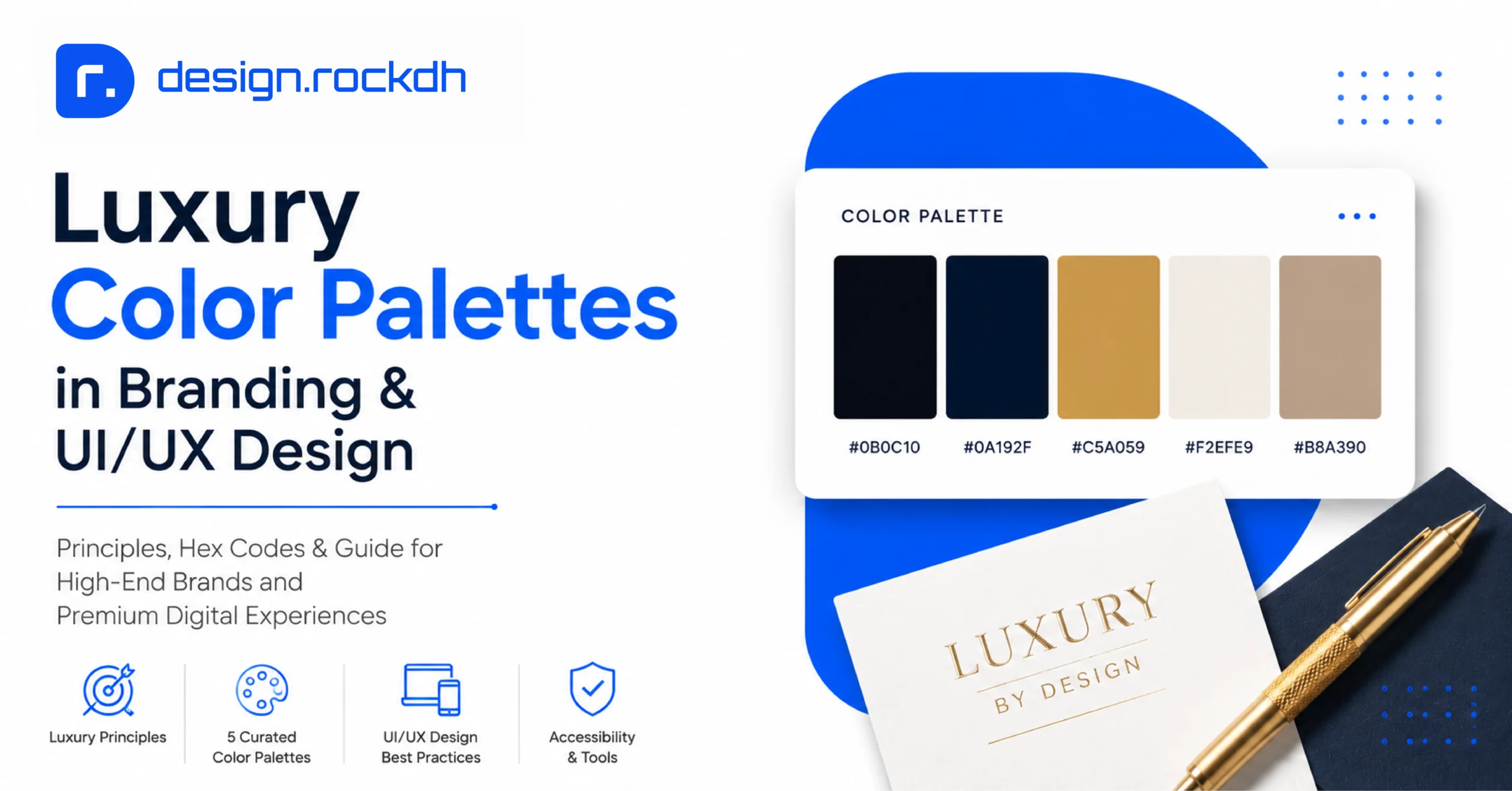
Typography doesn’t work in isolation. Your font choices should also fit the colors and overall visual identity of the project.
Two useful tools include:
Coolors Palette Generator: Helpful for creating complementary and harmonious color palettes.
WebAIM Contrast Checker: Useful for checking whether text and background combinations meet accessibility contrast requirements, including WCAG AA standards.
8. Web Font Optimization for Performance and Ad Revenue
Beautiful typography shouldn’t come at the expense of website speed.
Large or poorly optimized font files can increase page weight and delay the moment when users can comfortably read your content. Faster-loading pages can also contribute to better user experience, search performance, and ad viewability.
Here are some practical optimization techniques.
1. Use WOFF2 Compression
Whenever possible, serve .woff2 font files to modern browsers. WOFF2 generally provides better compression than older formats such as .woff or .ttf.
2. Use font-display: swap
Adding font-display: swap to your CSS @font-face rules can help prevent invisible text while the font is loading.
Instead of making visitors wait for the custom font, the browser can display a fallback font and switch to the preferred font when it becomes available.
3. Limit the Number of Font Weights
Every additional font weight can add more data to your website.
For most projects, you don’t need every available weight. A simple setup such as:
- Regular — 400
- Medium — 500
- Bold — 700
is often enough for a complete typography system.
4. Consider Self-Hosting
Self-hosting your web fonts can reduce reliance on third-party connections and may help improve loading performance by eliminating additional DNS lookup or connection overhead.
As always, make sure the font’s license allows the type of hosting and redistribution you’re planning.
9. Frequently Asked Questions
Can I trademark a logo made with a free commercial font?
Fonts licensed under licenses such as SIL Open Font License or Apache 2.0 generally allow you to create design work, including vector-based logo artwork, subject to the specific license terms.
The important distinction is that you’re using the typeface to create artwork rather than selling or redistributing the raw font software itself.
For trademark registration, however, it’s always worth checking the applicable trademark rules and getting professional legal advice if the brand is commercially important.
What is a Variable Font, and should I use one?
A variable font is a font file that can contain multiple variations, such as different weights, widths, or slants.
Instead of loading separate font files for Regular, Medium, Bold, and other styles, a single variable font can provide multiple values along one or more axes.
For websites, this can simplify font management and, depending on how the font is configured and loaded, potentially reduce the number of font files and HTTP requests.
Are all fonts on DaFont free for commercial use?
No.
This is one of the most important things to remember when downloading fonts from large font-sharing websites.
Many fonts are labeled “Free for Personal Use,” which means they’re not automatically suitable for client work, business websites, branding, or other commercial projects.
Always check the individual font’s license before using it commercially. If the licensing information isn’t clear, choose a font from a more clearly documented source.
10. Conclusion
You don’t need an expensive font library to create professional-looking websites, brands, apps, or marketing materials.
The world of open-source typography has grown significantly, and there are now plenty of high-quality typefaces available for commercial projects.
Fonts such as Inter, Plus Jakarta Sans, Poppins, Work Sans, Space Grotesk, Playfair Display, Merriweather, and Cormorant Garamond give designers a wide range of options—from clean and modern interfaces to elegant editorial layouts and premium branding.
The most important thing is to look beyond appearance. Before using any free commercial font, take a moment to verify its license, understand where you’re allowed to use it, and keep the original licensing information when required.
With the right combination of typography, licensing awareness, and performance optimization, you can create polished, professional designs without spending a fortune on font licenses.
For customizable design templates, vector graphics, and digital UI assets, explore the resource library at designrockdh.com.