
Think about the last time you visited a luxury brand’s website. Chances are, you noticed elegant typography that felt refined and timeless. Now compare that to the clean, minimal fonts used by most technology companies. Even before reading a single word, you probably formed an impression about each brand.
That isn’t a coincidence—it’s font psychology at work.
Typography is far more than a design element. Every font carries subtle emotional signals that influence how people interpret information, judge credibility, and connect with a brand. Whether you’re designing a website, creating a logo, publishing a blog, or launching a marketing campaign, the fonts you choose can shape your audience’s perception long before they process your message.
Research in branding, marketing, and user experience consistently shows that typography affects trust, readability, engagement, and even purchasing behavior. A well-chosen typeface reinforces your message, while the wrong one can create confusion or weaken your brand identity.
In this guide, you’ll discover how different font styles influence emotions, which typefaces work best for specific industries, and how to use typography strategically to create stronger designs and better user experiences.
What Is Font Psychology?
Font psychology is the study of how typefaces influence the way people think, feel, and respond to written content. Although the words remain the same, presenting them in different fonts can completely change how they’re perceived.
Imagine the phrase “We value your trust.”
Displayed in a traditional serif font, it feels established and dependable. Presented in a sleek sans-serif typeface, it appears modern and approachable. Written in a decorative script, it might feel elegant—but perhaps less suitable for a financial institution.
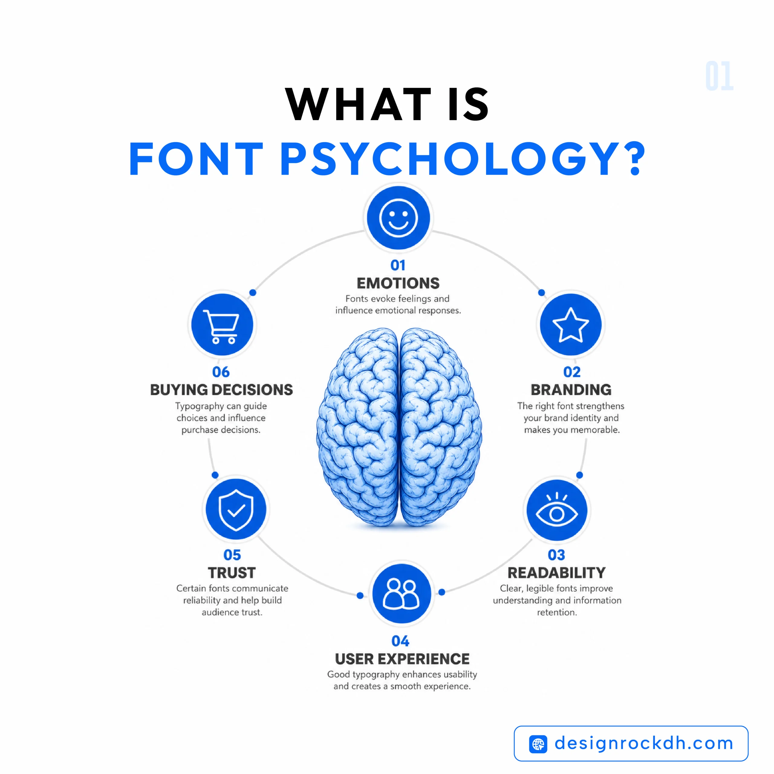
These reactions happen almost instantly because our brains associate certain font styles with familiar experiences.
For example:
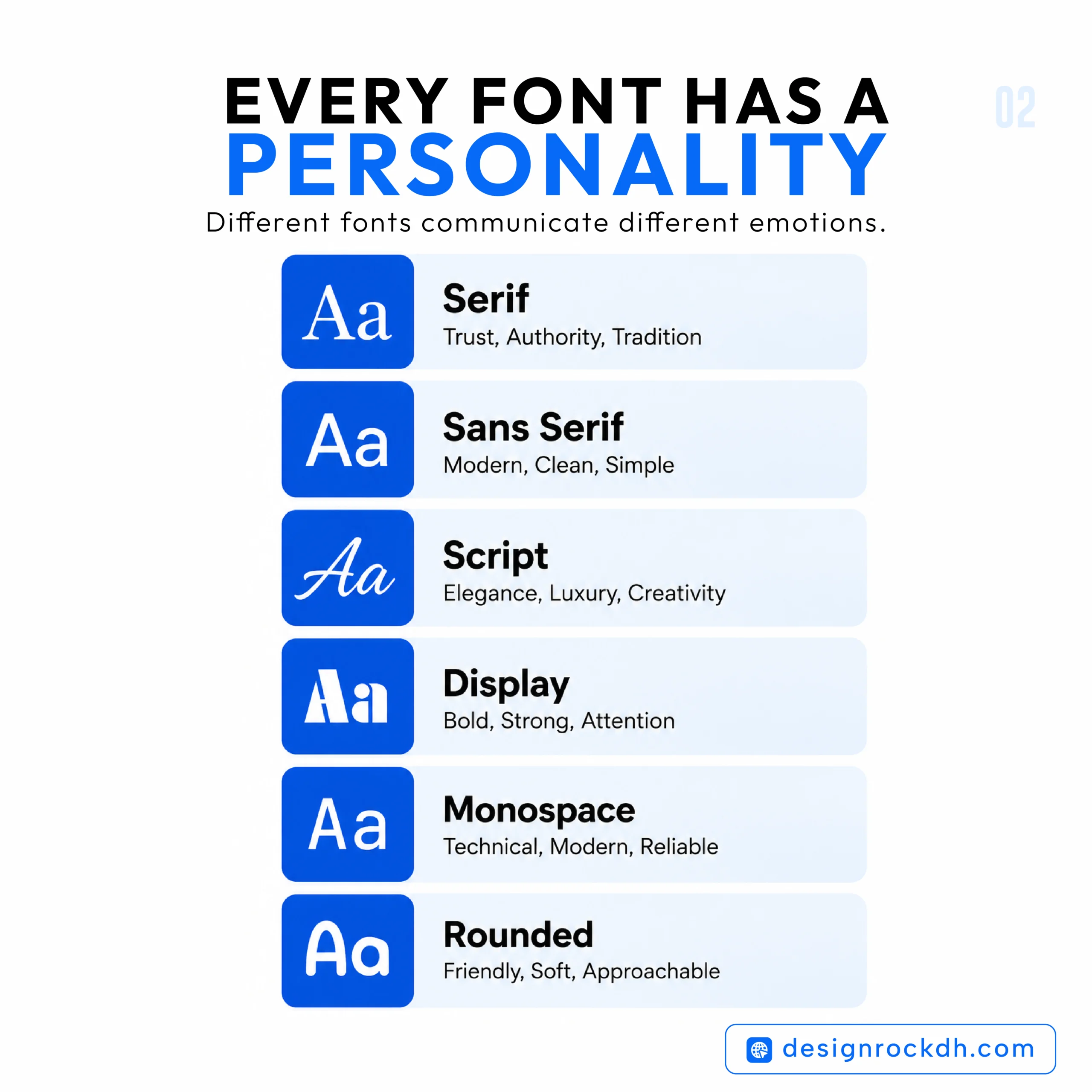
- Serif fonts often remind us of books, newspapers, and academic publications.
- Sans-serif fonts are closely linked to technology, apps, and modern digital products.
- Script fonts evoke handwritten invitations, luxury branding, and personal expression.
- Bold display fonts are commonly associated with advertising, entertainment, and sports.
These visual associations influence first impressions before readers consciously evaluate the content itself.
Why Font Psychology Matters
Typography isn’t just about making text attractive—it plays a critical role in communication.
The right font can help people trust your brand, understand your message more easily, and remember what they’ve seen. Poor typography, on the other hand, can make even high-quality content feel unprofessional.
Here’s why font psychology deserves attention:
1. It Creates Powerful First Impressions
People form opinions about websites and brands within moments. Typography contributes significantly to that initial judgment, alongside color, imagery, and layout.
2. It Reinforces Brand Personality
Every brand has a voice. Typography helps express whether that voice is traditional, innovative, luxurious, playful, professional, or approachable.
3. It Improves Readability
Beautiful typography means little if readers struggle to absorb the content. Choosing fonts designed for readability improves the overall user experience, especially on digital screens.
4. It Builds Trust
Financial institutions, universities, healthcare organizations, and legal firms often select fonts that communicate stability and authority because trust directly impacts decision-making.
5. It Supports Marketing Performance
Typography affects how advertisements, landing pages, product packaging, and promotional materials are perceived. Small design choices can influence click-through rates, conversions, and customer confidence.
Simply put, typography isn’t decoration—it’s communication.
Serif Fonts: Tradition, Trust, and Authority
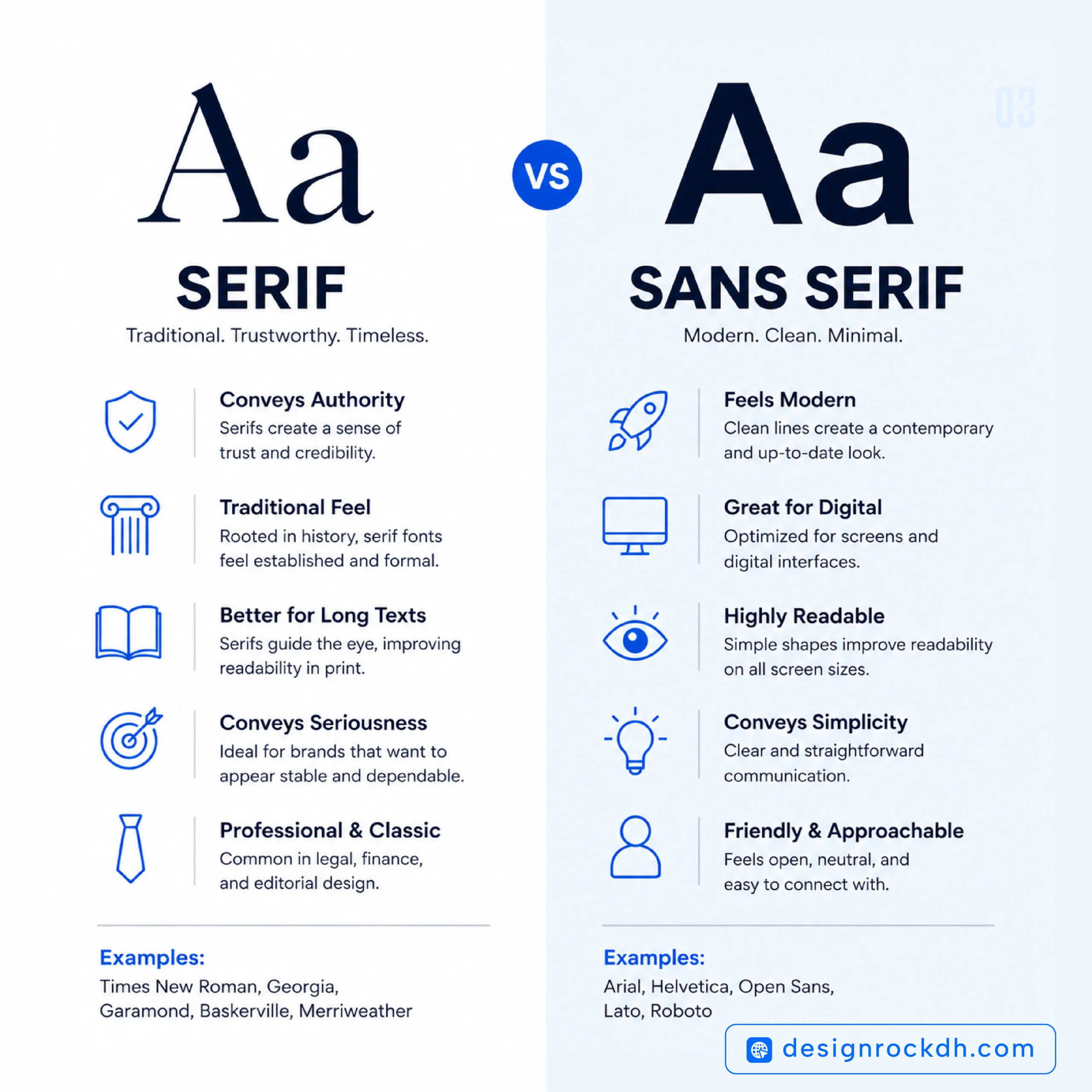
Serif fonts are among the oldest and most recognizable typography styles. Their small decorative strokes, known as “serifs,” give them a classic appearance that’s often associated with credibility and heritage.
Popular Serif Fonts
- Merriweather
- Playfair Display
- Garamond
- Baskerville
- Times New Roman
- Cormorant Garamond
Psychological Associations
Serif fonts typically communicate:
- Trustworthiness
- Professionalism
- Reliability
- Sophistication
- Heritage
- Stability
Because readers have encountered serif fonts in books, newspapers, and academic publications for generations, they naturally associate them with authority and knowledge.
That’s one reason why universities, newspapers, law firms, and luxury brands continue to use serif typography.
Where Serif Fonts Work Best
Serif fonts are ideal for:
- Editorial websites
- Financial institutions
- Law firms
- Luxury branding
- Print publications
- Universities
- High-end product packaging
If your goal is to create a sense of expertise or timeless elegance, serif fonts remain one of the strongest choices.
Free Downloads
- Merriweather
- Playfair Display
- Cormorant Garamond
(All are available through Google Fonts.)
Sans-Serif Fonts: Clean, Modern, and Approachable
If serif fonts represent tradition, sans-serif fonts represent simplicity and innovation.
Without decorative strokes, these typefaces appear cleaner and more contemporary. Their excellent readability has made them the standard choice for websites, mobile apps, software interfaces, and digital products.
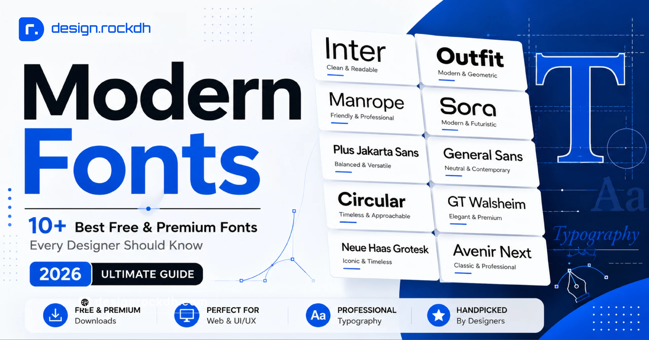
Popular Sans-Serif Fonts
- Inter
- Poppins
- Roboto
- Outfit
- Manrope
- Open Sans
- DM Sans
Psychological Associations
Sans-serif fonts are commonly linked with:
- Simplicity
- Innovation
- Honesty
- Accessibility
- Friendliness
- Efficiency
- Modern thinking
These qualities explain why many of today’s most recognizable technology companies rely on sans-serif typography throughout their branding.
Where Sans-Serif Fonts Perform Best
They are particularly effective for:
- SaaS platforms
- Mobile applications
- UI and UX design
- Startup branding
- Technology companies
- Portfolio websites
- Corporate presentations
Because they’re optimized for digital displays, sans-serif fonts typically deliver excellent readability across desktops, tablets, and smartphones.
Free Downloads
Popular free options include:
- Inter
- Poppins
- Outfit
- Roboto
- Manrope
Each is freely available through Google Fonts and widely used in professional web and app design.
Script Fonts: Elegant, Personal, and Emotionally Expressive
Script fonts are designed to resemble natural handwriting or calligraphy. Unlike standard typefaces, they create a sense of personality and emotion, making designs feel more intimate and memorable.
When used thoughtfully, script fonts can add sophistication and warmth. However, they work best in moderation. Overusing them—especially in long paragraphs—can quickly reduce readability.
Popular Script Fonts
- Great Vibes
- Allura
- Dancing Script
- Sacramento
- Parisienne
What Do Script Fonts Communicate?
Script fonts are often associated with:
- Elegance
- Creativity
- Romance
- Luxury
- Authenticity
- Personal connection
Because they mimic handwritten text, people naturally perceive them as more personal than standard fonts. This is why they’re commonly used for wedding invitations, beauty brands, fashion labels, and premium packaging.
Best Uses
Script fonts are ideal for:
- Luxury branding
- Wedding websites
- Beauty and skincare products
- Fashion brands
- Invitation cards
- Signature logos
- Social media quotes
When to Avoid Script Fonts
Despite their beauty, script fonts aren’t suitable for everything.
Avoid using them for:
- Website navigation
- Long blog paragraphs
- Mobile interfaces
- Technical documentation
- Small body text
A simple rule is to let script fonts shine in headlines or accents while keeping body copy in a highly readable serif or sans-serif font.
Display Fonts: Designed to Capture Attention
Some fonts aren’t meant for reading—they’re meant for making an impression.
Display fonts are bold, expressive, and full of personality. Their primary purpose is to grab attention instantly.
Whether it’s a movie poster, sports advertisement, or event banner, display fonts help create visual impact.
Popular Display Fonts
- Bebas Neue
- Anton
- League Spartan
- Bungee
- Oswald
Psychological Impact
Display fonts often evoke feelings of:
- Confidence
- Excitement
- Energy
- Boldness
- Creativity
- Adventure
Their dramatic appearance naturally draws the eye, making them perfect for headlines and promotional graphics.
Best Applications
Display fonts perform well in:
- Posters
- Headlines
- Event branding
- Gaming graphics
- Sports marketing
- YouTube thumbnails
- Advertising campaigns
Because they’re highly stylized, they’re rarely appropriate for long-form reading.
Think of display fonts as the “hook” that captures attention, while simpler fonts carry the rest of the message.
Monospace Fonts: Precision, Logic, and Technical Confidence
Unlike most typefaces, monospace fonts give every character exactly the same width.
Originally created for typewriters and later adopted by programmers, these fonts have become synonymous with technology and precision.
Popular Monospace Fonts
- JetBrains Mono
- IBM Plex Mono
- Fira Code
- Source Code Pro
- Space Mono
Emotional Associations
Monospace fonts communicate:
- Accuracy
- Technical expertise
- Logic
- Engineering
- Programming
- Reliability
When people see monospace typography, they immediately think of coding environments, terminals, and software development.
Best Uses
These fonts work particularly well for:
- Programming blogs
- Developer documentation
- Coding tutorials
- Technical dashboards
- Software interfaces
- Terminal screenshots
Outside technical contexts, however, monospace fonts can feel rigid and less comfortable for long-form reading.
Rounded Fonts: Friendly, Safe, and Approachable
Rounded fonts soften the sharp edges found in traditional typography. Their curved shapes create a welcoming and optimistic appearance.
They immediately feel more casual than serif fonts and less formal than many geometric sans-serif typefaces.
Popular Rounded Fonts
- Nunito
- Quicksand
- Fredoka
- Comfortaa
- Varela Round
Emotional Associations
Rounded typography is commonly linked with:
- Friendliness
- Safety
- Happiness
- Playfulness
- Kindness
- Simplicity
These emotional qualities explain why rounded fonts frequently appear in educational products, children’s brands, healthcare services, and food packaging.
Best Applications
Rounded fonts are especially effective for:
- Educational platforms
- Kids’ products
- Mobile apps
- Healthcare brands
- Food businesses
- Lifestyle brands
- Community-focused organizations
They create a welcoming atmosphere that encourages interaction without feeling overly formal.
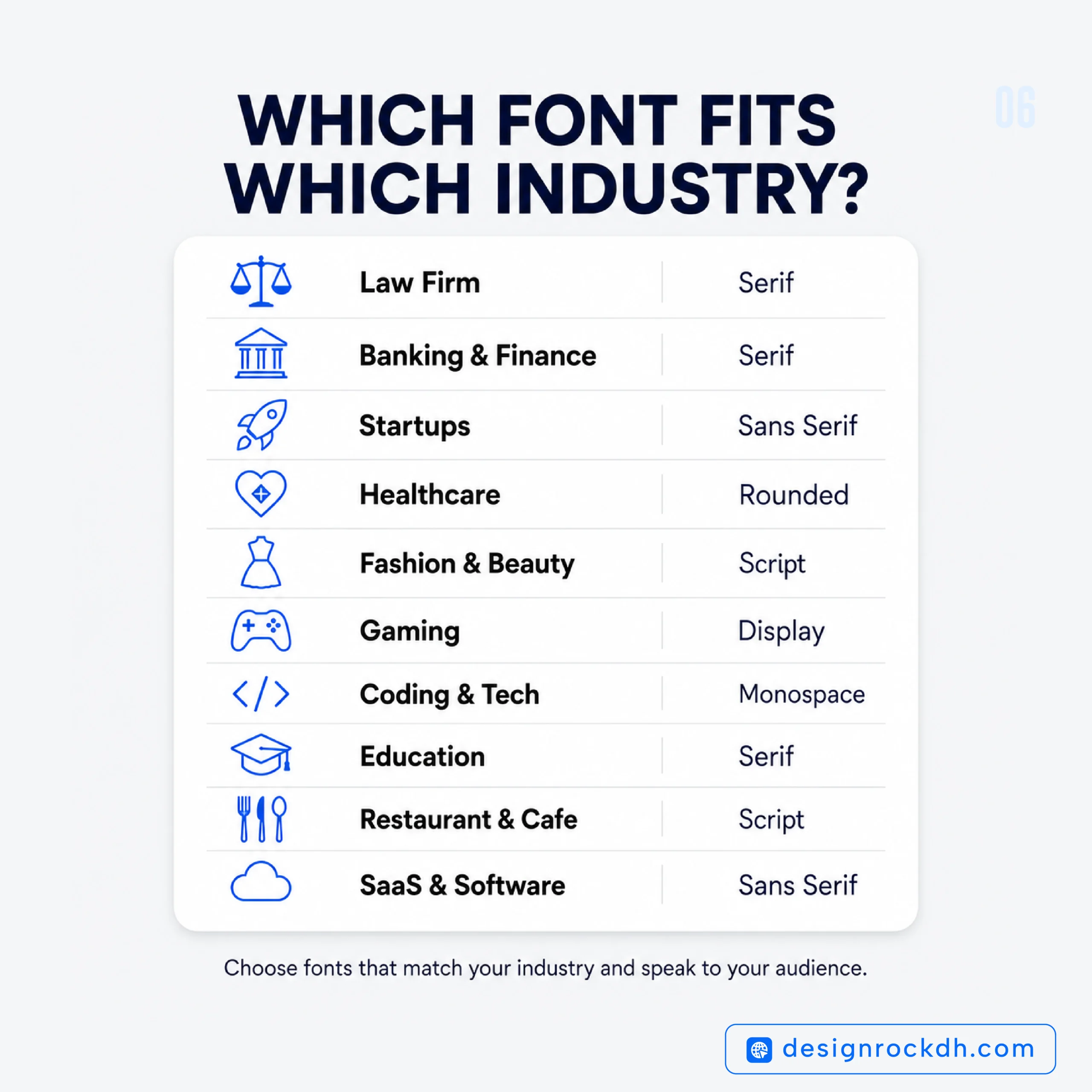
Font Psychology in Branding
Typography is one of the strongest visual signals a brand can use.
Even before someone reads your message, your font choice tells them what kind of company you are.
For example:
A luxury watch brand using Comic Sans would immediately lose credibility.
Likewise, a playful toy company using a formal legal-style serif font would feel disconnected from its audience.
The most successful brands carefully match typography with their personality.
Luxury Brands
Luxury companies often rely on elegant serif fonts because they suggest exclusivity, craftsmanship, and heritage.
Technology Companies
Modern tech businesses usually prefer clean sans-serif fonts that communicate innovation, simplicity, and efficiency.
Financial Institutions
Banks and investment firms often use classic typography to reinforce stability and trust.
Healthcare Organizations
Medical brands typically choose rounded or humanist sans-serif fonts because they appear caring, approachable, and reassuring.
Creative Businesses
Design studios and agencies have more freedom to experiment with expressive display fonts or custom typography that reflects originality.
When typography aligns with a brand’s identity, every visual element feels more consistent—and that consistency builds recognition over time.
Typography in UI and UX Design
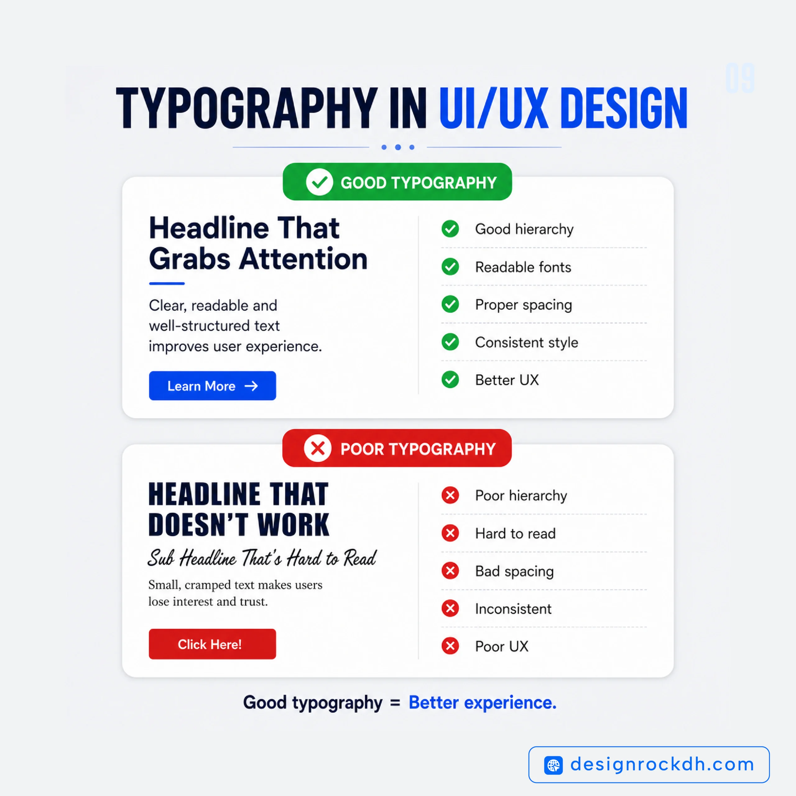
Great typography isn’t just about appearance—it directly affects usability.
A beautifully designed interface can still frustrate users if the text is difficult to read.
That’s why typography is considered a core part of user experience design.
When designing websites or applications, keep these principles in mind:
Prioritize Readability
Choose fonts that remain clear across different screen sizes.
Maintain Visual Hierarchy
Use different font sizes and weights to guide readers naturally through the content.
Limit Font Families
Two font families are usually enough for most websites.
Too many fonts create visual clutter and weaken brand consistency.
Optimize Line Height
Comfortable spacing makes long articles significantly easier to read.
Ensure Accessibility
Good typography isn’t only attractive—it should also be accessible to users with different visual abilities.
Proper contrast, spacing, and font size all contribute to a better reading experience.
Real-World Examples of Font Psychology
Some of the world’s most recognizable brands demonstrate typography psychology exceptionally well.
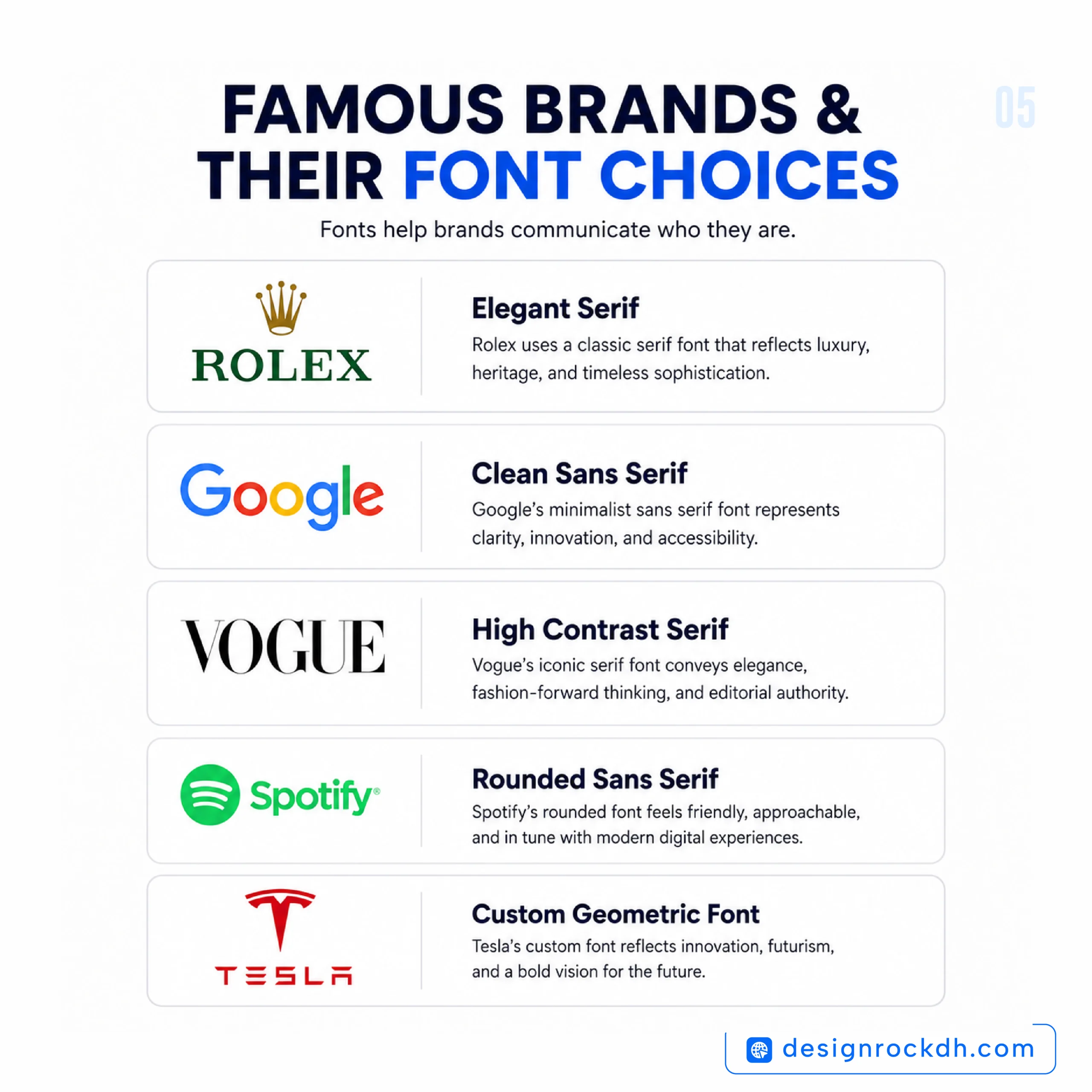
Google uses a clean sans-serif typeface to reinforce simplicity, accessibility, and innovation.
Vogue relies on elegant serif typography to communicate sophistication, authority, and timeless fashion.
Spotify combines modern typography with minimal design to appeal to a younger, digital-first audience.
The New York Times continues using classic serif typography because it reinforces credibility, journalism, and tradition.
These brands prove that typography isn’t simply decoration—it’s a strategic communication tool.
Best Font Pairings That Always Work
Choosing the right font is important, but pairing fonts effectively can elevate an entire design. A strong combination creates contrast without making the layout feel disconnected.
A common approach is to use one font for headings and another for body text. Headlines can have more personality, while body copy should prioritize readability.
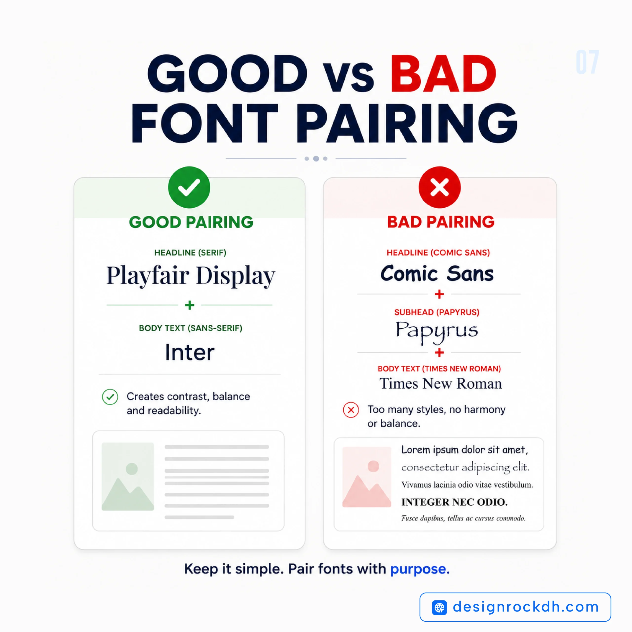
Here are some timeless combinations designers love:
| Heading Font | Body Font | Best For |
|---|---|---|
| Playfair Display | Inter | Luxury websites |
| Merriweather | Open Sans | Blogs & editorial content |
| Bebas Neue | Roboto | Posters & landing pages |
| Cormorant Garamond | Poppins | Fashion brands |
| League Spartan | Source Sans Pro | Startup websites |
| Outfit | DM Sans | SaaS products |
| Anton | Inter | Marketing campaigns |
When pairing fonts, aim for contrast in style rather than similarity. For example, combining a serif heading with a clean sans-serif body often creates a polished, balanced look.
Common Typography Mistakes Designers Should Avoid
Even the best fonts can lose their impact when used incorrectly. Avoiding a few common mistakes can dramatically improve both readability and visual appeal.
Using Too Many Fonts
Every typeface introduces a new visual voice. Mixing four or five fonts in a single design often creates inconsistency and confusion.
A good rule is to stick to two font families, or three at most.
Prioritizing Style Over Readability
Decorative fonts may look impressive in a logo or headline, but they’re rarely suitable for long paragraphs.
If readers struggle to understand the content, the design has failed its primary purpose.
Ignoring Mobile Devices
Typography that looks perfect on a desktop can become difficult to read on a smartphone.
Always preview your design across different screen sizes before publishing.
Weak Visual Hierarchy
When headings, subheadings, and body text all look similar, readers don’t know where to focus.
Use size, weight, spacing, and color consistently to guide the eye.
Poor Line Spacing
Text that’s too cramped feels overwhelming.
Likewise, excessive spacing disrupts reading flow.
Comfortable line height improves readability and keeps users engaged.
Mixing Conflicting Font Personalities
Every font communicates a different mood.
Pairing a playful handwritten font with an ultra-formal corporate typeface often creates visual inconsistency unless it’s done intentionally.
Where to Download Free Fonts
High-quality typography doesn’t have to be expensive. Many professional fonts are available free for both personal and commercial projects.
Here are some of the most trusted resources:
Google Fonts
The largest collection of free web fonts.
Best for:
- Websites
- UI design
- Branding
- Presentations
- Mobile apps
Popular fonts include:
- Inter
- Poppins
- Roboto
- Outfit
- Merriweather
- Playfair Display
- Nunito
Fontshare
An excellent source of professionally designed fonts with generous commercial licenses.
Popular choices include:
- General Sans
- Satoshi
- Cabinet Grotesk
- Switzer
- Clash Display
Font Squirrel
Ideal for designers looking for commercial-use fonts that have been carefully curated.
The League of Moveable Type
One of the oldest and most respected independent font foundries, offering high-quality open-source typefaces.
Adobe Fonts
Included with Adobe Creative Cloud, Adobe Fonts offers thousands of premium typefaces without additional licensing concerns.
How to Choose the Right Font
Selecting a font should never be based solely on appearance. Instead, consider the message you want your audience to receive.
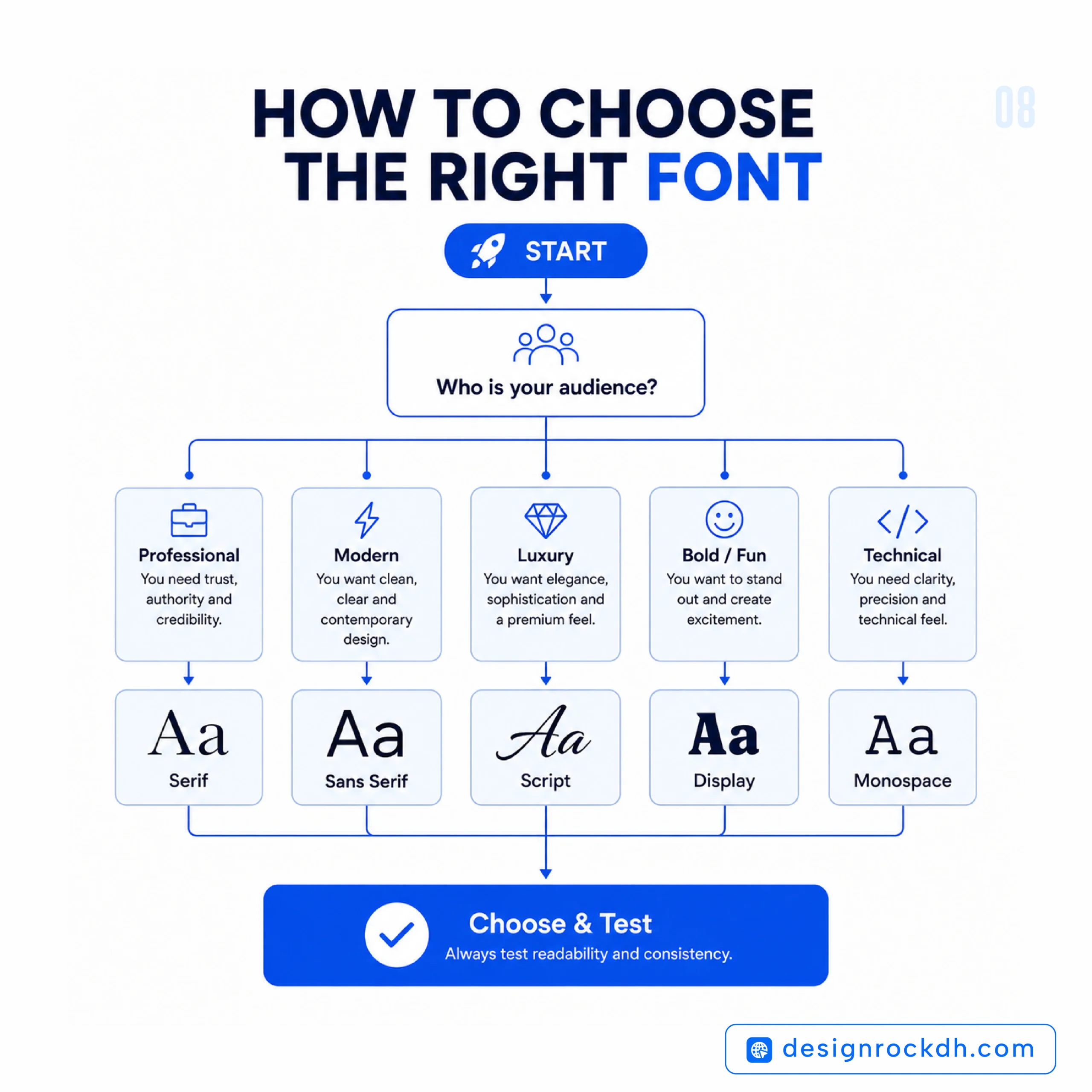
Ask yourself these questions:
- Who is my target audience?
- What emotion should this design create?
- Is readability more important than originality?
- Will most people view this on mobile or desktop?
- Does this font reflect my brand personality?
- Can it scale across different platforms?
A font isn’t just a design choice—it’s part of your communication strategy.
Frequently Asked Questions
What is Font Psychology?
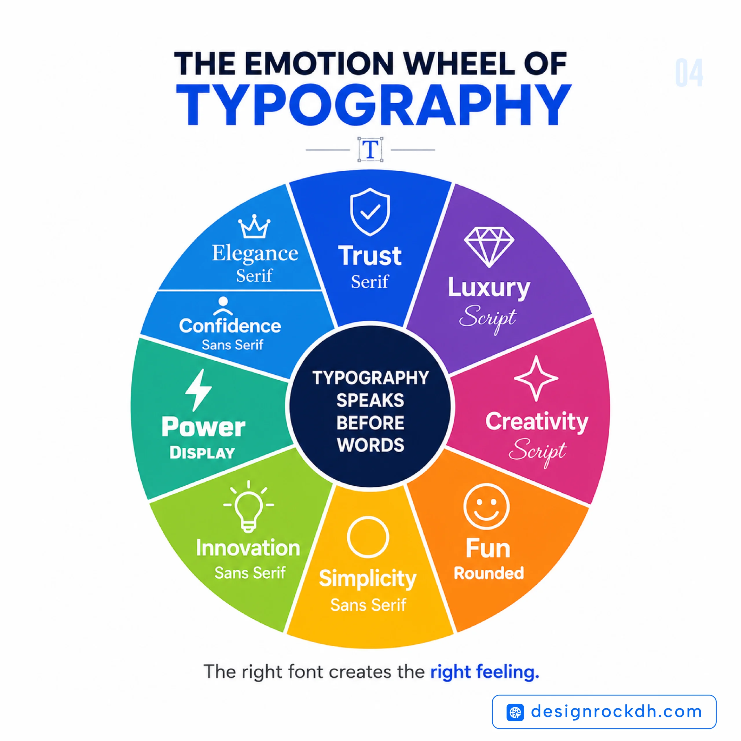
Font psychology explores how different typefaces influence human perception, emotions, and decision-making. The same message can feel trustworthy, playful, luxurious, or modern depending on the font used.
Which Fonts Build the Most Trust?
Traditional serif fonts such as Merriweather, Garamond, and Baskerville are widely associated with credibility and authority.
For digital products, modern sans-serif fonts like Inter and Roboto also create strong impressions of reliability because of their clean appearance and readability.
Are Serif Fonts Better Than Sans-Serif Fonts?
Neither is universally better.
Serif fonts are excellent for editorial design, luxury branding, and organizations that want to communicate tradition.
Sans-serif fonts are ideal for websites, mobile apps, technology companies, and modern digital products.
The best choice depends on your audience and objectives.
Can Fonts Influence Purchasing Decisions?
Yes.
Typography shapes first impressions, affects perceived product quality, and influences trust. While fonts aren’t the only factor in purchasing decisions, they play a meaningful role in how consumers evaluate brands.
How Many Fonts Should a Website Use?
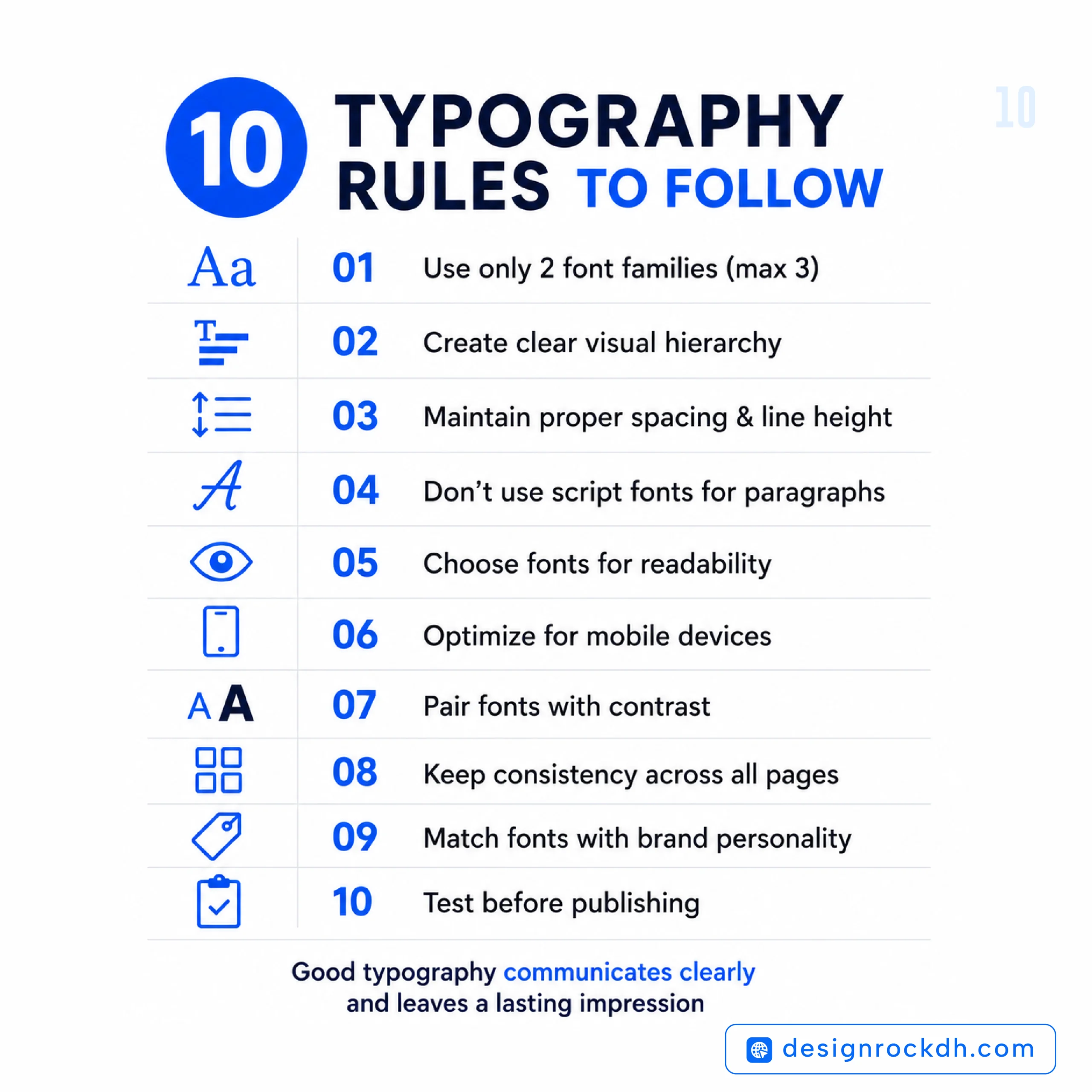
Most designers recommend using no more than two font families.
This keeps the interface consistent, improves readability, and strengthens brand identity.
Summary
Typography is often overlooked, yet it’s one of the most influential elements of visual communication.
Long before readers engage with your content, your font has already started telling a story. It can make your brand feel trustworthy, innovative, elegant, playful, or professional within seconds.
Understanding font psychology allows designers, marketers, bloggers, and business owners to make smarter typography decisions that support both user experience and brand identity.
Whether you’re creating a website, designing a logo, writing a blog post, or building a complete brand, choosing the right font isn’t simply about aesthetics—it’s about communicating the right message to the right audience.
The next time you select a typeface, remember that every curve, stroke, and letter shape influences how people perceive your work.
Great design begins with thoughtful typography.
Thank you for sharing this! I really appreciated
the way you explained “Font Psychology: Improve Branding with Better Typography” — it’s rare to see this kind of well-structured perspective.
These days I’m reading up on this topic as well,