
Typography is one of the most powerful elements of graphic and web design. A well-chosen font can make a design look modern, professional, and memorable, while a poor font choice can make even the best layout appear confusing or outdated. However, choosing a beautiful font is only half of the equation. The real magic happens when different fonts work together in harmony, a concept known as font pairing.
Whether you’re designing a logo, website, social media post, presentation, business card, or marketing banner, understanding font pairing will help you create designs that are visually appealing and easy to read.
In this guide, you’ll learn what font pairing is, why it matters, the basic principles behind it, and how to combine fonts like a professional designer.
What is Font Pairing?
Font pairing is the practice of combining two or more fonts in a single design to create visual balance, hierarchy, and personality. Instead of using one font for everything, designers typically use different fonts for headings, subheadings, and body text.
A successful font pair makes content easier to read while giving the design a polished and professional appearance.
Think of typography like fashion. Wearing matching colors and complementary accessories creates a stylish outfit. In the same way, pairing fonts that complement each other creates an attractive design.
Why Font Pairing Matters
Many beginners underestimate the importance of typography. They focus on colors, images, and layouts while ignoring the fonts. In reality, typography often determines whether users enjoy reading your content.
Good font pairing helps:
- Improve readability
- Create a professional appearance
- Build brand identity
- Guide readers through information
- Increase engagement
- Make designs more memorable
- Establish visual hierarchy
Imagine opening two websites. One uses random fonts with inconsistent spacing, while the other uses clean typography with clear headings and readable paragraphs. Most people naturally trust and enjoy the second website more.
Typography directly affects user experience.
Understanding Font Categories
Before learning how to pair fonts, it’s important to understand the major font categories.
Serif Fonts
Serif fonts have small decorative strokes at the ends of letters. They often feel traditional, elegant, trustworthy, and professional.
Popular examples include:
- Merriweather
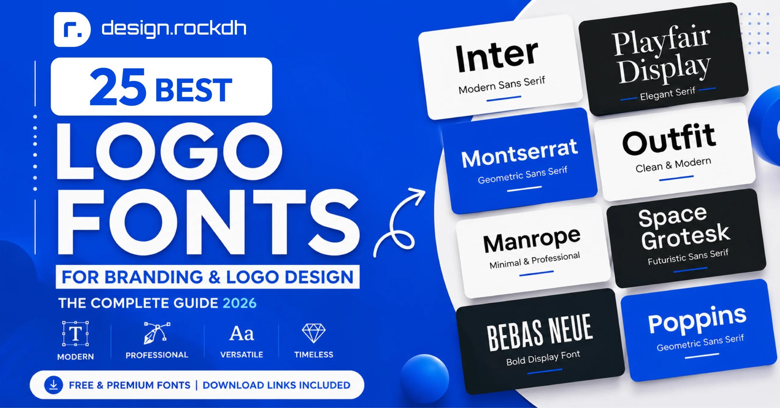
- Playfair Display
- Libre Baskerville
- Lora
- Crimson Text
Best for:
- Books
- Editorial layouts
- Luxury brands
- Magazines
- Professional websites
Sans Serif Fonts
Sans serif fonts do not have decorative strokes. They are clean, modern, and highly readable.
Popular examples include:
- Poppins
- Inter
- Open Sans
- Roboto
- Montserrat
- Manrope
- Nunito
Best for:
- Websites
- Mobile apps
- UI design
- Startups
- Technology brands
Script Fonts
Script fonts imitate handwriting or calligraphy.
Popular examples include:
- Pacifico
- Great Vibes
- Allura
- Dancing Script
Best for:
- Wedding invitations
- Logos
- Luxury branding
- Social media graphics
Use script fonts carefully because too much script text becomes difficult to read.
Display Fonts
Display fonts are decorative and designed for attention-grabbing headlines.
Examples include:
- Bebas Neue
- Anton
- Bangers
- Abril Fatface
- Oswald
These fonts work best for large titles rather than paragraphs.
The Golden Rule of Font Pairing
One of the biggest mistakes beginners make is combining too many fonts.
Professional designers usually use:
- One heading font
- One body font
Sometimes they add a third accent font, but rarely more than that.
Using only two fonts creates consistency and keeps the design clean.
Contrast Creates Balance
Great font pairing isn’t about choosing similar fonts.
It’s about choosing fonts that contrast without clashing.
For example:
Bold Heading
Light Paragraph
Large Title
Simple Body Text
Elegant Serif
Minimal Sans Serif
This contrast naturally guides the reader’s eyes.
Pair Fonts with Different Roles
Every font should have a job.
For example:
Heading:
Bold and eye-catching
Subheading:
Medium weight
Paragraph:
Simple and readable
Captions:
Small but clear
When each font serves a different purpose, the design becomes organized.
Keep Readability First
A beautiful font isn’t useful if nobody can read it.
When selecting fonts, ask yourself:
- Can people read it on mobile?
- Is it clear at small sizes?
- Does it work on dark backgrounds?
- Does it remain readable when printed?
Readability should always come before style.
Match the Mood
Every font communicates emotion.
For example:
Elegant fonts suggest luxury.
Rounded fonts feel friendly.
Bold fonts communicate strength.
Minimal fonts feel modern.
Vintage fonts create nostalgia.
Choose fonts that match your project’s personality.
A law firm’s website should not use playful cartoon fonts.
Likewise, a children’s toy store shouldn’t use stiff corporate typography.
Use Font Weights Before Adding More Fonts
Many designers download dozens of fonts when they only need one font family.
Modern font families often include:
- Thin
- Extra Light
- Light
- Regular
- Medium
- Semi Bold
- Bold
- Extra Bold
- Black
Using different weights creates hierarchy without making the design look inconsistent.
For example:
Heading — Poppins Bold
Subheading — Poppins Medium
Body Text — Poppins Regular
This simple approach looks clean and professional.
Avoid Pairing Similar Fonts
One common mistake is choosing fonts that look almost identical.
For example:
Roboto + Open Sans
Arial + Helvetica
Lato + Open Sans
These combinations don’t create enough visual distinction.
Instead, create noticeable contrast.
Good example:
Playfair Display + Poppins
Merriweather + Inter
Bebas Neue + Open Sans
Montserrat + Lora
These combinations immediately establish hierarchy while maintaining harmony.
20 Professional Font Pairing Examples
Choosing the right font combination doesn’t have to be difficult. Below are some of the most trusted font pairings used by professional designers worldwide. All of these fonts are free to download from Google Fonts unless otherwise noted.
1. Playfair Display + Poppins
One of the most popular font combinations.
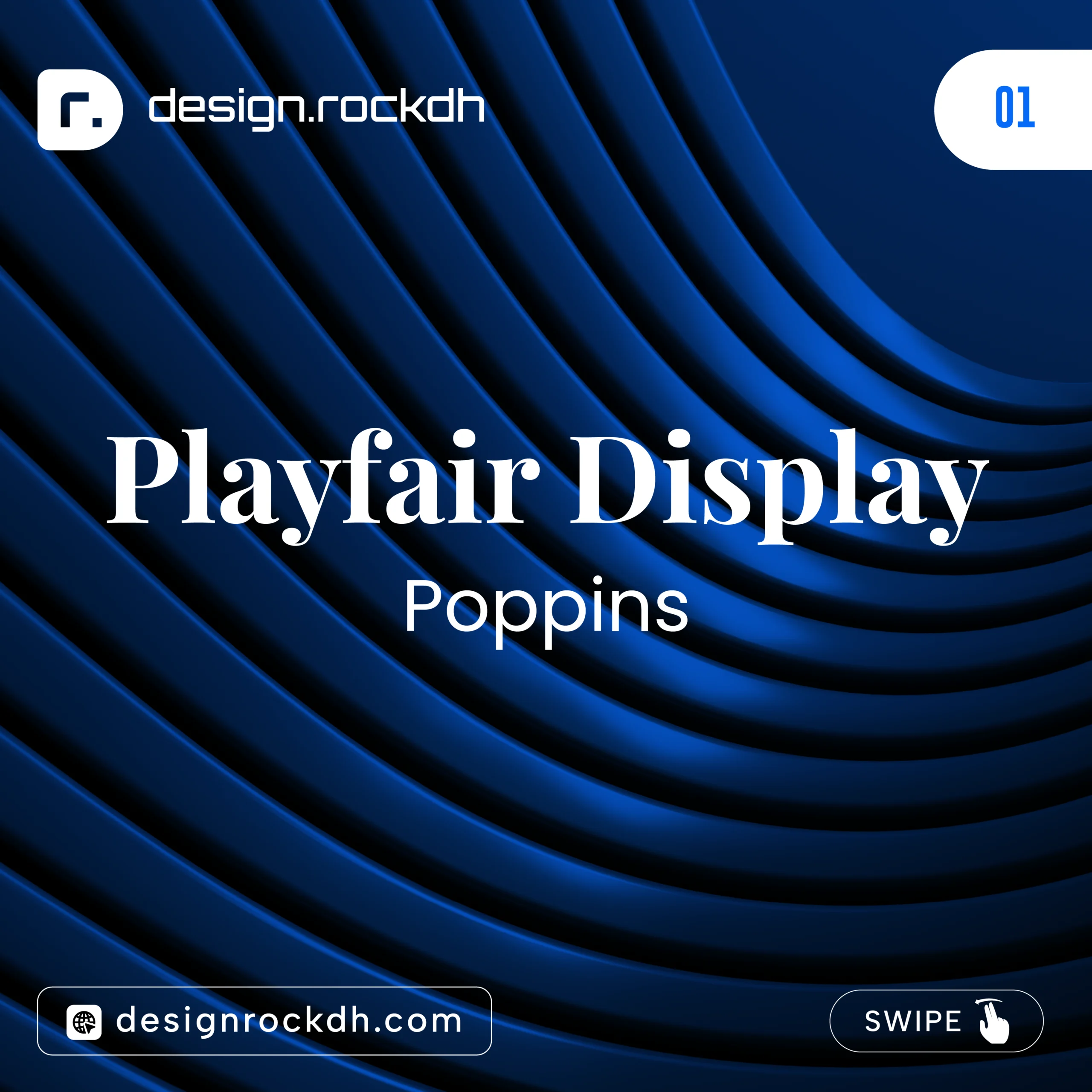
Playfair Display adds elegance with its classic serif style, while Poppins brings a modern and clean appearance.
Best For
- Fashion websites
- Luxury brands
- Beauty products
- Portfolio websites
- Wedding invitations
Download:
Playfair Display:
https://fonts.google.com/specimen/Playfair+Display
Poppins:
https://fonts.google.com/specimen/Poppins
2. Montserrat + Lora
Montserrat offers bold geometric shapes, while Lora provides excellent readability for longer paragraphs.
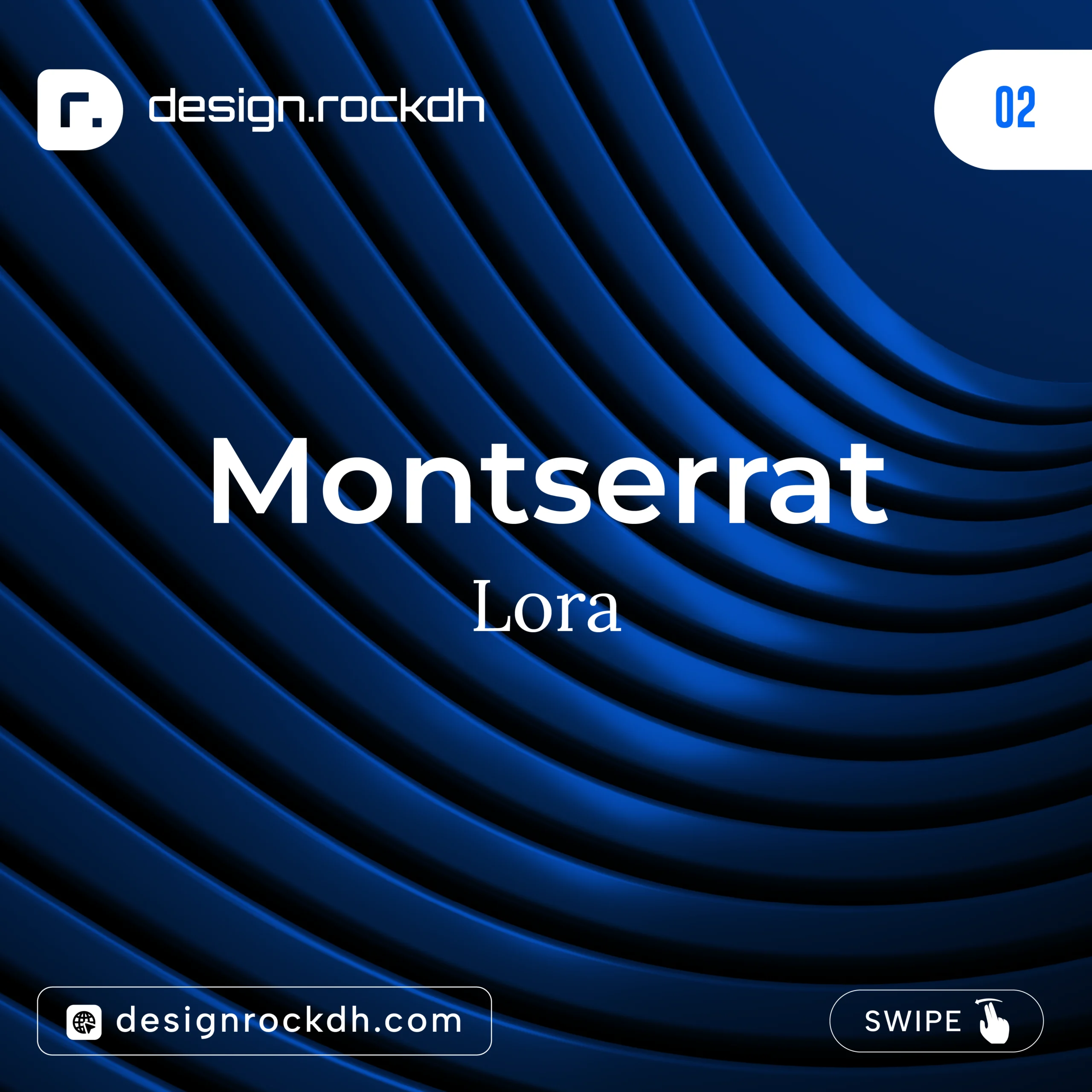
This pairing creates a professional yet approachable look.
Best For
- Blogs
- Company websites
- News portals
- Educational websites
Download:
Montserrat:
https://fonts.google.com/specimen/Montserrat
Lora:
https://fonts.google.com/specimen/Lora
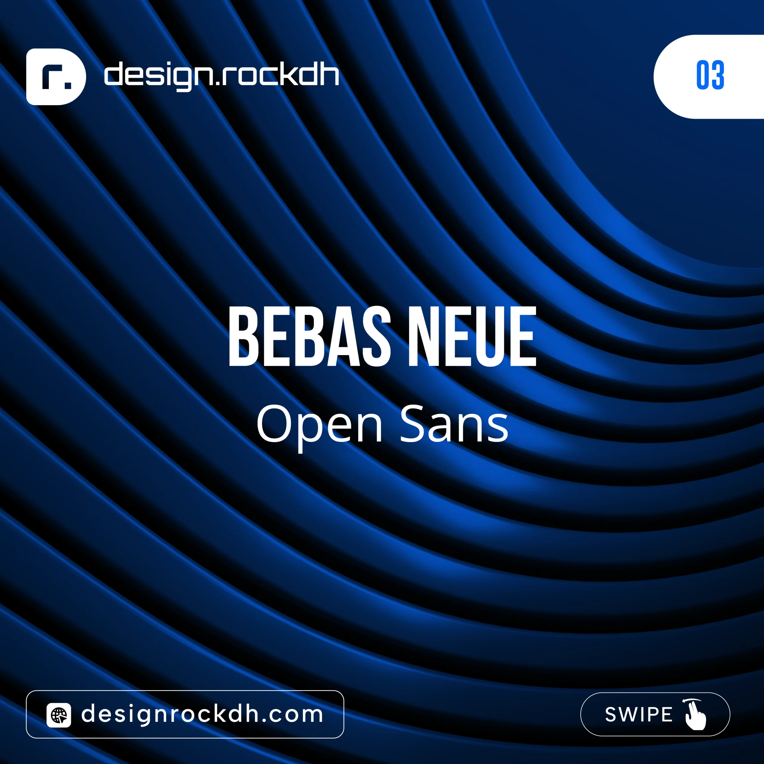
3. Bebas Neue + Open Sans
Bebas Neue is a powerful display font that grabs attention.
Open Sans keeps paragraphs easy to read.
Best For
- Posters
- Event banners
- Gym advertisements
- Sports graphics
Download:
Bebas Neue:
https://fonts.google.com/specimen/Bebas+Neue
Open Sans:
https://fonts.google.com/specimen/Open+Sans
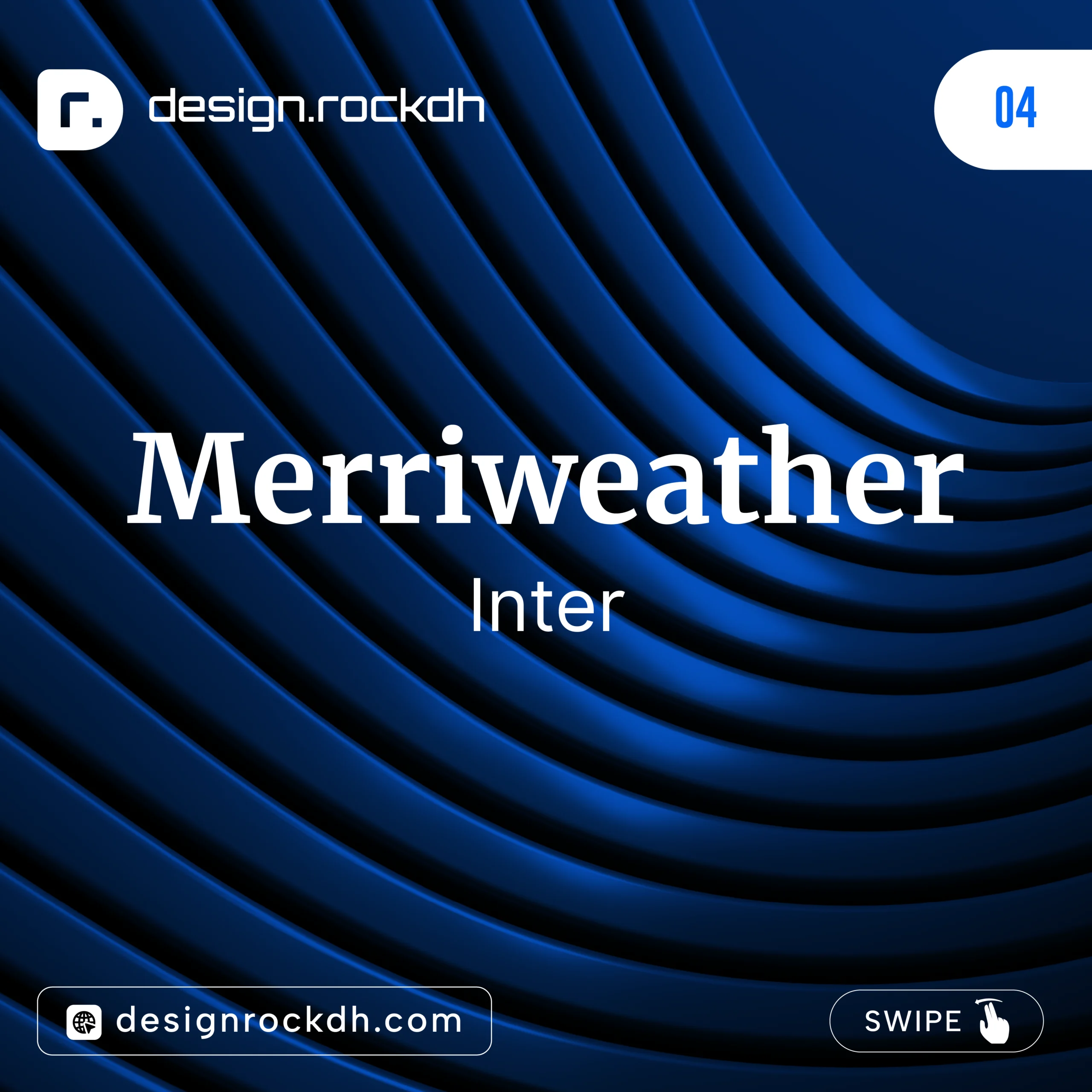
4. Merriweather + Inter
A fantastic combination for websites and blogs.
Merriweather creates attractive headlines while Inter offers exceptional readability on both desktop and mobile devices.
Best For
- Long-form articles
- News websites
- Online magazines
- Documentation
Download:
Merriweather:
https://fonts.google.com/specimen/Merriweather
Inter:
https://fonts.google.com/specimen/Inter
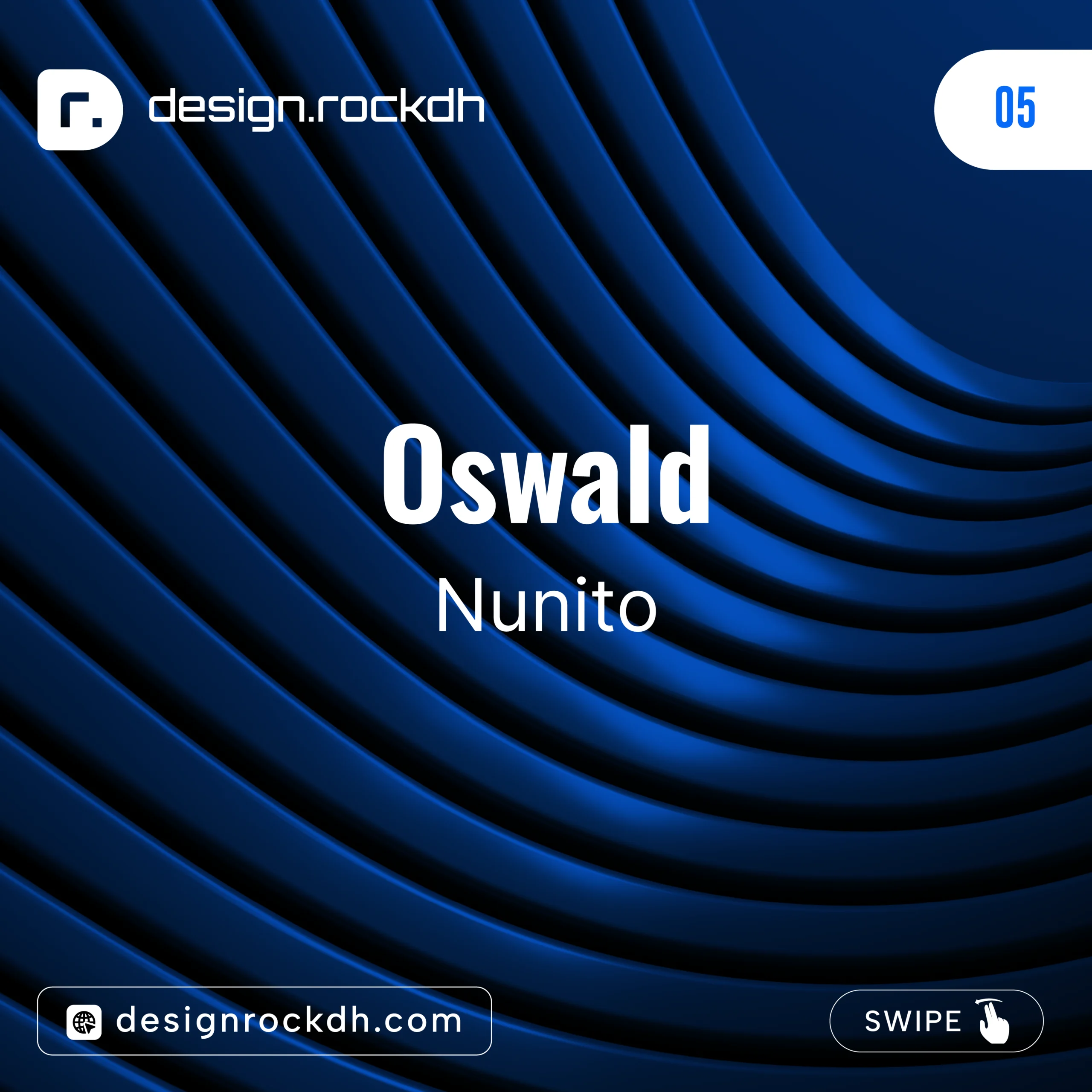
5. Oswald + Nunito
Oswald provides a bold, condensed style that immediately attracts attention.
Nunito adds warmth with its rounded characters.
Best For
- Restaurant menus
- Social media graphics
- Business promotions
- Product advertisements
Download:
Oswald:
https://fonts.google.com/specimen/Oswald
Nunito:
https://fonts.google.com/specimen/Nunito
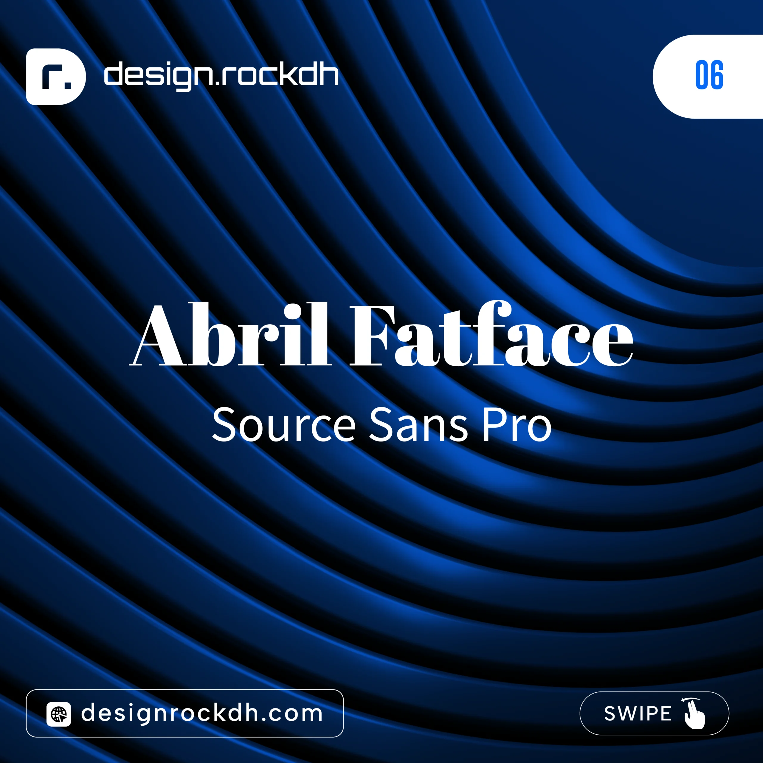
6. Abril Fatface + Source Sans Pro
This combination mixes dramatic headlines with a clean body font.
It creates a premium editorial appearance.
Best For
- Magazines
- Book covers
- Editorial layouts
- Landing pages
Download:
Abril Fatface:
https://fonts.google.com/specimen/Abril+Fatface
Source Sans Pro:
https://fonts.google.com/specimen/Source+Sans+3
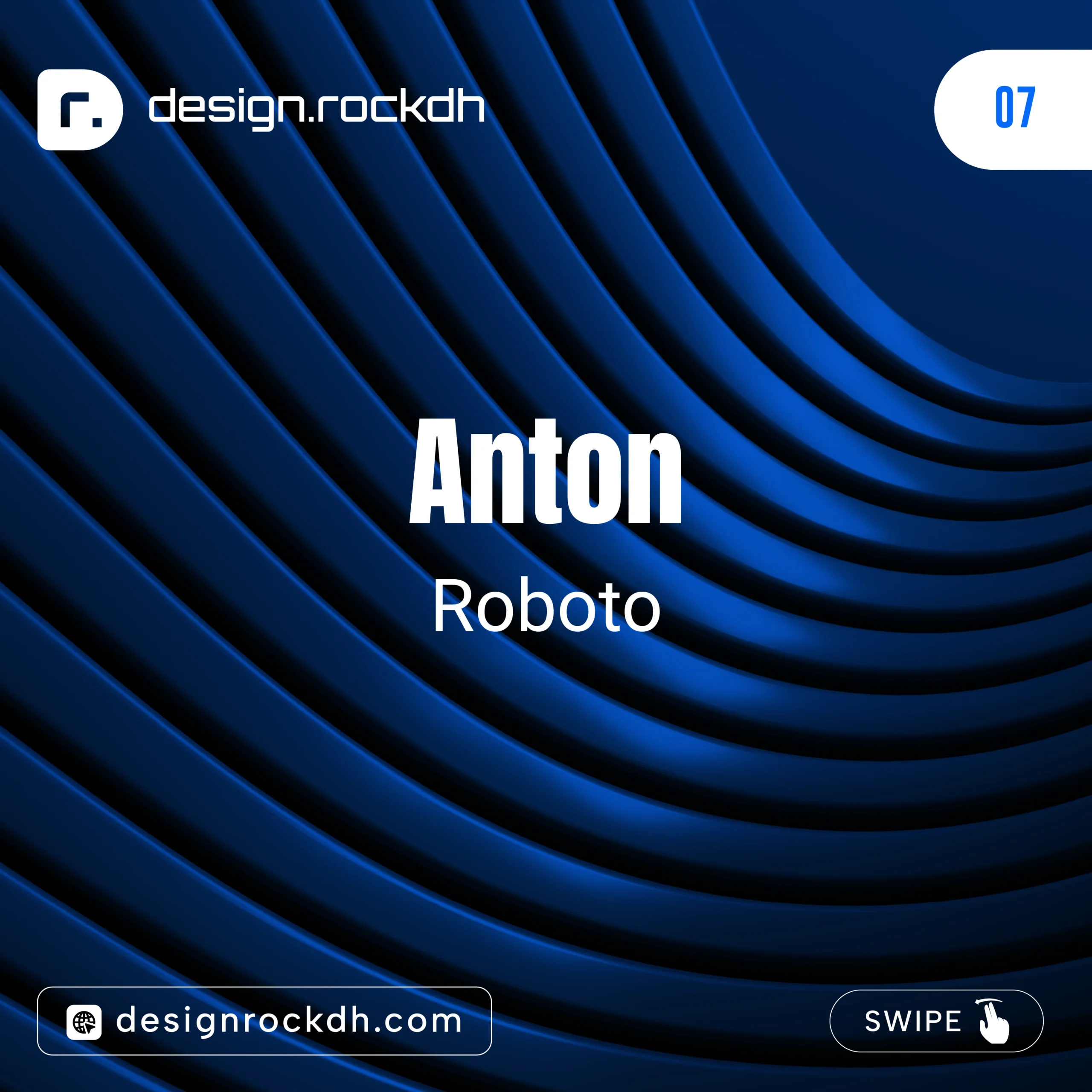
7. Anton + Roboto
Anton is bold and impossible to ignore.
Roboto balances the design with comfortable readability.
Best For
- YouTube thumbnails
- Advertising banners
- Product promotions
- Hero sections
Download:
Anton:
https://fonts.google.com/specimen/Anton
Roboto:
https://fonts.google.com/specimen/Roboto
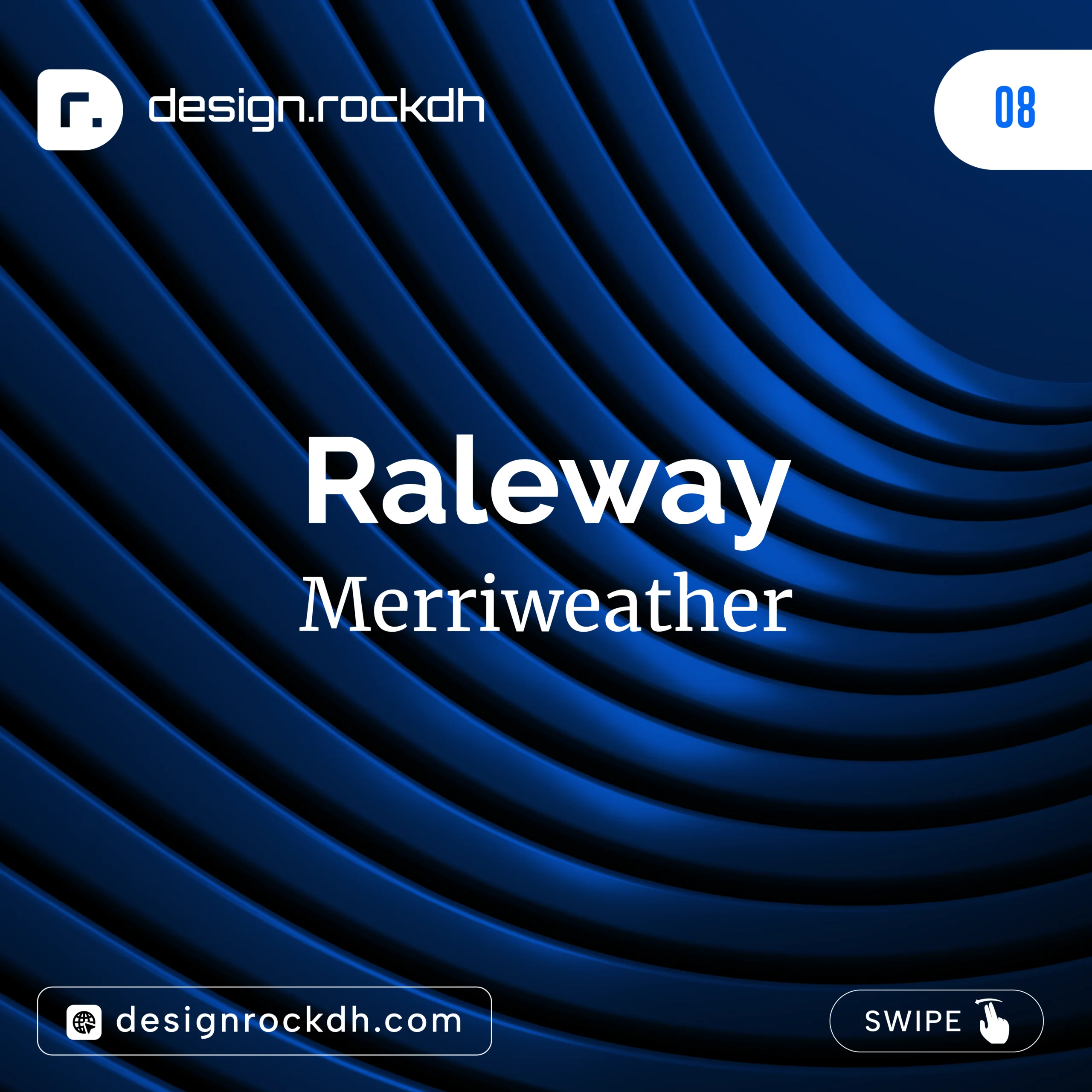
8. Raleway + Merriweather
Raleway has a sleek modern appearance.
Merriweather gives longer content a polished reading experience.
Best For
- Corporate websites
- Business reports
- Professional blogs
- Consulting firms
Download:
Raleway:
https://fonts.google.com/specimen/Raleway
Merriweather:
https://fonts.google.com/specimen/Merriweather
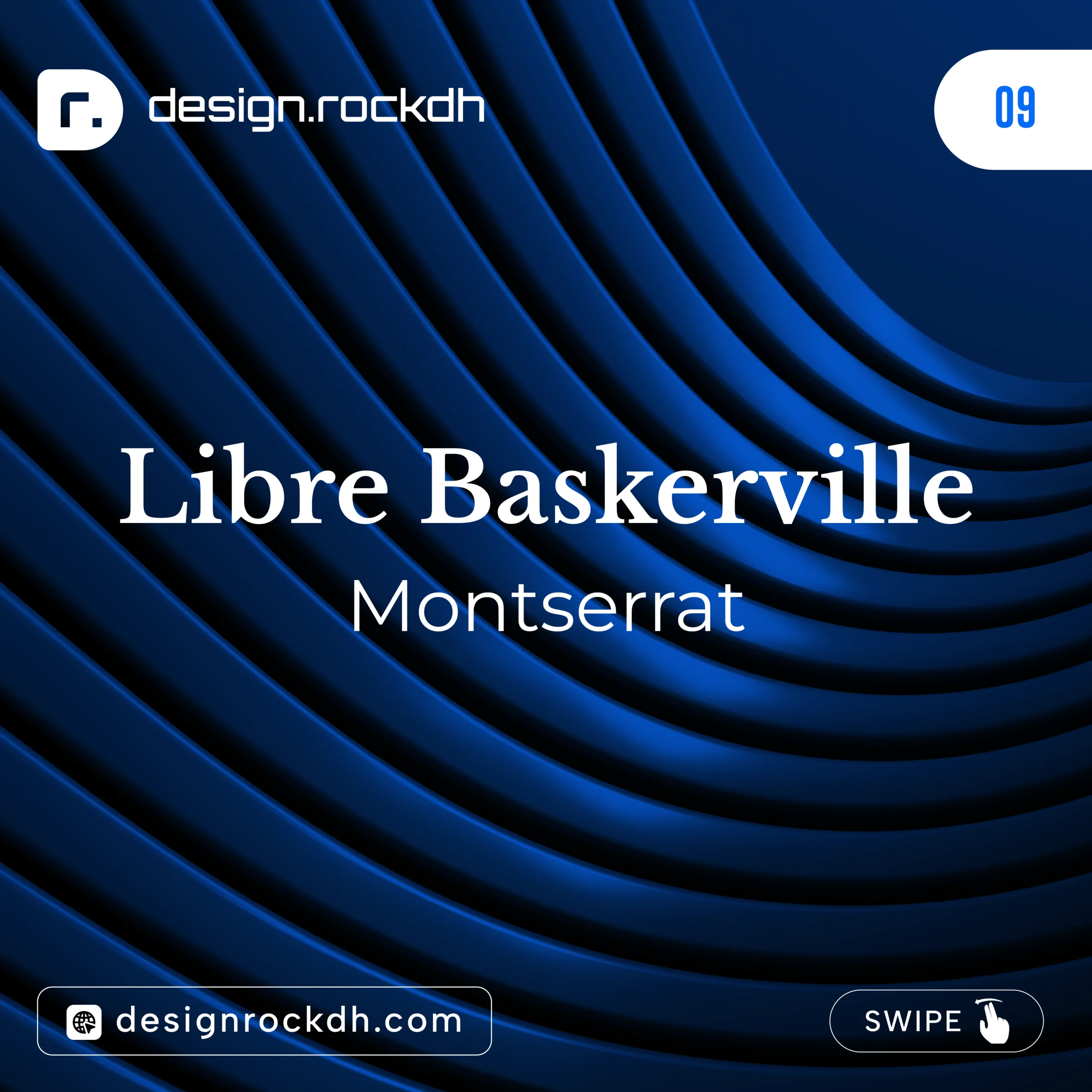
9. Libre Baskerville + Montserrat
Classic meets contemporary.
Libre Baskerville provides timeless elegance, while Montserrat keeps everything modern.
Best For
- Publishing
- Luxury branding
- Agency websites
- Editorial design
Download:
Libre Baskerville:
https://fonts.google.com/specimen/Libre+Baskerville
Montserrat:
https://fonts.google.com/specimen/Montserrat
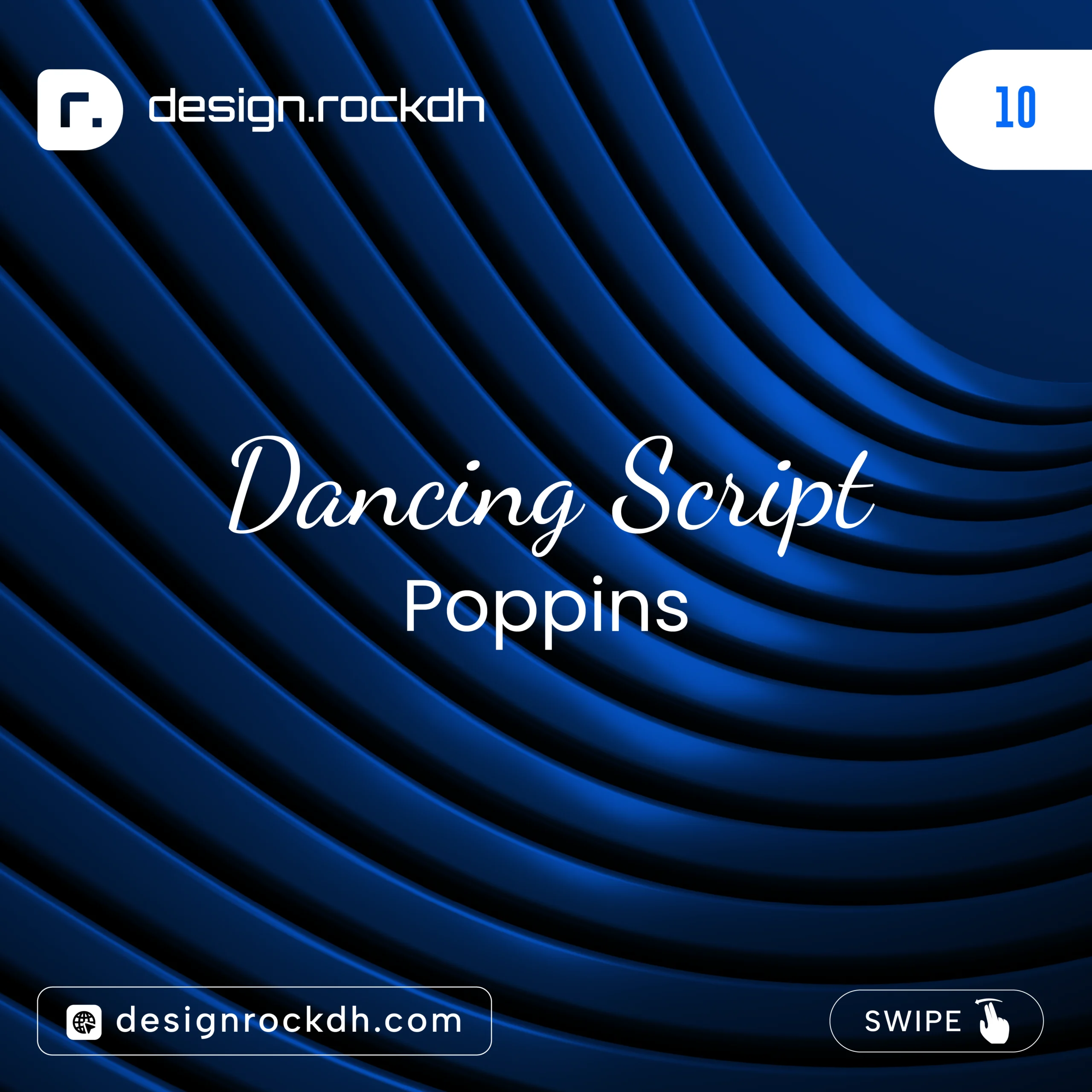
10. Dancing Script + Poppins
This pairing adds personality without sacrificing readability.
Use Dancing Script only for short headings.
Best For
- Greeting cards
- Wedding invitations
- Instagram posts
- Handmade product branding
Download:
Dancing Script:
https://fonts.google.com/specimen/Dancing+Script
Poppins:
https://fonts.google.com/specimen/Poppins
How to Choose the Right Font Pair
Before selecting fonts, ask yourself these simple questions.
Who is your audience?
Designs for children should feel playful.
Business websites should feel trustworthy.
Luxury brands should feel elegant.
Technology companies usually prefer modern sans serif fonts.
Understanding your audience helps narrow your font choices.
What is the purpose?
Different projects require different typography.
Examples include:
- Blog article
- Mobile app
- Company website
- Logo
- Business card
- Presentation
- Restaurant menu
- Event poster
Each project has unique typography needs.
Is the font readable?
Even the most beautiful font is useless if readers struggle to understand the text.
Always preview your design on different screen sizes before publishing.
Does the font support multiple languages?
If your audience is international, choose fonts that support extended character sets.
Google Fonts provides language support information for each font family.
Font Pairing Tips for Different Design Projects
Website Design
Keep headings bold.
Use a highly readable body font.
Avoid decorative fonts in paragraphs.
Maintain consistent spacing.
Logo Design
Use one memorable font.
Avoid combining several decorative fonts.
Simple logos remain recognizable across all sizes.
Social Media Graphics
Large bold headlines work best.
Pair them with simple supporting text.
Remember that users often scroll quickly, so readability is critical.
Business Presentations
Professional presentations should use clean typography.
Recommended combinations include:
- Montserrat + Lora
- Poppins + Inter
- Merriweather + Open Sans
These combinations look modern while remaining easy to read on large screens.
Branding Projects
Choose fonts that match the company’s personality.
Luxury brands often prefer serif fonts.
Technology startups usually prefer geometric sans serif fonts.
Creative agencies often mix bold display fonts with minimal body text.
Common Font Pairing Mistakes to Avoid
Even experienced designers occasionally make typography mistakes. Fortunately, most of these issues are easy to avoid once you understand the fundamentals.
1. Using Too Many Fonts
One of the biggest mistakes is using four or five different fonts in a single design.
Instead, limit yourself to:
- One heading font
- One body font
- One optional accent font
Too many fonts make a design look cluttered and unprofessional.
2. Choosing Fonts That Look Too Similar
Fonts should complement each other, not compete.
For example:
 Roboto + Open Sans
Arial + Helvetica
Lato + Open Sans
These combinations are so similar that they don’t create enough visual hierarchy.
Instead, combine different styles.
Examples:
 Playfair Display + Poppins
Oswald + Inter
Merriweather + Montserrat
3. Ignoring Font Hierarchy
Every design needs clear structure.
Readers should instantly recognize:
- Main heading
- Subheading
- Body text
- Captions
- Buttons
If everything looks the same size and weight, readers won’t know where to focus.
4. Using Decorative Fonts Everywhere
Display and script fonts are designed to attract attention—not to be read in long paragraphs.
Good practice:
- Decorative font for titles
- Clean sans serif font for paragraphs
This creates a balanced design that’s both attractive and readable.
5. Forgetting Line Spacing
Even perfect font pairing can fail if the spacing is poor.
Recommended line height:
- Body text: 1.5–1.8
- Headings: 1.2–1.3
Proper spacing improves readability and gives your content room to breathe.
6. Ignoring Mobile Users
More than half of web traffic now comes from smartphones.
Always test your typography on:
- Desktop
- Tablet
- Mobile
A font that looks great on a large monitor may appear too small or cramped on a phone.
Best Websites to Download Free Fonts
Here are some trusted sources for high-quality fonts.
Google Fonts
The most popular free font library, offering hundreds of open-source fonts optimized for both web and print.
Fontshare
A growing collection of professionally designed fonts that are free for personal and commercial use.
Adobe Fonts
Available with Adobe Creative Cloud, offering thousands of premium fonts for designers.
DaFont
A huge collection of decorative and creative fonts. Always check the license before using a font commercially.
Font Squirrel
Curates fonts that are free for commercial use, making it a reliable source for business projects.
Professional Typography Tips
Great typography is about more than choosing attractive fonts. Keep these practical tips in mind:
- Maintain consistent font sizes throughout your project.
- Use bold weights to emphasize headings instead of adding extra fonts.
- Leave enough white space around text to improve readability.
- Limit line length to about 50–75 characters for comfortable reading.
- Ensure strong contrast between text and background.
- Avoid using all capital letters for long paragraphs.
- Keep font styles consistent across every page of your website or brand materials.
These small adjustments can dramatically improve the overall look and usability of your designs.
Summary
Font pairing is both an art and a practical design skill. While there are no absolute rules, understanding typography principles allows you to make informed choices that enhance both aesthetics and readability.
The most effective font combinations create contrast without conflict, establish a clear visual hierarchy, and match the tone of your project. Whether you’re designing a website, logo, presentation, or social media graphic, thoughtful font pairing helps communicate your message more clearly and leaves a lasting impression on your audience.
Remember that simplicity often leads to the best results. Start with two complementary fonts, focus on readability, and maintain consistency throughout your design. As you gain experience, you’ll develop an eye for combinations that feel balanced, professional, and visually engaging.
Typography is more than just selecting attractive fonts—it’s about creating an enjoyable reading experience. Master the basics of font pairing, and every design you create will become more polished, effective, and memorable.

Very informative blog for font pairing