If you’re searching for the best sans serif fonts for branding, logo design, UI/UX, websites, social media, or graphic design, you’ve come to the right place. In this guide, you’ll discover some of the most popular free and premium sans serif fonts available in 2026, along with practical use cases, font pairing suggestions, and download resources to help you choose the right typeface for your next project.
Typography is one of the most powerful elements of visual design. It shapes how people perceive a brand, influences readability, and helps communicate your message clearly. Even a beautifully designed logo, website, or marketing campaign can lose its impact if the typography doesn’t match the overall design.
Among all typeface categories, sans serif fonts continue to dominate modern design. Their clean lines, minimal style, and excellent readability make them a favorite for designers across digital and print media. From startup branding and mobile apps to business websites and social media graphics, these fonts offer the flexibility needed for almost any creative project.
Whether you’re building a portfolio website, designing a user interface, creating marketing materials, or developing a complete brand identity, selecting the right sans serif font can instantly elevate the quality and professionalism of your work.
In this guide, you’ll learn what makes sans serif fonts so popular, explore the best free and premium options available today, discover effective font pairings, and find recommendations for different design projects.
What Are Sans Serif Fonts?
The term “sans serif” comes from the French word sans, meaning “without.” Simply put, sans serif fonts are typefaces that do not include the small decorative strokes, known as serifs, found at the ends of letters in traditional serif fonts.
Instead, they feature:
Clean, uncluttered lines
Simple geometric or humanist letterforms
A modern and professional appearance
Excellent readability on screens of all sizes
Because of their minimal design, sans serif fonts have become the preferred choice for websites, mobile applications, software interfaces, and digital products. They remain clear and easy to read on everything from smartphones to large desktop displays, making them ideal for today’s digital-first world.
Why Designers Prefer Sans Serif Fonts
There’s a reason many of the world’s leading brands rely on sans serif typography. Companies like Google, Spotify, Airbnb, Netflix, Adobe, and countless technology startups use these fonts to create clean, modern, and highly recognizable visual identities.
Designers appreciate sans serif fonts because they offer several important advantages:
Excellent readability across both desktop and mobile devices
A clean, professional look that suits modern branding
Strong versatility for websites, apps, presentations, and marketing materials
Better user experience thanks to clear, legible typography
A timeless style that rarely feels outdated
Improved visual hierarchy when combined with different font weights
Another advantage is their flexibility. Sans serif fonts pair beautifully with serif typefaces, allowing designers to create balanced typography systems for editorials, websites, and brand identities. This combination adds visual contrast while maintaining a polished and cohesive design.
Best Free Sans Serif Fonts Every Designer Should Try
High-quality typography doesn’t always come with a price tag. Many of today’s most popular sans serif fonts are completely free and offer professional results for branding, web design, UI/UX, marketing, and print projects. Whether you’re just starting out or expanding your font library, these typefaces deserve a place in your toolkit.
1. Inter
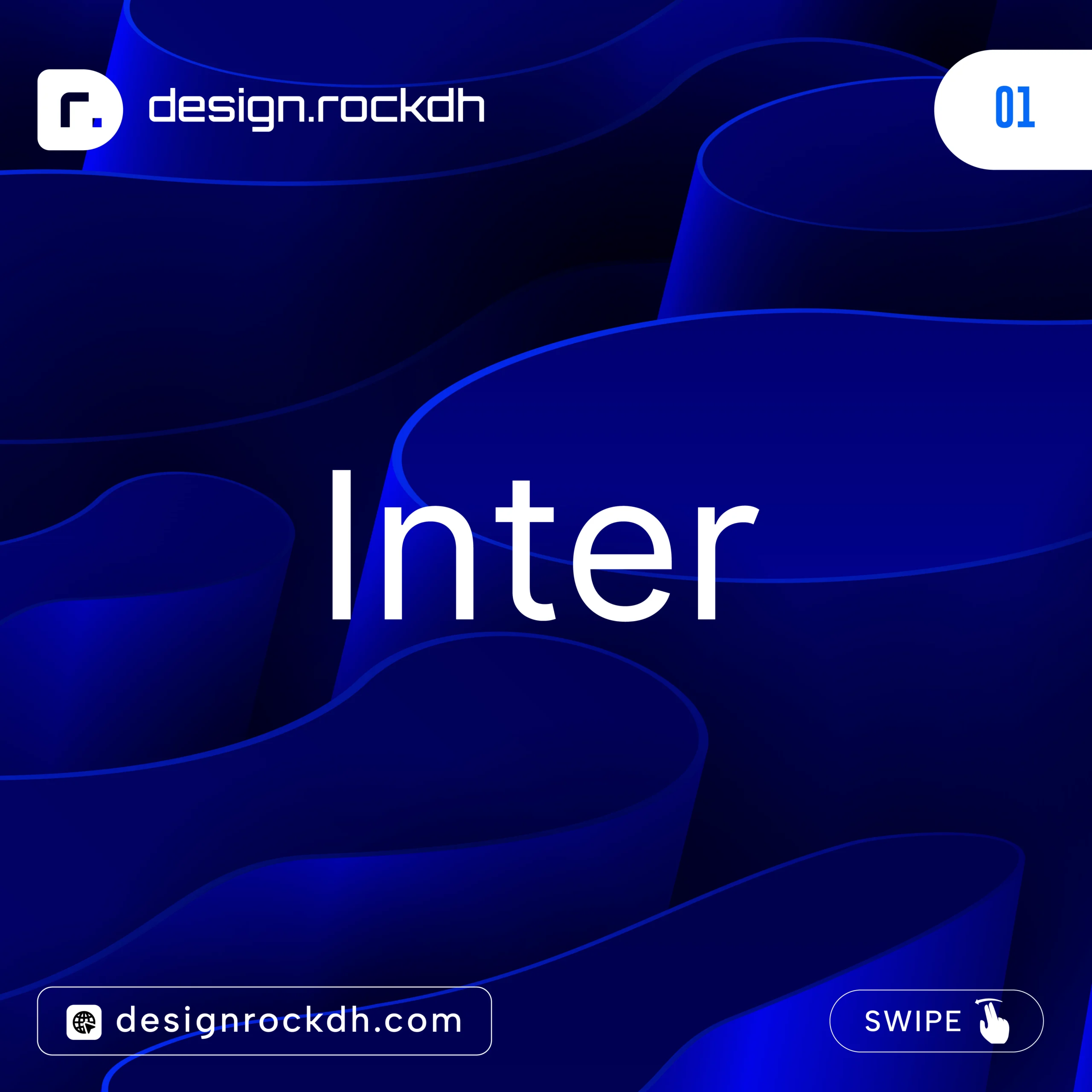
Inter has become one of the most trusted fonts for digital products and user interfaces. Designed specifically for screens, it delivers exceptional readability at both small and large sizes, making it a favorite among UI and UX designers.
Best for:
UI and UX design
Websites
Mobile apps
SaaS dashboards
Digital products
Download:
https://fonts.google.com/specimen/Inter
2. Poppins
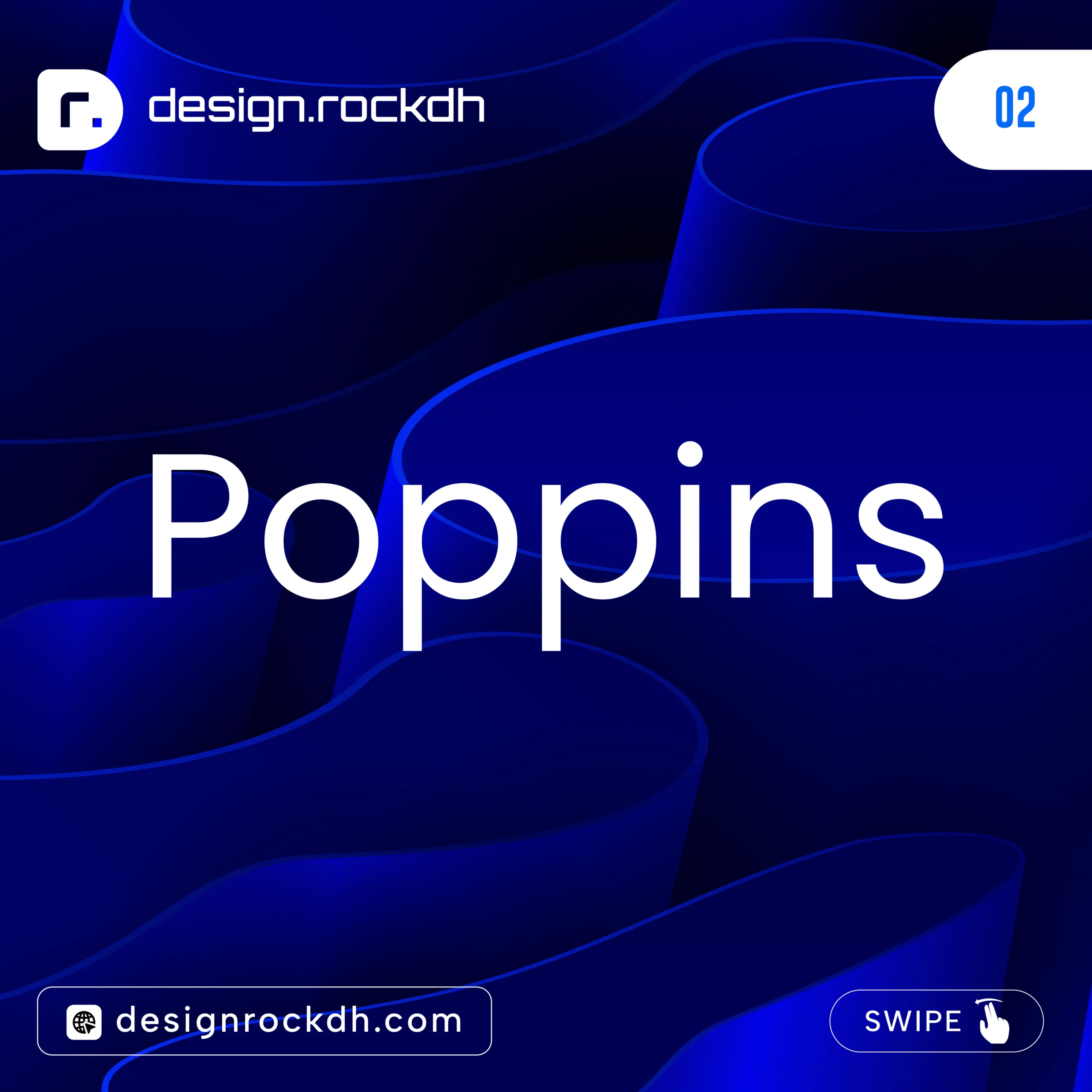
Poppins combines clean geometric shapes with subtle rounded details, creating a modern look that’s both professional and approachable. Its versatility makes it suitable for everything from branding to social media graphics.
Best for:
Branding projects
Social media content
Marketing materials
Presentations
Creative websites
Download:
https://fonts.google.com/specimen/Poppins
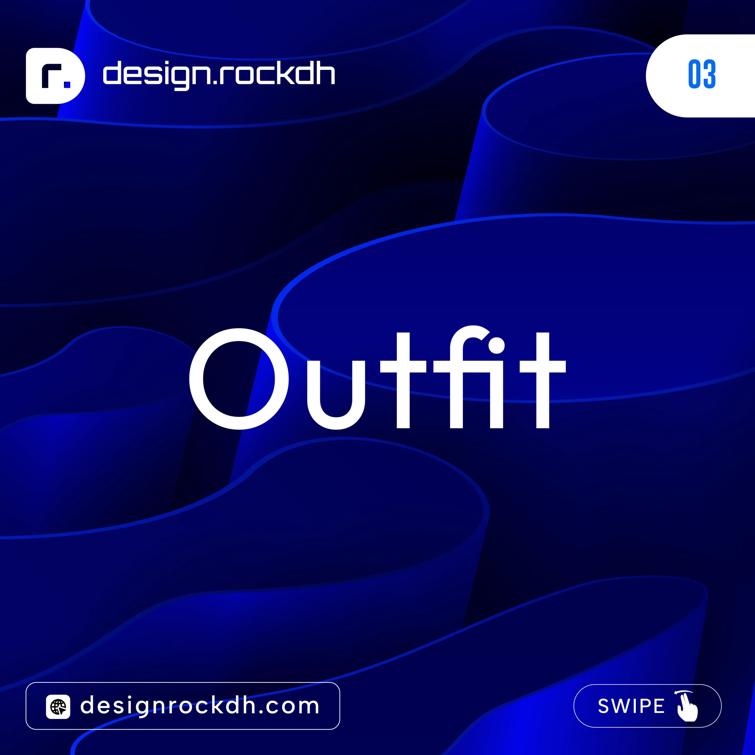
3. Outfit
Outfit has quickly gained popularity among designers who prefer bold, contemporary typography. Its clean structure makes it especially effective for large headings and modern website layouts.
Best for:
Landing pages
Hero sections
Creative agency websites
Portfolio sites
Modern branding
Download:
https://fonts.google.com/specimen/Outfit
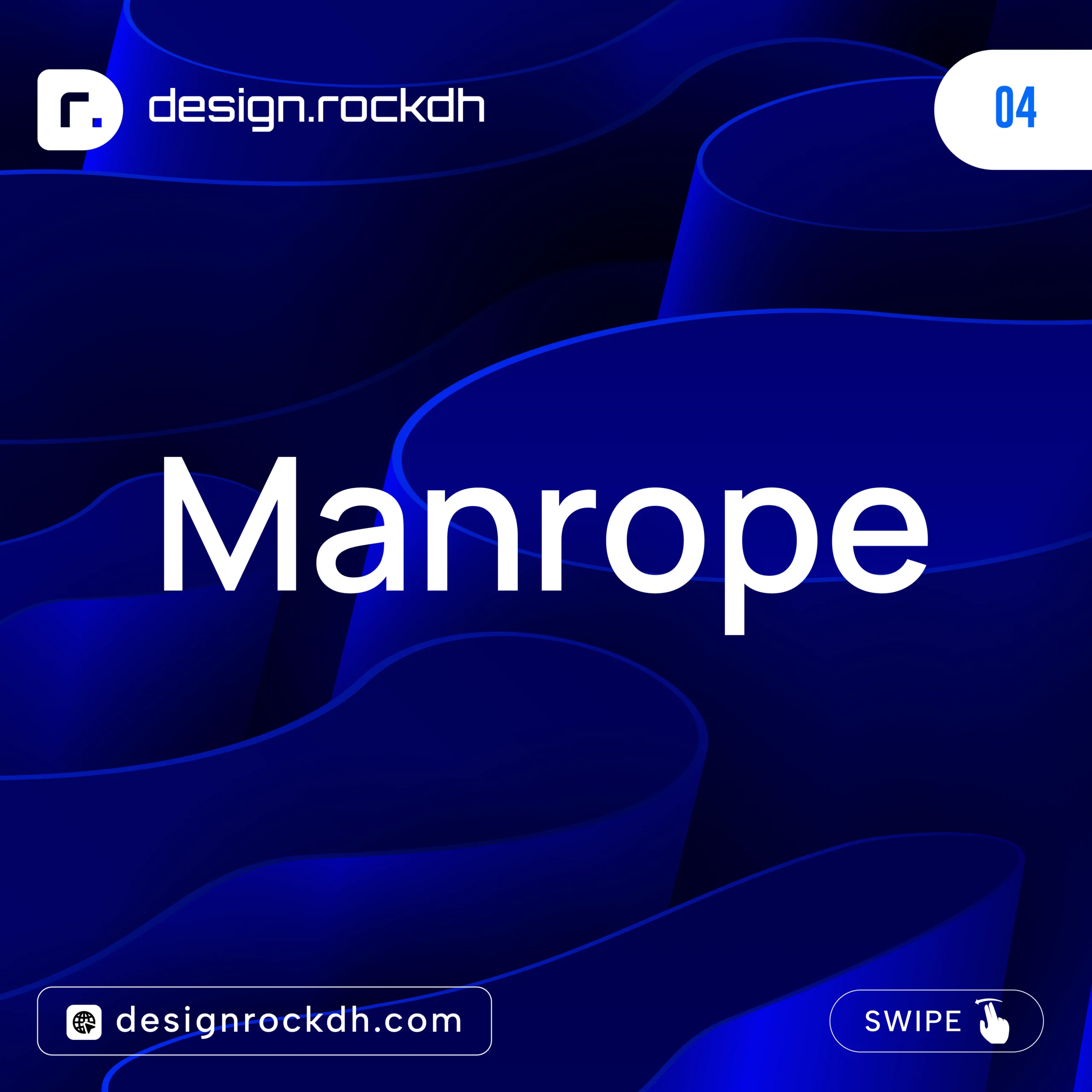
4. Manrope
If you’re looking for a font that feels minimal, elegant, and highly readable, Manrope is an excellent choice. Its balanced proportions work beautifully across both digital interfaces and business-focused designs.
Best for:
SaaS platforms
Corporate websites
Financial services
UI design
Professional branding
Download:
https://fonts.google.com/specimen/Manrope
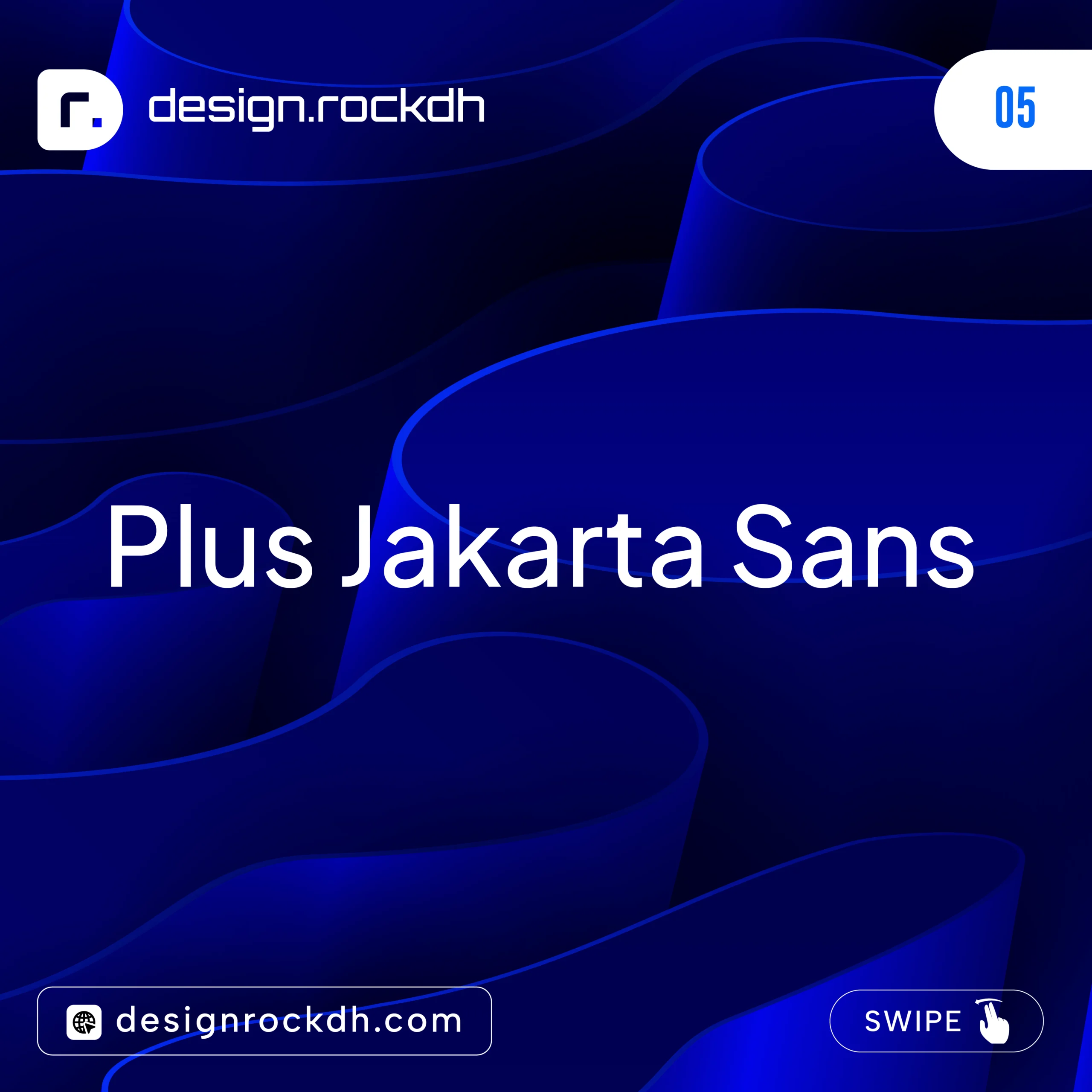
5. Plus Jakarta Sans
Plus Jakarta Sans is one of the fastest-growing open-source fonts in modern design. With its clean appearance and excellent readability, it’s a great option for startups and technology brands.
Best for:
Startup branding
Mobile applications
Product design
Dashboards
Modern business websites
Download:
https://fonts.google.com/specimen/Plus+Jakarta+Sans
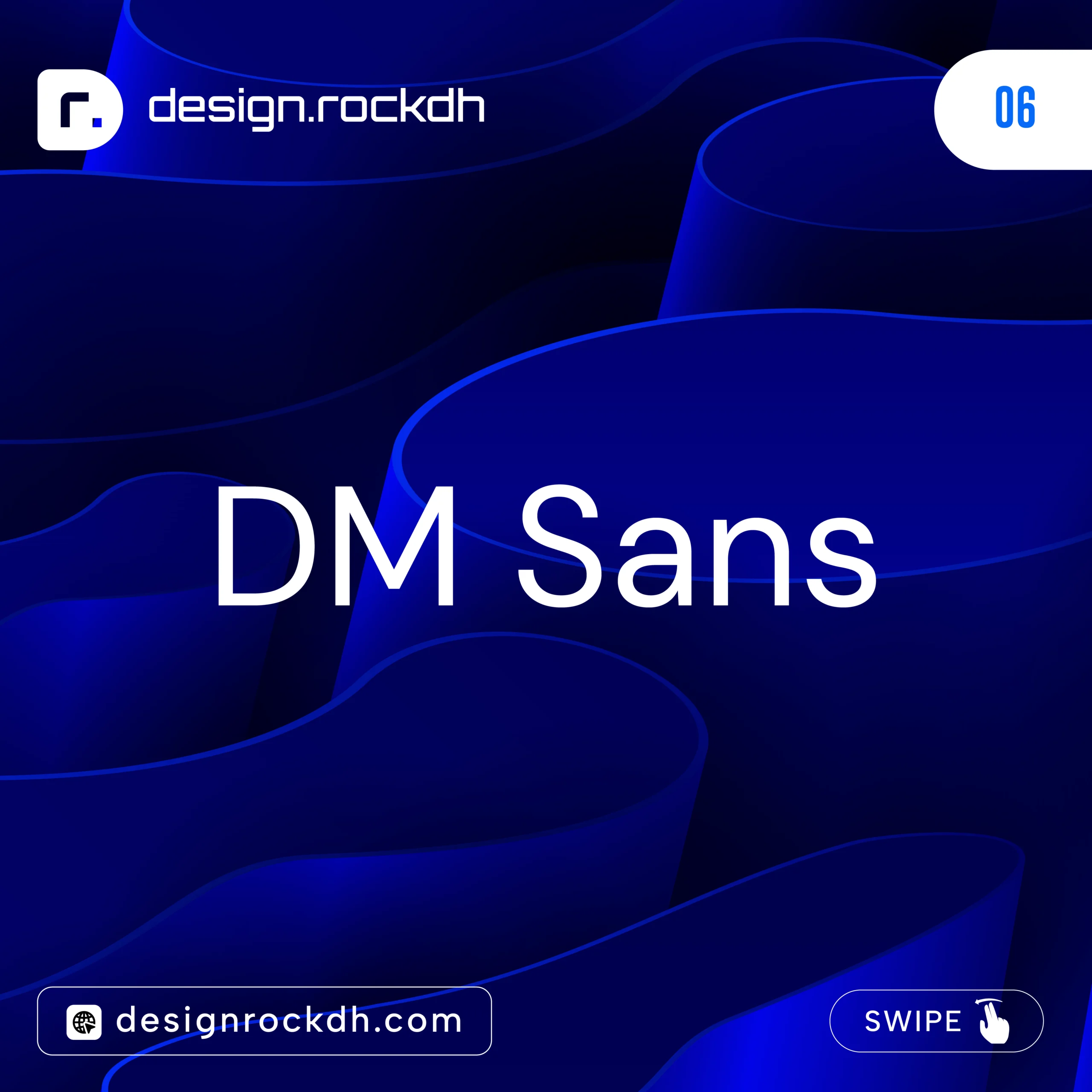
6. DM Sans
Inspired by classic geometric typography, DM Sans delivers a clean and friendly appearance without sacrificing professionalism. It’s flexible enough for both interface design and marketing materials.
Best for:
User interfaces
Business websites
Presentations
Social media graphics
Marketing campaigns
Download:
https://fonts.google.com/specimen/DM+Sans
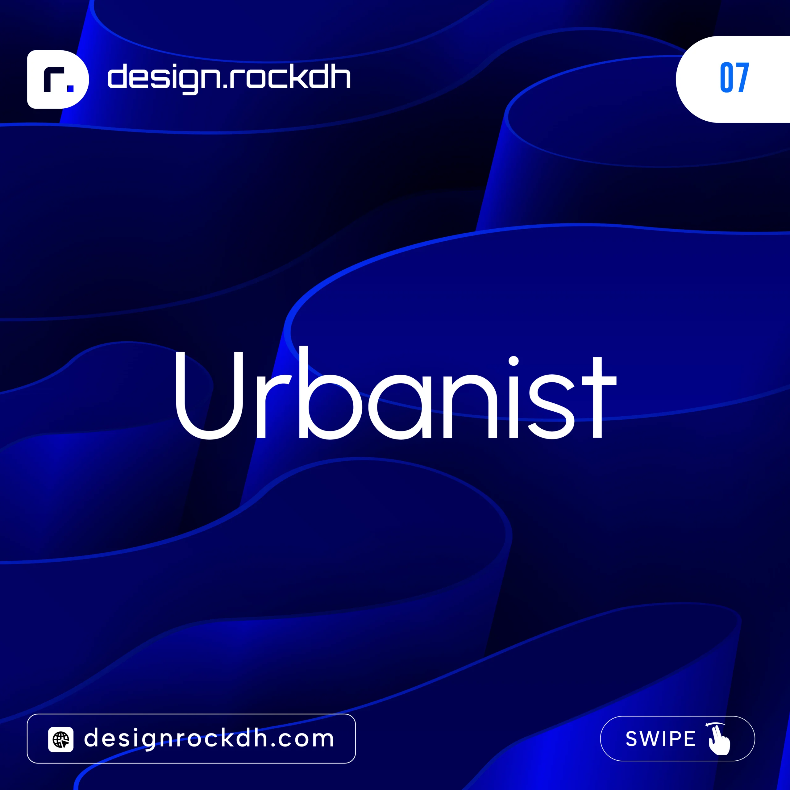
7. Urbanist
For projects that need a modern or futuristic feel, Urbanist is an excellent option. Its geometric style works particularly well for technology companies, AI products, and innovative brands.
Best for:
Technology companies
AI startups
Software products
Modern branding
Digital experiences
Download:
https://fonts.google.com/specimen/Urbanist
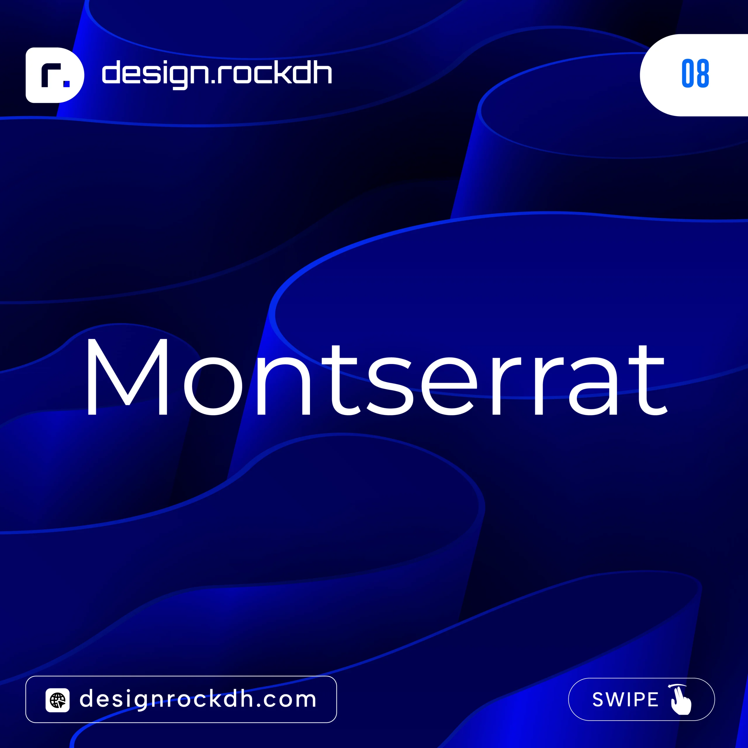
8. Montserrat
Few fonts have remained as consistently popular as Montserrat. Its timeless design, clean lines, and wide range of weights make it one of the most versatile fonts available today.
Best for:
Logo design
Headlines
Posters
Websites
Brand identities
Download:
https://fonts.google.com/specimen/Montserrat
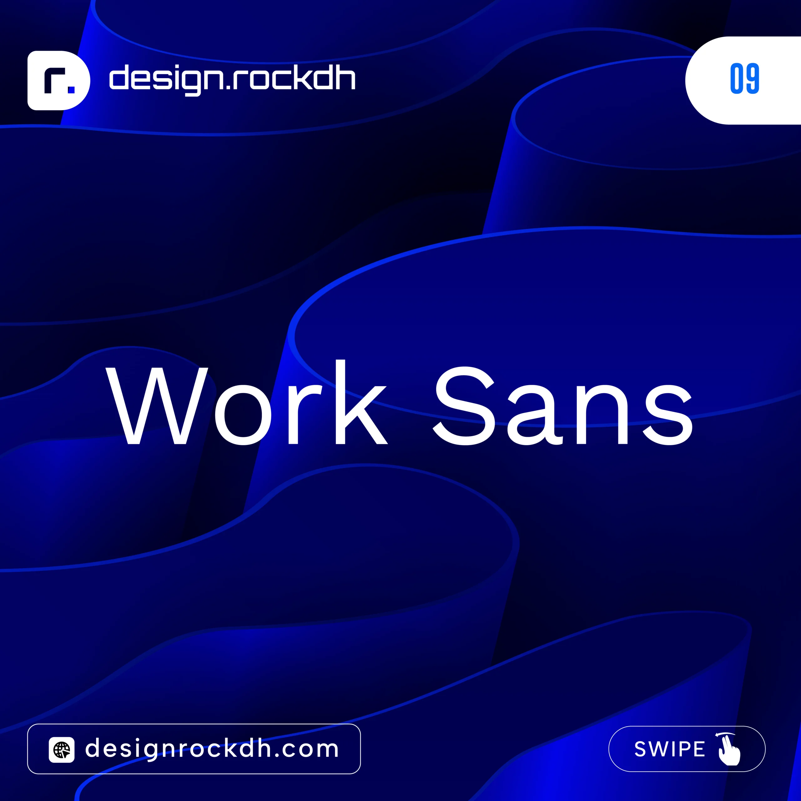
9. Work Sans
Designed with readability in mind, Work Sans performs exceptionally well for long-form content. It’s a reliable choice for blogs, articles, and corporate websites where clear typography is essential.
Best for:
Blogs
Articles
Corporate websites
UI design
Editorial content
Download:
https://fonts.google.com/specimen/Work+Sans
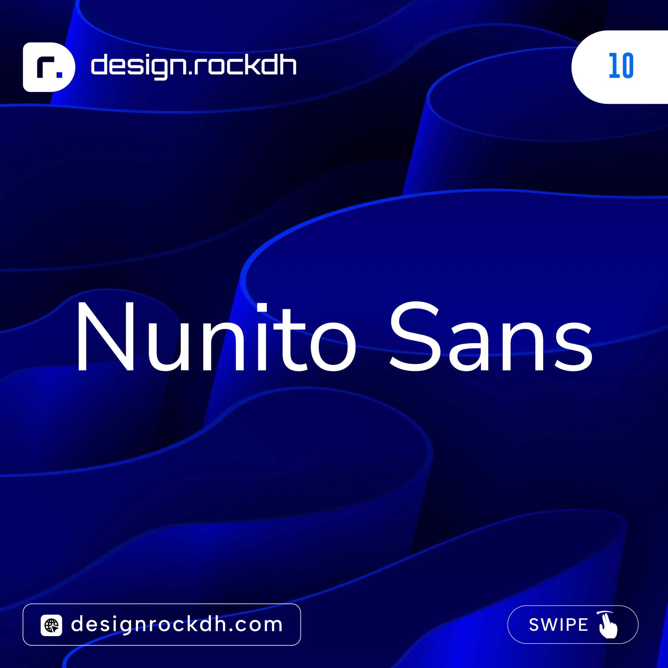
10. Nunito Sans
Nunito Sans features soft, rounded letterforms that create a friendly and welcoming appearance. It’s widely used in educational platforms, healthcare websites, and family-focused brands.
Best for:
Education websites
Healthcare brands
Children’s products
Mobile apps
Friendly business branding
Download:
https://fonts.google.com/specimen/Nunito+Sans
Why These Free Fonts Stand Out
The best free sans serif fonts combine professional quality with outstanding versatility. They include multiple font weights, support dozens of languages, and perform beautifully across websites, mobile apps, branding projects, presentations, and marketing materials.
Whether you’re creating a sleek startup identity, designing a modern website, or developing a mobile application, these fonts provide the flexibility and readability needed for professional results—all without adding to your budget.
Premium Sans Serif Fonts Worth the Investment
While free fonts are more than capable of handling many design projects, premium typefaces often provide additional refinements, broader language support, and highly polished character sets. If you’re creating high-end brand identities, editorial layouts, or commercial design work, investing in a professional font family can make a noticeable difference.
Here are some of the most respected premium sans serif fonts used by designers and creative agencies around the world:
Neue Haas Grotesk – A timeless classic known for its clean, balanced design.
Circular – Friendly, modern, and widely recognized in digital branding.
GT America – Combines the best qualities of American and European typography.
Suisse Int’l – A minimalist typeface favored by luxury brands and creative studios.
Avenir Next – Elegant, highly legible, and suitable for both print and digital projects.
Gotham – Famous for its bold, confident style and strong branding presence.
Proxima Nova – One of the most versatile sans serif fonts for websites and marketing.
Sofia Pro – Soft, contemporary, and ideal for lifestyle and creative brands.
Graphik – Clean and highly adaptable, making it a favorite for technology companies.
Brandon Grotesque – A geometric font with a warm, approachable personality.
Although premium fonts require a purchase, they often include extensive font weights, advanced OpenType features, multilingual support, and commercial licensing options, making them a worthwhile investment for professional designers.
Best Sans Serif Fonts for Logo Design
A great logo starts with the right typography. The font you choose helps communicate your brand’s personality, values, and level of professionalism. Clean, balanced sans serif fonts create logos that remain readable across websites, business cards, packaging, and large-format signage.
Some of the best sans serif fonts for logo design include:
Outfit – Modern and bold with excellent versatility.
Montserrat – A timeless favorite for contemporary branding.
Gotham – Strong, confident, and highly recognizable.
Circular – Friendly and approachable without losing professionalism.
Graphik – Minimal and sophisticated.
Avenir Next – Elegant with excellent readability.
Poppins – Geometric and stylish for modern brands.
Manrope – Clean, refined, and perfect for technology-focused businesses.
These fonts work particularly well because they maintain their clarity and visual impact at every size, from mobile app icons to billboard advertisements.
Best Sans Serif Fonts for Websites
Website typography needs to be readable, responsive, and visually appealing across all screen sizes. Choosing a font optimized for digital use helps improve the overall user experience while making your content easier to read.
Here are some of the best choices for web design:
| Font | Best For |
|---|---|
| Inter | UI design, SaaS platforms, and web applications |
| Manrope | Business websites and corporate brands |
| DM Sans | Marketing websites and landing pages |
| Poppins | Creative portfolios and agency websites |
| Work Sans | Blogs, articles, and editorial content |
| Plus Jakarta Sans | Startup websites and digital products |
| Outfit | Landing pages and modern homepage designs |
These fonts are optimized for digital environments, load efficiently, and remain highly readable on desktops, tablets, and smartphones.
Best Sans Serif Fonts for UI/UX Design
When designing user interfaces, readability and consistency are just as important as visual style. Interface fonts should remain clear at smaller sizes while providing enough flexibility for buttons, menus, forms, and navigation elements.
Many experienced UI and UX designers rely on the following fonts:
Inter
Manrope
Plus Jakarta Sans
DM Sans
IBM Plex Sans
Source Sans 3
These typefaces are carefully designed for digital products and perform exceptionally well across websites, mobile applications, dashboards, and software interfaces. Their balanced spacing, multiple font weights, and excellent screen rendering help create intuitive, user-friendly experiences that feel polished and professional.
Font Pairing Ideas
Choosing the right font is only half the job. Pairing complementary typefaces creates visual contrast, improves readability, and gives your designs a polished, professional appearance. A well-balanced font combination helps establish hierarchy, making it easier for readers to navigate your content.
Here are a few tried-and-tested sans serif font pairings that work beautifully across websites, branding projects, presentations, and marketing materials.
Pairing 1
Heading: Montserrat
Body: Inter
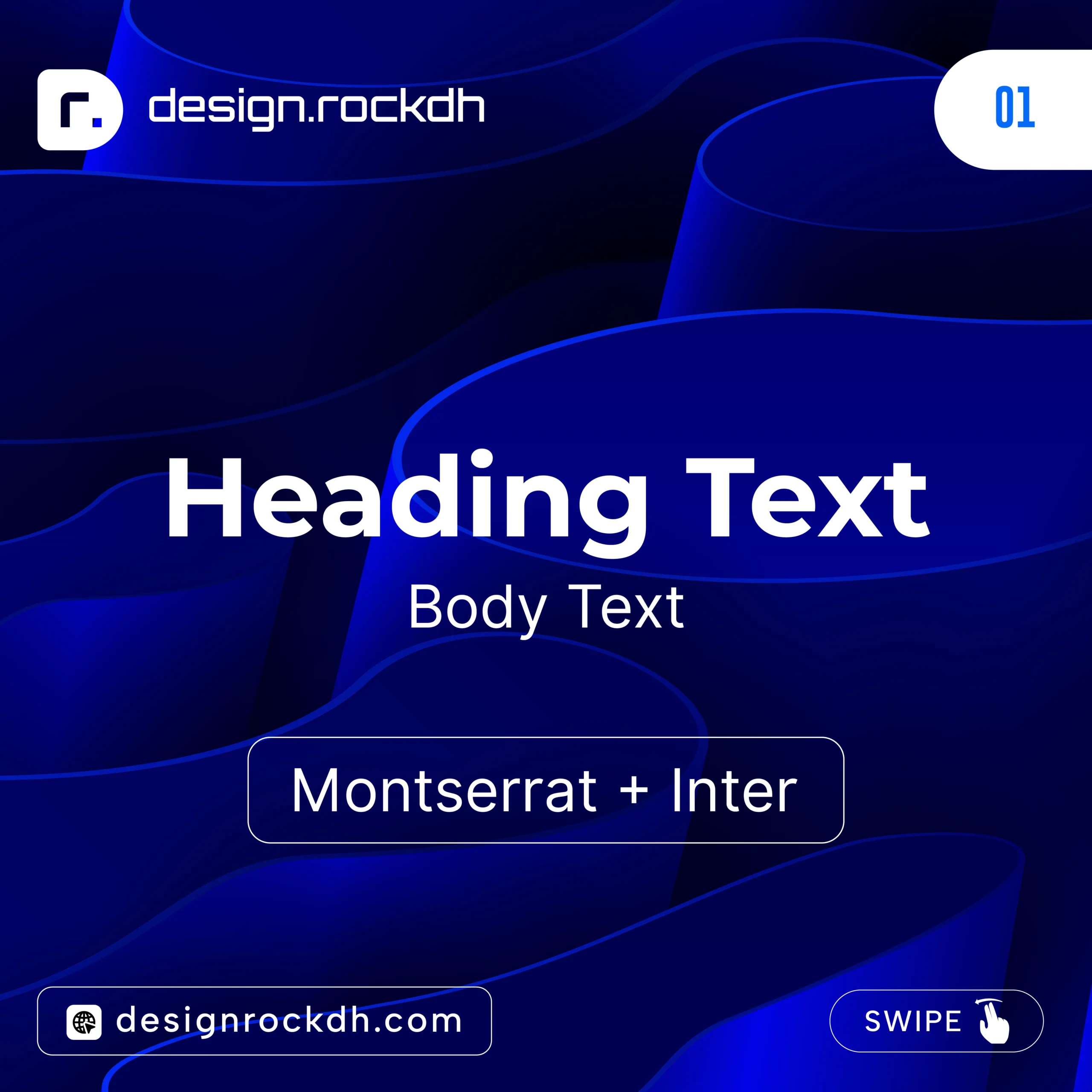
This combination blends bold, eye-catching headlines with highly readable body text. It’s an excellent choice for business websites, SaaS platforms, and modern corporate branding.
Pairing 2
Heading: Outfit
Body: Manrope
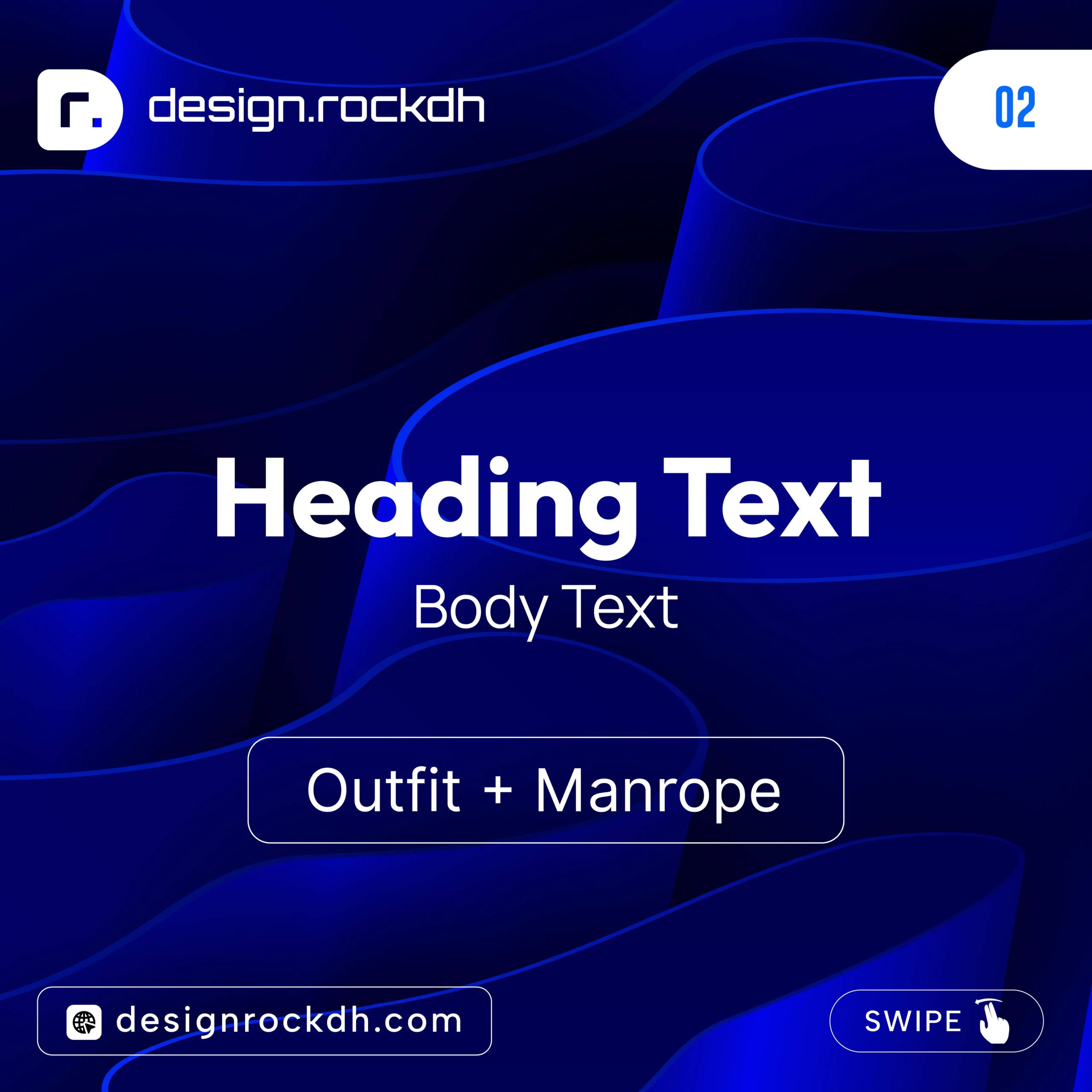
Outfit adds a bold, contemporary feel to headings, while Manrope keeps longer paragraphs clean and comfortable to read. This pairing is ideal for portfolios, creative agencies, and landing pages.
Pairing 3
Heading: Poppins
Body: Work Sans
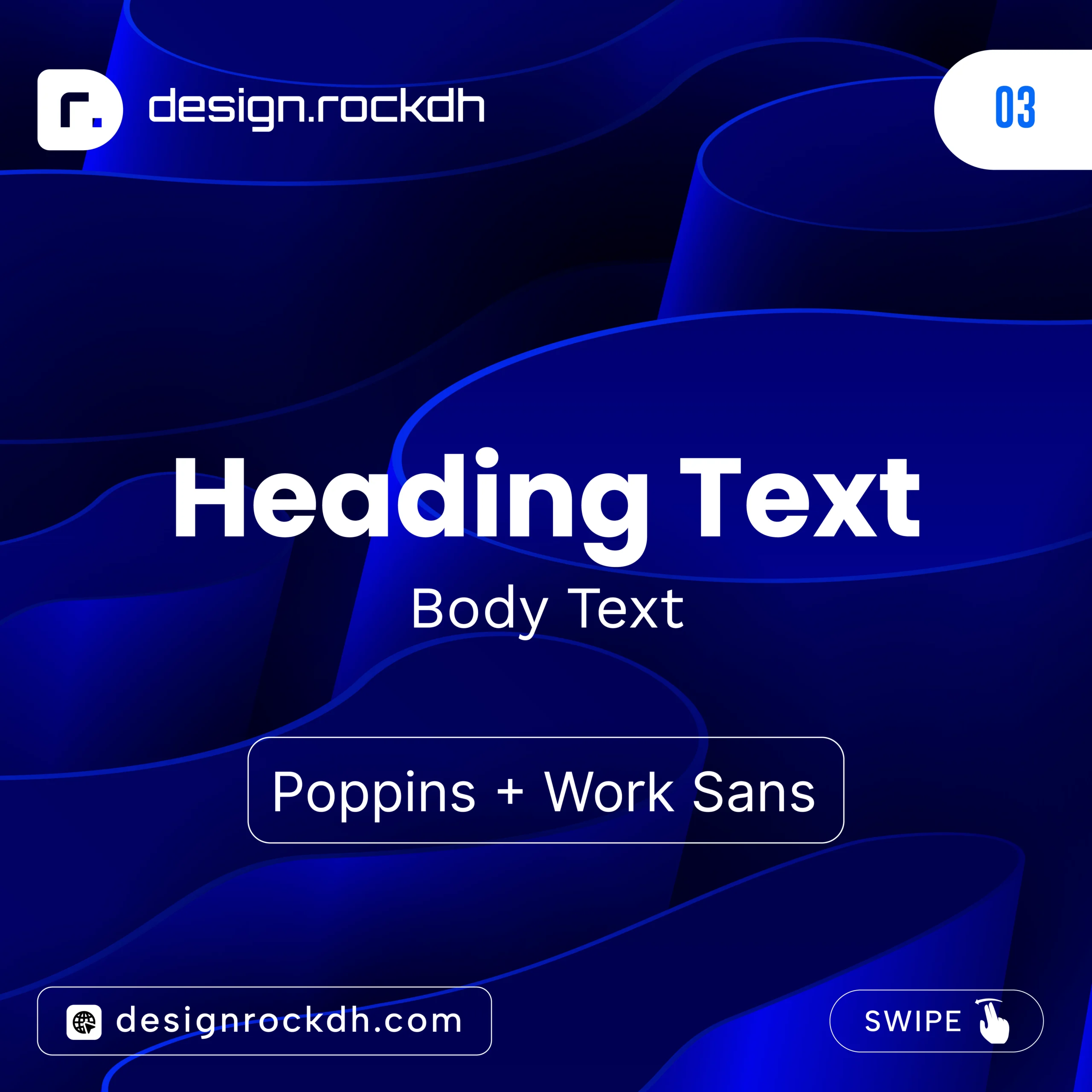
Poppins brings personality to titles, while Work Sans offers excellent readability for articles and longer content. Together, they create a balanced, approachable design suitable for blogs, educational websites, and digital publications.
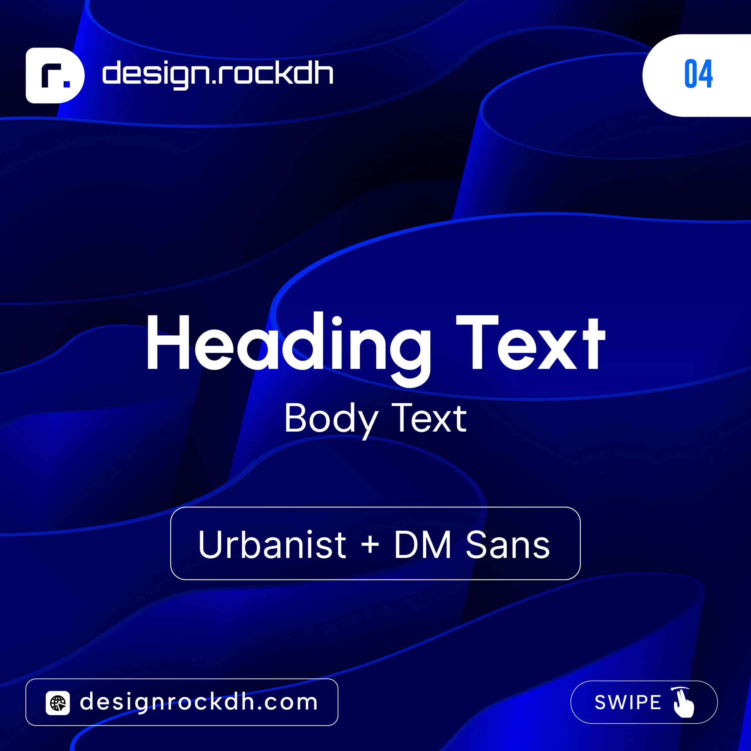
Pairing 4
Heading: Urbanist
Body: DM Sans
Pairing 5
Heading: Plus Jakarta Sans
Body: Nunito Sans
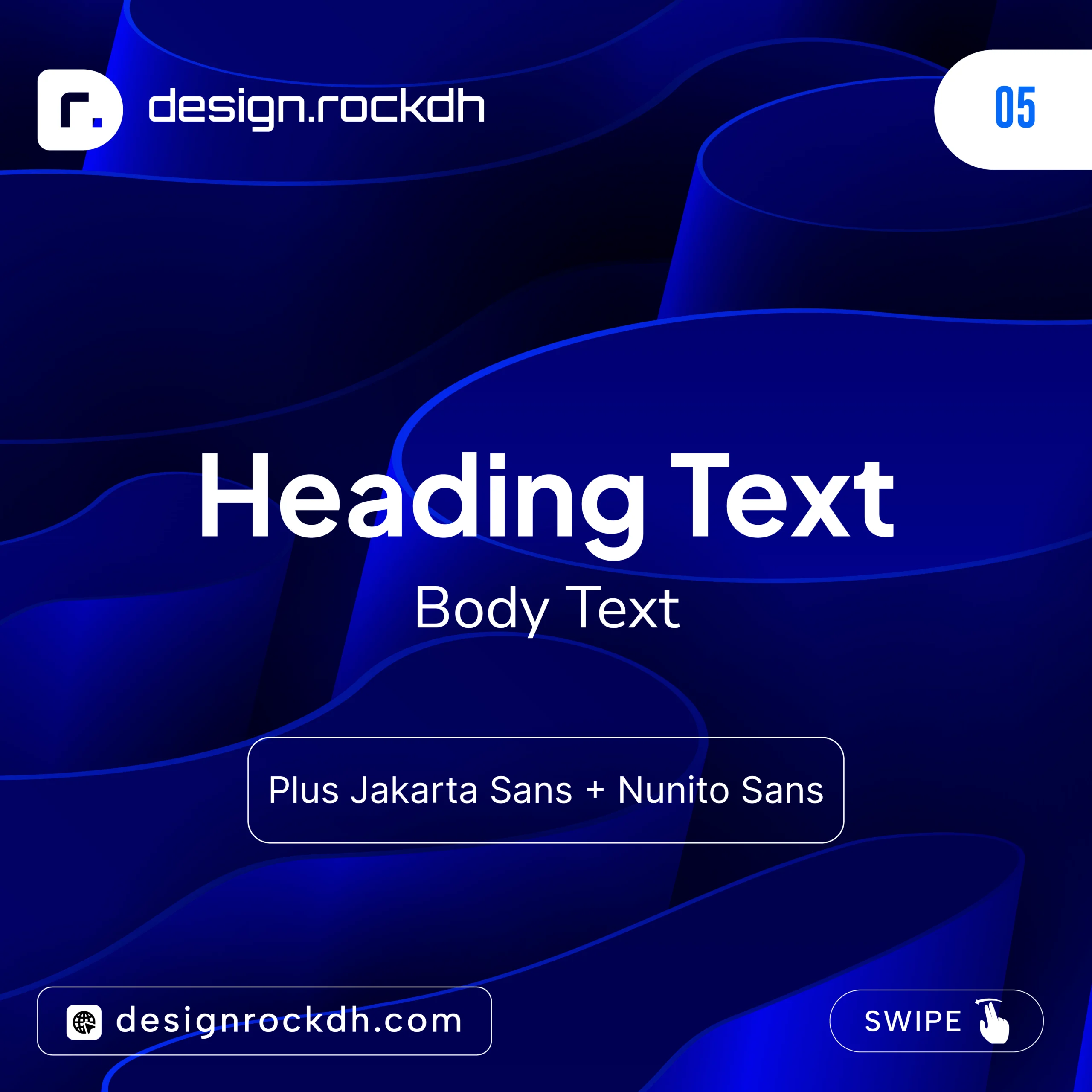
If you’re designing for a startup, technology company, or AI-focused brand, this pairing delivers a sleek, modern aesthetic without compromising usability.
Tips for Choosing the Right Sans Serif Font
With hundreds of excellent fonts available, selecting the right one can feel overwhelming. Instead of choosing based solely on appearance, consider how the font will perform in real-world applications.
Prioritize Readability
No matter how attractive a typeface looks, it should always be easy to read. Fonts with clear letterforms and balanced spacing provide a better reading experience across websites, mobile devices, and printed materials.
Match the Font to Your Brand
Typography plays a major role in shaping brand identity. Your font should reflect the personality and values of your business.
For example:
Minimalist brands often benefit from clean, understated typography.
Luxury brands frequently combine elegant serif headings with modern sans serif body text.
Technology companies tend to favor geometric sans serif fonts that communicate innovation and simplicity.
Creative agencies often choose bold, expressive typefaces that showcase originality.
Choose a Font Family with Multiple Weights
A versatile font family makes it easier to create visual hierarchy throughout your design. Ideally, your chosen typeface should include a range of weights such as:
Thin
Light
Regular
Medium
SemiBold
Bold
ExtraBold
Having multiple weights allows you to differentiate headings, subheadings, buttons, captions, and body text while maintaining a consistent visual style.
Common Typography Mistakes to Avoid
Even experienced designers can make typography mistakes that reduce the overall quality of a project. Avoiding these common issues will help your designs look cleaner and more professional.
Using Too Many Fonts
Limiting your design to two or three complementary typefaces creates a more cohesive and consistent visual identity.
Ignoring Spacing
Poor letter spacing, line spacing, or paragraph spacing can make content difficult to read, regardless of how good the font itself is.
Inconsistent Font Weights
Randomly mixing different font weights often creates an unbalanced layout. Use weight changes intentionally to establish a clear content hierarchy.
Low Contrast
Text should always be easy to distinguish from its background. Strong contrast improves accessibility and enhances the overall reading experience.
Forgetting Mobile Readability
A font that looks great on a desktop monitor may not perform as well on a smartphone. Always test typography across multiple screen sizes before publishing.
Using Decorative Fonts for Body Text
Decorative or display fonts are excellent for headlines, but they can quickly become difficult to read in longer paragraphs. Reserve them for titles and use a clean sans serif font for body content.
How Sans Serif Fonts Can Improve SEO
Typography doesn’t directly affect search engine rankings, but it has a significant impact on user experience—and that’s where SEO benefits begin.
When visitors can read your content comfortably, they’re more likely to stay on your website, explore additional pages, and engage with your content. These positive user signals contribute to a stronger overall website experience.
Well-chosen typography can help improve:
Time spent on page
Content readability
Mobile usability
Accessibility
User engagement
Lower bounce rates
Search engines increasingly prioritize websites that offer an excellent user experience. By choosing clean, readable sans serif fonts and presenting content in a clear, organized layout, you create a better experience for both your audience and search engines.
Good typography may not be a direct ranking factor, but it supports the engagement metrics that often contribute to long-term SEO success.
Related Typography Resources
If you’re passionate about typography and want to build a stronger design toolkit, there are plenty of other resources worth exploring. Expanding your knowledge of fonts, color theory, and branding can help you create more polished and professional designs.
Here are a few guides that pair well with this article:
Best Luxury Fonts for Branding – Discover elegant typefaces for premium brands and high-end design projects.
Futuristic Fonts for Logo Design – Explore modern fonts that work perfectly for tech companies, startups, and AI brands.
Best Script Fonts for Creative Projects – Add personality and elegance to invitations, packaging, and creative branding.
Free Fonts Every Designer Should Download – Build a versatile font library without spending a fortune.
Modern Font Pairing Ideas – Learn how to combine fonts to create balanced, visually appealing layouts.
Best Google Fonts for Websites – Find high-performance fonts optimized for responsive web design.
Logo Design Font Guide – Understand how typography influences brand identity and logo design.
Modern Color Palettes for Designers – Pair your typography with color schemes that enhance visual impact.
Gradient Color Combinations with HEX Codes – Create eye-catching digital designs using professionally selected gradients.
Exploring related topics not only improves your design skills but also helps you make more informed decisions when working on branding, web design, and digital products.
Frequently Asked Questions
What is a sans serif font?
A sans serif font is a typeface that doesn’t include the small decorative strokes, known as serifs, at the ends of letters. These fonts are recognized for their clean, modern appearance and excellent readability, making them a popular choice for websites, mobile apps, branding, and digital interfaces.
Which sans serif font is best for logo design?
There isn’t a single “best” option, as the right choice depends on your brand’s personality. However, fonts such as Montserrat, Outfit, Gotham, Circular, Manrope, and Avenir Next are widely used because they scale well and create clean, memorable logos.
Are Google Fonts free for commercial use?
Most fonts available through Google Fonts are open source and can be used for both personal and commercial projects. Before using any typeface in client work or commercial products, it’s still a good idea to review the individual font’s license to confirm its usage terms.
Which sans serif fonts work best for websites?
Some of the best options for web design include Inter, Manrope, DM Sans, Work Sans, and Plus Jakarta Sans. These fonts are designed for excellent screen readability, fast loading, and responsive performance across different devices.
Can serif and sans serif fonts be used together?
Absolutely. Pairing a serif font for headings with a sans serif font for body text is a common design technique. This combination creates visual contrast, improves hierarchy, and helps content remain both attractive and easy to read.
Are premium fonts worth buying?
If you regularly work on branding, editorial design, or commercial client projects, premium fonts can be a worthwhile investment. They often provide larger character sets, more font weights, advanced OpenType features, and broader language support than many free alternatives.
Summary
Sans serif fonts continue to shape modern design because they’re clean, versatile, and easy to read across virtually every medium. Whether you’re designing a logo, building a website, creating a mobile app, or developing marketing materials, the right typeface can strengthen your message and improve the overall user experience.
If you’re just starting your typography journey, begin with reliable free fonts like Inter, Poppins, Outfit, Manrope, and Plus Jakarta Sans. These families offer exceptional quality and enough flexibility for most creative projects. As your experience grows and your design needs become more advanced, investing in premium typefaces can provide even greater control, consistency, and creative possibilities.
Remember that great typography isn’t about following trends—it’s about choosing fonts that communicate clearly, reflect your brand, and create a seamless reading experience for your audience.
Keep experimenting with different typefaces, explore new font pairings, and refine your typography skills over time. Every project is an opportunity to create designs that are not only visually appealing but also functional, memorable, and impactful.
For more design inspiration, typography guides, color palettes, branding resources, and free creative assets, continue exploring DesignRockDH. Building a strong design library and staying up to date with modern typography trends will help you produce better work and grow as a designer.