Not every font looks brand-ready.
Some fonts feel like body text.
Some feel decorative.
But some typefaces instantly look like a logo.
In this article, I break down five fonts that already carry strong branding potential and explain how to use them strategically.

1. Agale – Minimal Geometric Logo Font
Agale is modern, clean, and structurally balanced.
Why it works:
-
Strong geometric construction
-
Balanced spacing
-
Minimal but distinctive letterforms
-
Excellent scalability for digital use
Best for:
-
Tech startups
-
Agencies
-
SaaS brands
-
Personal brands
Agale gives immediate contemporary identity without needing a symbol.
download
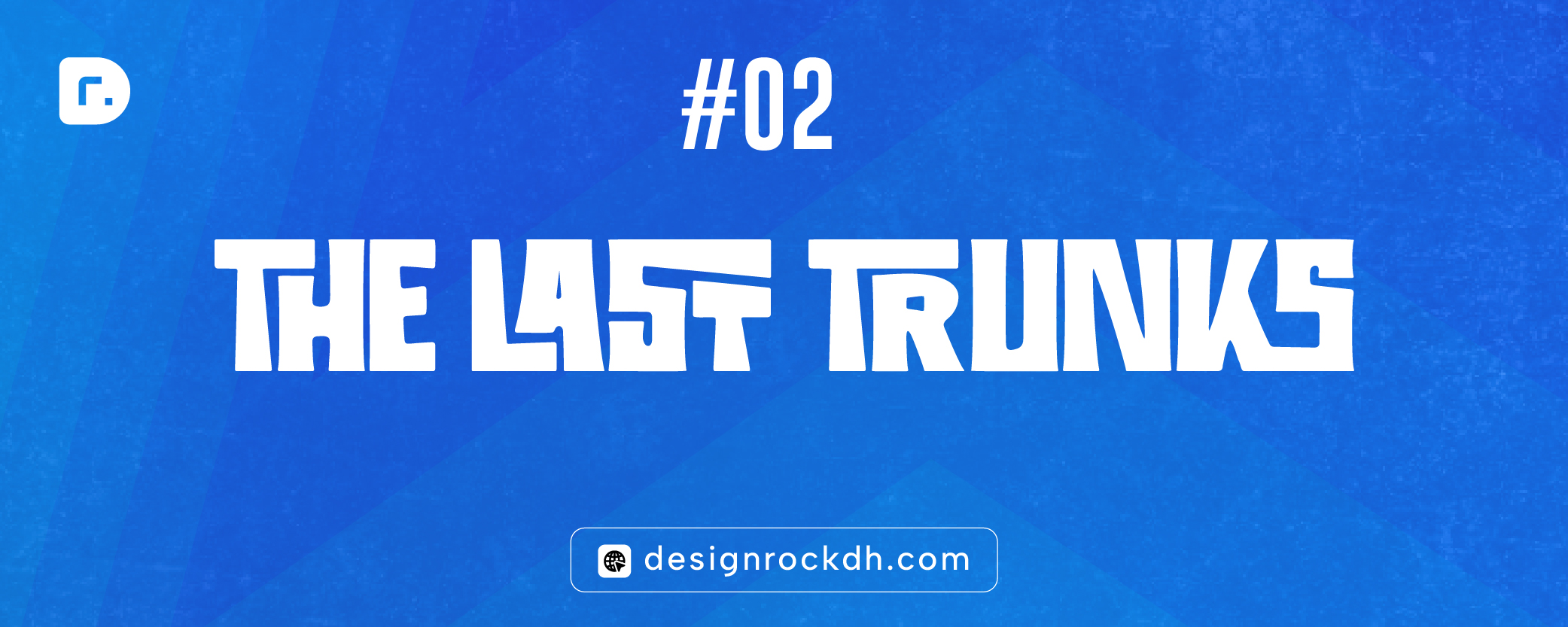
2. The Last Trunks – Bold Retro Display Font
This font has strong block energy and high visual impact.
Why it works:
-
Thick letter structure
-
High memorability
-
Vintage-inspired confidence
Best for:
-
Clothing brands
-
Streetwear
-
Outdoor brands
-
Merchandise logos
It feels strong and statement-driven.
download

3. Zaslia – Elegant Luxury Serif Font
Zaslia delivers premium aesthetics.
Why it works:
-
High stroke contrast
-
Refined curves
-
Editorial elegance
Best for:
-
Fashion brands
-
Beauty businesses
-
Jewelry labels
-
Boutique products
It instantly elevates brand perception.
download

4. Casko – Timeless Sophisticated Serif
Casko blends classic structure with modern readability.
Why it works:
-
Balanced serif proportions
-
Professional tone
-
Strong typographic authority
Best for:
-
Consulting firms
-
Corporate brands
-
High-end services
-
Publishing brands
Casko feels trustworthy and long-term.
download

5. Transcity – Modern Retro Script Logo Font
Transcity combines personality with clarity.
Why it works:
-
Unique curves
-
Decorative yet readable
-
Distinct rhythm
Best for:
-
Cafes
-
Creative studios
-
Lifestyle brands
-
Packaging design
Script fonts like this work best with precise spacing adjustments.
download
What Makes These Fonts Look Like Logos?
These five fonts share:
✔ Strong structure
✔ Memorable shapes
✔ Clear hierarchy
✔ Scalable forms
✔ Brand personality
A logo font must be clear in 3 seconds and recognizable in 1.
How to Use These Fonts Professionally
-
Adjust kerning manually
-
Modify one letter for uniqueness
-
Test in black and white first
-
Confirm commercial licensing
-
Avoid using default settings
Professional typography requires refinement.
A logo doesn’t always need an icon.
Sometimes the right font is the brand.
Agale, Zaslia, Casko, Transcity, and The Last Trunks all have strong logo potential when used strategically.


Hmm it appears like your site ate my first comment (it was super long) so I guess I’ll just sum it up
what I had written and say, I’m thoroughly enjoying your blog.
I as well am an aspiring blog blogger but I’m still new
to everything. Do you have any recommendations for first-time blog writers?
I’d definitely appreciate it.
Ahaa, its fastidious discussion on the topic of
this piece of writing at this place at this blog, I have read all that, so at this time me also commenting here.
Howdy! I know this is kinda off topic however I’d figured I’d ask.
Would you be interested in trading links or maybe guest authoring a blog article or vice-versa?
My site discusses a lot of the same topics as yours and I feel we could greatly benefit from each other.
If you are interested feel free to send me an email. I look forward to hearing from you!
Awesome blog by the way!
Hmm is anyone else experiencing problems with the images on this
blog loading? I’m trying to figure out if its a problem
on my end or if it’s the blog. Any responses would be greatly appreciated.
Hi there i am kavin, its my first time to commenting anywhere, when i
read this piece of writing i thought i could also create comment
due to this brilliant post.
I visit daily some blogs and blogs to read articles, except this blog offers quality based writing.
I love looking through a post that can make men and women think.
Also, thank you for allowing for me to comment!
Please let me know if you’re looking for a writer for your weblog.
You have some really good articles and I feel I would be a good asset.
If you ever want to take some of the load off, I’d
absolutely love to write some material for your blog in exchange
for a link back to mine. Please shoot me an e-mail if interested.
Regards!
No matter if some one searches for his essential thing, so he/she needs to
be available that in detail, so that thing is maintained over
here.
What’s Going down i am new to this, I stumbled upon this I’ve discovered It absolutely useful and it has helped
me out loads. I’m hoping to contribute & assist other users like its aided me.
Good job.
It is perfect time to make some plans for the future and it’s time to be happy.
I’ve read this post and if I could I desire to suggest you some
interesting things or suggestions. Maybe you can write next articles
referring to this article. I want to read even more things about it!
I could not refrain from commenting. Very well written!
Hello! Do you know if they make any plugins to assist with SEO?
I’m trying to get my blog to rank for some targeted keywords but I’m not seeing very good success.
If you know of any please share. Many thanks!
you can use Yoast SEO plugin or Rank Math Plugin
Hi there, I check your blogs daily. Your writing style is awesome, keep it up!
I have read so many articles or reviews on the topic
of the blogger lovers but this paragraph is truly a nice piece of writing,
keep it up.
I really like reading a post that can make people think.
Also, thank you for allowing me to comment!
This is really interesting, You are a very skilled blogger.
I’ve joined your feed and look forward to seeking more of your excellent post.
Also, I have shared your web site in my social networks!