Luxury is about much more than having a high price tag. In today’s global market, people often associate luxury with prestige, heritage, craftsmanship, exclusivity, and attention to detail.
That is why luxury brands rarely need to shout for attention. Instead of relying on flashy graphics or aggressive visual effects, they often communicate confidence through simplicity, refined typography, carefully considered proportions, and plenty of breathing room.
At the heart of this visual language is the luxury logo.
Some of the world’s most recognizable luxury brands have built their identities around logos that feel remarkably simple at first glance. Fashion houses, premium automotive brands, fine jewelry companies, and high-end hospitality businesses all demonstrate how typography, geometry, and restraint can create a powerful sense of value.
Whether you’re creating an identity for a boutique hotel, an artisanal fragrance brand, a luxury real estate company, or a private wealth consultancy, understanding what makes a logo feel premium is essential.
In this guide, we’ll explore the fundamental principles of luxury logo design, look at four major luxury logo archetypes, discuss high-end typography choices, review practical luxury color palette hex codes, and walk through a professional vector design workflow using Adobe Illustrator and Figma.
The 4 Core Pillars of Luxury Logo Design
A strong luxury identity usually rests on four important design principles:
| Pillar | Strategic Objective | Visual & Technical Execution |
|---|---|---|
| 1. Understated Restraint | Create effortless confidence | Quiet luxury, generous whitespace, minimal visual clutter |
| 2. Timeless Longevity | Avoid short-lived trends | Classical proportions, refined serifs, enduring geometry |
| 3. Optical & Mathematical Harmony | Create a sense of visual perfection | Golden-ratio grids, careful kerning, balanced strokes |
| 4. Materiality & Tactile Versatility | Ensure the logo works in physical applications | Gold foil, embossing, debossing, engraving, embroidery |
Let’s look at each principle more closely.
1. Understated Restraint: The “Quiet Luxury” Approach
Many mass-market brands compete for attention with bright colors, dramatic shadows, complicated illustrations, and oversized graphics.
Luxury branding tends to take a very different route.
Less can often communicate more.
Generous white space, restrained colors, elegant letterforms, and a simple visual system can make a logo feel established and confident without becoming visually overwhelming.
This approach is often associated with the idea of quiet luxury—a style that feels sophisticated without trying too hard to prove it.
2. Timeless Longevity vs. Trend Chasing
Design trends come and go. A luxury logo, however, is expected to remain relevant for years, sometimes even decades.
Instead of designing around whatever happens to be fashionable today, designers should focus on strong proportions, recognizable forms, and typography that can stand the test of time.
The source guide points to the Chanel interlocking “CC” monogram and the Rolex coronet as examples of identities that have maintained their recognition over many decades.
The goal isn’t to make a logo look old-fashioned. It’s to create something that feels relevant without being dependent on a temporary trend.
3. Optical Kerning & Mathematical Precision
Typography can look technically correct and still feel visually unbalanced.
That’s why luxury logo design often requires more than relying on automatic software kerning. Individual character pairs may need to be adjusted manually to account for optical weight, negative space, and the alignment of stroke endings.
Small spacing adjustments can make a surprisingly large difference.
When every letter sits comfortably beside the next one, the overall wordmark feels more polished and intentional.
4. Tactile Materiality
A luxury logo shouldn’t only look good on a high-resolution screen.
It should also translate effectively to physical materials and production techniques.
Think about applications such as:
- Hot-stamped gold foil
- Blind debossing on premium cardstock
- Laser engraving on metal
- Embroidery on silk
- Premium packaging
- Architectural signage
A well-built logo should remain recognizable and elegant across these different applications.
The 4 Primary Archetypes of Luxury Logos
Although every brand should have its own identity, many luxury logos fall into a few recognizable visual categories.
| Luxury Archetype | Key Visual Traits | Target Industries | Example Brands |
|---|---|---|---|
| 1. Didone / Serif | High contrast, delicate hairline serifs | Haute couture, cosmetics, editorial | Vogue, Harper’s Bazaar, Rolex |
| 2. Modernist Sans | Clean geometry, wide tracking | Contemporary luxury, streetwear | Saint Laurent, Chanel, Celine |
| 3. Interlocking Monogram | Fused initials, symmetrical construction | Fashion, leather goods, private clubs | Louis Vuitton, Gucci, Rolls-Royce |
| 4. Minimalist Crest | Refined heraldry, animal silhouettes | Automotive, equestrian, heritage brands | Porsche, Ferrari, Ralph Lauren |
Archetype 1: Didone & Modern Classical Serifs
Didone typography is known for its dramatic contrast between thick vertical strokes and extremely thin horizontal elements.
This high contrast gives the style an elegant and editorial character, which is why it is often associated with high fashion, cosmetics, luxury publishing, and sophisticated branding.
When handled carefully, a Didone wordmark can feel both glamorous and intellectually refined.
Archetype 2: Modernist High-Fashion Sans-Serifs
Not every luxury brand relies on serif typography.
In recent years, many established fashion houses have moved toward clean, bold sans-serif wordmarks.
These logos are often presented in uppercase with generous letter spacing. The result is simple, contemporary, and highly adaptable to digital environments.
This style can communicate:
- Modern authority
- Architectural precision
- Simplicity
- Digital readiness
- Contemporary luxury
Archetype 3: Interlocking Monograms
A monogram turns initials into a distinctive visual symbol.
The strongest monograms aren’t simply letters placed next to each other. Their forms are carefully constructed so that the characters work together as one cohesive mark.
When designed well, a monogram can become one of the most recognizable assets in a brand identity.
It can be applied to:
- Clothing
- Leather goods
- Packaging
- Accessories
- Textiles
- Digital backgrounds
- Social media assets
Typography: Selecting the Perfect Luxury Font
Typography is arguably one of the most important components of a luxury logo.
The right typeface needs to balance historical character, elegance, uniqueness, and modern readability.
Here are several fonts highlighted in the original guide:
| Font | Category | Best High-End Application |
|---|---|---|
| Cormorant Garamond | Classical Serif | Fine fragrance, luxury jewelry |
| Playfair Display | Modernist Serif | Editorial, luxury fashion, hotels |
| Cinzel | Roman Inscriptional | Real estate, private banking, legal |
| Bodoni Moda | Didone Serif | High-end cosmetics, fashion houses |
| Plus Jakarta Sans | Geometric Sans | Contemporary luxury technology |
| Montserrat | Architectural Sans | Luxury architecture, minimalist spas |
A font shouldn’t simply be selected because it “looks expensive.” Its proportions, spacing, readability, and relationship with the rest of the identity all matter.
Professional Typographic Rules for Luxury Logos
1. Consider All-Caps Typography
Uppercase lettering can give a wordmark a strong architectural quality.
It creates a sense of stability, symmetry, and permanence—qualities that work particularly well for premium branding.
2. Use Generous Tracking
Luxury wordmarks often benefit from increased letter spacing.
The original guide recommends tracking between +150 and +350 in Adobe Illustrator or Figma, depending on the typeface and application.
The purpose isn’t simply to make the logo wider. Carefully controlled spacing gives each character room to breathe and can create a more exclusive visual rhythm.
3. Customize the Letterforms
Using a font exactly as downloaded can make a logo feel generic.
For a more distinctive identity, designers can modify:
- Letter terminals
- Crossbars
- Ligatures
- Character proportions
- Connections between letters
These changes can help transform an existing typeface into a more proprietary wordmark or monogram.
Curated Luxury Color Palettes With Hex Codes
Luxury branding generally avoids overly saturated colors.
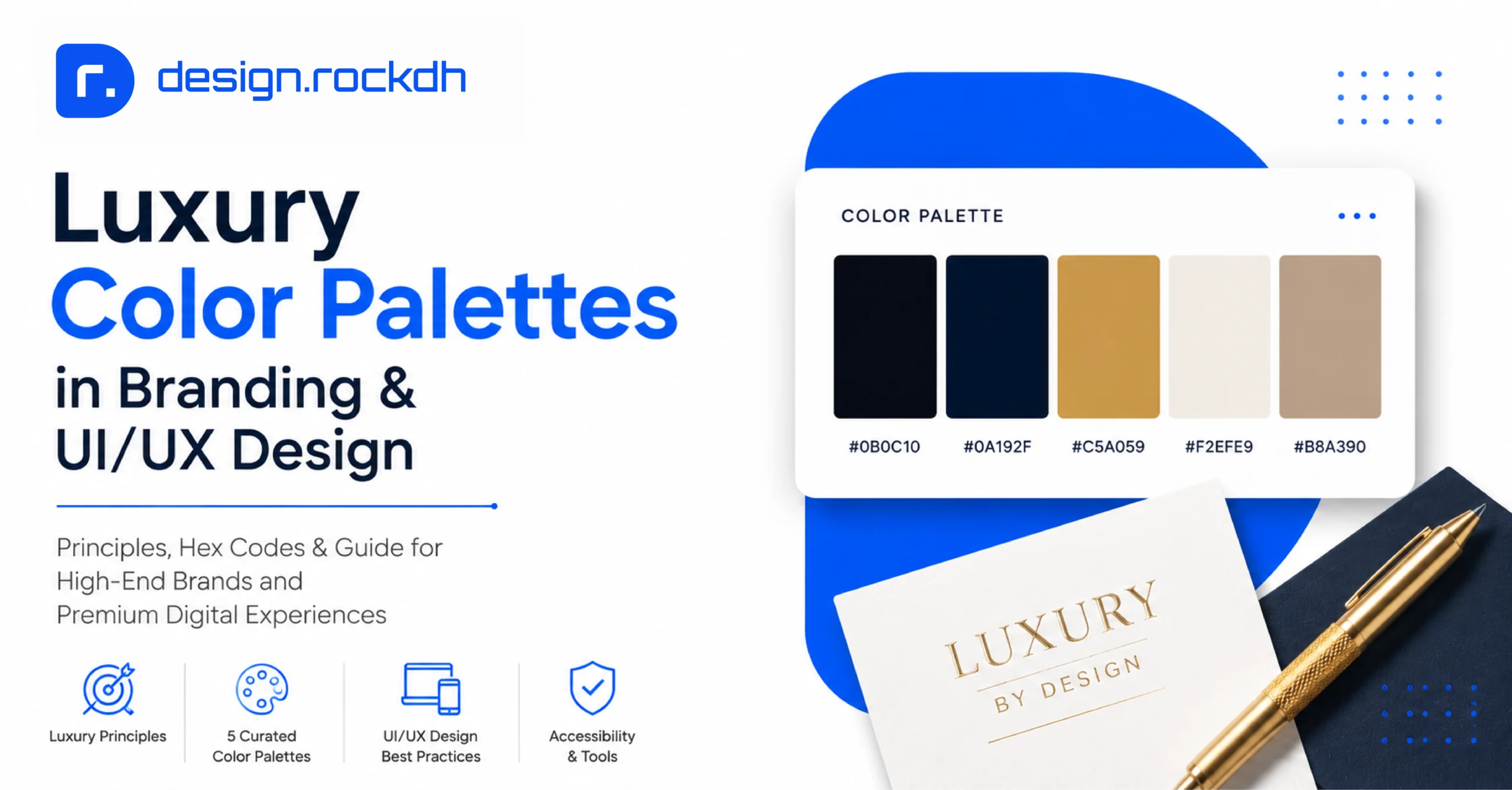
Instead, premium identities often rely on deep neutrals, muted metallic-inspired tones, and sophisticated jewel shades.
Here are four palettes from the guide.
Palette 1: Imperial Noir & Champagne Gold
Best for: Prestige and opulence
- Obsidian Noir:
#0B0B0B— Primary canvas / structural foundation - Champagne Gold:
#D4AF37— Metallic accent / logo mark - Soft Ecru:
#F5F2EB— Secondary text / subtle highlights - Deep Charcoal:
#1C1C1E— Cards and container surfaces
The combination of deep black and warm gold immediately creates a premium visual direction, particularly when paired with restrained typography.
Palette 2: Midnight Sapphire & Sterling Platinum
Best for: Fintech and wealth brands
- Midnight Sapphire:
#0F172A— Deep background - Sterling Platinum:
#E2E8F0— Clean, high-contrast text - Frosted Ice Blue:
#38BDF8— Subtle interactive highlight - Deep Slate:
#1E293B— Elevated surface layer
This palette offers a more contemporary interpretation of luxury. The dark foundation provides authority, while the cool platinum and blue accents introduce a modern digital feel.
Palette 3: Royal Emerald & Antique Bronze
Best for: Heritage brands and boutique hospitality
- Deep Forest Emerald:
#064E3B— Dominant heritage tone - Antique Bronze Gold:
#92400E— Accent and foil tone - Alabaster Warm White:
#FAFAF9— Background - Muted Sage:
#D1FAE5— Secondary surface
This combination works particularly well when the goal is to communicate heritage, warmth, craftsmanship, and exclusivity.
Palette 4: Minimalist Alabaster & Pure Carbon
Best for: Modern high fashion
- Pure Carbon Black:
#121212— Logotype / primary contrast - Crisp Pure White:
#FFFFFF— Negative-space canvas - Muted Cool Slate:
#64748B— Secondary text - Warm Sand Neutral:
#F4EFEA— Packaging accent
For designers who prefer a cleaner aesthetic, this palette keeps the identity minimal while still allowing subtle warmth through the sand tone.
Designers can further develop and test custom combinations using tools such as Coolors and Adobe Color. Contrast should also be checked against accessibility requirements using the WebAIM Contrast Checker.
Step-by-Step: Vector Crafting in Adobe Illustrator & Figma
Creating a premium logo isn’t just about finding the right font or drawing a nice shape. The construction process matters just as much.
A structured workflow can help maintain consistency and precision from the first sketch through final production.
Professional Workflow
| Stage | Focus |
|---|---|
| Stage 1: Research | Heritage and brand positioning |
| Stage 2: Optical | Grid and golden-ratio guidelines |
| Stage 3: Vector | Shape Builder and precise construction |
| Stage 4: Custom | Ligatures and manual kerning |
| Stage 5: Print & Embossing | Vector separation and foil specifications |
1. Construct the Geometric Grid
In Adobe Illustrator, start with a modular grid and circular tangent guides based on golden-ratio proportions.
The commonly referenced ratio is:
1 : 1.618
Circular arcs can then be used to create smooth, continuous curves rather than awkward vector transitions.
The objective is not to force every logo into a mathematical formula. Instead, the grid provides a consistent framework for building balanced shapes.
2. Craft Custom Vector Ligatures
Once the primary wordmark has been selected, convert the type to vector outlines.
In Adobe Illustrator:
Ctrl + Shift + O on Windows
Cmd + Shift + O on Mac
After outlining the letters, individual elements can be modified and merged.
For example, a leg from an “R” could be connected to the stem of a nearby “A.” The Shape Builder Tool can then be used to combine overlapping elements and develop a distinctive monogram or custom letterform.
3. Calibrate Hairline Stroke Thickness
High-contrast Didone typography requires particular attention to thin strokes.
According to the guide, hairline strokes should measure at least 0.5 pt at standard reproduction size, around 1.5 inches wide.
If a stroke is too thin, it may disappear during physical production processes such as offset printing or screen printing.
This is an important reminder: a logo can look perfect on a monitor and still fail during production.
Common Mistakes in Luxury Logo Design
Even experienced designers can accidentally make a luxury logo look less premium.
Here are some of the most common problems to avoid.
1. Overusing Fake 3D Gold Effects
One of the easiest ways to make a luxury logo look cheap is to add excessive digital gold effects.
Fake bevels, heavy embossing, metallic reflections, and glowing gradients may look impressive in a presentation, but they don’t necessarily communicate genuine luxury.
A stronger approach is to build the logo as a clean, flat vector.
If the final application requires a metallic finish, the effect can be produced physically through techniques such as real gold foil stamping.
2. Crowding Too Many Elements
Luxury design needs room to breathe.
Trying to fit an icon, wordmark, tagline, decorative border, and other elements into a small space can make the identity feel busy and reduce its perceived value.
Whitespace isn’t wasted space.
It is part of the design.
3. Using Generic Script or Signature Fonts
Unmodified cursive fonts can quickly make a premium identity feel generic or amateurish.
They can also create readability problems, particularly at smaller sizes.
If handwritten typography is central to the brand, a better solution may be to commission bespoke hand-drawn lettering or calligraphy.
Frequently Asked Questions
Didone and other high-contrast serif fonts, such as Bodoni Moda, Playfair Display, and Cormorant Garamond, are strongly associated with luxury branding. Modern all-caps sans-serif fonts, including Montserrat and Plus Jakarta Sans with generous letter spacing, are also widely used for contemporary luxury identities.
Black and white create a clean, authoritative, and highly versatile visual identity. A monochromatic logo can work across different packaging, photography, seasonal collections, and marketing materials without competing with the surrounding design.
Present the logo through realistic, high-fidelity mockups that show how it works in real-world applications. Gold foil business cards, embossed linen boxes, matte black shopping bags, premium packaging, and architectural signage can help clients understand the logo's overall look, versatility, and premium feel.
Summary
Luxury logo design is ultimately about restraint, precision, and consistency.
A premium logo doesn’t need dozens of visual elements to make an impression. In many cases, the strongest identities are built from carefully selected typography, balanced proportions, thoughtful spacing, and a restrained color system.
Whether you choose a sophisticated Didone serif, a modernist sans-serif, an interlocking monogram, or a refined crest, the goal remains the same: create an identity that feels distinctive today and remains relevant years from now.
Pay close attention to negative space, optical kerning, vector construction, physical production requirements, and material applications. These small decisions often make the difference between a logo that simply looks attractive and one that genuinely feels high-end.
For customizable luxury logo templates, vector monograms, and premium UI design resources, the original guide recommends exploring the design library at designrockdh.com