Think about the last website, app, or brand that instantly caught your attention. Chances are, it wasn’t just the logo or typography that impressed you—it was the colors. Before we read a headline or click a button, our brains react to color. In just a fraction of a second, colors can make something feel trustworthy, exciting, luxurious, or even urgent.
That’s why color is far more than decoration. It’s one of the most powerful communication tools a designer has.
Whether you’re creating a website, designing a mobile app, building a brand identity, or crafting social media graphics, understanding color design will help you make smarter creative decisions. The right colors improve user experience, strengthen branding, and even influence purchasing decisions.
In this comprehensive guide, you’ll learn everything you need to know about color design—from the fundamentals of color theory to choosing effective color palettes, understanding color psychology, and applying professional design techniques used by leading designers around the world.
Whether you’re just starting your design journey or you’re looking to refine your creative skills, this guide will give you a strong foundation.
What Is Color Design?
Color design is the strategic use of color to communicate ideas, guide attention, and create emotional connections through visual design.
Many beginners choose colors simply because they “look nice.” Professional designers approach color differently. Every color choice is intentional and serves a specific purpose.
For example:
- A financial company often uses shades of blue because blue represents trust, stability, and reliability.
- An organic skincare brand typically uses green tones to suggest nature and sustainability.
- Luxury brands frequently rely on black, white, and gold to communicate elegance and exclusivity.
- Children’s products usually feature bright, energetic colors that inspire fun and creativity.
In other words, color isn’t just about aesthetics—it’s about communication.
A successful color design balances several important elements:
- Visual appeal
- Brand identity
- User experience
- Readability
- Accessibility
- Emotional impact
- Consistency across platforms
When these elements work together, your design feels professional, memorable, and easy to use.
Why Is Color Design So Important?
People often underestimate how much color influences decision-making.
Research in marketing and user experience consistently shows that first impressions are formed within seconds, and color plays a major role in those impressions. Even when users don’t consciously notice your color choices, those choices influence how they perceive your brand.
Good color design can help you:
Build Brand Recognition
Think about brands like Coca-Cola, Spotify, or Facebook. Even without seeing their logos, many people recognize them simply by their signature colors.
Consistent use of color helps audiences remember your brand more easily.
Improve User Experience
Imagine visiting a website where every button has a different color and nothing stands out.
Confusing, right?
Color creates visual hierarchy. It tells users where to click, what information is important, and how to navigate a page naturally.
Good color choices reduce confusion and make interfaces feel intuitive.
Increase Conversions
In digital marketing, color often influences user actions.
A well-designed call-to-action button stands out because it contrasts with the rest of the page—not because it’s randomly bright.
Professional designers use accent colors strategically to draw attention without overwhelming users.
Create Emotional Connections
Colors evoke feelings before words do.
Warm colors like red, orange, and yellow often create excitement and energy.
Cool colors such as blue and green communicate calmness, trust, and balance.
Choosing the right emotional tone helps users connect with your message more effectively.
Understanding Color Theory
Every great designer eventually learns color theory.
Rather than relying on guesswork, color theory provides practical rules for combining colors in visually pleasing and functional ways.
Once you understand these principles, selecting color palettes becomes much easier.
Primary Colors
Traditional color theory begins with three primary colors:
- Red
- Blue
- Yellow
These colors cannot be created by mixing other colors together.
Instead, they’re the foundation for producing every other color on the color wheel.
Secondary Colors
Secondary colors are created by mixing two primary colors.
Examples include:
- Blue + Yellow = Green
- Red + Yellow = Orange
- Red + Blue = Purple
These colors expand your palette while maintaining harmony.
Tertiary Colors
When you mix a primary color with a neighboring secondary color, you create tertiary colors.
Examples include:
- Blue-Green
- Yellow-Green
- Red-Orange
- Blue-Violet
- Yellow-Orange
- Red-Violet
Professional designers frequently use tertiary colors because they offer more subtle and sophisticated palettes than basic primary colors.
The Color Wheel Explained
The color wheel is one of the most valuable tools in graphic design.
Instead of randomly choosing colors, designers use the wheel to identify combinations that naturally work together.
Understanding these relationships helps create balance, contrast, and visual interest.
Complementary Colors
Complementary colors sit directly opposite each other on the color wheel.
Popular examples include:
- Blue and Orange
- Purple and Yellow
- Red and Green
Because they create strong contrast, complementary colors are excellent for:
- Call-to-action buttons
- Marketing graphics
- Sports branding
- Posters
- Advertisements
However, they should be used thoughtfully. Too much contrast can make a design feel overwhelming.
Analogous Colors
Analogous colors are positioned next to one another on the color wheel.
For example:
- Blue
- Blue-Green
- Green
Since these colors share similar tones, they create calm, harmonious designs.
They’re especially popular for:
- Wellness brands
- Travel websites
- Nature-themed projects
- Portfolio websites
- Editorial layouts
Triadic Color Schemes
A triadic palette uses three colors evenly spaced around the color wheel.
Examples include:
- Red
- Yellow
- Blue
Triadic schemes create vibrant designs while maintaining visual balance.
They’re commonly used in illustration, branding, educational content, and creative industries where energy and personality are important.
Monochromatic Color Schemes
Sometimes, less is more.
Monochromatic palettes use different shades, tints, and tones of a single color.
For example:
- Dark Blue
- Royal Blue
- Sky Blue
- Light Blue
This approach creates clean, elegant, and modern designs that feel highly professional.
Many premium SaaS products and minimalist websites rely on monochromatic color systems because they’re visually consistent and easy to maintain.
Choosing Colors with Purpose
One of the biggest mistakes beginners make is selecting colors based only on personal preference.
Professional designers start by asking questions instead:
- Who is the target audience?
- What emotion should the design communicate?
- Is the brand playful or professional?
- Will the design be viewed mostly on mobile devices?
- Does the color palette meet accessibility standards?
Answering these questions first makes color selection much more strategic.
Instead of decorating a design, you’re using color to solve communication problems—and that’s what separates professional design from amateur work.
Color Psychology: How Colors Influence Human Behavior
Have you ever wondered why most banks use blue, fast-food restaurants often use red and yellow, or luxury brands prefer black and gold?
These choices aren’t accidental. Designers and marketers use color psychology to influence how people think and feel.
Color psychology is the study of how different colors affect human emotions, perceptions, and decision-making. While cultural differences exist, many color associations are surprisingly consistent across the world.
Understanding these associations helps designers create experiences that align with a brand’s goals.
Blue – Trust, Stability, and Professionalism
Blue is one of the most widely used colors in branding because it conveys reliability and confidence.
People often associate blue with:
Trust
Intelligence
Security
Calmness
Professionalism
That’s why you’ll frequently see blue used by technology companies, financial institutions, healthcare organizations, and corporate businesses.
Best for:
Business websites
SaaS platforms
Mobile apps
Banks
Healthcare services
Design Tip: Pair blue with white or light gray for a clean, modern interface that feels approachable and professional.
Red – Energy, Passion, and Action
Red is impossible to ignore. It’s bold, energetic, and naturally attracts attention.
It often represents:
Passion
Excitement
Urgency
Confidence
Strength
Because of its high visibility, designers commonly use red for promotional banners, sale announcements, and call-to-action elements.
Best for:
Food brands
Sports brands
Entertainment
Retail promotions
Design Tip: Use red strategically. Too much red can overwhelm users and make a design feel aggressive.
Green – Growth, Nature, and Balance
Green symbolizes life, renewal, and sustainability.
It’s commonly associated with:
Nature
Health
Success
Money
Freshness
Brands focused on wellness, environmental sustainability, or finance often rely on green to reinforce their message.
Best for:
Organic products
Finance apps
Environmental organizations
Healthcare brands
Yellow – Optimism and Creativity
Yellow is energetic and cheerful.
It immediately grabs attention and communicates positivity.
Common associations include:
Happiness
Creativity
Optimism
Warmth
Youthfulness
However, bright yellow can reduce readability if overused.
Best for:
Children’s products
Educational platforms
Creative agencies
Lifestyle brands
Orange – Friendly and Innovative
Orange combines the excitement of red with the warmth of yellow.
It often communicates:
Confidence
Creativity
Innovation
Friendliness
Adventure
Many startups use orange because it feels energetic without appearing overly aggressive.
Purple – Luxury and Imagination
Purple has long been associated with royalty and premium experiences.
Today it also represents creativity and innovation.
It’s commonly used for:
Premium products
Beauty brands
Creative agencies
Educational platforms
Black and White – Timeless Simplicity
Black suggests sophistication, elegance, and authority.
White represents simplicity, cleanliness, and minimalism.
When used together, these colors create timeless designs that rarely go out of style.
Luxury brands, fashion companies, photographers, and architecture studios often build their visual identity around black-and-white palettes.
How to Build a Professional Color Palette
Choosing random colors rarely produces great results.
Professional designers create structured color systems that remain consistent across every design.
A typical design system includes:
Primary Color
Your main brand color.
This is the color users will remember most.
Examples:
Blue
Green
Purple
Secondary Color
Supports the primary color without competing with it.
Often used for backgrounds, cards, icons, or secondary interface elements.
Accent Color
Accent colors draw attention.
They’re perfect for:
Buttons
Notifications
Links
Important labels
Promotional sections
Because accent colors stand out, they should be used sparingly.
Neutral Colors
Neutral colors give your design room to breathe.
Typical neutrals include:
White
Light Gray
Medium Gray
Dark Gray
Black
Most professional interfaces actually contain more neutral colors than bright colors.
The 60-30-10 Rule
One of the easiest ways to achieve visual balance is the 60-30-10 Rule.
Professional designers have relied on this principle for decades.
Here’s how it works:
60% – Primary color
Usually the background or dominant visual area.
30% – Secondary color
Supports the primary color and adds variety.
10% – Accent color
Highlights important elements like buttons, links, or calls to action.
This simple formula prevents designs from feeling cluttered while ensuring important elements naturally attract attention.
Popular Color Combinations That Always Work
If you’re unsure where to start, these tried-and-tested combinations are excellent choices.
Blue + White
A clean, trustworthy combination that’s ideal for corporate websites, SaaS platforms, and healthcare brands.
Navy + Orange
A modern pairing that creates strong contrast while maintaining professionalism.
Great for landing pages and call-to-action buttons.
Black + Gold
Elegant and luxurious.
Perfect for premium brands, fashion, jewelry, and high-end portfolios.
Green + Beige
Natural and calming.
Ideal for eco-friendly businesses, wellness brands, and lifestyle websites.
Dark Gray + Cyan
Popular among technology startups because it feels modern and futuristic.
Purple + Pink
Creative, energetic, and youthful.
Often used by entertainment, beauty, and creative industries.
Color Design for Branding
Your brand colors are far more than decorative choices—they become part of your identity.
When customers repeatedly see the same color palette across your website, social media, packaging, and marketing materials, they begin to associate those colors with your business.
That’s why consistency matters.
Instead of changing colors for every campaign, establish a core brand palette and use it consistently across every touchpoint.
A strong brand color system typically includes:
One primary brand color
One or two supporting colors
One accent color
A set of neutral colors
This structure keeps your brand recognizable while giving designers enough flexibility for different projects.
Color Design in UI and UX
In user interface design, colors aren’t just decorative—they help users understand how a product works.
Good UI color design improves usability by creating clear visual hierarchy.
For example:
Primary buttons should always use the same color.
Error messages should use consistent warning colors.
Success notifications should follow a recognizable pattern.
Links should remain visually distinct from regular text.
Consistency reduces cognitive load because users quickly learn what each color represents.
The result is a smoother, more intuitive experience.
Designing for Accessibility
Beautiful colors are important—but accessible colors are essential.
Millions of people experience some form of color vision deficiency or low vision. If your design relies only on color to communicate information, some users may struggle to understand it.
To make your designs more inclusive:
Use sufficient contrast between text and backgrounds.
Never rely solely on color to indicate meaning.
Pair colors with icons, labels, or patterns where appropriate.
Test your interface in light mode and dark mode.
Check your palette with accessibility testing tools before publishing.
Accessible design isn’t a limitation—it’s a hallmark of thoughtful, professional work.
Color Design Trends to Watch in 2026
Design trends evolve every year, but great color design is always built on timeless principles. Instead of chasing every new trend, successful designers blend modern aesthetics with strong usability and brand consistency.
Here are some of the biggest color trends shaping digital and graphic design in 2026.
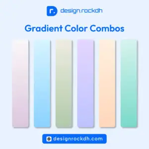
1. Soft Gradient Backgrounds
Gradients have made a strong comeback, but today’s versions are much more refined than the bold gradients of the past.
Designers are using subtle transitions between two or three harmonious colors to add depth without overwhelming the interface.
You’ll often see soft blue-to-purple, pink-to-orange, or teal-to-cyan gradients on SaaS websites, startup landing pages, and mobile apps.
Best for:
- Hero sections
- Landing pages
- App onboarding screens
- Portfolio websites
2. Earth-Inspired Color Palettes
As sustainability becomes more important, natural colors continue to gain popularity.
Earth tones create a calm, authentic, and welcoming experience.
Popular shades include:
- Olive Green
- Sage Green
- Sand Beige
- Clay Brown
- Terracotta
- Warm Gray
These palettes work particularly well for lifestyle brands, cafés, eco-friendly businesses, and wellness products.
3. Dark Mode Design
Dark mode is no longer just an optional feature—it has become an expectation for many users.
A well-designed dark interface reduces eye strain in low-light environments while giving products a premium, modern appearance.
Instead of using pure black (#000000), many designers prefer deep charcoal or dark navy backgrounds because they’re easier on the eyes.
4. Vibrant Accent Colors
Minimal interfaces often rely on neutral backgrounds with one vibrant accent color.
For example:
- White background
- Gray typography
- Electric Blue CTA
- Bright Orange highlight
- Lime Green notification
This approach keeps interfaces clean while naturally directing users’ attention.
5. Glassmorphism
Glassmorphism remains popular in UI design.
This style combines:
- Frosted glass effects
- Semi-transparent cards
- Soft shadows
- Light gradients
- Blurred backgrounds
When paired with balanced color palettes, it creates elegant and futuristic interfaces.
Best Free Tools for Choosing Color Palettes
You don’t have to build every color palette from scratch. These free tools can help you generate, test, and refine professional color schemes.
Adobe Color
One of the most trusted tools for designers.
Features include:
- Color wheel
- Harmony rules
- Accessibility checks
- Gradient inspiration
- Community-created palettes
Download & Use:
https://color.adobe.com
Coolors
A favorite among UI and branding designers.
Generate unlimited palettes with a single key press, lock favorite colors, and export palettes in multiple formats.
Website:
https://coolors.co
Color Hunt
Perfect when you’re looking for inspiration.
Browse thousands of hand-picked color combinations submitted by designers worldwide.
Website:
https://colorhunt.co
Happy Hues
Happy Hues showcases complete website examples using different color palettes, making it easier to understand how colors work together in real projects.
Website:
https://www.happyhues.co
Huemint
Huemint uses AI to generate complete color systems tailored to websites, logos, branding, and illustrations.
Website:
https://huemint.com
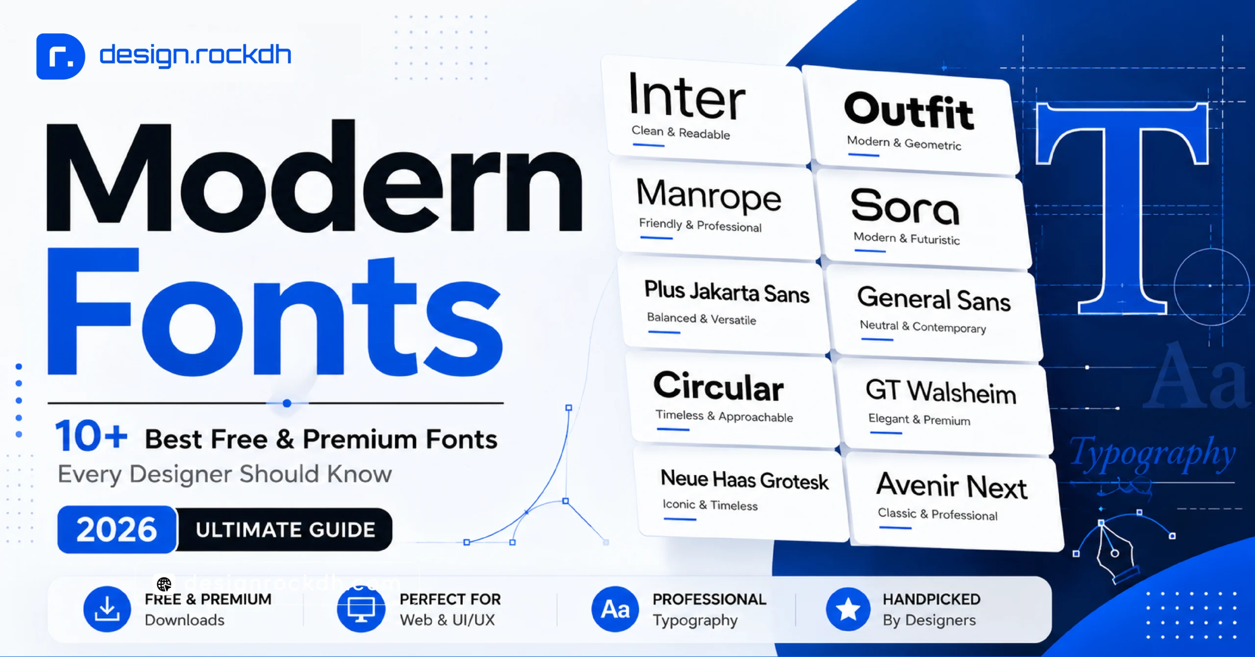
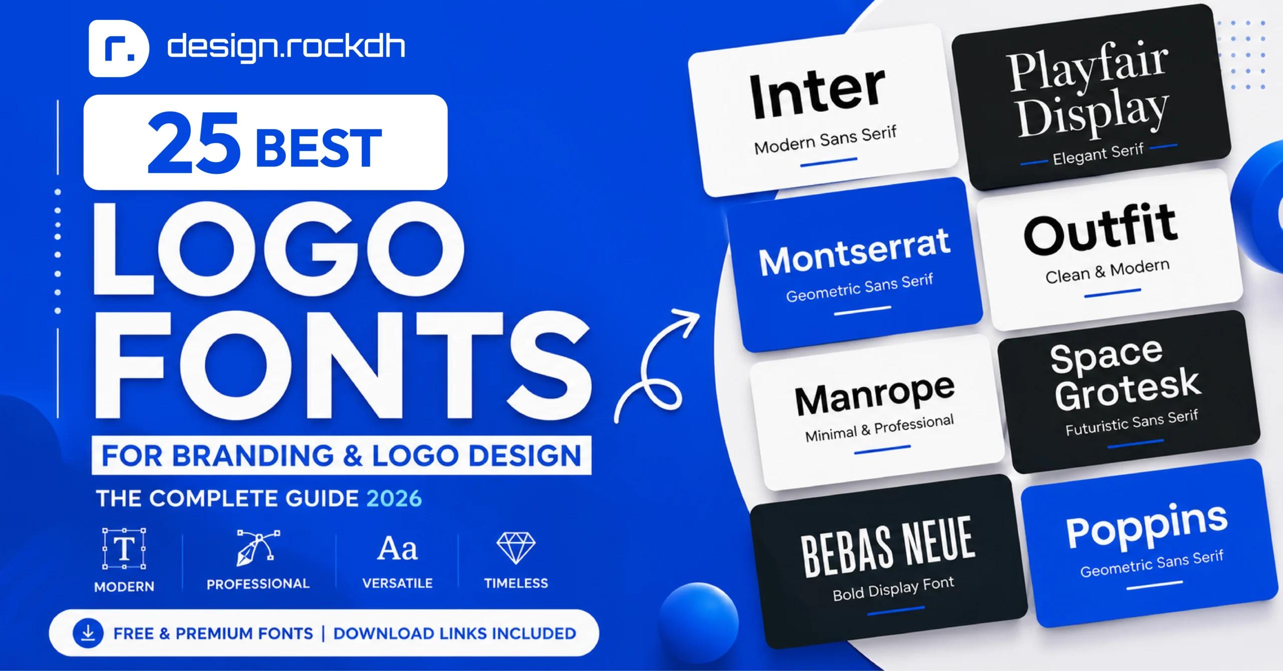
Best Free Fonts That Pair Beautifully with Modern Color Design
Typography and color should complement each other. Even the perfect color palette can lose its impact if paired with an unsuitable typeface.
Below are some of the best free fonts for modern design projects.
| Font | Best For | Download |
|---|---|---|
| Inter | UI Design, Dashboards | https://fonts.google.com/specimen/Inter |
| Poppins | Branding, Websites | https://fonts.google.com/specimen/Poppins |
| Manrope | SaaS, Business | https://fonts.google.com/specimen/Manrope |
| Outfit | Landing Pages | https://fonts.google.com/specimen/Outfit |
| Plus Jakarta Sans | Apps & Interfaces | https://fonts.google.com/specimen/Plus+Jakarta+Sans |
| DM Sans | Mobile UI | https://fonts.google.com/specimen/DM+Sans |
| Space Grotesk | Creative Projects | https://fonts.google.com/specimen/Space+Grotesk |
| Montserrat | Marketing Materials | https://fonts.google.com/specimen/Montserrat |
| Raleway | Editorial Design | https://fonts.google.com/specimen/Raleway |
| Bebas Neue | Headlines & Posters | https://fonts.google.com/specimen/Bebas+Neue |
Pro Tip: Limit your project to one or two font families. Combining too many fonts can make a design feel inconsistent and harder to read.
Common Color Design Mistakes to Avoid
Even experienced designers can make mistakes when working with color. Being aware of these common issues can help you create cleaner and more effective designs.
Using Too Many Colors
A palette with too many unrelated colors can make your design look cluttered. Start with three to five core colors and expand only when necessary.
Ignoring Contrast
Low-contrast text may look stylish but can be difficult to read. Always prioritize readability over aesthetics.
Following Trends Blindly
Trends come and go. Your brand identity should remain consistent. Use trends as inspiration—not as rules.
Overusing Bright Colors
Bright colors are excellent for emphasis, but using them everywhere reduces their impact and can overwhelm users.
Forgetting Accessibility
Designs should be usable by everyone. Test your color combinations for sufficient contrast and avoid relying solely on color to communicate information.
Expert Tips for Better Color Design
Professional designers rarely depend on intuition alone. They follow repeatable design principles that improve consistency across every project.
Here are a few habits worth adopting:
- Start with grayscale to establish hierarchy before introducing color.
- Build a reusable design system with defined primary, secondary, accent, and neutral colors.
- Keep your color palette simple and consistent.
- Test your designs on multiple devices and screen types.
- Use accent colors sparingly to highlight important actions.
- Document HEX, RGB, and HSL values for your brand colors to ensure consistency across web and print.
Suggested articles :
- 5 Fonts That Look Like Professional Logos (2026 Guide)
https://designrockdh.com/fonts-that-look-like-logos/ - Free Fonts for Designers: Stylish Fonts for Logos, Branding & Social Media
https://designrockdh.com/best-sans-serif-fonts/ - 5 Modern Brand Identity Mockup Prompts for Stunning Presentation Designs
https://designrockdh.com/modern-brand-identity-mockup-prompts/ - 5 Modern Color Palettes with HEX Codes for Designers
https://designrockdh.com/5-modern-color-palettes-with-hex-codes-for-designers/ - 6 Modern Gradient Color Palettes Designers Should Use in 2026
https://designrockdh.com/6-modern-gradient-color-palettes-designers-should-use-in-2026/ - Fonts for T-Shirt Design: How to Choose the Right Typeface
https://designrockdh.com/fonts-for-t-shirt-design-how-to-choose-the-right-typeface-2026-guide/
Frequently Asked Questions
What is color design?
Color design is the strategic use of colors to improve communication, usability, branding, and visual appeal across digital and print media.
Why is color important in graphic design?
Color influences first impressions, creates emotional responses, improves readability, establishes visual hierarchy, and strengthens brand recognition.
What are the best color combinations?
Some of the most effective combinations include:
- Blue & White
- Navy & Orange
- Black & Gold
- Green & Beige
- Purple & Pink
- Dark Gray & Cyan
The best choice depends on your audience, industry, and brand personality.
How many colors should a brand use?
Most professional brands use three to five core colors, including a primary color, supporting colors, an accent color, and neutral shades.
Which colors work best for websites?
A neutral background paired with a strong primary brand color and one accent color generally provides the best balance between readability and visual appeal.
Summary
Great color design isn’t about choosing the trendiest palette—it’s about solving communication problems through thoughtful visual decisions.
Every color in a design should have a purpose. Whether you’re creating a brand identity, designing a mobile app, or building a website, your color choices influence how users feel, navigate, and interact with your content.
Start with a clear understanding of your audience, build a consistent color system, and always prioritize usability alongside aesthetics. Over time, you’ll develop an eye for color that transforms ordinary designs into memorable experiences.
As you continue learning, experiment with different palettes, study successful brands, and analyze how professional designers use color. The more you practice, the more confidently you’ll create designs that are not only beautiful but also meaningful and effective.