
Imagine opening two websites that sell the exact same product. One immediately feels trustworthy, modern, and easy to navigate. The other looks cluttered, unprofessional, and somehow “off,” even though the content is nearly identical.
What’s creating that difference?
More often than not, it’s color.
Before visitors read your headline, explore your services, or click a button, their brains have already started forming opinions based on your color choices. In just a few seconds, color communicates emotion, personality, credibility, and even quality. That’s why companies invest heavily in building recognizable color systems—and why every designer should understand the fundamentals of color theory.
Whether you’re designing a website, creating a logo, building a mobile app, designing social media graphics, or developing a complete brand identity, color is never just decoration. It’s a communication tool.
In this comprehensive guide, you’ll learn how color theory works, why it matters in modern design, how professional designers build effective color palettes, and how you can use color strategically to create beautiful, functional, and memorable designs.
By the end of this article, you’ll have a practical understanding of color theory that you can apply to your own creative projects with confidence.
What Is Color Theory?
Color theory is a collection of design principles that explain how colors interact, influence perception, and work together to create visually balanced compositions. Rather than choosing colors randomly, designers rely on color theory to make intentional decisions that improve usability, strengthen branding, and communicate specific emotions.
Think of color theory as the grammar of visual communication. Just as writers use grammar to create clear and meaningful sentences, designers use color relationships to create interfaces and graphics that feel natural, attractive, and easy to understand.
A strong understanding of color theory helps answer questions like:
- Which colors naturally complement each other?
- How can color improve readability?
- Which color combinations create the strongest visual contrast?
- What colors communicate trust, excitement, or luxury?
- How can color guide users toward important actions?
Without these principles, even a beautifully structured design can feel inconsistent or confusing.
Why Color Theory Matters in Modern Design
Many people believe great design is mostly about creativity. Creativity certainly plays an important role, but successful design is equally about solving problems.
Color influences nearly every aspect of the user experience.
When used effectively, it can instantly guide attention toward important content, reinforce brand recognition, improve accessibility, and create emotional connections with users. Poor color choices, on the other hand, often result in visual clutter, weak hierarchy, and lower user engagement.
Consider some of the world’s most recognizable brands. Even without seeing their logos, you can probably identify them by their signature colors alone. That’s because consistent color usage builds familiarity over time.
Good color decisions help designers:
- Improve user experience by making interfaces easier to navigate.
- Increase readability through proper contrast.
- Create stronger visual hierarchy.
- Strengthen brand recognition.
- Build emotional trust with audiences.
- Increase engagement and conversions.
- Support accessibility for diverse users.
These benefits explain why color theory remains one of the most valuable skills for graphic designers, UI/UX designers, product designers, and branding specialists alike.
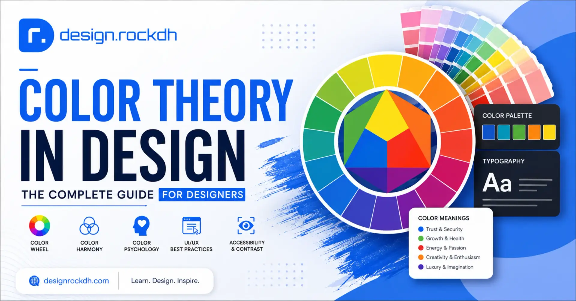
Understanding the Color Wheel
Every designer should become familiar with the color wheel because it forms the foundation of almost every color decision.
Originally developed to organize colors based on their relationships, the color wheel helps designers discover combinations that naturally feel balanced and visually appealing.
The wheel is divided into three main categories.
Primary Colors
Primary colors cannot be created by mixing other colors together.
They include:
- Red
- Blue
- Yellow
These three colors serve as the building blocks for nearly every other color in traditional color theory.
Secondary Colors
When two primary colors are combined, they produce secondary colors.
For example:
- Blue + Yellow = Green
- Red + Yellow = Orange
- Blue + Red = Purple
Secondary colors provide more flexibility while maintaining harmony within a palette.
Tertiary Colors
Tertiary colors are created by mixing one primary color with a neighboring secondary color.
Examples include:
- Blue-Green
- Yellow-Green
- Yellow-Orange
- Red-Orange
- Red-Purple
- Blue-Purple
These intermediate colors allow designers to build richer, more sophisticated visual systems with smoother transitions between hues.
Instead of relying only on bold primary colors, modern interfaces often use carefully selected tertiary shades to create subtle depth and balance.
Why Professional Designers Always Start With the Color Wheel
Choosing colors based solely on personal preference often leads to inconsistent designs.
Professional designers rarely begin by asking, “What color do I like?”
Instead, they ask questions such as:
- Who is the target audience?
- What emotion should users feel?
- What action should users take?
- What personality should the brand communicate?
The color wheel helps answer those questions by revealing which colors naturally support one another and which combinations create contrast, emphasis, or harmony.
Rather than limiting creativity, understanding color relationships gives designers more control over how their work is perceived.
That’s why mastering the color wheel is one of the first lessons taught in graphic design, branding, illustration, and UI/UX design courses.
Color Harmony in Design: How to Combine Colors Like a Professional Designer
Now that you understand the basics of the color wheel, it’s time to learn how designers actually use it.
Knowing individual colors is helpful, but knowing how colors work together is what separates amateur design from professional design. This relationship between colors is known as color harmony.
Color harmony refers to combinations of colors that naturally create balance, contrast, and visual appeal. Instead of randomly selecting colors, designers rely on established harmony rules to create layouts that feel intentional and easy on the eyes.
Whether you’re designing a landing page, a mobile app, a logo, or a complete brand identity, choosing the right harmony can dramatically improve the overall user experience.
Let’s explore the most widely used color harmony techniques.
1. Complementary Colors
Complementary colors are located directly opposite each other on the color wheel.
Some classic examples include:
- Blue + Orange
- Red + Green
- Purple + Yellow
Because these colors create the strongest contrast, they’re excellent for grabbing attention.
Think about many “Buy Now” or “Sign Up” buttons. Designers often use complementary colors because they naturally stand out from the surrounding interface without requiring extra decoration.
Best Uses
Complementary color schemes work especially well for:
- Call-to-action (CTA) buttons
- Marketing banners
- Promotional graphics
- Sports branding
- Posters
- Product advertisements
Advantages
The biggest advantage is contrast.
When used correctly, complementary colors immediately direct the user’s eye toward important content.
However, using them in equal amounts can feel overwhelming. Professional designers usually choose one dominant color while using its complementary color only as an accent.
This creates excitement without causing visual fatigue.
2. Analogous Colors
Analogous colors sit next to each other on the color wheel.
For example:
Blue → Blue-Green → Green
Because these colors are closely related, they naturally feel calm, balanced, and cohesive.
Instead of creating dramatic contrast, analogous palettes create smooth transitions and a unified appearance.
That’s one reason many wellness brands, educational platforms, and portfolio websites rely on analogous color schemes.
Best Uses
Analogous colors are ideal for:
- Websites
- Mobile applications
- Dashboards
- Presentation slides
- Nature-inspired brands
- Editorial layouts
Advantages
These palettes feel comfortable and professional because the colors already share visual similarities.
The result is a clean interface that guides users naturally without overwhelming them.
If your goal is elegance rather than excitement, analogous colors are often an excellent choice.
3. Triadic Colors
Triadic color harmony uses three colors evenly spaced around the color wheel.
A classic example includes:
- Red
- Blue
- Yellow
Unlike complementary palettes, triadic schemes offer more variety while still maintaining balance.
Because each color has equal visual importance, these palettes feel energetic, playful, and creative.
Professional designers often reduce the saturation of one or two colors so the overall design doesn’t become visually overwhelming.
Best Uses
Triadic palettes are popular in:
- Children’s products
- Educational graphics
- Creative agencies
- Entertainment brands
- Infographics
These industries benefit from bright, engaging visuals that immediately capture attention.
4. Split Complementary Colors
Split complementary harmony begins with one primary color.
Instead of choosing the exact opposite color, designers select the two colors located on either side of that opposite color.
The result offers nearly the same visual contrast as complementary colors but feels softer and easier to balance.
Many experienced designers prefer this approach because it provides flexibility without sacrificing impact.
Benefits
A split complementary palette offers:
- Strong visual contrast
- Better balance
- More color variety
- Less visual tension
It’s an excellent choice for websites, dashboards, and digital products where readability is just as important as visual interest.
5. Monochromatic Colors
Sometimes the most effective palette uses only a single color.
Monochromatic color schemes rely on different shades, tints, and tones of one base color.
For example:
Light Blue
↓
Blue
↓
Dark Blue
Although simple, monochromatic palettes often look incredibly sophisticated.
They’re especially popular in SaaS products, fintech applications, healthcare platforms, and corporate websites because they create a strong sense of consistency and professionalism.
Best Uses
Monochromatic palettes are perfect for:
- SaaS dashboards
- Corporate websites
- Portfolio websites
- Minimal UI
- Productivity apps
The biggest advantage is clarity.
Since every element belongs to the same color family, users can focus more on the content rather than the decoration.
6. Tetradic Colors
Tetradic harmony combines four colors that form a rectangle on the color wheel.
Among all harmony systems, this is one of the most versatile—but also one of the most difficult to master.
Using four equally vibrant colors can quickly create visual chaos.
That’s why professional designers typically choose one dominant color while allowing the remaining colors to support the composition.
Best Uses
Tetradic color schemes are commonly used for:
- Large illustrations
- Data visualizations
- Complex dashboards
- Infographics
- Editorial graphics
When balanced properly, they produce rich, dynamic visuals with plenty of variety.
Warm Colors vs. Cool Colors
Beyond harmony, designers also think about the emotional temperature of colors.
Warm Colors
Warm colors include:
- Red
- Orange
- Yellow
These colors naturally communicate:
- Energy
- Passion
- Excitement
- Urgency
- Optimism
Because they stimulate attention, warm colors are widely used in food brands, entertainment, sports, retail, and seasonal promotions.
A bright orange button, for example, often feels energetic and encourages immediate interaction.
Cool Colors
Cool colors include:
- Blue
- Green
- Purple
These colors are generally associated with:
- Calmness
- Trust
- Stability
- Professionalism
- Growth
That’s why banks, healthcare providers, software companies, educational institutions, and finance brands frequently build their identities around cool color palettes.
Blue, in particular, has become one of the most trusted colors in digital product design because it communicates reliability without feeling aggressive.
Choosing the Right Harmony for Your Project
There’s no universal “best” color combination.
The right harmony depends on your audience, industry, and communication goals.
Ask yourself these questions before selecting a palette:
- Should the design feel calm or energetic?
- Do I want users to focus on one element or explore the entire page?
- Am I designing for a luxury brand, a startup, or an educational platform?
- Which emotion should visitors experience first?
When your color choices align with your message, the entire design feels more cohesive and memorable.
Professional designers don’t simply choose colors they like—they choose colors that help users understand, trust, and engage with the design.
Color Psychology in Design: How Colors Influence Human Decisions
Have you ever wondered why banks often use blue, eco-friendly brands lean toward green, or luxury fashion houses frequently embrace black?
These choices aren’t random.
Behind every successful brand lies a carefully planned color strategy rooted in color psychology—the study of how colors influence human thoughts, emotions, and behaviors.
While culture, personal experiences, and context all shape how people perceive colors, certain emotional associations appear consistently across many industries. Designers use these patterns to create stronger connections between brands and their audiences.
Understanding color psychology allows you to choose colors that don’t just look attractive—they communicate the right message before users even begin reading.
Understanding Color Psychology
Color psychology explores the relationship between visual color and emotional response.
When someone visits your website, opens your app, or notices your logo, their brain processes color almost instantly. That first impression often shapes whether your design feels trustworthy, energetic, luxurious, playful, or calming.
Of course, no single color has a universal meaning. Cultural differences and individual experiences always influence perception.
However, many colors have developed common associations through years of marketing, branding, and everyday experience.
Professional designers use these emotional cues strategically rather than relying on personal preference.
What Different Colors Communicate
Let’s look at the emotions commonly associated with major colors and where they’re frequently used.
Blue — Trust, Stability, and Professionalism
Blue remains one of the safest and most versatile colors in design.
It often represents:
- Trust
- Security
- Intelligence
- Reliability
- Stability
This is one reason technology companies, financial institutions, healthcare providers, and SaaS businesses frequently choose blue as their primary brand color.
When users see blue, they often feel more confident sharing information or making purchasing decisions.
If your goal is to build credibility, blue is an excellent starting point.
Green — Nature, Growth, and Wellness
Green naturally reminds people of forests, plants, and healthy environments.
It commonly represents:
- Growth
- Sustainability
- Health
- Balance
- Freshness
Brands focused on wellness, healthcare, environmental initiatives, and organic products frequently use green because it reinforces their message without requiring additional explanation.
Green also performs well in interfaces where “success” or positive actions need to be communicated.
Red — Energy, Passion, and Urgency
Few colors attract attention as quickly as red.
It immediately creates a sense of excitement and movement.
Red is commonly associated with:
- Passion
- Love
- Energy
- Urgency
- Power
Restaurants often use red because it’s believed to stimulate appetite, while retailers rely on it during promotional campaigns to create urgency.
In UI design, red is typically reserved for errors, warnings, or destructive actions such as deleting data.
Because red naturally attracts attention, it should be used carefully rather than excessively.
Orange — Creativity and Enthusiasm
Orange combines the energy of red with the optimism of yellow.
It often communicates:
- Creativity
- Adventure
- Confidence
- Friendliness
- Innovation
Many startups and creative agencies incorporate orange into their branding because it feels energetic without appearing overly aggressive.
Orange also works well for call-to-action buttons that need to stand out from neutral backgrounds.
Yellow — Optimism and Happiness
Yellow is often associated with:
- Positivity
- Joy
- Curiosity
- Optimism
- Warmth
Because it’s one of the brightest colors, yellow naturally attracts attention.
However, too much bright yellow can become visually overwhelming, so designers typically use it as an accent rather than a dominant interface color.
Educational platforms and children’s brands often use yellow to create an inviting atmosphere.
Purple — Creativity and Luxury
Purple has long been connected with royalty and exclusivity.
Today, it commonly represents:
- Luxury
- Creativity
- Imagination
- Wisdom
- Sophistication
Beauty brands, premium products, and creative industries frequently incorporate purple to communicate elegance and originality.
Black — Elegance and Exclusivity
Black is timeless.
Depending on context, it can represent:
- Luxury
- Power
- Sophistication
- Authority
- Modernity
Luxury fashion brands often rely on black because it creates a premium appearance without requiring excessive visual complexity.
Minimalist interfaces also use black to establish strong contrast and clean aesthetics.
White — Simplicity and Clarity
White is often associated with:
- Simplicity
- Purity
- Cleanliness
- Transparency
- Minimalism
Modern technology companies frequently use generous white space because it improves readability while allowing important interface elements to stand out.
White doesn’t simply function as a background—it actively contributes to visual hierarchy.
Gray and Pink
Gray generally communicates neutrality, professionalism, and balance.
Pink often conveys compassion, friendliness, warmth, and lifestyle-focused branding.
Both colors become more powerful when paired with complementary palettes that reinforce their intended message.
Color Theory in Branding
Some of the world’s most recognizable companies are identified as much by their colors as by their logos.
Think about how quickly you recognize certain brands simply from a familiar shade of blue, red, or green.
This isn’t coincidence.
Consistent color usage helps customers build trust and recognition over time.
According to the original guide, successful branding often follows familiar emotional patterns:
- Blue communicates trust and reliability.
- Red creates excitement and appetite.
- Green reinforces sustainability and wellness.
- Black emphasizes luxury and exclusivity.
When choosing brand colors, ask yourself:
- What values does my brand represent?
- Who is my target audience?
- Which emotions should customers experience?
- How do competitors use color?
The best brand palettes align visual identity with business personality rather than simply following design trends.
Applying Color Theory in UI/UX Design
In digital products, color isn’t only decorative—it functions as part of the interface itself.
Users quickly learn what colors mean because modern applications follow consistent visual patterns.
For example:
| Interface Element | Typical Color |
|---|---|
| Primary Button | Brand Color |
| Secondary Button | Neutral Gray |
| Success Message | Green |
| Warning Alert | Orange |
| Error Message | Red |
| Information Notice | Blue |
Because these patterns appear across thousands of websites and apps, users instinctively understand them.
Maintaining consistency throughout your interface improves usability and reduces confusion.
Color should always help users complete tasks more efficiently, not distract them from those tasks.
Accessibility and Contrast
Beautiful interfaces should also be inclusive.
One of the most common mistakes new designers make is choosing colors that look attractive but reduce readability.
Accessibility begins with sufficient contrast.
For example:
✅ Dark text on light backgrounds
✅ Light text on dark backgrounds
Avoid combinations like:
- Light gray text on white backgrounds
- Red and green together for essential information
Not every user perceives color in the same way.
Designing with accessibility in mind ensures that everyone—including users with visual impairments or color vision deficiencies—can comfortably interact with your content.
Better accessibility almost always leads to a better user experience for everyone.
RGB vs. CMYK: Choosing the Right Color Mode
One mistake many beginners make is designing everything in a single color mode.
In reality, different mediums require different color systems.
RGB (Red, Green, Blue)
RGB is designed for digital displays.
Use it when creating:
- Websites
- Mobile applications
- Social media graphics
- Digital presentations
- User interfaces
Because RGB uses light, colors generally appear brighter and more vibrant on screens.
CMYK (Cyan, Magenta, Yellow, Black)
CMYK is designed for physical printing.
Use it for:
- Business cards
- Flyers
- Posters
- Packaging
- Brochures
Since printers use ink instead of light, printed colors may appear slightly less vibrant than their RGB equivalents.
If your final product will be printed, always prepare your artwork in CMYK to avoid unexpected color shifts.
Using HEX Codes in Digital Design
Unlike print, digital design relies heavily on HEX color values to maintain consistency across websites and applications.
For example:
- Blue —
#2563EB - Green —
#10B981 - Orange —
#F97316 - White —
#FFFFFF - Black —
#111827
Saving your brand colors as HEX values ensures that every designer and developer uses the exact same colors across every screen and platform.
How to Build an Effective Color Palette
One of the biggest misconceptions in design is that using more colors automatically makes a design more attractive. In reality, the opposite is often true.
Most professional brands rely on a limited, well-structured color palette. By defining clear roles for each color, they create designs that are easier to recognize, more visually balanced, and consistent across every platform.
A simple and effective framework recommended in the original guide is the 60–30–10 rule:
- 60% Primary Color – Forms the foundation of your design.
- 30% Secondary Color – Supports the primary color and adds variety.
- 10% Accent Color – Draws attention to important elements like buttons, links, or calls-to-action.
This ratio helps create a clear visual hierarchy without overwhelming the user.
Best Free Tools for Creating Color Palettes
You don’t need expensive software to create professional color schemes. Several free tools make it easy to explore harmonious palettes, test combinations, and gather inspiration.
Adobe Color
One of the most powerful tools for building palettes based on established color harmony rules.
Best for:
- Color wheel exploration
- Harmony generation
- Accessibility checks
Download:
https://color.adobe.com/
Coolors
A fast and intuitive palette generator that’s perfect when you need inspiration in seconds.
Best for:
- Branding projects
- UI color systems
- Quick experimentation
Download:
https://coolors.co/
Color Hunt
A curated collection of trending color palettes created by designers around the world.
Best for:
- Website inspiration
- Social media graphics
- Modern design trends
Download:
https://colorhunt.co/
Happy Hues
Designed specifically for web designers looking for real interface color inspiration.
Best for:
- Website layouts
- Landing pages
- UI inspiration
Download:
https://www.happyhues.co/
Huemint
Uses artificial intelligence to generate complete brand color systems based on your design goals.
Best for:
- Brand identities
- Startup projects
- Product design
Download:
https://huemint.com/
Each of these resources can help you experiment with palettes while developing your own understanding of color relationships.
Best Free Google Fonts That Pair Well with Modern Color Palettes
Typography and color work hand in hand.
Even the perfect color palette can feel unprofessional if it’s paired with the wrong typeface. Likewise, a great font becomes even more effective when supported by thoughtful color choices.
The original guide recommends these free Google Fonts:
| Font | Best For |
|---|---|
| Inter | UI/UX, SaaS |
| Manrope | Websites |
| Outfit | Modern Branding |
| Poppins | Social Media |
| DM Sans | Mobile Apps |
| Plus Jakarta Sans | Landing Pages |
| Space Grotesk | Creative Design |
| Urbanist | Dashboards |
| Sora | Startup Websites |
| Nunito Sans | Blogs |
These fonts are versatile, highly readable, and pair well with both minimalist and colorful design systems.
Common Color Mistakes Designers Should Avoid
Even experienced designers occasionally make color-related mistakes. Fortunately, most of them are easy to avoid once you know what to watch for.
Using Too Many Colors
A palette with too many competing colors often feels chaotic.
Instead of trying to include every favorite color, focus on three to five core colors that work together consistently.
Ignoring Contrast
Poor contrast makes text difficult to read and weakens the overall user experience.
Always ensure sufficient contrast between text and background, especially for headings, buttons, and navigation.
Following Trends Without Purpose
Design trends come and go.
Choosing colors simply because they’re fashionable can make your brand feel outdated within a few years.
Instead, select colors that genuinely reflect your brand’s personality and audience.
Forgetting Accessibility
Color should never be the only way users receive important information.
Test your designs for readability and consider people with color vision deficiencies when choosing combinations.
Inconsistent Branding
Using different color palettes across your website, presentations, social media, and marketing materials weakens brand recognition.
Create a style guide and use the same core colors consistently across every platform.
Practical Tips for Choosing Better Colors
If you’re unsure where to begin, keep these practical guidelines in mind:
- Start with one strong primary brand color.
- Add one complementary secondary color.
- Reserve one accent color for calls-to-action.
- Use neutral colors generously to create breathing room.
- Test your palette on multiple screens and devices.
- Pair your colors with consistent typography.
- Check color contrast using accessibility tools.
- Save your colors as reusable design tokens or brand guidelines.
Small decisions like these make a significant difference as your projects become larger and more complex.
- 6 Modern Gradient Color Palettes Designers Should Use in 2026
https://designrockdh.com/6-modern-gradient-color-palettes-designers-should-use-in-2026/ - 5 Modern Color Palettes with HEX Codes for Designers
https://designrockdh.com/5-modern-color-palettes-with-hex-codes-for-designers/ - 6 Soft Gradient Color Combinations That Instantly Elevate Your Designs
https://designrockdh.com/6-soft-gradient-color-combinations-that-instantly-elevate-your-designs/ - 6 Elegant Color Combination Ideas for Designers with HEX Codes
https://designrockdh.com/color-combination-ideas-for-designers/ - Free Fonts for Designers: Stylish Fonts for Logos, Branding & Social Media
https://designrockdh.com/free-fonts-for-designers-stylish-fonts-for-logos-branding-social-media/ - 5 Fonts That Look Like Professional Logos (Agale, Zaslia & More)
https://designrockdh.com/fonts-that-look-like-logos/ - Fonts for T-Shirt Design: How to Choose the Right Typeface
https://designrockdh.com/fonts-for-t-shirt-design-how-to-choose-the-right-typeface-2026-guide/ - Easy-to-Read Fonts for Design: Clear, Modern, and Highly Legible Typeface
https://designrockdh.com/easy-to-read-fonts-for-design-clear-modern-and-highly-legible-typeface/
Frequently Asked Questions
Is color theory important for beginners?
Absolutely. Learning color theory early helps you make more intentional design decisions, improve visual balance, and avoid many common mistakes that beginners often encounter.
How many colors should a brand use?
According to the guide, most brands work well with one primary color, one secondary color, one accent color, and a set of neutral shades. This keeps branding consistent while allowing enough flexibility across different designs.
Which color is best for building trust?
Blue is widely associated with trust, stability, and professionalism, making it a popular choice for technology companies, financial institutions, and healthcare organizations.
What’s the best color combination for websites?
There isn’t a single perfect combination.
The right palette depends on your audience, industry, and goals. However, a neutral background paired with a strong primary brand color and a contrasting accent color for calls-to-action is a reliable starting point.
Which free color palette tool should I start with?
The original guide recommends Coolors for quick inspiration and Adobe Color for building palettes using established color harmony principles.
Summary
Color theory is much more than learning the names of colors or memorizing the color wheel. It’s about understanding how people perceive visual information and using that knowledge to create meaningful design experiences.
Whether you’re designing a logo, building a website, developing a mobile app, or creating marketing materials, thoughtful color choices can improve readability, strengthen branding, guide user behavior, and leave a lasting impression.
The best designers don’t choose colors based on trends alone. They choose colors that solve communication problems, support accessibility, and reinforce the message they want users to remember.
As you continue growing your design skills, experiment with different palettes, study successful brands, and test your work across devices and audiences. The more intentionally you use color, the more professional and effective your designs will become.









When someone writes an piece of writing he/she maintains the plan of a user in his/her brain that how a user can understand it. Therefore that’s why this article is outstdanding. Thanks!
Great article! As someone interested in smart investing, I find posts like this. It’s refreshing to see down-to-earth advice instead of generic tips.
I am extremely inspired together with your writing abilities and also with the format for your weblog. Is this a paid subject or did you customize it your self? Anyway keep up the excellent quality writing, it is rare to look a great weblog like this one these days..
Hi, after reading this awesome post i am too glad to share my knowledge here with mates.
I blog often and I truly thank you for your content. This great article has truly peaked my interest. I will book mark your blog and keep checking for new details about once a week. I subscribed to your RSS feed too.
Hola! I’ve been reading your site for a while now and finally got the bravery to go ahead and give you a shout out from Atascocita Tx! Just wanted to mention keep up the excellent job!
Unquestionably believe that which you said. Your favourite justification seemed to be on the net the simplest factor to be mindful of. I say to you, I certainly get irked whilst people consider issues that they plainly do not recognise about. You controlled to hit the nail upon the highest as neatly as outlined out the entire thing with no need side effect , people could take a signal. Will probably be back to get more. Thank you
Thanks a bunch for sharing this with all of us you really know what you’re speaking about! Bookmarked. Kindly also talk over with my site =). We can have a link change arrangement between us
This piece of writing offers clear idea in support of the new visitors of blogging, that in fact how to do blogging and site-building.