A logo is much more than a symbol—it’s the face of your brand. Long before customers experience your products or services, they’ll form an opinion based on your visual identity. While colors, icons, and layouts all contribute to that first impression, typography often does the heavy lifting.
Think about companies like Google, Netflix, Coca-Cola, Canon, or Zara. Even without their icons, their names are instantly recognizable because of their distinctive typography. That’s the power of a well-chosen logo font.
Selecting the right font isn’t simply about picking something stylish. Your typeface should communicate your brand’s personality, remain readable across different sizes, and stay relevant for years—not just follow today’s design trends.
Whether you’re designing a logo for a startup, refreshing an existing brand, or creating identities for clients, understanding logo typography is essential. In this guide, you’ll learn how professional designers choose fonts, discover some of the best free and premium logo fonts available today, and find trusted resources to download them.
Why Your Logo Font Matters
Typography is one of the most powerful elements of brand identity because it influences perception before people even read your message.
A modern sans-serif font immediately suggests innovation and simplicity. A classic serif communicates tradition and trust. A handwritten script feels personal and artistic, while a bold display font demands attention.
Research in branding and consumer psychology consistently shows that people form opinions about a brand within seconds. Much of that judgment comes from visual design—including typography.
A thoughtfully selected logo font can make your business appear:
- Professional
- Modern
- Innovative
- Luxurious
- Trustworthy
- Creative
- Friendly
- Premium
On the other hand, choosing a trendy or poorly designed typeface can make your brand look outdated, inconsistent, or difficult to remember.
Simply put, your font becomes part of your brand’s voice.
What Makes a Great Logo Font?
Professional logo designers rarely choose fonts based only on appearance. Instead, they evaluate several key characteristics before making a decision.
Readability
Your logo should remain legible whether it’s displayed on a business card or a billboard. If people struggle to read your company name, the font isn’t doing its job.
Personality
Every typeface carries emotional meaning. Before choosing a font, ask yourself:
- Does it feel premium?
- Is it approachable?
- Does it match my industry?
- Will it appeal to my target audience?
A luxury jewelry brand and a gaming company shouldn’t use the same typography.
Scalability
A good logo works across every platform:
- Websites
- Mobile apps
- Packaging
- Business cards
- Social media profiles
- Product labels
- Merchandise
- Email signatures
Always test your logo at both very small and very large sizes.
Timelessness
Many trendy fonts disappear after a few years. Brands that invest in timeless typography avoid expensive redesigns later.
Instead of following trends, prioritize clarity and longevity.
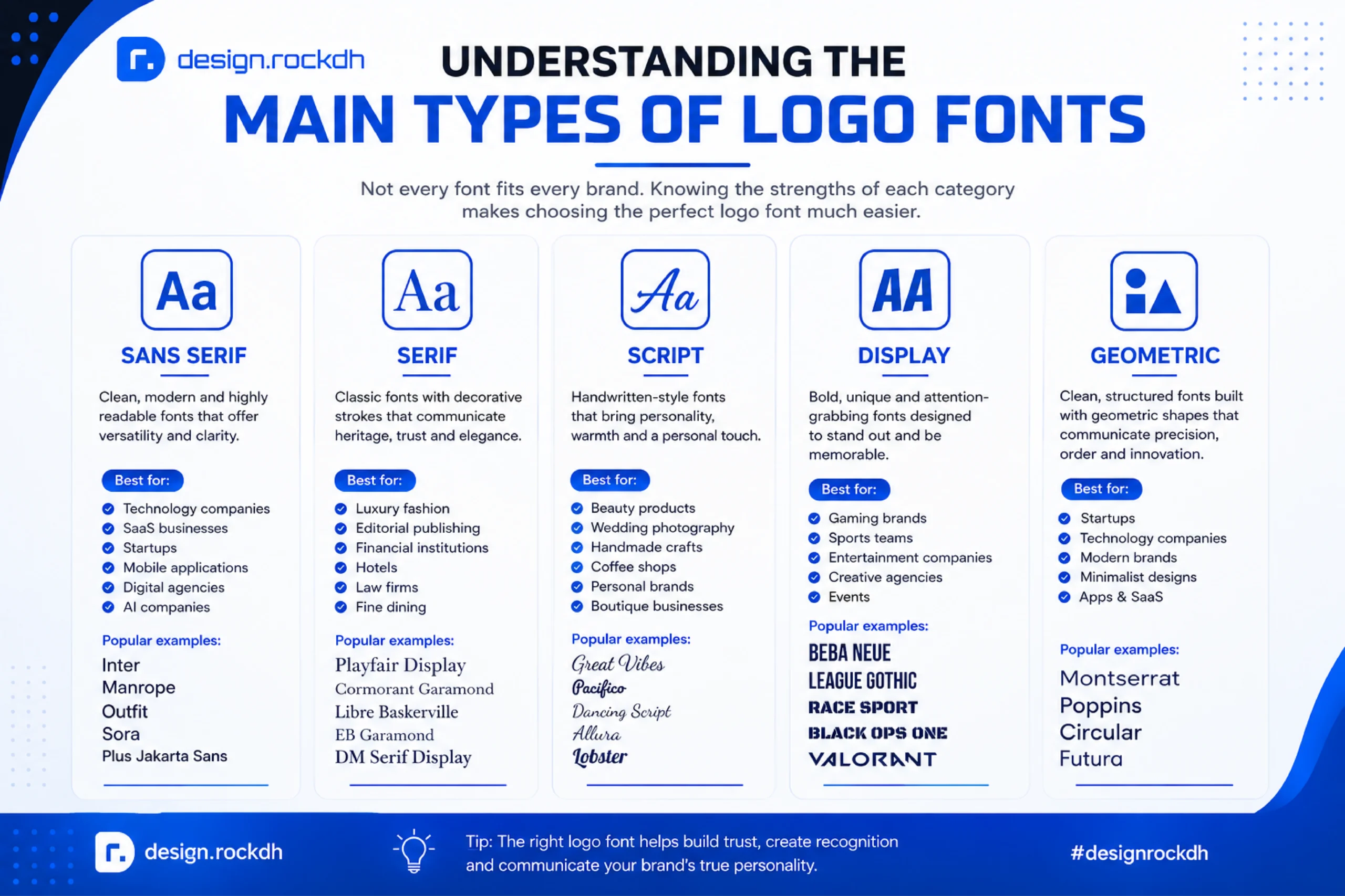
Understanding the Main Types of Logo Fonts
Not every font fits every brand. Knowing the strengths of each category makes choosing much easier.
Sans Serif Fonts
Sans serif fonts have become the standard choice for modern businesses. Their clean appearance, balanced proportions, and excellent readability make them incredibly versatile.
They’re especially popular among:
- Technology companies
- SaaS businesses
- Startups
- Mobile applications
- Digital agencies
- AI companies
Popular examples include:
- Inter
- Manrope
- Outfit
- Sora
- Plus Jakarta Sans
These fonts work beautifully across websites, mobile interfaces, and digital branding.
Serif Fonts
Serif fonts feature decorative strokes at the ends of characters. They communicate heritage, authority, sophistication, and elegance.
Brands in these industries often prefer serif typography:
- Luxury fashion
- Editorial publishing
- Financial institutions
- Hotels
- Law firms
- Fine dining
Excellent serif options include:
- Playfair Display
- Cormorant Garamond
- Libre Baskerville
- EB Garamond
- DM Serif Display
Script Fonts
Script fonts imitate handwriting and bring personality to a brand.
They’re ideal for:
- Beauty products
- Wedding photography
- Handmade crafts
- Coffee shops
- Personal brands
- Boutique businesses
However, readability should always come first. Decorative script fonts are best used sparingly.
Display Fonts
Display fonts are designed to grab attention.
They’re commonly used for:
- Gaming brands
- Sports teams
- Entertainment companies
- Creative agencies
- Events
These fonts often feature bold shapes and distinctive character designs that make logos memorable.
Geometric Fonts
Geometric fonts rely on simple mathematical forms like circles and squares. They communicate precision, order, and innovation.
Popular choices include:
- Montserrat
- Poppins
- Circular
- Futura
These fonts are particularly effective for startups and technology companies looking for a minimalist identity.
How to Choose the Right Logo Font
Choosing the perfect logo font isn’t about finding the prettiest typeface—it’s about selecting one that reflects your brand’s identity.
Start by asking yourself a few important questions.
Who Is Your Audience?
Your audience should influence every branding decision.
For example:
- Young tech users often respond well to modern sans-serif fonts.
- Luxury shoppers expect elegant serif typography.
- Creative audiences appreciate unique display fonts.
- Corporate clients generally prefer clean, professional lettering.
Understanding your audience helps narrow your options quickly.
What Personality Should Your Brand Communicate?
Every font tells a story.
Here’s a simple reference:
| Brand Personality | Recommended Font Style |
|---|---|
| Modern | Inter, Outfit |
| Luxury | Playfair Display |
| Creative | Bebas Neue |
| Friendly | Nunito Sans |
| Professional | IBM Plex Sans |
| Minimal | Manrope |
| Technology | Space Grotesk |
| Fashion | Raleway |
Before selecting a font, define three words that describe your brand. Then choose typography that reinforces those qualities.
Think Beyond the Logo
A logo rarely exists in isolation.
The same typography often appears on:
- Website headings
- Marketing materials
- Packaging
- Business presentations
- Social media graphics
- Email newsletters
Choosing a flexible font family with multiple weights makes maintaining visual consistency much easier.
Consider Font Licensing
One of the biggest mistakes beginners make is downloading fonts without checking the license.
Some fonts are free only for personal use.
Others require a commercial license before being used in branding or client work.
Google Fonts provides an excellent collection of open-source fonts suitable for commercial projects, making it a popular choice for professional designers.
Always verify licensing before publishing a logo.
Free vs Premium Logo Fonts
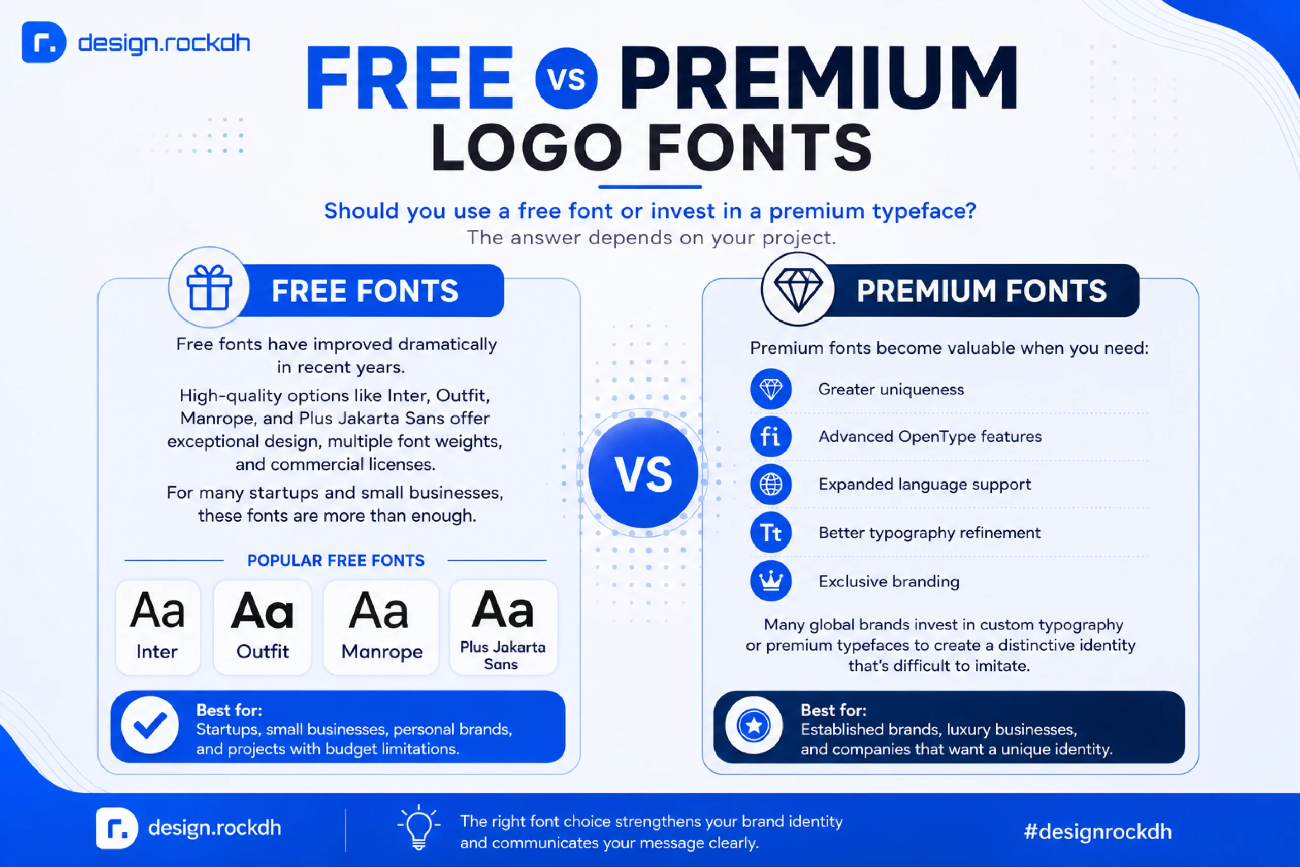
Should you use a free font or invest in a premium typeface?
The answer depends on your project.
Free Fonts
Free fonts have improved dramatically in recent years.
High-quality options like Inter, Outfit, Manrope, and Plus Jakarta Sans offer exceptional design, multiple font weights, and commercial licenses.
For many startups and small businesses, these fonts are more than enough.
Premium Fonts
Premium fonts become valuable when you need:
- Greater uniqueness
- Advanced OpenType features
- Expanded language support
- Better typography refinement
- Exclusive branding
Many global brands invest in custom typography or premium typefaces to create a distinctive identity that’s difficult to imitate.
Why Designers Rarely Use Fonts “As-Is”
One of the biggest misconceptions is that professional logos are created simply by typing a company name using a font.
In reality, experienced designers almost always customize typography.
They may:
- Adjust letter spacing
- Modify character shapes
- Create custom ligatures
- Redraw certain letters
- Balance visual weight
- Improve optical alignment
These subtle refinements transform an ordinary typeface into a unique brand asset.
That’s why two logos using the same font can look completely different.
The 25 Best Logo Fonts for Branding in 2026
Now that you understand what makes a great logo font, let’s look at the typefaces professional designers use most often. These fonts have earned their reputation because they’re versatile, highly readable, and capable of representing brands across different industries.
Rather than choosing a font simply because it’s trendy, think about how well it reflects your brand’s personality. The best logo isn’t necessarily the most decorative one—it’s the one people remember.
1. Inter
Category: Sans Serif
Inter has become one of the most popular fonts among UI designers, startups, and SaaS companies. Originally created for digital interfaces, it offers exceptional readability at every size, making it an excellent choice for modern logos.
Its balanced proportions and clean appearance give brands a professional, trustworthy image without feeling cold or corporate.
Best for
- SaaS
- Technology
- AI startups
- Mobile apps
- Software companies
Strengths
✔ Extremely readable
✔ Modern appearance
✔ Multiple font weights
✔ Free for commercial use
Download
https://fonts.google.com/specimen/Inter
2. Manrope
Category: Sans Serif
Manrope combines simplicity with elegance. Unlike many geometric fonts, it feels softer and more approachable, making it suitable for both startups and established businesses.
Its clean curves create a refined identity while maintaining excellent legibility.
Best for
- Creative agencies
- Consulting firms
- Startups
- Digital businesses
Why Designers Love It
- Modern without looking generic
- Excellent spacing
- Works beautifully in minimalist logos
Download
https://fonts.google.com/specimen/Manrope
3. Outfit
Category: Geometric Sans Serif
Outfit has quickly become a favorite among branding designers. It strikes a perfect balance between geometric precision and human warmth.
Because of its neutral appearance, it pairs well with icons, monograms, and minimalist brand identities.
Perfect For
- Personal brands
- Creative studios
- Design agencies
- Architecture firms
Pros
- Excellent letter balance
- Great for wordmarks
- Highly scalable
Download
https://fonts.google.com/specimen/Outfit
4. Sora
Category: Modern Sans Serif
Sora has a slightly rounded appearance that makes brands feel approachable while still looking innovative.
It’s particularly popular among AI startups and fintech companies because it feels contemporary without becoming overly futuristic.
Best Industries
- FinTech
- Artificial Intelligence
- SaaS
- Healthcare Technology
Download
https://fonts.google.com/specimen/Sora
5. Montserrat
Category: Geometric Sans Serif
Few fonts are as recognizable as Montserrat. Inspired by traditional urban typography, it has become one of the most downloaded Google Fonts.
Its versatility makes it suitable for nearly every industry.
Great For
- Real estate
- Fashion
- Marketing agencies
- Retail
- Lifestyle brands
Strengths
- Large font family
- Easy to customize
- Strong readability
Download
https://fonts.google.com/specimen/Montserrat
6. Poppins
Category: Geometric Sans Serif
Poppins brings a youthful personality without sacrificing professionalism.
Its perfectly circular geometry creates a clean, balanced look that performs well in logos, websites, and marketing materials.
Recommended For
- Startups
- Ecommerce
- Mobile apps
- Digital products
- Creative businesses
Download
https://fonts.google.com/specimen/Poppins
7. Bebas Neue
Category: Display Font
If your goal is to create a bold, unforgettable logo, Bebas Neue deserves serious consideration.
Its tall uppercase characters command attention while remaining surprisingly readable.
Ideal For
- Sports
- Gaming
- Entertainment
- Fitness
- Automotive
Advantages
- Bold visual impact
- Excellent for headlines
- Highly memorable
Download
https://fonts.google.com/specimen/Bebas+Neue
8. Raleway
Category: Elegant Sans Serif
Raleway combines sophistication with simplicity.
Originally designed as a single thin weight, it has grown into a versatile font family that works exceptionally well for premium branding.
Perfect For
- Fashion
- Beauty
- Lifestyle
- Interior design
- Photography
Download
https://fonts.google.com/specimen/Raleway
9. Playfair Display
Category: Serif
Playfair Display is one of the most elegant serif fonts available.
Its dramatic contrast and graceful curves instantly create a premium feel, making it a favorite among luxury brands.
Best For
- Jewelry
- Hotels
- Editorial
- Wedding businesses
- Luxury products
Strengths
- Elegant
- Timeless
- Distinctive
Download
https://fonts.google.com/specimen/Playfair+Display
10. Cormorant Garamond
Category: Serif
Inspired by classical typography, Cormorant Garamond feels sophisticated without appearing old-fashioned.
It’s an excellent choice when you want a refined logo with a touch of personality.
Ideal Industries
- Luxury fashion
- Cosmetics
- Publishing
- Art galleries
Download
https://fonts.google.com/specimen/Cormorant+Garamond
11. Libre Baskerville
Category: Serif
Libre Baskerville emphasizes readability and professionalism.
Unlike decorative serif fonts, it remains clear even at smaller sizes, making it practical for branding.
Best For
- Financial services
- Legal firms
- Education
- Professional consulting
Download
https://fonts.google.com/specimen/Libre+Baskerville
12. DM Serif Display
Category: Serif
DM Serif Display combines traditional elegance with modern proportions.
Its bold personality helps brands appear upscale while remaining approachable.
Works Well For
- Luxury brands
- Restaurants
- Hotels
- Beauty products
Download
https://fonts.google.com/specimen/DM+Serif+Display
13. Space Grotesk
Category: Grotesk Sans Serif
Space Grotesk is one of the most exciting modern fonts available today.
It blends geometric construction with subtle irregularities, giving brands a distinctive yet highly professional appearance.
Many AI and Web3 startups have adopted similar typography because it communicates innovation without sacrificing readability.
Recommended For
- AI companies
- Blockchain projects
- Software startups
- UX agencies
- Technology brands
Highlights
✔ Modern personality
✔ Excellent digital readability
✔ Great for minimalist logos
✔ Free commercial license
Download
https://fonts.google.com/specimen/Space+Grotesk
Quick Comparison Table
| Font | Style | Best For |
|---|---|---|
| Inter | Sans Serif | SaaS, Tech |
| Manrope | Sans Serif | Agencies |
| Outfit | Sans Serif | Creative Brands |
| Sora | Sans Serif | AI & FinTech |
| Montserrat | Geometric | Corporate |
| Poppins | Geometric | Startups |
| Bebas Neue | Display | Sports |
| Raleway | Elegant Sans | Fashion |
| Playfair Display | Serif | Luxury |
| Cormorant Garamond | Serif | Editorial |
| Libre Baskerville | Serif | Corporate |
| DM Serif Display | Serif | Premium Branding |
| Space Grotesk | Grotesk | Technology |
Pro Tip from Professional Logo Designers
Don’t evaluate a font by typing your company name once and making a decision.
Instead:
- Test it in all uppercase and Title Case.
- Print it in black and white.
- View it at 32px, 128px, and 500px.
- Check how it looks beside your icon or symbol.
- Compare spacing between letters rather than focusing only on the letterforms.
Many fonts that look impressive at large sizes become difficult to read when scaled down. A logo should remain recognizable whether it’s on a social media profile picture or a billboard.
14. Plus Jakarta Sans
Category: Modern Sans Serif
If you’re looking for a font that feels clean, professional, and approachable, Plus Jakarta Sans deserves a place on your shortlist. Inspired by modern urban typography, it offers balanced proportions and a friendly personality without sacrificing professionalism.
Unlike many geometric fonts that can feel cold or mechanical, Plus Jakarta Sans introduces subtle curves that make brands appear more human and accessible.
It’s particularly popular among UI designers, fintech companies, and productivity apps.
Best For
- SaaS platforms
- Financial technology
- Productivity apps
- Startups
- Corporate branding
Why Designers Choose It
- Highly readable
- Contemporary appearance
- Large font family
- Excellent for responsive branding
Download
https://fonts.google.com/specimen/Plus+Jakarta+Sans
15. Urbanist
Category: Geometric Sans Serif
Urbanist was designed with modern digital experiences in mind. Its minimalist letterforms create a sophisticated identity while remaining flexible enough for both web and print applications.
If your brand focuses on simplicity and innovation, Urbanist is an outstanding choice.
Perfect For
- Design agencies
- Architecture firms
- Digital products
- Mobile applications
- Modern startups
Advantages
✔ Elegant proportions
✔ Minimal appearance
✔ Excellent readability
✔ Free commercial license
Download
https://fonts.google.com/specimen/Urbanist
16. Rubik
Category: Rounded Sans Serif
Rubik introduces softer corners and rounded geometry, making brands feel approachable and energetic.
Although it’s playful, it still maintains enough professionalism for business applications.
Recommended For
- Education
- Children brands
- Apps
- E-commerce
- Lifestyle companies
Strengths
- Friendly personality
- Clean letterforms
- Works well in colorful branding
Download
https://fonts.google.com/specimen/Rubik
17. Archivo
Category: Grotesk Sans Serif
Archivo was originally developed for newspaper headlines, which explains its outstanding readability.
Its bold character structure makes it an excellent option for companies wanting a strong, confident identity.
Best Industries
- Construction
- Manufacturing
- Logistics
- Real estate
- Consulting
Why It’s Popular
- Strong visual presence
- Professional look
- Excellent scalability
Download
https://fonts.google.com/specimen/Archivo
18. League Spartan
Category: Display Sans Serif
League Spartan is bold without becoming overwhelming.
Its wide, geometric letters immediately communicate strength and confidence, making it perfect for brands that want to appear powerful.
Great For
- Sports brands
- Fitness
- Automotive
- Men’s fashion
- Outdoor products
Pros
- Highly memorable
- Bold typography
- Great headline font
Download
https://fonts.google.com/specimen/League+Spartan
19. IBM Plex Sans
Category: Corporate Sans Serif
Developed by IBM, this font family balances technology with humanity.
Unlike many corporate fonts, IBM Plex Sans feels warm and approachable while maintaining a highly professional appearance.
Best For
- Enterprise software
- Healthcare
- Technology
- Education
- Government organizations
Why It Works
- Excellent multilingual support
- Corporate credibility
- Outstanding readability
Download
https://fonts.google.com/specimen/IBM+Plex+Sans
20. Nunito Sans
Category: Rounded Sans Serif
Nunito Sans combines geometric precision with rounded terminals, creating an inviting personality.
Brands looking to appear friendly and approachable often choose Nunito.
Ideal For
- Healthcare
- Education
- Community organizations
- Nonprofits
- Family brands
Advantages
✔ Soft appearance
✔ Excellent readability
✔ Modern styling
Download
https://fonts.google.com/specimen/Nunito+Sans
21. Anton
Category: Display Font
Anton isn’t subtle—and that’s exactly why many brands love it.
Originally inspired by traditional advertising typography, Anton creates logos that immediately demand attention.
Best For
- Sports
- Music
- Events
- Entertainment
- Streetwear
Designer Tip
Because Anton is naturally bold, pairing it with a lighter secondary font creates a balanced visual identity.
Download
https://fonts.google.com/specimen/Anton
22. Oswald
Category: Condensed Sans Serif
Oswald modernizes classic gothic typography while maintaining strong readability.
Its condensed proportions make it especially useful when logo space is limited.
Perfect For
- Restaurants
- Construction
- Automotive
- Sports
- Retail
Why Use It?
- Compact design
- Strong personality
- Easy to recognize
Download
https://fonts.google.com/specimen/Oswald
23. Figtree
Category: Modern Sans Serif
Figtree is one of the newest additions to Google Fonts, yet it has quickly gained popularity among UI and branding designers.
Its balanced construction makes logos appear clean without feeling generic.
Recommended For
- Startups
- Creative agencies
- SaaS
- AI companies
- Personal brands
Highlights
- Modern appearance
- Smooth curves
- Excellent screen readability
Download
https://fonts.google.com/specimen/Figtree
24. Lexend
Category: Humanist Sans Serif
Lexend was created with readability as its primary goal. It features wider letter spacing and carefully designed character shapes that reduce reading fatigue.
While originally intended for long-form reading, it also performs exceptionally well in modern branding.
Best For
- Educational platforms
- Technology
- Healthcare
- Online learning
- Government projects
Benefits
✔ Highly accessible
✔ Excellent readability
✔ Unique personality
Download
https://fonts.google.com/specimen/Lexend
25. Work Sans
Category: Grotesk Sans Serif
Work Sans is a versatile font family inspired by early grotesque typefaces while incorporating modern refinements.
Its simplicity makes it one of the safest choices for timeless logo design.
Best For
- Agencies
- Consulting
- Corporate branding
- Professional services
- Software companies
Why Designers Like It
- Clean typography
- Flexible font family
- Suitable for both print and digital branding
Download
https://fonts.google.com/specimen/Work+Sans
Best Premium Logo Fonts Worth the Investment
Free fonts are fantastic, but premium fonts often provide more refined details, expanded language support, and exclusive character sets. If you’re creating a long-term brand identity, investing in a premium typeface can be worthwhile.
GT Walsheim
One of the most recognizable modern branding fonts. Its geometric structure feels both friendly and premium.
Perfect for: Technology, startups, luxury brands
Circular
Circular has become synonymous with modern digital branding. Companies like Spotify helped popularize this clean, geometric typeface.
Best for: Apps, SaaS, fintech, digital products
Gotham
Gotham projects confidence and stability, making it a favorite for corporate identities and political campaigns.
Best for: Corporate branding, finance, architecture
Avenir Next
Designed by the legendary Adrian Frutiger, Avenir Next blends geometric precision with human warmth.
Best for: Premium businesses, healthcare, education
Proxima Nova
One of the most widely used commercial fonts on the web, Proxima Nova bridges classic and modern typography.
Best for: E-commerce, technology, media companies
Sofia Pro
Sofia Pro offers a softer, more approachable alternative to traditional geometric sans-serif fonts.
Best for: Lifestyle, fashion, beauty, creative agencies
Neue Haas Grotesk
The original inspiration behind Helvetica, Neue Haas Grotesk remains a timeless choice for premium branding.
Best for: Editorial, luxury, corporate identities
Best Font Pairings for Logo Design
Many logos include a tagline beneath the company name. Pairing fonts correctly creates hierarchy and visual harmony.
Here are some combinations professional designers frequently use:
| Primary Font | Secondary Font | Ideal For |
|---|---|---|
| Inter | Playfair Display | Technology + Luxury |
| Outfit | Manrope | Creative Agencies |
| Montserrat | Libre Baskerville | Corporate Branding |
| Space Grotesk | DM Serif Display | AI & FinTech |
| Poppins | Cormorant Garamond | Fashion |
| Bebas Neue | Inter | Sports |
| Raleway | Manrope | Lifestyle |
| IBM Plex Sans | Playfair Display | Professional Services |
Font Pairing Tips
- Limit your logo to one or two fonts.
- Use contrasting styles, such as serif with sans-serif.
- Keep visual hierarchy clear.
- Match the mood of both typefaces.
- Test readability at small sizes.
Typography Best Practices for Professional Logos
Creating a memorable logo involves more than selecting a font. Professional designers refine typography to ensure it performs well across every application.
Here are a few best practices:
- Adjust kerning manually rather than relying on default spacing.
- Avoid stretching or compressing fonts.
- Test your logo in black and white before adding color.
- Use vector formats (SVG, AI, or EPS) for scalability.
- Maintain consistent spacing between letters.
- Create both horizontal and stacked logo variations.
- Ensure readability on screens, print materials, and merchandise.
- Customize letterforms when possible to make the logo unique.
One small adjustment to spacing or a single customized character can turn a common typeface into a memorable brand mark.
Common Logo Font Mistakes to Avoid
Even the most experienced designers occasionally make typography mistakes. Fortunately, most of them are easy to avoid once you know what to look for.
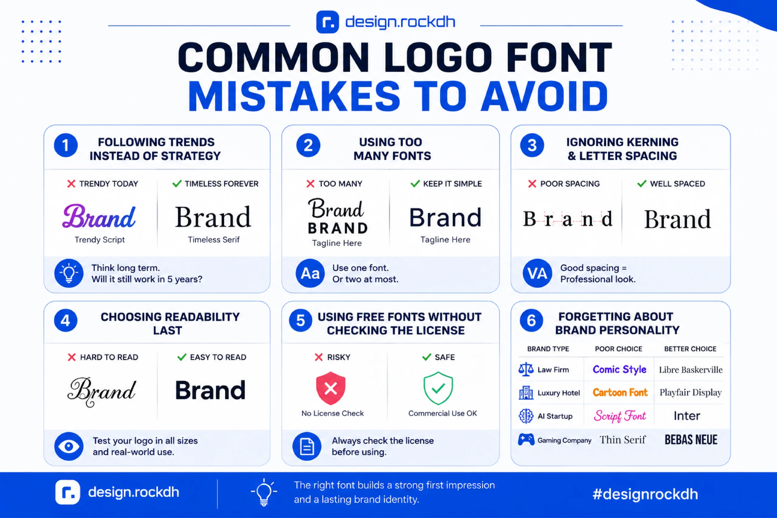
1. Following Trends Instead of Strategy
Typography trends change every year. What looks modern today may feel outdated in a few years.
A logo should represent your brand for years—not just until the next design trend arrives.
Before choosing a trendy font, ask yourself:
Will this still represent my business five years from now?
Timeless typography almost always outperforms trendy typography.
2. Using Too Many Fonts
One of the quickest ways to weaken a logo is by mixing several unrelated fonts.
Professional logos typically use:
- One font for a wordmark
- Or two complementary fonts when a tagline is included
Adding three or four different fonts creates visual confusion and reduces brand recognition.
Rule of thumb: Less is more.
3. Ignoring Kerning and Letter Spacing
Great typography isn’t just about choosing the right font—it’s also about spacing.
Poor kerning can make even expensive premium fonts look amateurish.
Professional designers always inspect:
- Letter spacing
- Character balance
- Visual alignment
- Word spacing
Even small spacing adjustments dramatically improve a logo’s appearance.
4. Choosing Readability Last
Some fonts look amazing in a portfolio but fail in real-world branding.
Always test your logo at different sizes:
- Website header
- Business card
- Mobile app icon
- Social profile picture
- Product packaging
- Billboard
If customers can’t read your logo in a small format, the font isn’t suitable.
5. Using Free Fonts Without Checking the License
Not every free font can legally be used in commercial branding.
Before using any font, verify:
- Commercial license
- Logo usage rights
- Modification permissions
- Redistribution rules
Google Fonts is one of the safest sources because nearly every font is released under an open-source license suitable for commercial projects.
6. Forgetting About Brand Personality
Typography should reinforce your brand’s message.
For example:
| Brand Type | Poor Choice | Better Choice |
|---|---|---|
| Law Firm | Comic-style Display Font | Libre Baskerville |
| Luxury Hotel | Rounded Cartoon Font | Playfair Display |
| AI Startup | Decorative Script | Inter |
| Gaming Company | Thin Serif | Bebas Neue |
Your font should support your brand—not contradict it.
How Professional Designers Customize Fonts
One common misconception is that professional logo designers simply type a company name using a font and call it finished.
In reality, custom typography is a standard part of logo design.
Experienced designers often modify fonts by:
- Adjusting kerning
- Redrawing individual letters
- Creating custom ligatures
- Changing stroke thickness
- Softening corners
- Editing terminals
- Removing unnecessary details
- Designing completely unique letterforms
These refinements help transform a widely available font into a distinctive visual identity.
That’s why brands using the same base typeface can still have logos that feel entirely different.
Where to Download Logo Fonts Safely
Downloading fonts from unofficial websites can expose you to outdated files, incorrect licensing, or even malware. Whenever possible, use trusted font libraries.
Free Font Resources
Google Fonts
The most popular collection of open-source fonts for commercial use.
Perfect for:
- Websites
- Startups
- Freelancers
- Branding projects
Font Squirrel
Offers carefully curated fonts with commercial licenses.
Adobe Fonts
Available with Adobe Creative Cloud subscriptions.
Ideal for professional designers who need premium-quality typefaces with seamless Adobe integration.
Premium Font Marketplaces
If you’re looking for exclusive fonts, these marketplaces are trusted by professional designers.
- MyFonts
- Fontspring
- Creative Market
- Envato Elements
- YouWorkForThem
Premium fonts often include:
- More weights
- Alternate glyphs
- Variable fonts
- Better multilingual support
- Advanced OpenType features
Frequently Asked Questions
What is the best font for a logo?
There isn’t a single “best” logo font because every brand has different goals. However, Inter, Outfit, Manrope, Montserrat, Playfair Display, and Space Grotesk are among the most versatile choices for modern branding.
Are Google Fonts good for logos?
Yes. Google Fonts offers a large collection of high-quality open-source fonts that are free for commercial use. Many successful startups and established businesses use Google Fonts in their branding.
Should I use a serif or sans-serif font?
It depends on your brand personality.
Choose sans-serif fonts if you want a modern, clean, and technology-focused identity.
Choose serif fonts if your brand emphasizes luxury, tradition, authority, or elegance.
Can I modify a font for my logo?
In most cases, yes—but always check the font license first. Many commercial and open-source licenses allow designers to modify letterforms for logo creation.
Are free fonts professional enough for branding?
Absolutely. Fonts like Inter, Manrope, Outfit, Plus Jakarta Sans, and Space Grotesk are widely used by professional designers and startups around the world.
How many fonts should a logo use?
Most professional logos use one font. If your logo includes a tagline, using two complementary fonts is generally the maximum recommended.
Final Thoughts
Choosing the right logo font is about more than aesthetics—it’s about creating a visual identity that communicates your brand’s values, builds trust, and stands the test of time. A thoughtfully selected typeface can make your business feel innovative, luxurious, approachable, or authoritative before a single word is read.
Whether you’re designing for a startup, a global brand, or your own creative portfolio, focus on clarity, consistency, and long-term usability rather than short-lived trends. Start with proven typefaces like Inter, Outfit, Manrope, or Playfair Display, then refine them through careful spacing and subtle customization to create something uniquely yours.
Remember, the most successful logos aren’t necessarily the most complex—they’re the ones people remember. Invest time in choosing the right typography today, and your logo will continue to represent your brand effectively for years to come.