Typography shapes the way people experience your designs. Among all type styles, serif fonts have remained a favorite for generations because they combine elegance, readability, and timeless appeal. Whether you’re designing a brand identity, building a website, creating editorial layouts, or producing marketing materials, the right serif font can instantly elevate your work.
Although design trends continue to evolve, serif fonts have never gone out of style. Modern type designers have refreshed these classic letterforms, making them just as effective for digital projects as they are for print.
In this guide, you’ll discover what serif fonts are, why they’re still a popular choice in 2026, where they work best, how to pair them with other typefaces, and 12 excellent free serif fonts you can start using today.
Whether you’re a graphic designer, marketer, business owner, or creative enthusiast, this guide will help you choose the perfect serif font for your next project.
What Is a Serif Font?
A serif font is a typeface with small finishing strokes, known as serifs, at the ends of its letters. While these details may seem subtle, they have a significant impact on both appearance and readability.
For centuries, serif fonts have been associated with professionalism, tradition, and trust. That’s why they’re commonly used in books, newspapers, magazines, universities, law firms, luxury brands, and financial institutions.
Today’s serif fonts blend classic craftsmanship with modern design principles. Many contemporary serif families are optimized for screens, making them an excellent choice for websites, blogs, and digital publications as well as printed materials.
Why Designers Still Love Serif Fonts
Despite the growing popularity of minimalist sans-serif typefaces, serif fonts continue to play an important role in modern design. Their versatility allows them to work across a wide range of creative projects while adding a sense of refinement that many other fonts simply can’t match.
Some of the biggest advantages of serif fonts include:
- A polished, professional appearance
- Comfortable reading for longer passages of text
- A premium, sophisticated feel
- Timeless style that rarely looks outdated
- Excellent performance in both print and digital media
- Strong visual hierarchy for headlines and branding
These qualities make serif fonts a dependable choice for everything from editorial layouts and corporate branding to luxury packaging and website design.
Where Can You Use Serif Fonts?
One of the biggest strengths of serif fonts is their versatility. While they’re often associated with traditional publishing, they’re equally effective in many modern design projects. Choosing the right serif typeface can instantly give your work a more polished and memorable look.
Logo Design
Serif fonts are a popular choice for logo design, especially for brands that want to communicate elegance, heritage, or trust. Luxury fashion labels, jewelry companies, law firms, and premium lifestyle brands often rely on serif typography because it creates a refined, timeless identity that leaves a lasting impression.
Website Headlines
Many modern websites use serif fonts for headings while pairing them with clean sans-serif fonts for body text. This combination creates visual contrast, improves readability, and gives the page a sophisticated, editorial feel without sacrificing user experience.
Editorial Design
Serif fonts have long been the standard for magazines, newspapers, books, and long-form articles. Their letterforms guide the eye naturally across the page, making lengthy content more comfortable to read while adding a sense of authority and professionalism.
Packaging Design
When a product needs to feel premium, serif fonts are often the first choice. They’re widely used on beauty products, perfumes, wine labels, specialty coffee packaging, and gourmet food brands because they help communicate quality, craftsmanship, and attention to detail.
Wedding Invitations
Elegant serif typefaces bring a sense of romance and tradition to wedding stationery. Whether paired with delicate script fonts or used on their own, they create invitations that feel graceful, timeless, and beautifully understated.
Business Cards
Professionals in industries such as finance, architecture, consulting, and law frequently choose serif fonts for business cards. A well-selected serif typeface projects confidence, credibility, and professionalism while helping establish a strong first impression.
Types of Serif Fonts
Not all serif fonts share the same personality. Over the years, designers have developed several distinct styles, each with its own characteristics and ideal use cases.
Old Style Serif
Old Style serif fonts are inspired by Renaissance-era typography. They feature gentle contrast between thick and thin strokes, soft curves, and highly readable letterforms.
Popular examples include Garamond and Caslon.
These fonts are perfect for:
Books
Editorial layouts
Printed publications
Classic branding
Transitional Serif
Transitional serif fonts bridge the gap between traditional and modern typography. They offer sharper contrast and cleaner shapes while maintaining the elegance associated with classic serif designs.
A well-known example is Baskerville.
These fonts work particularly well for:
Publishing
Corporate branding
Business communications
Professional presentations
Didone Serif
Didone fonts are known for their dramatic contrast, thin hairlines, and refined appearance. They immediately create a luxurious, high-fashion aesthetic that stands out in premium branding.
Famous examples include Bodoni and Didot.
They’re especially suitable for:
Fashion brands
Luxury products
Magazine covers
High-end advertising
Slab Serif
Slab serif fonts feature thick, block-like serifs that create a bold, confident appearance. They combine the familiarity of serif typography with a modern, attention-grabbing style.
Popular choices include Roboto Slab and Arvo.
These fonts are ideal for:
Headlines
Posters
Packaging
Website banners
Bold branding
12 Best Free Serif Fonts to Download
Finding a great serif font doesn’t have to mean spending money. There are plenty of beautifully designed free typefaces that deliver professional results for branding, editorial work, websites, and marketing materials. Here are twelve of the best free serif fonts every designer should consider adding to their collection.
1. Cormorant Garamond
Cormorant Garamond is a refined, contemporary interpretation of the classic Garamond family. Its elegant curves and graceful proportions make it a favorite for luxury branding and editorial design.

Best for: Luxury logos, Fashion brands, Editorial layouts, High-end marketing materials
Download: https://fonts.google.com/specimen/Cormorant+Garamond
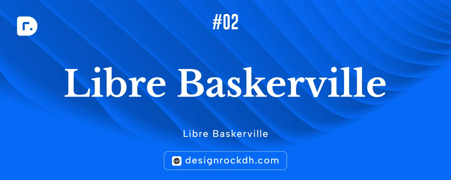
2. Libre Baskerville
Designed specifically for digital reading, Libre Baskerville offers excellent clarity on both desktop and mobile screens. It combines traditional character with modern readability, making it a reliable choice for online content.
Best for: Blogs, Business websites, Online magazines, Long-form articles
Download: https://fonts.google.com/specimen/Libre+Baskerville
3. Playfair Display
Playfair Display has become one of the most recognizable serif fonts in modern design. Its striking contrast and sophisticated appearance make it perfect for eye-catching headlines and premium branding.

Best for: Website headers, Brand identities, Magazine titles, Luxury design projects
Download: https://fonts.google.com/specimen/Playfair+Display
4. Lora
Lora strikes a perfect balance between elegance and readability. Its subtle curves give it a warm, approachable feel, making it an excellent option for content-heavy websites and editorial projects.

Best for: Blogs, Editorial layouts, Company websites, Digital publications
Download: https://fonts.google.com/specimen/Lora
5. Crimson Pro
Crimson Pro was created with long-form reading in mind. It offers exceptional legibility while maintaining a polished, professional appearance that’s ideal for formal publications.
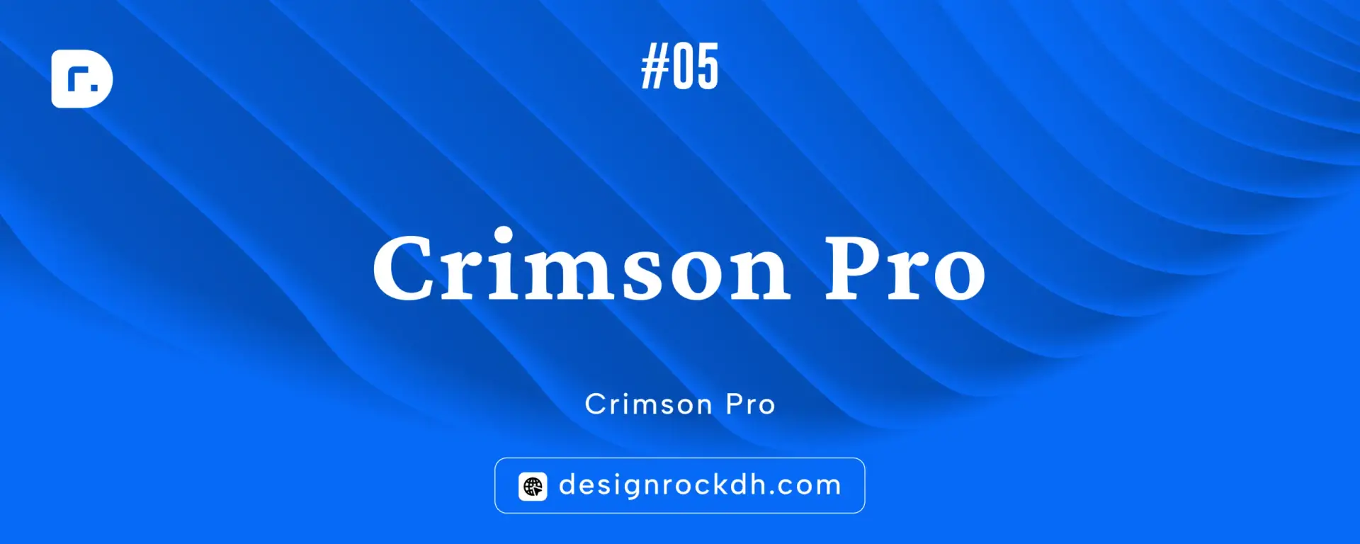
Best for: Books, Reports, Research papers, Publishing
Download: https://fonts.google.com/specimen/Crimson+Pro
6. EB Garamond
Inspired by one of history’s most celebrated typefaces, EB Garamond delivers timeless elegance with outstanding readability. It’s an excellent choice for designers who want a classic look without feeling outdated.
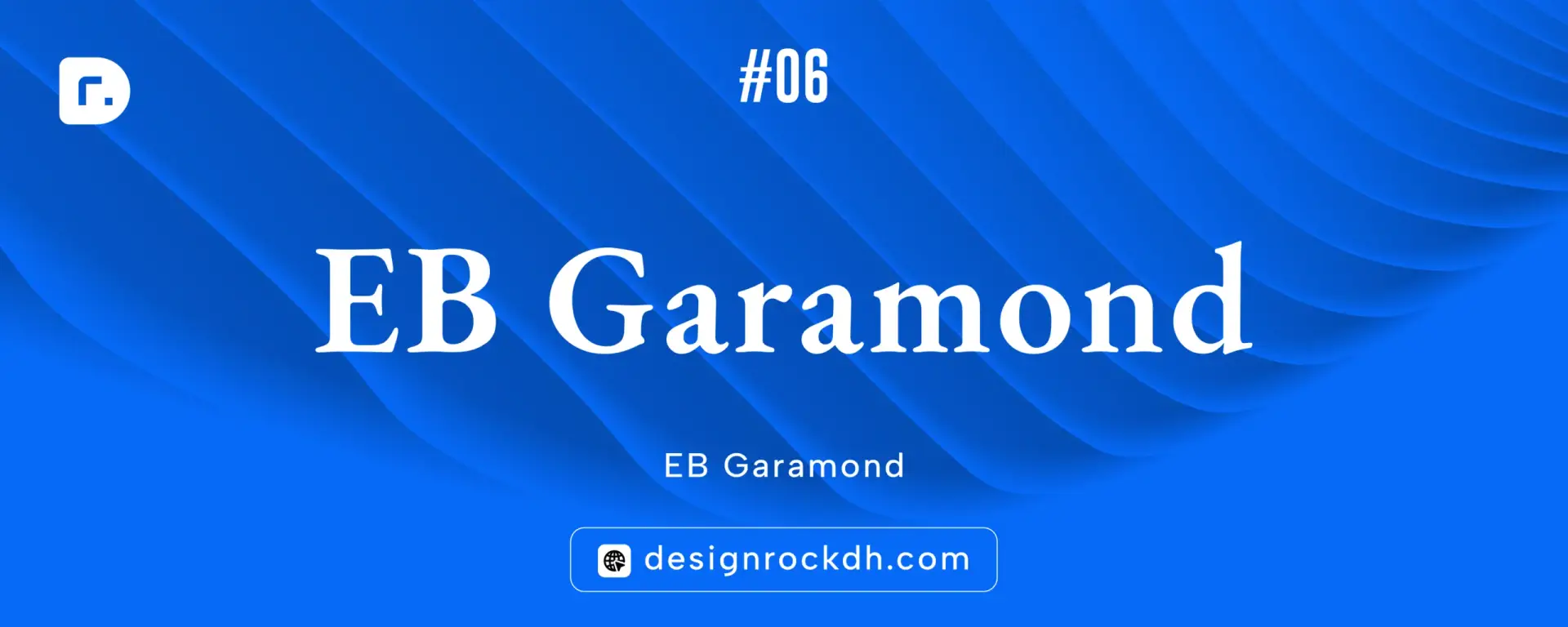
Best for: Books, Editorial design, Print publications, Traditional branding
Download: https://fonts.google.com/specimen/EB+Garamond
7. Alegreya
Alegreya was designed to create a comfortable reading experience. Its distinctive letterforms add personality while maintaining excellent clarity across both print and digital formats

Best for: Articles, Educational content, Blogs, Editorial projects
Download: https://fonts.google.com/specimen/Alegreya
8. Cardo
Originally developed for scholars and researchers, Cardo supports a wide range of languages and special characters. Its thoughtful design makes it especially valuable for academic and historical publications.

Best for: Academic writing, Journals, Research papers, Historical publications
Download: https://fonts.google.com/specimen/Cardo
9. Arvo
Arvo is a bold slab serif that blends traditional structure with a modern edge. Its strong shapes make it ideal for designs that need to grab attention quickly.

Best for: Posters, Headlines, Packaging, User interface design
Download: https://fonts.google.com/specimen/Arvo
10. Bitter
Bitter was specifically designed to improve readability on digital screens. It performs exceptionally well in blogs, news websites, and content-rich interfaces where comfort matters.

Best for: News websites, Blogs, Online publications, Digital reading
Download: https://fonts.google.com/specimen/Bitter
11. Spectral
Spectral is a versatile serif family that adapts beautifully to both print and digital environments. Its contemporary style makes it suitable for everything from websites to mobile applications.
Best for: Websites, Apps, Dashboards, Editorial layouts
Download: https://fonts.google.com/specimen/Spectral
12. Bree Serif
Bree Serif combines a friendly personality with a professional appearance. Its rounded forms create a welcoming tone while remaining polished enough for commercial branding.

Best for: Branding, Product packaging, Marketing materials, Creative businesses
Download: https://fonts.google.com/specimen/Bree+Serif
These twelve fonts prove that you don’t need an expensive type library to create beautiful designs. Whether you’re building a luxury brand, designing a blog, or producing editorial content, each of these free typefaces offers its own unique personality and strengths. Experiment with different combinations to find the style that best reflects your project’s goals.
Best Serif Font Pairings
A beautiful serif font becomes even more effective when paired with the right sans-serif typeface. The contrast between the two creates visual balance, improves readability, and gives your designs a polished, professional appearance.
Here are a few reliable font combinations that designers frequently use:
| Serif Font | Pairs Well With |
|---|---|
| Playfair Display | Inter |
| Lora | Poppins |
| Libre Baskerville | Montserrat |
| Cormorant Garamond | DM Sans |
| Crimson Pro | Open Sans |
| EB Garamond | Source Sans Pro |
| Spectral | Manrope |
| Bitter | Roboto |
As a general rule, let your serif font handle headlines or branding, while a clean sans-serif font takes care of body copy. This approach creates clear visual hierarchy and keeps long passages comfortable to read.
Serif vs. Sans Serif
Both serif and sans-serif fonts have their strengths, and choosing between them depends on the personality you want your design to communicate.
Serif fonts are known for their classic appearance, elegant details, and excellent readability in long-form content. They’re commonly used in books, magazines, luxury branding, and editorial design where trust and sophistication matter.
Sans-serif fonts, on the other hand, feature clean lines without decorative strokes. They feel modern, simple, and highly versatile, making them a popular choice for websites, mobile apps, user interfaces, and technology brands.
Rather than choosing one over the other, many successful brands combine both styles. A serif headline paired with a minimalist sans-serif body font offers the perfect balance of personality and readability.
How to Choose the Right Serif Font
The best serif font isn’t necessarily the most beautiful—it’s the one that fits your project’s purpose.
Before making a decision, consider these questions:
Is your brand modern, traditional, or somewhere in between?
Will your design be viewed mostly online, in print, or both?
Do you want to communicate luxury, authority, creativity, or warmth?
Will readers spend time reading long paragraphs?
Does readability matter more than decorative style?
Answering these questions will help narrow your options and ensure your typography supports your overall design goals rather than distracting from them.
Common Mistakes to Avoid
Even the best typeface can lose its impact if it’s used incorrectly. Keeping your typography simple and intentional will produce far better results.
Some common mistakes include:
Using highly decorative serif fonts for long blocks of body text.
Mixing several serif fonts in the same design, creating unnecessary visual clutter.
Ignoring spacing between lines and paragraphs, which reduces readability.
Choosing extremely thin serif fonts at small sizes, especially on mobile devices.
Overlooking language support when designing multilingual projects.
Good typography isn’t just about choosing a beautiful font—it’s also about using it consistently and appropriately.
Frequently Asked Questions
Are serif fonts suitable for websites?
Absolutely. Modern serif fonts are optimized for digital screens and work particularly well for headings, blog posts, and editorial-style websites. Pairing them with a clean sans-serif body font often delivers the best user experience.
Which serif font is best for logo design?
There isn’t a single perfect choice, but some of the most popular options include:
Playfair Display
Cormorant Garamond
EB Garamond
Libre Baskerville
Each offers a unique personality, so the right choice depends on your brand’s style and audience.
Are Google Fonts free?
Yes. Most fonts available through Google Fonts are free for both personal and commercial use under their respective licenses, making them an excellent resource for designers and businesses alike.
Do serif fonts improve readability?
For books, magazines, reports, and other long-form content, serif fonts are widely appreciated for their comfortable reading experience. Their subtle letterforms help guide the eye across lines of text, reducing reading fatigue over longer passages.
Summary
Serif fonts have earned their place in design history for good reason. They combine elegance, readability, and versatility in a way that few other type styles can match. Whether you’re creating a luxury logo, designing a business website, producing editorial content, or developing premium packaging, the right serif font can instantly strengthen your visual identity.
The twelve free fonts featured in this guide provide an excellent starting point for designers of every skill level. Explore different combinations, experiment with pairings, and choose typefaces that reflect your brand’s personality rather than simply following trends.
Typography is one of the most powerful tools in design. When used thoughtfully, the right serif font doesn’t just make your work look better—it helps communicate your message more clearly and leaves a lasting impression on your audience.
Related Typography Guides You Can Read Next
To build a strong internal linking structure and help readers continue exploring typography, link this article with: