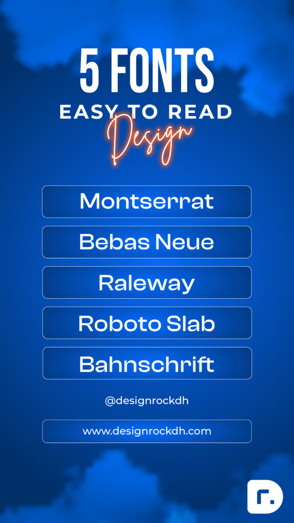
Top 5 Easy-to-Read Fonts for Design | Enhance Clarity & Style
When choosing fonts for your design projects, readability and clarity should always come first. Fonts that prioritize these qualities ensure your message is communicated effectively without compromising on style.
What Makes a Font Easy to Read?
- Well-Proportioned Elements: Balanced letter shapes contribute to a clean and consistent look.
- Distinct Letterforms: Unique character shapes reduce ambiguity and enhance legibility.
- Generous Spacing: Adequate kerning and line spacing make the text easier to read in any format.
- Versatility: These fonts perform exceptionally across different mediums, including digital interfaces and print materials.
Easy-to-read fonts are adaptable to various sizes and resolutions, making them ideal for branding, headlines, or body text. They combine visual appeal with functionality, enhancing both aesthetics and user experience.
Top 5 Fonts That Are Easy to Read for Design
- Montserrat Font
A modern and versatile sans-serif font known for its clean and geometric letterforms. Perfect for headlines, branding, and digital projects. - Bebas Neue Font
A bold and condensed sans-serif typeface that excels in making a strong visual impact without losing clarity. - Raleway Font
A sleek and elegant sans-serif font, ideal for both display and body text, offering excellent readability with a touch of sophistication. - Roboto Slab Font
A friendly yet professional slab-serif typeface with excellent readability, especially for long-form content and digital interfaces. - Bahnschrift Font
A clean and straightforward sans-serif font inspired by DIN typefaces. Its simplicity ensures clarity in various design applications.


