Introduction to Modern Typography & Font Selection
Typography is much more than choosing a font that looks attractive. It plays a vital role in how people experience your content, understand your message, and remember your brand. Whether you’re designing a website, creating a brand identity, building a mobile app, or publishing a blog, the fonts you choose can significantly influence both appearance and usability.
In today’s digital world, typography has become an essential part of user experience. A carefully selected typeface improves readability, creates visual hierarchy, and helps visitors navigate content effortlessly. On the other hand, poor font choices can make even the best-designed website feel outdated or difficult to read.
Modern designers also face new challenges. Fonts must perform well across desktops, tablets, and smartphones while maintaining fast loading speeds and consistent rendering. Variable fonts, responsive typography, accessibility standards, and web performance are now key considerations for every design project.
If you publish content online or monetize your website with platforms like Google AdSense, typography becomes even more important. Clean, readable text encourages visitors to stay longer, reduces bounce rates, and creates a more enjoyable reading experience—all of which contribute to a higher-quality website.
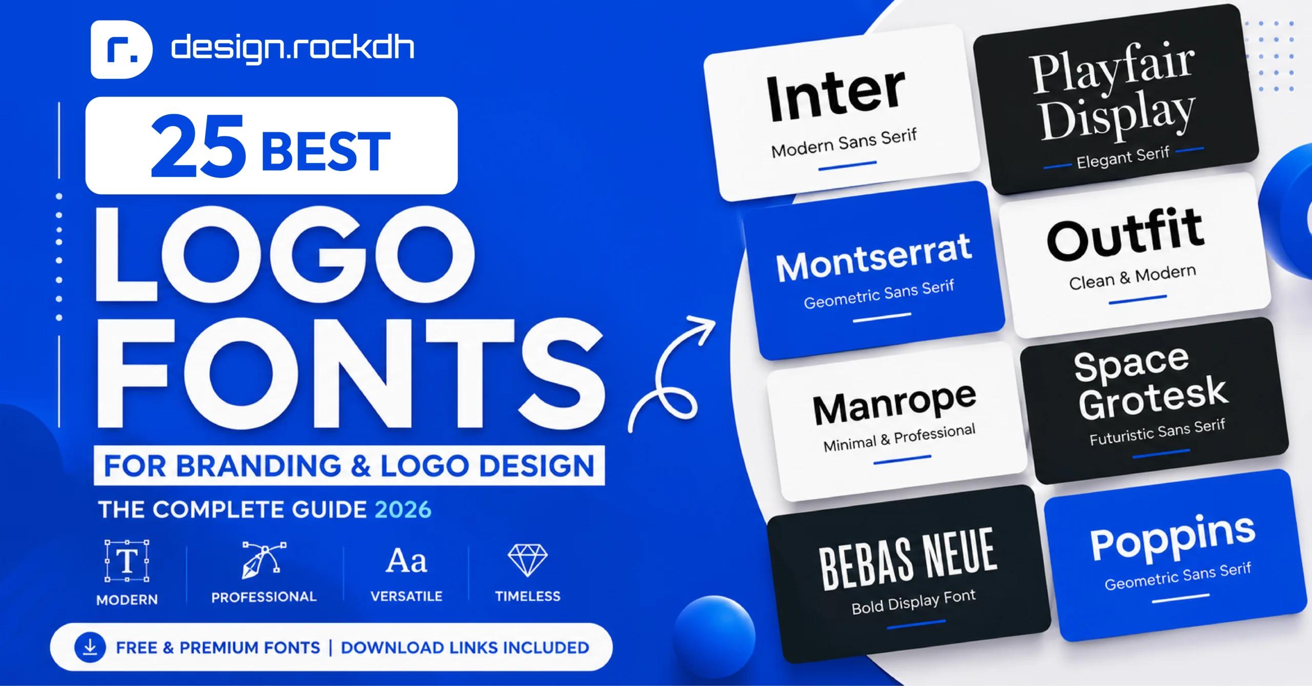
In this guide, we’ll explore ten of the best fonts for graphic and web designers in 2026. You’ll discover where each font performs best, how to pair it with other typefaces, and practical tips for using typography to build visually appealing, professional, and high-performing digital experiences.
Why Choosing the Right Font Matters for User Experience & Brand Identity
A font does much more than display words on a screen. It influences how people feel about your brand, how easily they absorb information, and whether they enjoy reading your content. In many cases, typography creates the first impression before visitors even begin reading. That’s why choosing the right font is one of the most important decisions in both graphic and web design.
The Psychology of Typography
Every typeface communicates a different personality. A modern sans-serif font often feels clean, professional, and innovative, making it a popular choice for technology companies and startups. On the other hand, serif fonts create a sense of tradition, trust, and sophistication, which is why they’re commonly used by luxury brands, publishers, and financial institutions.
The right font helps reinforce your brand identity and makes your message more memorable. However, when typography doesn’t match your brand’s personality, visitors may perceive your website as inconsistent or less credible—even if the content itself is excellent.
Readability and Accessibility Matter
Beautiful typography isn’t enough if people struggle to read it. Good fonts should remain clear across different screen sizes, from smartphones to large desktop monitors. Factors such as x-height, spacing, stroke width, and character distinction all contribute to a comfortable reading experience.
Accessibility is equally important. Choosing highly legible fonts, maintaining proper font sizes, and ensuring sufficient contrast between text and background help create an inclusive experience for every visitor. Following accessibility best practices also supports compliance with WCAG guidelines and improves usability for people with visual impairments.
Typography’s Impact on SEO and User Experience
Typography doesn’t directly improve search rankings, but it has a significant effect on user behavior. When content is easy to read, visitors are more likely to stay on your website, explore additional pages, and engage with your content. These positive user experience signals can contribute to better overall website performance.
For websites using Google AdSense, clean typography also supports a professional layout. Well-structured headings, readable body text, and clear visual hierarchy make content easier to scan while helping advertisements blend naturally into the page without distracting readers. The result is a more polished website that benefits both visitors and publishers.
The 10 Best Fonts Every Designer Should Know in 2026
The world of typography keeps evolving, but some fonts consistently stand out because of their versatility, readability, and timeless appeal. Whether you’re designing a website, creating a brand identity, or building a mobile app, choosing the right typeface can instantly improve the overall look and feel of your project.
Below are ten fonts that continue to be trusted by designers around the world in 2026. Each one offers unique strengths, making it suitable for different creative projects and design styles.
Top Sans-Serif Fonts for Modern Digital Design
Sans-serif fonts remain the first choice for most digital products because they’re clean, easy to read, and perform exceptionally well across different screen sizes. From websites and mobile apps to dashboards and marketing materials, these fonts deliver a modern and professional appearance.
1. Inter – The Go-To Font for Modern UI Design
If there’s one font that has become a favorite among UI and UX designers, it’s Inter. Designed by Rasmus Andersson, Inter was created specifically for digital interfaces, making it one of the best choices for websites, software applications, and mobile products.
What makes Inter stand out is its outstanding readability. Even at smaller sizes, every letter remains crisp and easy to recognize. Its generous x-height, balanced spacing, and extensive range of weights make it incredibly flexible for everything from navigation menus to long-form content.
Best for:
User interface (UI) design
SaaS platforms
Mobile applications
Website body text
Dashboards and admin panels
Why designers love it:
Excellent readability on every screen size
Available as a variable font
Large selection of font weights
Professional yet neutral appearance
Completely free and open source
Recommended font pairing:
Inter works beautifully with elegant serif fonts such as Playfair Display or Merriweather. This combination creates a clean contrast that’s perfect for blogs, corporate websites, and editorial layouts.
Pro Tip:
If you’re building a design system in Figma, take advantage of Inter’s variable font support. It allows you to adjust font weights more efficiently while keeping your design consistent across every screen.
2. Montserrat – A Bold Choice for Branding and Headlines
Inspired by the historic street signs of Buenos Aires, Montserrat has become one of the most recognizable geometric sans-serif fonts available today. Designed by Julieta Ulanovsky, it combines strong geometric shapes with a modern personality, making it perfect for attention-grabbing headlines and branding projects.
Montserrat has a confident appearance that immediately captures attention without feeling overwhelming. Its wide letterforms make headlines look clean, bold, and highly professional.
Best for:
Logo design
Hero sections
Marketing campaigns
Posters
Corporate branding
Why designers love it:
Strong visual impact
Wide range of font weights
Modern geometric style
Excellent readability in large headings
Works well across both print and digital media
Recommended font pairing:
For body text, pair Montserrat with neutral fonts like Roboto or Open Sans. The contrast creates a balanced layout that’s easy to read while keeping the overall design visually appealing.
Pro Tip:
When using Montserrat in uppercase headlines, slightly increase the letter spacing. This small adjustment makes the typography feel more refined and gives premium branding projects a polished, high-end look.
3. Roboto – A Reliable Font for Every Digital Project
When it comes to versatility, Roboto is hard to beat. Originally developed by Google for Android, this font has become one of the most widely used typefaces across websites, mobile apps, and digital products. Its clean design and balanced proportions make it suitable for almost any project, whether you’re designing an e-commerce store, a corporate website, or a content-rich blog.
One of Roboto’s biggest strengths is its ability to remain highly readable on every screen size. It combines geometric shapes with soft, open curves, giving the font a modern yet approachable feel. Because of this balance, Roboto works equally well for both headings and body text.
Best for:
Business websites
E-commerce stores
Mobile applications
Blogs and news websites
Content-heavy web pages
Why designers love it:
Excellent readability across devices
Fast loading and optimized for the web
Large family with multiple weights and styles
Clean, professional appearance
Free to use through Google Fonts
Recommended font pairing:
Pair Roboto with Lora if you’re creating an editorial-style website, or combine it with Oswald for bold marketing pages and eye-catching landing pages.
Pro Tip:
If your project contains lots of text, use Roboto Regular for paragraphs and Roboto Medium or Bold for headings. This creates a clear visual hierarchy while keeping the design clean and consistent.
4. Poppins – Clean Geometry with a Modern Personality
If you’re looking for a font that feels fresh, stylish, and contemporary, Poppins is an excellent choice. Designed by Ninad Kale and Jonny Pinhorn for the Indian Type Foundry, Poppins is known for its perfectly geometric letterforms and friendly appearance.
Its balanced proportions make it a favorite among startup brands, SaaS companies, and creative agencies. Whether you’re designing a landing page, social media graphic, or mobile app interface, Poppins adds a polished, modern touch without sacrificing readability.
Unlike many geometric fonts that can feel overly rigid, Poppins strikes a nice balance between professionalism and personality. That’s one of the reasons it continues to be a popular choice among designers in 2026.
Best for:
Startup branding
Mobile app interfaces
Landing pages
Presentation slides
Social media graphics
Why designers love it:
Modern geometric style
Friendly and approachable appearance
Excellent readability for digital screens
Supports multiple languages
Wide range of font weights for flexible design
Recommended font pairing:
For a sophisticated look, pair Poppins with Merriweather. The contrast between the modern sans-serif headings and the classic serif body text creates a balanced and visually appealing layout.
Pro Tip:
Poppins works especially well when combined with plenty of white space. Avoid overcrowding your layout, and let the font’s clean geometry create a simple, premium-looking design.
Top Serif Fonts for Editorial Design and Premium Branding
While sans-serif fonts dominate modern interfaces, serif fonts continue to play an important role in branding and editorial design. Their decorative strokes add character, elegance, and a sense of tradition that many businesses and publications value. Whether you’re designing a magazine, a luxury brand, or a long-form blog, the right serif font can instantly make your content feel more polished and trustworthy.
5. Playfair Display – Elegant Typography for Luxury Designs
If your goal is to create a premium or sophisticated look, Playfair Display is one of the best fonts you can choose. Designed by Claus Eggers Sørensen, this font takes inspiration from classic European typography while giving it a modern touch.
Its dramatic contrast between thick and thin strokes makes every headline stand out. That’s why it’s widely used in fashion magazines, luxury websites, beauty brands, and high-end product packaging. Although it’s not ideal for long paragraphs, it shines in titles and large headings where elegance matters most.
Best for:
Luxury branding
Fashion websites
Magazine headlines
Editorial blogs
Premium product packaging
Why designers love it:
Sophisticated and timeless appearance
Eye-catching headlines
Beautiful italic styles
Creates a strong visual hierarchy
Works perfectly with modern sans-serif fonts
Recommended font pairing:
Pair Playfair Display with Inter or Montserrat for body text. The combination of a refined serif heading and a clean sans-serif paragraph creates a professional layout that’s both stylish and easy to read.
Pro Tip:
To make Playfair Display look even more elegant, give your headings extra breathing room with generous spacing and pair them with subtle, high-contrast color palettes.
6. Merriweather – Built for Comfortable Reading
When your content includes long articles, tutorials, or documentation, Merriweather is one of the safest and most reliable serif fonts available. Created by Eben Sorkin, it was specifically designed to improve readability on digital screens.
Its open letterforms, tall x-height, and balanced spacing reduce eye strain, making it ideal for readers who spend long periods on your website. Instead of drawing attention to itself, Merriweather lets your content take center stage.
Best for:
Blog articles
Online magazines
Documentation
News websites
Educational platforms
Why designers love it:
Excellent readability for long-form content
Comfortable on both desktop and mobile screens
Strong legibility at smaller sizes
Professional yet welcoming appearance
Free through Google Fonts
Recommended font pairing:
For a modern editorial look, combine Merriweather with Poppins or Inter. The mix of classic and contemporary styles creates a clean, balanced reading experience.
Pro Tip:
Use Merriweather as your primary body font while reserving sans-serif fonts for headings and navigation. This combination improves readability and gives your website a more refined visual structure.
7. Lora – A Serif Font with Warmth and Personality
If you’re looking for a serif font that feels creative without sacrificing readability, Lora is an excellent option. Designed by Cyreal, Lora blends traditional typography with subtle calligraphic influences, resulting in a font that feels warm, expressive, and approachable.
Unlike more formal serif fonts, Lora adds personality to your content. It’s especially popular among bloggers, writers, creative professionals, and lifestyle brands that want their content to feel inviting and authentic.
Its elegant italic style also makes it perfect for pull quotes, testimonials, and highlighted sections throughout a page.
Best for:
Lifestyle blogs
Personal portfolios
Creative agencies
Storytelling websites
Editorial content
Why designers love it:
Natural, human-friendly appearance
Beautiful italic variants
Comfortable reading experience
Works well in both print and digital projects
Adds personality without feeling overly decorative
Recommended font pairing:
Lora pairs beautifully with clean sans-serif fonts like Roboto or Space Grotesk. The contrast creates an attractive balance between creativity and clarity.
Pro Tip:
If your website focuses on storytelling or personal branding, use Lora for article content and combine it with a bold sans-serif heading to create a memorable reading experience.
Top Variable and Display Fonts for Creative Projects
Not every font is meant for long paragraphs. Some typefaces are designed to make an instant impression, whether they’re used in a hero section, a campaign banner, or a creative portfolio. Display fonts bring personality and visual impact to your designs, helping important messages stand out without saying a word.
If you’re working on bold branding, modern websites, or creative marketing campaigns, these fonts deserve a place in your toolkit.
8. Space Grotesk – A Modern Font with a Tech-First Personality
For designers who love clean interfaces with a futuristic edge, Space Grotesk is an excellent choice. Originally inspired by the fixed-width Space Mono, this font offers a more flexible, proportional design while keeping its distinctive technical character.
Space Grotesk has become increasingly popular among SaaS companies, Web3 startups, developer portfolios, and AI-focused websites because it feels modern without looking overly experimental. Its unique letterforms add personality while remaining highly readable.
Best for:
Technology websites
Startup landing pages
Developer portfolios
AI and SaaS products
Creative agency websites
Why designers love it:
Unique and memorable appearance
Excellent readability
Variable font support
Modern, futuristic personality
Works well for both headings and UI elements
Recommended font pairing:
Pair Space Grotesk with Inter for body text. Their styles complement each other perfectly, creating a clean interface that feels both modern and professional.
Pro Tip:
Use Space Grotesk primarily for headlines, feature sections, and call-to-action blocks. Combining it with a simpler body font helps maintain readability while allowing the headings to capture attention.
9. Oswald – Bold Headlines That Demand Attention
When your design needs maximum visual impact, Oswald delivers. Inspired by the classic Alternate Gothic style, this condensed sans-serif font is ideal for headlines where space is limited but visibility is essential.
Its narrow proportions allow you to fit large, powerful titles into smaller areas without making the layout feel crowded. That’s why Oswald is commonly used in sports graphics, promotional banners, event posters, and news websites.
Best for:
Hero banners
Marketing campaigns
Sports graphics
Event posters
News headlines
Why designers love it:
Strong visual presence
Space-saving condensed design
Highly readable in large sizes
Perfect for bold headlines
Free through Google Fonts
Recommended font pairing:
Combine Oswald with Roboto for body content. The pairing balances Oswald’s bold personality with Roboto’s clean readability, creating a layout that’s both dynamic and easy to read.
Pro Tip:
Avoid using Oswald for long paragraphs. Its condensed letterforms are most effective in short headlines, banners, and call-to-action sections.
10. Syne – Creative Typography That Stands Out
If your goal is to create something unique and memorable, Syne is a font worth exploring. Originally designed for the French art collective Sybilles, Syne has gained popularity among designers looking for bold typography with artistic character.
Its expressive letterforms and dramatic weight variations make it perfect for creative portfolios, fashion brands, event promotions, and modern visual identities. Even a simple headline can feel distinctive when set in Syne.
Despite its artistic personality, Syne remains surprisingly versatile when paired with a clean supporting font.
Best for:
Creative portfolios
Fashion brands
Agency websites
Event landing pages
Poster and campaign design
Why designers love it:
Bold artistic style
Wide range of font weights
Memorable visual identity
Great for display typography
Excellent choice for creative branding
Recommended font pairing:
Pair Syne with Inter or another neutral sans-serif font. This combination allows Syne to take center stage while keeping the rest of the design clean and balanced.
Pro Tip:
Use Syne sparingly. It’s designed to grab attention, so reserving it for headlines and featured text will create a stronger visual impact without overwhelming your layout.
Essential Principles for Choosing and Pairing Fonts
Choosing a great font is only the beginning. The real challenge is knowing how to use it effectively. Even the most beautiful typefaces can look unprofessional if they’re paired poorly or used without a clear visual hierarchy.
Whether you’re designing a website, creating a brand identity, or building a mobile app, following a few fundamental typography principles will help you create layouts that are both visually appealing and easy to read.
1. Build a Clear Visual Hierarchy
A good design naturally guides readers from the most important information to the least important. Typography plays a major role in creating that flow.
Instead of relying on color alone, use differences in font size, weight, and spacing to establish a clear hierarchy. Larger, bolder headings immediately attract attention, while smaller body text encourages comfortable reading.
A simple structure like the one below works well for most websites:
H1: 40–56px (Bold or ExtraBold)
H2: 28–36px (SemiBold or Bold)
H3: 22–28px (Medium or SemiBold)
Body Text: 16–18px (Regular)
Captions: 12–14px (Regular)
Don’t overlook line spacing, either. Headings generally look better with tighter line-height, while paragraphs are much easier to read with a line-height of around 1.5–1.7.
2. Pair Fonts That Complement Each Other
One of the easiest ways to make a design look polished is to combine fonts that create contrast without competing for attention.
A classic approach is pairing a serif font for headings with a sans-serif font for body text. The serif adds personality and elegance, while the sans-serif keeps long passages clean and readable.
Keep these simple rules in mind:
Limit your design to two font families whenever possible.
Use different font weights before introducing another typeface.
Pair fonts with similar proportions to create visual harmony.
Avoid combining fonts that look almost identical, as they can make the design feel inconsistent rather than intentional.
Popular combinations include:
Inter + Playfair Display
Montserrat + Roboto
Poppins + Merriweather
Space Grotesk + Inter
These pairings have become popular because they provide strong contrast while maintaining a balanced, professional appearance.
3. Optimize Fonts for Better Website Performance
Typography doesn’t just affect appearance—it also influences how quickly your website loads.
Loading several large font files can slow down your pages, affecting both user experience and Core Web Vitals. Fortunately, a few simple optimizations can make a noticeable difference.
Here are some best practices:
Use the WOFF2 format whenever possible for smaller file sizes.
Load only the font weights your project actually needs.
Enable font-display: swap so visitors can read content immediately while fonts finish loading.
Choose variable fonts instead of multiple separate font files whenever they’re available.
Remove unnecessary language subsets if your audience only uses one language.
These small improvements help create faster websites, improve accessibility, and contribute to better SEO performance without compromising your visual design.
Essential Typography Tools Every Designer Should Know
Choosing the right font is only part of the design process. The tools you use can make typography easier to manage, improve consistency, and help you create professional-looking projects more efficiently. Whether you’re designing websites, branding materials, or digital products, these resources are worth keeping in your toolkit.
1. Google Fonts
If you’re looking for high-quality fonts that are free to use, Google Fonts is the best place to start. It offers hundreds of open-source typefaces that are optimized for the web and easy to integrate into any project. Designers love it because the fonts load quickly, work across different devices, and are regularly updated.
2. Adobe Fonts
For premium creative work, Adobe Fonts provides a massive collection of professional typefaces included with Adobe Creative Cloud. Since the fonts sync directly with applications like Photoshop, Illustrator, and InDesign, it’s a convenient choice for designers who already work within the Adobe ecosystem.
3. Figma
Figma has become one of the most popular tools for UI and UX design, and typography is one of its strongest features. You can create reusable text styles, maintain consistent typography across multiple screens, and collaborate with your team in real time—all from your browser.
4. Typewolf
Need inspiration for font pairings? Typewolf showcases real websites using modern typography, making it an excellent resource for discovering popular font combinations and current design trends.
5. Font Squirrel
Font Squirrel is another valuable resource for designers searching for free commercial-use fonts. It also includes useful tools for generating web fonts and checking licensing information before using a typeface in client projects.
6. WhatTheFont
Ever come across a beautiful font but didn’t know its name? WhatTheFont can identify typefaces from an uploaded image, making it incredibly useful when you’re trying to match an existing design or recreate a specific style.
7. Coolors
Typography and color go hand in hand. Coolors helps designers generate attractive color palettes that improve readability and create stronger visual contrast. It’s especially useful when building brand identities or designing accessible websites.
Best Practices for an AdSense-Friendly Typography Layout
If your website relies on Google AdSense or other display advertising, typography plays a bigger role than many people realize. A clean, readable layout encourages visitors to spend more time on your pages while making advertisements feel like a natural part of the overall experience.
Here are a few typography best practices worth following:
Maintain Strong Text Contrast
Always ensure there’s enough contrast between your text and background. Dark text on a light background is still one of the easiest combinations to read, helping visitors stay focused on your content for longer.
Keep Line Length Comfortable
Long lines can quickly become tiring to read, especially on desktop screens. Aim for around 50–75 characters per line to create a more comfortable reading experience and improve content flow.
Prevent Layout Shifts
Unexpected text movement during page loading creates a poor user experience. Using optimized web fonts, defining font dimensions where possible, and implementing proper loading techniques can help keep your layout stable.
Separate Content from Advertisements
Your readers should always be able to distinguish editorial content from advertisements. Leave adequate spacing around ad units and maintain a consistent typography style throughout the page. A clean layout not only looks more professional but also aligns with Google’s quality recommendations.
Focus on the Reader First
At the end of the day, great typography is about making your content enjoyable to read. When visitors can quickly scan headings, comfortably read paragraphs, and navigate your pages without distractions, they’re more likely to stay longer, engage with your content, and return in the future.
Summary
Great typography is about much more than making text look attractive. The fonts you choose shape how people experience your website, understand your message, and remember your brand. Whether you’re designing a business website, a mobile app, an online store, or a personal portfolio, selecting the right typeface can dramatically improve both aesthetics and usability.
The fonts featured in this guide have earned their place because they consistently deliver excellent readability, versatility, and professional results. Clean sans-serif fonts like Inter, Roboto, and Poppins are ideal for modern digital interfaces, while elegant serif fonts such as Playfair Display, Merriweather, and Lora bring personality and sophistication to editorial and branding projects. If you’re aiming for something more creative, display fonts like Space Grotesk, Oswald, and Syne can help your designs stand out without sacrificing usability.
Remember that great typography isn’t just about choosing the “best” font—it’s about choosing the right font for your audience, your content, and your brand. Combine thoughtful font pairing, consistent hierarchy, responsive design, and performance optimization, and you’ll create experiences that not only look professional but also feel effortless to use.
As design trends continue to evolve, focusing on readability, accessibility, and user experience will always be a smarter strategy than simply following what’s popular. A well-chosen typeface can strengthen your brand identity, improve engagement, and leave a lasting impression on every visitor.
Take Your Design Skills to the Next Level
Typography is just one piece of great design. Building a memorable brand also requires thoughtful layouts, consistent visual identity, effective color choices, and user-focused experiences.
If you’re looking for more practical design tips, UI/UX insights, branding strategies, and creative inspiration, explore the latest resources at DesignRockDH. Whether you’re a beginner or an experienced designer, you’ll find actionable guides to help you create modern, high-performing digital experiences with confidence.
Keep experimenting, keep learning, and most importantly, choose fonts that make your content easier—and more enjoyable—to read.