
Have you ever recognized a company before even reading its name?
That’s the power of branding through color.
Think about Coca-Cola’s iconic red, Facebook’s recognizable blue, or McDonald’s famous yellow arches. These colors have become deeply connected to their brands, making them instantly familiar to millions of people around the world.
Brand colors aren’t just decorative choices—they’re one of the strongest visual assets a business can own. The right color palette can communicate your brand’s personality, build trust, influence purchasing decisions, and make your business memorable in a crowded marketplace.
Whether you’re launching a new startup, designing a logo, refreshing your website, or building a complete visual identity, choosing the right brand colors is a decision that deserves careful thought.
In this guide, you’ll discover how brand colors influence perception, how to build an effective color palette, common mistakes to avoid, and the best fonts and tools to create a professional brand identity that lasts.
What Are Brand Colors?
Brand colors are the official colors that visually represent your business across every touchpoint. They help create consistency, reinforce recognition, and communicate your brand’s personality before a single word is read.
You’ll typically see these colors used across:
- Logos
- Websites
- Business cards
- Social media graphics
- Product packaging
- Marketing materials
- Presentations
- Email campaigns
- Mobile apps
When customers repeatedly encounter the same colors across different platforms, they begin to associate those colors with your brand. Over time, this consistency builds familiarity and trust, making your business easier to recognize in an increasingly competitive market.
Strong visual consistency doesn’t just improve recognition—it also creates a more professional image and strengthens the overall customer experience.
Why Brand Colors Matter
People often make impressions within seconds, and color plays a major role in that first impression.
Long before someone reads your headline or explores your products, your color palette has already started communicating a message about your business.
A thoughtfully chosen set of brand colors can help you:
- Increase brand recognition
- Build customer trust
- Create emotional connections
- Present a professional image
- Maintain consistency across marketing channels
- Improve conversion rates
Imagine visiting a company’s website where every page uses different colors, different button styles, and inconsistent branding. It immediately feels less trustworthy.
Now compare that with brands that maintain a consistent visual identity across their website, social media, advertisements, packaging, and email marketing. Everything feels connected, polished, and intentional.
That’s exactly why brand colors matter—they create familiarity, and familiarity builds confidence.
Understanding Color Psychology
Colors naturally trigger emotional responses. Although cultural differences can influence perception, certain colors tend to communicate similar feelings across many audiences.
Understanding color psychology allows you to choose colors that align with your brand’s values and the emotions you want customers to experience.
| Color | Common Meaning | Popular Industries |
|---|---|---|
| Blue | Trust, reliability, intelligence | Technology, finance, healthcare |
| Green | Nature, growth, health | Sustainability, wellness, agriculture |
| Red | Energy, excitement, passion | Food, entertainment, sports |
| Orange | Creativity, enthusiasm, confidence | Startups, education, marketing |
| Yellow | Happiness, optimism, friendliness | Children’s brands, education |
| Purple | Luxury, imagination, creativity | Beauty, fashion, premium products |
| Black | Sophistication, power, elegance | Luxury, fashion, automotive |
| White | Simplicity, cleanliness, clarity | Healthcare, minimal brands |
| Gray | Balance, professionalism, neutrality | Corporate businesses, consulting |
However, color psychology shouldn’t be treated as a strict rulebook.
For example, while blue is widely associated with trust, a creative agency may successfully use vibrant purple or orange to communicate innovation and originality. Likewise, a luxury fashion brand may rely almost entirely on black and white to create an elegant, timeless identity.
The most effective brand colors are those that match your audience, your industry, and your brand personality—not simply the latest design trends.
Another important consideration is cultural context. A color that symbolizes celebration in one country may carry a completely different meaning elsewhere. If your business serves an international audience, it’s worth researching how your chosen colors are perceived across different regions.
Ultimately, successful branding isn’t about choosing the “best” color. It’s about selecting colors that consistently communicate who you are and what your brand stands for.
How to Choose Brand Colors
Choosing brand colors isn’t just about picking shades you personally like. The right palette should reflect your company’s personality, appeal to your audience, and remain effective for years to come. A thoughtful color strategy helps create a consistent visual identity that customers instantly recognize.
Instead of selecting colors at random, use these four steps to build a brand palette with purpose.
1. Understand Your Audience
Start by thinking about the people you’re trying to reach.
Ask yourself:
- Who is my ideal customer?
- What age group am I targeting?
- What emotions should people feel when they interact with my brand?
- Should my brand appear playful, professional, luxurious, or innovative?
For example, a premium jewelry brand often relies on black, gold, and white to express elegance and exclusivity. On the other hand, a children’s education platform may use bright yellow, orange, and blue to create a fun, energetic, and welcoming experience.
When your colors resonate with your audience’s expectations, your brand feels more relatable and trustworthy.
2. Define Your Brand Personality
If your brand were a person, how would you describe it?
Is it:
- Modern?
- Luxury?
- Creative?
- Friendly?
- Professional?
- Minimal?
- Innovative?
Your answers should influence every design decision, including your color palette.
For instance, a technology company that wants to communicate reliability may choose shades of blue and gray. A creative agency, however, might lean toward purple or orange to highlight originality and bold thinking.
The key is consistency. Your colors should reinforce your personality across your website, social media, presentations, and marketing materials.
3. Study Your Competitors
Researching competitors doesn’t mean copying them—it means understanding your market.
Take time to analyze:
- The colors competitors commonly use
- Industry design trends
- Visual patterns customers are already familiar with
Then ask yourself one important question:
How can my brand stand out while still feeling appropriate for my industry?
For example, many financial companies use blue because it represents trust and stability. If your financial startup wants a more modern image, you might introduce a vibrant accent color while keeping blue as the foundation of your palette.
Differentiation is often more valuable than imitation.
4. Think Long-Term
Brand colors should remain effective for years, not just the current design trend.
Before making a final decision, test your palette across different applications:
- Websites
- Mobile apps
- Social media posts
- Printed materials
- Packaging
- Presentations
- Dark mode interfaces
- Light mode interfaces
A palette that looks beautiful on a website but performs poorly in print or becomes difficult to read in dark mode can create consistency problems later.
Choosing timeless colors today saves expensive redesigns in the future.
Primary, Secondary & Accent Colors
Most professional brands don’t rely on a single color. Instead, they build a flexible system that keeps every design consistent while adding visual variety.
A typical brand palette consists of three color categories.
Primary Color
Your primary color is the heart of your visual identity.
It appears most frequently and is commonly used in:
- Logos
- Website headers
- Navigation
- Key marketing materials
- Brand graphics
Example:
Blue
This becomes the color people associate with your business first.
Secondary Colors
Secondary colors support the primary color without competing for attention.
They’re useful for:
- Section backgrounds
- Illustrations
- Cards
- Icons
- Supporting graphics
Most brands use two or three secondary colors.
Example Palette:
- Blue
- Gray
- White
Together, these colors create balance while keeping the overall identity consistent.
Accent Color
Accent colors should be used sparingly.
Their purpose is to attract attention where it matters most.
Typical uses include:
- Call-to-action buttons
- Links
- Notifications
- Highlights
- Promotional banners
Example:
Orange
Because accent colors appear less frequently, they naturally draw the user’s eye and improve visual hierarchy.
Popular Brand Color Palettes
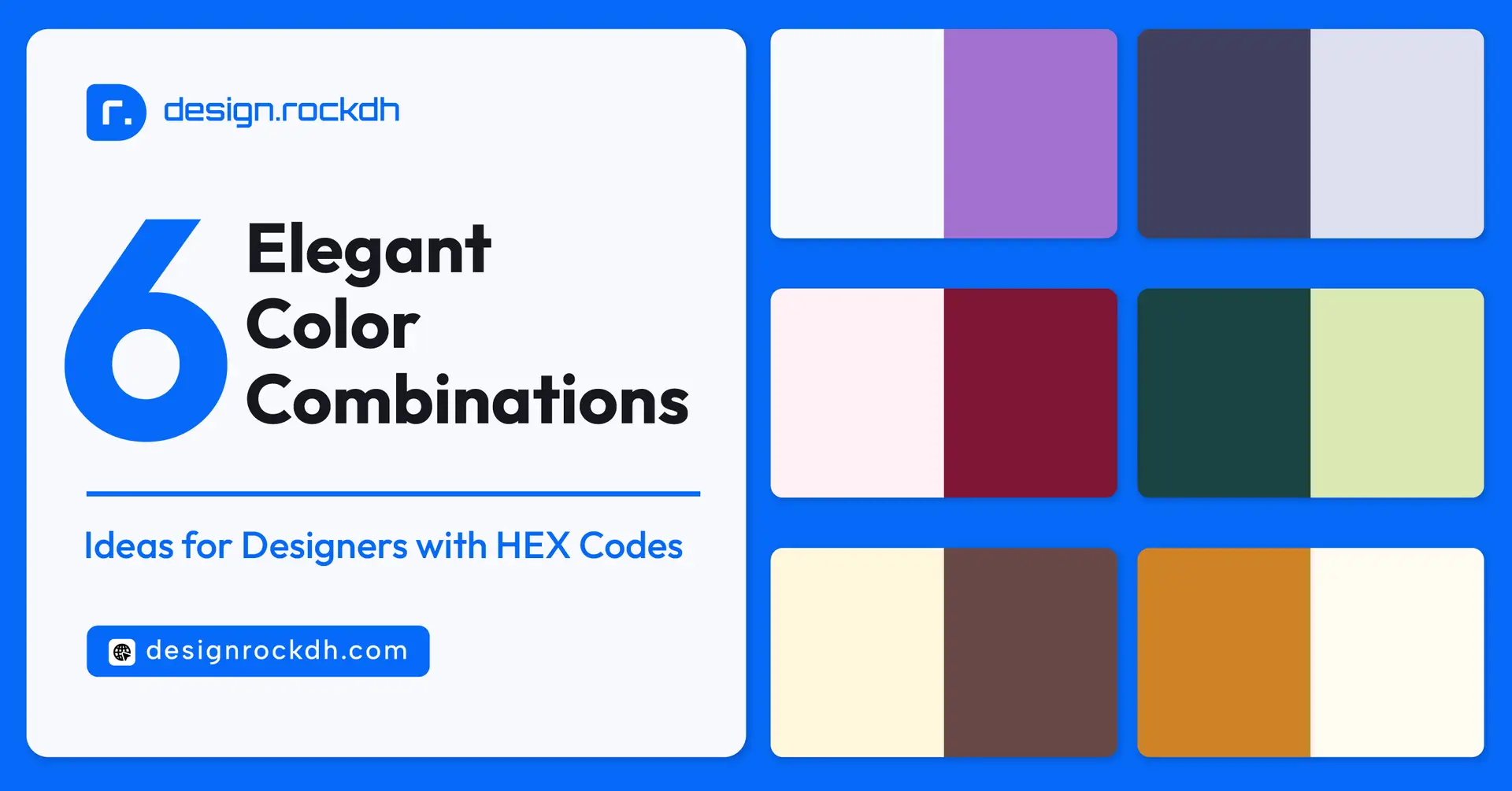
Looking for inspiration? These combinations work well across different industries while maintaining a clean, modern appearance.
Modern Technology
A reliable palette for SaaS companies, startups, and digital products.
- Primary: #2563EB
- Secondary: #1E293B
- Neutral: #F8FAFC
This combination feels trustworthy, modern, and professional.
Creative Agency
Perfect for designers, marketers, and creative studios.
- Primary: #7C3AED
- Accent: #F59E0B
- Background: #F3F4F6
The mix of purple and amber creates an energetic, imaginative identity.
Luxury Brand
Ideal for premium fashion, jewelry, or high-end services.
- Black — #000000
- Gold — #D4AF37
- White — #FFFFFF
Simple, timeless, and sophisticated.
Eco-Friendly Business
Suitable for sustainable brands, agriculture, and wellness companies.
- Green — #16A34A
- Dark Green — #14532D
- Light Background — #F0FDF4
These shades naturally communicate growth, health, and environmental responsibility.
Healthcare
A clean and calming palette for medical organizations and wellness platforms.
- Blue — #0EA5E9
- Light Blue — #E0F2FE
- White — #FFFFFF
The combination reinforces trust, cleanliness, and care.
Industry Color Examples
Different industries often favor certain colors because they align with customer expectations.
Technology
Popular colors:
- Blue
- White
- Gray
Why?
These colors communicate innovation, security, and reliability.
Finance
Common choices include:
- Navy Blue
- Blue
- Green
Why?
Customers associate these colors with stability, trust, and financial confidence.
Restaurants & Food Brands
Frequently used colors:
- Red
- Orange
- Yellow
Why?
Warm colors naturally attract attention and are often associated with appetite, excitement, and energy.
Fashion & Luxury
Preferred colors:
- Black
- White
- Beige
Why?
These neutral tones create a refined, elegant, and timeless appearance.
Healthcare
Most healthcare brands rely on:
- Blue
- Green
Why?
These colors evoke cleanliness, safety, wellness, and reassurance—qualities that are especially important in the medical field.
Accessibility Matters
Choosing beautiful colors is only half the job. If people struggle to read your content or navigate your website because of poor color choices, even the strongest brand identity loses its impact.
Accessibility isn’t just about meeting design standards—it’s about making your brand usable for everyone, including people with visual impairments or color vision deficiencies.
A color palette that works well for all users improves the overall experience, increases engagement, and even supports SEO by reducing frustration and encouraging visitors to stay longer.
Here are a few best practices to follow when building an accessible brand color system:
- Maintain sufficient contrast between text and background colors.
- Avoid relying on color alone to communicate important information.
- Test your designs in both light mode and dark mode.
- Choose fonts that remain easy to read at different sizes.
- Follow WCAG accessibility recommendations whenever possible.
A brand that’s accessible isn’t just more inclusive—it also appears more professional and trustworthy.
Brand Style Guide Essentials
Once you’ve chosen your brand colors, don’t leave them undocumented.
A brand style guide ensures that everyone—from designers and developers to marketers and content creators—uses your visual identity consistently.
Without clear guidelines, colors often become inconsistent across websites, advertisements, presentations, and social media, weakening brand recognition over time.
A professional brand guide should include the following sections.
Logo Usage
Your logo is one of your most valuable brand assets, so define exactly how it should be used.
Include guidelines for:
- Minimum logo size
- Safe spacing around the logo
- Approved logo variations
- Incorrect logo usage examples
These rules help protect your brand identity regardless of where the logo appears.
Brand Color Codes
Never rely on visual estimates when recreating your colors.
Document every official color using standard formats, including:
- HEX
- RGB
- CMYK
- Pantone (if applicable)
Providing exact values ensures consistency across digital and print materials.
Typography
Your typography should work alongside your brand colors to create a unified visual language.
Document font usage for:
- Headlines
- Body text
- Buttons
- Captions
- Navigation
- Form labels
Keeping typography consistent improves readability and strengthens brand recognition.
Icon Style
Icons should follow a single visual style throughout your brand.
Whether you choose outline icons, filled icons, or rounded illustrations, maintain that style across your website, mobile app, presentations, and marketing materials.
Consistency in small details contributes to a stronger overall identity.
Photography Guidelines
Images should feel like they belong to the same brand.
Define standards for:
- Photography style
- Lighting
- Color grading
- Composition
- Image mood
When every image follows a consistent approach, your brand develops a more recognizable visual personality.
UI Components
For digital products, document your interface elements as well.
Include specifications for:
- Buttons
- Cards
- Forms
- Navigation menus
- Alerts
- Badges
This creates a consistent user experience while making future design updates much easier.
Best Fonts for Brand Identity
Color attracts attention, but typography keeps people reading.
The right font can reinforce your brand personality just as effectively as your color palette. Whether your brand is modern, minimal, luxurious, or playful, selecting a high-quality typeface helps create a stronger and more memorable identity.
Below are some of the best free fonts for branding, all available from Google Fonts.
1. Inter
Inter has become one of the most popular fonts for modern digital products.
It’s highly readable, performs beautifully across different screen sizes, and works particularly well for SaaS products, startups, dashboards, and corporate websites.
Download:
https://fonts.google.com/specimen/Inter
2. Poppins
Poppins features clean geometric letterforms that give designs a modern and approachable appearance.
It’s an excellent choice for branding, landing pages, portfolios, and social media graphics.
Download:
https://fonts.google.com/specimen/Poppins
3. Montserrat
Montserrat combines professionalism with versatility.
It works equally well for logos, headlines, marketing materials, and business websites.
Download:
https://fonts.google.com/specimen/Montserrat
4. Outfit
Outfit offers a fresh, contemporary look that’s ideal for modern websites and digital-first brands.
Its clean design pairs especially well with minimalist color palettes.
Download:
https://fonts.google.com/specimen/Outfit
5. Manrope
Manrope is elegant without feeling overly decorative.
Its balanced proportions make it an excellent choice for corporate websites, premium brands, and long-form content.
Download:
https://fonts.google.com/specimen/Manrope
6. DM Sans
DM Sans is designed with user interfaces in mind.
Its excellent readability makes it a popular option for apps, dashboards, and modern websites.
Download:
https://fonts.google.com/specimen/DM+Sans
7. Space Grotesk
Looking for something with more personality?
Space Grotesk offers a contemporary style that works particularly well for creative agencies, technology startups, and innovation-focused brands.
Download:
https://fonts.google.com/specimen/Space+Grotesk
8. Plus Jakarta Sans
Plus Jakarta Sans combines professionalism with a modern aesthetic.
It’s ideal for corporate branding, business presentations, landing pages, and enterprise websites.
Download:
https://fonts.google.com/specimen/Plus+Jakarta+Sans
Free Color Palette Tools
You don’t have to create a brand color palette from scratch. Several free tools make it easy to explore combinations, test harmony, and generate professional palettes in minutes.
Some of the most popular options include:
- Coolors
- Adobe Color
- Color Hunt
- Happy Hues
- Huemint
- Eva Colors
- Material Theme Builder
These tools allow you to experiment with different color combinations, generate HEX and RGB values, and export palettes directly into your design workflow.
If you’re just starting your branding journey, these platforms are excellent sources of inspiration and can significantly speed up the design process.
Common Brand Color Mistakes
Even experienced designers occasionally make mistakes when building a brand palette.
Avoid these common pitfalls:
❌ Using too many colors, making the brand feel inconsistent.
❌ Ignoring accessibility and contrast, which reduces readability.
❌ Following short-lived design trends instead of choosing timeless colors.
❌ Creating low-contrast interfaces that are difficult to use.
❌ Skipping a documented brand style guide.
❌ Using different logo colors across platforms.
❌ Applying inconsistent colors on social media.
❌ Allowing marketing materials to drift away from the official brand palette.
Remember, consistency is one of the biggest factors behind successful branding. Customers are far more likely to remember a brand that looks the same everywhere they encounter it.
Frequently Asked Questions
How many brand colors should a business have?
There’s no universal rule, but most successful brands keep things simple. A balanced color system usually includes:
- One primary color that represents the brand.
- Two secondary colors that support the main identity.
- One accent color for buttons, links, and calls to action.
This approach creates consistency while giving designers enough flexibility across different marketing materials.
Should my logo colors match my website colors?
Yes—they absolutely should.
Your logo and website are often the first touchpoints people have with your brand. When both use the same color palette, your business looks more professional and becomes easier to recognize.
Consistent colors across your website, social media, packaging, email campaigns, and advertisements help strengthen brand recognition over time.
Can I change my brand colors later?
Yes, but it should be done carefully.
Many successful companies refresh or modernize their visual identity as they grow. However, changing your colors too often can confuse existing customers and reduce the recognition you’ve worked hard to build.
If you decide to rebrand, make sure the transition is strategic and consistent across every customer touchpoint.
Are bright colors always better for branding?
Not necessarily.
Bright colors can attract attention and create energy, but they’re not the right choice for every business.
A luxury fashion brand may benefit from a minimal black-and-white palette, while a children’s education platform might perform better with vibrant yellows and blues.
The best colors depend on your:
- Target audience
- Industry
- Brand personality
- Business goals
Instead of following trends, choose colors that genuinely represent your brand.
Which color builds the most trust?
Blue is one of the most trusted colors in branding.
It’s commonly associated with:
- Trust
- Reliability
- Security
- Intelligence
- Professionalism
That’s why many technology companies, financial institutions, healthcare providers, and corporate businesses use blue as their primary brand color.
However, trust doesn’t come from color alone. Consistency, quality, and customer experience also play a significant role in how people perceive your brand.
Summary
Brand colors are much more than a design choice—they’re a powerful communication tool that shapes how people perceive and remember your business.
When combined with thoughtful typography, a consistent design system, and accessible user experiences, the right color palette helps create a brand that feels professional, recognizable, and trustworthy.
Whether you’re designing a logo, launching a new website, or building a complete visual identity from the ground up, taking the time to choose your brand colors carefully is an investment that pays off in the long run.
Instead of chasing short-lived design trends, focus on creating a timeless palette that reflects your brand’s values and resonates with your audience. A well-planned color system will strengthen recognition, improve consistency across every platform, and support your business as it continues to grow.
Remember, great brands aren’t remembered only by their names—they’re remembered by how they make people feel. And color is often the first impression that starts that connection.





Really enjoyed this piece.