6 Stunning color palettes for design
Eager to jazz up your designs? Go ahead and have a look at a well put together compilation of 6 stunning color palettes and be pattern impressionable. These are fabulous combinations and let these designs touch the artist within you!
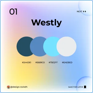
1. Westly
Color Code:
#244D61 #5689C0 #75E2FF #EAEBED
Westly Color Palette
🎨 #244D61 (Deep Teal)
A rich teal that adds depth and sophistication to your design. Ideal for backgrounds or as a bold accent color, it brings a sense of elegance and stability.
🌊 #5689C0 (Soft Blue)
This calm and serene blue creates a soothing atmosphere, making it perfect for websites, branding, or calm interior spaces.
☁️ #75E2FF (Light Sky Blue)
A fresh and airy color that brings brightness and openness. Ideal for highlights, call-to-action buttons, or light illustrations.
🪞 #EAEBED (Pale Gray)
A soft, neutral gray that pairs beautifully with bolder colors, adding balance and elegance to the overall design.
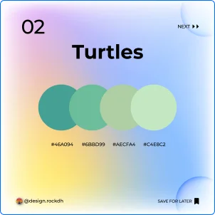
2. Turtles
Color Code:
#46A094 #6BBD99 #AECFA4 #C4E8C2
🐢 Turtles Color Palette
🌿 #46A094 (Deep Greenish Teal)
A rich, earthy shade of teal that grounds the palette with a sense of stability and harmony. Perfect for natural or organic designs, it evokes a connection to nature and tranquility.
🍃 #6BBD99 (Soft Sage Green)
A soothing and fresh green that adds a calming, earthy vibe. Ideal for eco-friendly brands or health and wellness-related designs, it brings a sense of renewal and balance.
🍀 #AECFA4 (Muted Mint Green)
A soft, pastel green that conveys a gentle and inviting feel. Perfect for backgrounds, logos, or any design that needs a touch of lightness and freshness.
🌱 #C4E8C2 (Light Mint Green)
A fresh, airy green that brings a sense of tranquility and peace. Ideal for accents, buttons, or any area where you want to convey a serene and calming atmosphere.
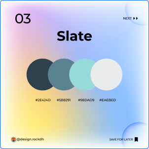
3. Slate
Color Code:
#2E424D #5B8291 #98DAD9 #EAEBED
🪨 Slate Color Palette
🌌 #2E424D (Dark Slate Blue)
A deep, muted blue-gray that exudes sophistication and depth. Perfect for backgrounds or as a bold accent in modern designs, it brings a touch of elegance and strength.
🌫️ #5B8291 (Slate Gray)
A cool, calming gray-blue that creates a serene and professional atmosphere. Ideal for corporate branding or website designs, it offers a balanced and composed aesthetic.
💧 #98DAD9 (Pale Aqua)
A soft, tranquil aqua that lightens the mood and adds a refreshing touch. Great for highlights, icons, or subtle design elements, it introduces a sense of calmness and clarity.
🌁 #EAEBED (Light Gray)
A soft, neutral gray that balances the palette with a light and airy feel. Ideal for backgrounds or creating space within your design, it enhances openness and simplicity.
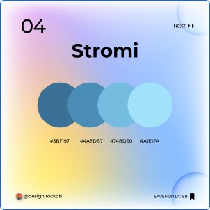
4. Stromi
Color Code:
#3B7197 #4A8DB7 #74BDE0 #A1E1FA
🌩️ Stromi Color Palette
🌊 #3B7197 (Stormy Blue)
A deep, moody blue that adds sophistication and drama to your design. Ideal for creating bold statements in logos, headings, or backgrounds, it evokes a sense of strength and confidence.
🌥️ #4A8DB7 (Cool Sky Blue)
A calming, cool-toned blue that brings a sense of tranquility and balance. Perfect for website elements or professional designs, it creates a serene and composed aesthetic.
💦 #74BDE0 (Soft Aqua Blue)
A fresh, light blue that adds brightness and clarity. Ideal for accents, call-to-action buttons, or visual highlights, it injects a touch of vibrancy and energy.
☁️ #A1E1FA (Pale Sky Blue)
A delicate, airy blue that lightens the palette, bringing a feeling of openness and peace. Perfect for backgrounds or light illustrations, it softens the overall look while maintaining a refreshing vibe.
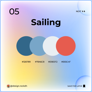
5. Sailing
Color Code:
#326789 #78A6C8 #E9EEF2 #E65C4F
⛵ Sailing Color Palette
🌊 #326789 (Ocean Blue)
A deep, rich blue that reflects the vastness of the ocean, bringing depth and grounding to your design. Perfect for creating bold elements like headers or backgrounds, it evokes a sense of strength and stability.
🌫️ #78A6C8 (Soft Ocean Mist)
A soothing, muted blue that conveys calmness and serenity. Ideal for balancing other colors in your design or as a subtle background for websites and branding.
🌤️ #E9EEF2 (Light Seaside White)
A soft, airy white with a touch of blue, perfect for lightening up the palette and creating a clean, open feel. Use it to add a sense of freshness and clarity to your design.
🪸 #E65C4F (Coral Red)
A vibrant coral red that adds a pop of energy and warmth, making it ideal for accentuating key elements or call-to-action buttons. It injects excitement and liveliness into your composition.
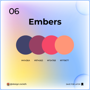
6. Embers
Color Code:
#41436A #974063 #F54768 #FF9677
🔥 Embers Color Palette
🌑 #41436A (Deep Charcoal Blue)
A dark, muted blue-gray that adds depth and mystery to your design. Ideal for backgrounds or bold accents in modern, sophisticated compositions, it exudes a sense of refinement and intrigue.
🍇 #974063 (Rich Mulberry)
A deep, luxurious purple with red undertones, bringing warmth and a touch of drama to your design. Perfect for adding elegance and richness to branding or visual elements.
🌸 #F54768 (Vibrant Pink)
A bold, striking pink that infuses energy and excitement into the palette. Ideal for call-to-action buttons, highlights, or any element that needs to stand out and capture attention.
🍑 #FF9677 (Soft Peach)
A warm, inviting peach that softens the palette with a gentle touch. It balances the brighter tones while adding a hint of warmth and approachability to your design.
Best 6 stunning color palettes in USA.

